Painted Harvest Christmas Wreath CAS Card

by Joanne James11. October 2017 20:51

Wednesday already?! Just time for a really quick share of another clean-and-simple Christmas Wreath using the Painted Harvest stamp set that I made with some ladies in a Christmas card class a couple of weeks ago:


Here's the low-down on today's card:

A Christmas Wreath - Today's Painted Harvest stamp set Christmas wreath uses the largest of the petal stamps, stamped once in Wild Wasabi then rotated through 180 degrees before inking and stamping again in Garden Green over the top. This gives a much fuller, more dimensional wreath than the one on Monday's card. I then used the small dot stamp to stamp my Real Red berries.

Painted Autumn - I added a narrow strip of Painted Autumn designer series paper to my card; I love that the reverse side of our papers often feature a more neutral design, such as these watercoloured stripes, that lend themselves to more than just autumn/fall projects. Some of the ladies in my class used the leafy pattern on the reverse of this strip and I must say that looked great too. I'm so happy the Painted Autumn papers are included in the 'buy 3, get 1 free' offer on designer series paper this month too - all the more reason to stock up!

Season's Greetings - Today's card features a big, bold sentiment from the 'Snowflake Sentiments' set, perfect for today's card and not a snowflake in sight!

Here is the visual summary of the key products used on today's project for you to pin for easy reference:


You can see all of my 'How To' summaries on my 'How To - Tips and Techniques' Pinterest board in case you've missed any. 

Hopefully I'll be back tomorrow with another project. Until then, happy stampin'!


Stampin' Up! Supplies Used:

Table built using Product Table Builder by The Crafty Owl - Independent Stampin' Up! Demonstrator.

Painted Harvest Sunflowers For The Paper Players #PP364

by Joanne James1. October 2017 09:00

It's Sunday, the start of a new month and time for this week's new challenge over at The Paper Players! The queen of beautiful florals, the talented Sandy, is the hostess this week and her passion is reflected in her chosen theme this week:
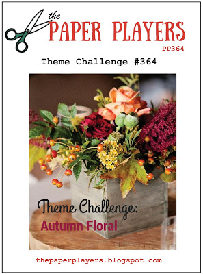
 

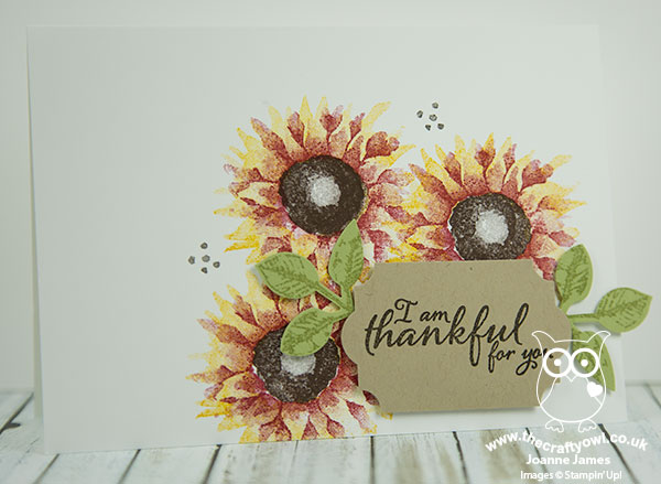
I had the best of intentions of producing a fabulously over-the-top floral to honour the lovely Sandy today, but the last minute preparations for my stand at the Crafting Live Exhibition at Stoneleigh Park this weekend meant that my time rather ran away with me this week and instead I've resorted to sharing much more of a clean and simple card that I already had 'in the bag' as it were. Today's card uses one the runaway success bundles from the current seasonal catalogue - Painted Harvest. Take a look:
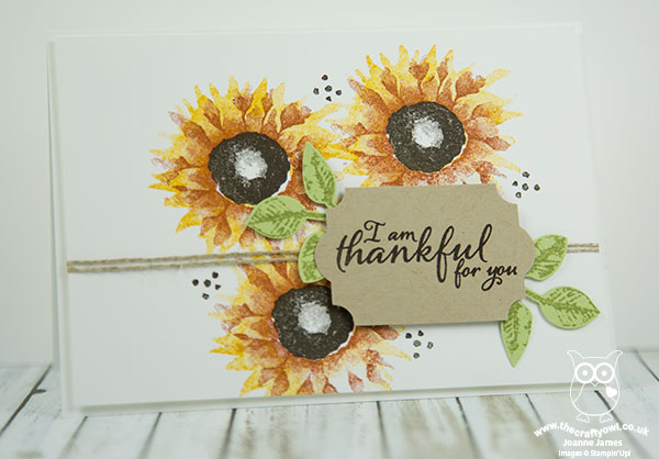
 

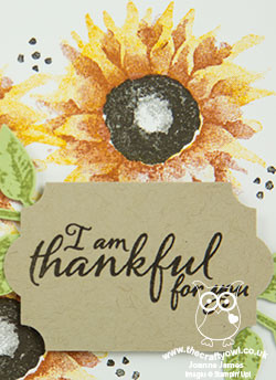
Here's the low-down on today's card:

Painted Harvest - What can I say other than I LOVE these sunflowers! The sentiments in this set are lovely but it's the sunflowers that get me: it is a two-step stamp set that gives a beautiful watercoloured effect and as they are photopolymer it's so easy to stamp. They are so forgiving - they look great however you line them up! If you're a first-time stamper, this would be a great set to cut your teeth on. 

Add A Leaf - The leaves in the stamp set also match up with the leaf punch which is the other item that can be bought in the Painted Harvest bundle for a saving of 10% - that's why we all love a bundle!

Autumnal Colour Combinations - These sunflowers can be stamped in both traditional and less traditional colours; here is my sample board showing how they look stamped in a number of autumnal coloured floral combinations:
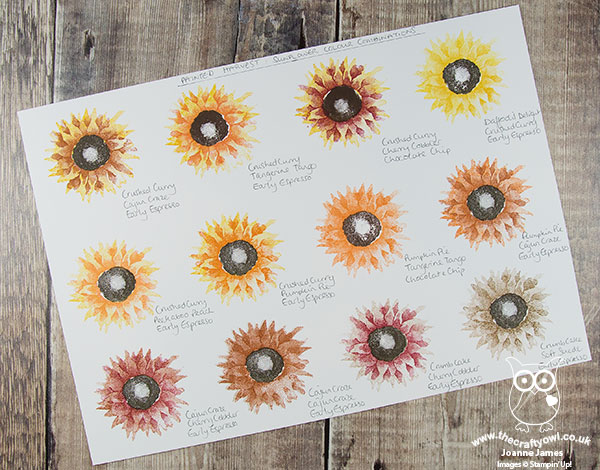
 

Which one is your favourite? I also made a whole bunch of these cards, minus the twine, to send out to my customers with my seasonal catalogues and as thank you cards to be included with my open house orders - here are some of them up close so you can see the colour combinations in more detail. 

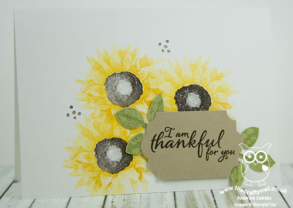
This one is a combination of Crushed Curry and Daffodil Delight:
 

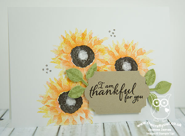
This one is a combination of Crushed Curry and Peekaboo Peach:
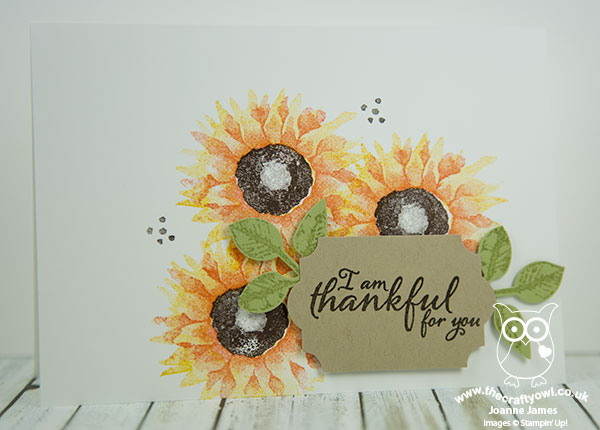
This one is a combination of Crushed Curry and Tangerine Tango:
This one is a combination of Crushed Curry and Cajun Craze:
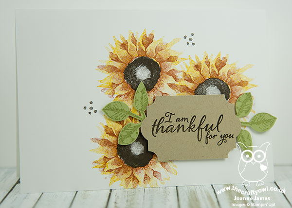
Lastly my favourite of all, this one is a combination of Crushed Curry and Cherry Cobbler:
This is by no means an exhaustive set of colour combinations. Let me know in the comments below which ones are your favourites or what other combinations you've tried that you would like to share.  

Also, if you live local to me in or around Northampton, I have a class using this set scheduled for Monday 6th November - read more about it here or contact me to book your place! 

Here is the visual summary of the key products used on today's project for you to pin for easy reference:
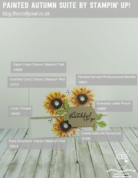
 

You can see all of my Product and 'How To' summaries on my 'How To - Tips and Techniques' Pinterest board in case you've missed any. 

Before you reach for your ink and papers, check out what our amazing team has created to inspire you this week:

The Paper Players Design Team
 
 
Here's a quick recap of our challenge rules:
 
1.  Create a new paper project
2.  Upload your creation to your blog with a link back to us and provide a direct link to the post featuring your challenge submission.
3.  Please link your card to no more than four challenges, TOTAL.
4.  Have FUN! 


I look forward to seeing what you create with this week's theme. Enjoy the rest of your weekend as it will be over all too quickly; I'll be spending a second day at the Crafting Live Show at Stoneleigh Park today - come and say hello to me on stand A10 if a visit is part of your weekend plans. I'll be back tomorrow with another project; until then, happy stampin'!


Stampin' Up! Supplies Used: 

Table built using Product Table Builder by The Crafty Owl - Independent Stampin' Up! Demonstrator.


At Home With You Doorstep Card - Three Ways To Incorporate Texture Into Your Projects

by Joanne James26. September 2017 05:00

Today I'm sharing a card from one of my recent monthly technique classes featuring the At Home With You bundle. This class was also all about ways to incorporate texture into your projects and so is perfect to link up with the team over at Just Add Ink this week where the theme is 'Just Add Texture':

Each of the cards that we made used texture in different ways: one using embossing paste, another using stencilling and dry embossing and this Autumnal new home doorstep card which actually features three different ways to incorporate texture into your project - take a look:


Aside from the obvious texture created by layering my diecut pieces, there are also more subtle textures added to this card. Here's the low-down on how I did it:

Adding Texture 1: Use Patterned Paper - I used a piece of the Wood Textures Designer Series Paper Stack for my front door - this is a quick and easy way to add texture to your project. I chose a piece of whitewashed wood pattern to stand out against my Bermuda Bay walls, however with each DSP stack containing 4 sheets each of 12 double-sided designs, you have 24 different wood effects to choose from - seriously spoilt for choice!

Adding Texture 2: Dry Embossing - To ground my door I added a strip of Crumb Cake cardstock across the lower part of my cardfront, but before I glued it in place I first embossed it with one of the hidden gem pieces in the Bike Ride Framelits set; did you know that this set, just like the Eclectic Layers Thinlits, includes a piece that embosses as opposed to diecuts? I've circled it so that you can see it in the set below:


This added a fun cobblestone-textured path outside my front door.

Adding Texture 3: Stamping - Lastly, I wanted my doormat to look like one of those rough, coir mats that are a traditional feature of a front doorstep. To achieve this look, I used one of the stamps in the 'Timeless Textures' stamp set and stamped it in Soft Suede onto Soft Suede cardstock, for a tone-on-tone textured look. I stamped off first so the effect is subtle, yet it adds a little detail that definitely contributes by adding further texture to my card.

There are lots of ways to add texture to your projects; I will have a few more to share in the other projects from this class and the gallery over at Just Add Ink also has lots of inspiration too.

Here is the visual summary of the key products used on today's project for you to pin for easy reference:


You can see all of my 'How To' summaries on my 'How To - Tips and Techniques' Pinterest board in case you've missed any. 

Enjoy your day and I'll be back tomorrow with another project. Until then, happy stampin'!


Stampin' Up! Supplies Used:

Table built using Product Table Builder by The Crafty Owl - Independent Stampin' Up! Demonstrator.

At Home With You Christmas Card and Matching Gift Bag Punch Board Gift Box

by Joanne James21. September 2017 18:59

Happy Friday everyone! I'm not sure where the time goes - I can't believe it's the end of the working week already - well, for some anyway! Today I'm sharing a another card along with a matching gift box from one of last month's monthly technique classes using the At Home With You bundle - take a look:


Here's the low-down on today's card:

At Home With You At Christmas - The At Home With You bundle is so versatile and works for lots of different seasons. Today's card features the gorgeous holly bough around the door, along with the holly wreath and the ornamental trees either side of the front door. I coloured them with my Stampin' Write markers and they were easily cut out with the framelits. I even decorated the inside and envelope for complete co-ordination.

More Ways To Add Texture - As with the last card I shared featuring this set (you can see that card here if you missed it), today's card has another three ways in which you can incorporate texture into your projects:

Adding Texture 1: Stamping To add to the Christmas feel, I wanted a red front door; by stamping my Real Red cardstock with the Hardwood stamp in Real Red, before stamping with the door outline in black, to add some tone-on-tone interest and texture for added kerb appeal.

Adding Texture 2: Dry Embossing On both my card and box I embossed the Smoky Slate base cardstock with my Brick Wall textured embossing folder to create some textured walls as a backdrop for my festive entrance.

Adding Texture 3: Embellish Sometimes on a card it helps to minimise bulk especially if you need it to be post-friendly, however this is rarely the case with packaging and the addition of bulky embellishments is less of an issue. On my gift box, in addition to a tag and ribbon, I added a boxwood wreath to my front door - I love the extra texture this adds.

A Matching Gift Box - It's always nice to be able to create fancy packaging for gifts and no more so than at this time of year. I made my simple gift box using the Gift Bag Punch Board (I just didn't score the side indents to make the bag shape) and created a little triangle roof for a lid (it's a simple hinged closure that is held in place with washi tape) that I stencilled some tile on using some Basic Grey ink and my brick pattern Patterned Party Decorative Mask and added a tag punched with the super-useful Everyday Label Punch:

This box measures approx. and is a reasonable size, big enough to accommodate most small gifts. Here's a picture of both items together:


Here is the visual summary of the key products used on today's project for you to pin for easy reference:


You can see all of my 'How To' summaries on my 'How To - Tips and Techniques' Pinterest board in case you've missed any. 

Enjoy the rest of your day and I'll be back tomorrow with another project. Until then, happy stampin'!


Stampin' Up! Supplies Used:

Table built using Product Table Builder by The Crafty Owl - Independent Stampin' Up! Demonstrator.

High Tide Birthday Card For Dad #GDP103

by Joanne James6. September 2017 20:25

Good evening lovely readers! So today was the day that saw my precious James Juniors return to school - I got lots of work done, but boy was the house quiet! So we are about to return to our school routines and something close to normal working will resume. I've been busy making lots of Christmas samples in readiness for my open house on Friday however September is also a big birthday month for us, with several family members and friends celebrating birthdays (my good self included!) So today I'm sharing a card that I made for my Dad's birthday that fits perfectly with the theme over at the Global Design Project this week:

I decided to make a slightly larger card than usual as I wanted to be able to personalise it - take a look:


I decided to use the High Tide stamp set for my card - such a great set for masculine cards and one that you can use to make quite colourful masculine cards (they don't always have to be brown :-) ) I stamped my beach scene off to the left as I wanted it to act as something of a background for my sentiment, then paired the Happy Birthday from the 'Butterfly Basics' stamp set with my stamped and diecut 'DAD' - you know how much I love these letters and co-ordinating framelits! I'm not generally one for frills, especially on a masculine card, so pretty ribbon was a no-no for me, however I did add some burlap beneath my diecut letters for a little extra touch - I think it fits nicely with the beachy theme too.

If you like the High Tide set and live local to me, you might like to know that this is the set we will be using in one of my October Monthly Technique Classes - get in touch if you would like more information.

Here is the visual summary of the key products used on today's project for you to pin for easy reference:


You can see all of my 'How To' summaries on my 'How To - Tips and Techniques' Pinterest board in case you've missed any. 

I hope you enjoyed today's quick post; I'll be back tomorrow with another project. Until then, happy stampin'!


Stampin' Up! Supplies Used:

Table built using Product Table Builder by The Crafty Owl - Independent Stampin' Up! Demonstrator.

Beautiful Bouquet One Sheet Wonder

by Joanne James11. August 2017 20:00

Friday already - where did the week go?! I've been having fun with my not-so-little ones - and today my youngest James Junior turned 10 years old so now I have two children in double digits - I really don't know where the time goes! We have had a fun day of games, football, dinner out and a trip to the cinema so all in all a lovely end to the week. Following a few absent days, I thought it was time for a quick post to share more of my makes with the Beautiful Bouquet stamp set. I actually used the set to create a one sheet wonder, that I turned into eight cards that I then duplicated for my thank you cards to go out with my customer orders this month. Here's one of the cards in the set:


Here's the low-down on today's card:

Bright Colour Combo - I chose a bright colour combination of hot pink, orange and red with a contrasting touch of blue for my set of cards - the Marina Mist blue is definitely the wild card here, however I think it breaks up the other colours in a good way. Here's the colour combination if you'd like to save it for future use:


Step It Up - I could have simply added my one sheet wonder panels to my card bases, along with a sentiment stamped on a basic square or punched circle, to complete my cards in record time. I decided to step them up slightly with the aid of my Stitched Shape Framelits, Layered Squares and Circles Framelits and some additional stamped flowers that I then diecut with the co-ordinating Bouquet Bunch Framelits. Completion took a little more time for sure, however I think it was worth it - sometimes it's the details that count and really make the difference.

The Wonder Of One Sheet - A one sheet wonder is a fun way to create your own patterned paper and can be a quick solution if you want to create a bunch of cards. I made up my own cut template for this one, with a set of easy cuts to make the most out of my single sheet of A4 cardstock. Here's a shot showing all the cards I made just to give you a flavour off the set:


I used a variety of base and mat colours - the tiny flowers make Beautiful Bouquet a great set to use for a one sheet wonder. Why not give it a try with some of your favourite colour combinations?

Here is the visual summary of the key products used on today's project for you to pin for easy reference:


You can see all of my 'How To' summaries on my 'How To - Tips and Techniques' Pinterest board in case you've missed any. 

I'll be back on Sunday with another project. Until then, happy stampin'!


Stampin' Up! Supplies Used:

Table built using Product Table Builder by The Crafty Owl - Independent Stampin' Up! Demonstrator.

Beautiful Bouquet Three Ways From Simple to Stepped Up

by Joanne James4. August 2017 08:00

Happy Friday everyone! School holidays have got the better of me this week and with an all-day technique class too and pre-order of my seasonal goodies from the new Autumn-Winter catalogue, I've just not had the opportunity for blogging. I've plenty of makes to share with you though and today to thank you for your patience this week I thought I would show you not one, not two but three cards - another trio from simple to stepped up, this time featuring the Beautiful Bouquet Bundle that you can find on pages 92-93 of the 2017 Annual Stampin' Up! catalogue.

The Beautiful Bouquet stamp set has a wonderful collection of both florals and sentiments that are suitable for a wide variety of occasions and when paired with the co-ordinating Bouquet Bunch Framelits Dies can be used to make the most amazing 3D floral bouquets. The set really does offer something for every kind of crafter; I started out with the following basic colour combination and set to work:


Clean and Simple - Quick And Easy - If you're short on time or new to crafting, this set is great for a simple one layer card like this one:


All you need to do is take a sheet of Extra Thick Whisper White for your card base, stamp your stems and a few carefully chosen blooms directly onto the card front along with a sentiment of your choice, add a few rhinestones and your card is done. Bright colours that compliment each other and some contrasting flower centres really help this simple card to have a big impact.

Step It Up - If you have a bit more time and are feeling more adventurous, using a few extra tools and embellishments will allow you to 'step up' your card and create something with a little more depth and detail, whilst still relatively easy to make:


My second card follows the same basic layout as the first, however this time I've used the framelits to cut out the bow and the flower heads and popped them up on dimensionals, and some circle punches to punch out my sentiment and layer it onto some Berry Burst cardstock for extra pop. In addition to the rhinestones, I've added a little tab of Daffodil Delight Double-Stitched Ribbon to my sentiment circle for an extra touch.

Going For Gold - Stepped Up To The Max - If you have the time and want to really explore a wide range of techniques, tools and embellishments, it's possible to use the Beautiful Bouquet Bundle to create something really special:


My third card is a CASE of the card on page 93 of the Stampin' Up! catalogue and really goes to town: the framelits have been used to diecut the entire bouquet, having stamped the flower heads first, and layered onto some background-stamped squares cut with the Layering Squares Framelits and an embossed background (my card uses the retired Large Polka Dot TIEF but you could of course use the current Polka Dot Basics Textured Impressions Embossing Folder as per the catalogue sample). There are some additional colours, doilies, linen thread and a sprinkling of the gorgeous glitter enamel dots that really help to make this card something special.

Here are the visual summaries of the key products used on today's projects for you to pin for easy reference:


You can see all of my 'How To' summaries on my 'How To - Tips and Techniques' Pinterest board in case you've missed any. 

So which of the above cards is your favourite? Do leave me a comment below, I'd love to hear your thoughts. I love them all and as I have the bundle, like the fact that I can choose my style depending on how the mood - or in my case time available - takes me! I have a few more cards to share using this set, so stay tuned next week if florals are your thing.

Enjoy your day and I'll be back tomorrow with another project, quite possibly with something of a more seasonal nature. Until then, happy stampin'!


Stampin' Up! Supplies Used:

Table built using Product Table Builder by The Crafty Owl - Independent Stampin' Up! Demonstrator.

Eclectic Layers Thinlits Diamond Background: Part 2

by Joanne James25. July 2017 06:00

I've another Oh So Eclectic card for you today! Still looking at the different ways you can use the diamond-patterned die in the Eclectic Layers Thinlits to create backgrounds - today's example is actually a CASE of a card featured on page 132 of the Stampin' Up! catalogue: 


Here's the low-down on today's card:

Colour Above - This card uses the diamond-patterned thinlit in the Eclectic Layers Thinlits set, again without the outline, to add interest to the mat layer of the card. On today's card I've used a piece of Extra Thick Whisper White below the diecut layer and cut the diecut out of a piece of the lovely faux watercoloured paper from the Naturally Eclectic designer series paper pack - this time the Emerald Envy piece,which was the other end of the paper I used for the background on my previous card. I added further detail to this layer by stamping leaves and dots directly onto it and added texture by sticking some of the diamonds that had been cut out back onto the base layer. Waste not, want not as the saying goes!

Embossed Leaves - Did you realise that two of the leaf thinlits and one of the diamond thinlits in the Eclectic Layers set are actually for embossing not die cutting? I've highlighted them on the image below - so useful for adding in texture to your designs:


I used the sprig of leaves on the background layer, again another way to add detail and texture without adding bulk.

The Midas Touch - A few final gold elements - foil, mini sequins and metallic thread - finish the card.

As my regular readers will know, I'm not usually into 'fussy' cards, however I love this set: it makes freestyle collage cards so easy, without having to sacrifice too much of my clean and layered style. 

Here is the visual summary of the key products used on today's project for you to pin for easy reference:


You can see all of my 'How To' summaries on my 'How To - Tips and Techniques' Pinterest board in case you've missed any. 

I'll be back soon with my final card (for now!) that uses the Oh So Eclectic product suite. Until then, happy stampin'!


Stampin' Up! Supplies Used:

Table built using Product Table Builder by The Crafty Owl - Independent Stampin' Up! Demonstrator.


Oh So Eclectic 2017-18 Stampin' Up! Annual Catalogue Cover CASE

by Joanne James19. July 2017 11:00

Today I have another Oh So Eclectic card from this month's technique class which is actually a CASE of the card on the front cover of the current 2017-18 Annual Stampin' Up! catalogue:


The eye-catching front cover was in part what attracted my ladies to the Oh So Eclectic Bundle in the first place, so it seemed only right that we should make some of the cards showcased. I thought I would use today's post to actually talk about ways in which you can use the catalogue to help you on your creative journey and inform the sets that you buy when you shop for Stampin' Up! products.

Here's the low-down on today's card:

CASE The Catalogue - The catalogue is not only the place to find the details for all of the products that Stampin' Up! sells, it is also a valuable resource of tips, tricks and ideas and serves as a source of inspiration in and of itself. It's choc-full of great examples of how many of the products can be used and I always encourage my customers to use their catalogues to their full potential, whether in doing a 'Copy and Share Everything' or 'Copy And Selectively Edit' (both fit the acronym CASE) or to use the ideas as inspiration to create something different entirely. Today's card is my CASE of the one that sits in the middle of the front cover page. I changed out the sentiment for one that I have - I used one from the 'Butterfly Basics' stamp set, a 'go to' for me - but otherwise stayed pretty true to the sample.

A Sample For Everyone - The catalogue might seem a little overwhelming at first glance, with so many stamp sets, tools and accessories and lots of colourful images showing samples galore. The trick is to look out for the clever signposts that are dotted throughout the catalogue that help you navigate your way, whatever type of crafter you are. On pages 6 and 7, there are lots of useful pointers of things to look out for as you browse, whether you are new to crafting or someone looking for more creative freedom. Either way, the catalogue has you covered. Particular signposts that I would encourage you to pay attention to are the 'quick and easy' icon:


Equally, the 'step it up' icon shows how you can start with a simple project, then 'step it up' with additional tools and embellishments:


There are also lots of tips and information panels that describe how to do lots of techniques - invaluable if you don't get to attend a class and benefit from the knowledge of your Stampin' Up! demonstrator in person or aren't able to get online to look something up, read their blog or watch a YouTube video. Last but not least, the 'You Can Make It' panels show you a project and are accompanied by a shopping list of the supplies you will need in order to recreate it yourself. Stampin' Up! really does try and make it easy for you!

One Step Up - So the card above is the first or interim stepped-up version using the Oh So Eclectic stamp set. The central panel is stamped, however it also includes a stamped and diecut flower, a label printed with the Pretty Label Punch and a sentiment from an alternative set, along with some Naturally Eclectic Designer Series Paper, some Pool Party Solid Baker's Twine and some Emerald Envy ribbon. If you are a regular stamper and have lots of supplies, this card is a great example of how you can bring various sets and tools together, yet is still relatively quick and easy to produce. 

Here is the visual summary of the key products used on today's project for you to pin for easy reference:


You can see all of my 'How To' summaries on my 'How To - Tips and Techniques' Pinterest board in case you've missed any. 

I'll be back soon with another 'CASE The Catalogue Cover' card, this time showcasing the bells-and-whistles fully stepped up version using the Oh So Eclectic product suite. Until then, happy stampin'!


Stampin' Up! Supplies Used:

Table built using Product Table Builder by The Crafty Owl - Independent Stampin' Up! Demonstrator.

Oh So Eclectic Faux Textured Embossed Flowers

by Joanne James17. July 2017 12:00

I've had a few days of rest from blogging as I'm currently taking a well-earned vacation, hence no Paper Players post from me yesterday - the rest of the team have been busy though so do check out their cards for this week's Clean And Simple challenge here.

Today sees the resumption of my holiday blogging schedule - I still have some Oh So Eclectic cards to share with you, so whilst I can't promise to blog every day as I usually do, I will be sharing every few days so do pop by if you are enjoying this series showing the versatility of the Oh So Eclectic stamp set and the co-ordinating Eclectic Layers Thinlits.

Here's another Oh So Eclectic card from my technique class last week featuring a fun technique that I introduced my ladies to for the first time: 


Here's the low-down on today's card:

Faux Textured Embossing - Are you wondering which embossing folder I used to create my Oh So Eclectic embossed flowers? You'll be guessing for a while - as the answer is none at all! Texture is an important feature on a card, with the layers and crinkled ribbon additional textural components, however it can be achieved in other ways too. I introduced my class to the concept of faux texture embossing, where you create a pattern, usually using a repeating shape, from lots of diecuts. This gives the suggestion of embossing and adds an additional layer of texture. The trick is to ensure your shapes are adhered securely to your base. Running the whole piece through a Big Shot with new cutting plates also helps to embed the diecuts into the base.

A Crinkle of Berry Burst - I added some pleats of the new crinkle ribbon in Berry Burst to my card; this ribbon is so soft and ties beautiful bows. I like the effect of the crinkle ribbon but always feel like I need to iron it before use!

A Pop Of Lime - Again I used one of the sentiments from the Oh So Eclectic stamp set on my card, this time stamping in Night of Navy on Lemon-Lime Twist for a pop of colour.  

Here is the visual summary of the key products used on today's project for you to pin for easy reference:


You can see all of my 'How To' summaries on my 'How To - Tips and Techniques' Pinterest board in case you've missed any. 

I'll be back soon with another card that uses the Oh So Eclectic product suite. Until then, happy stampin'!


Stampin' Up! Supplies Used:

Table built using Product Table Builder by The Crafty Owl - Independent Stampin' Up! Demonstrator.

New Online Exclusives

There are new products available exclusively in the online store from 5 November - check them out here.

Latest Kits!

Stampin Cut and Emboss

The Layered Landscapes Kit and Nature's Paintings Kit are the latest kits in the online store - get yours here!

Shop Online

Access my online shop 24 x 7, 365 days of the year:

Current November hostess code:

9NKXDTTR

Shop Online

Mini Catalogue

BROWSE THE CATALOGUE

'Tis The Season - the new Stampin' Up! Mini Catalogue is here! For more details and to download your copy click here

Scrapbooking

Stampin' Up! has introduced a new range of 12x12" scrapbooking product and kit - the full range is now available to purchase online. To download a copy of the new digital Scrapbooking Catalogue click here.

2024-25 Annual Catalogue

BROWSE THE CATALOGUE

Click on the image to download your copy of the 2024-25 annual catalogue. For a full list of current SU! supplies, go to my online store. If you would like any help or advice, please drop me a line at joanne@thecraftyowl.co.uk or give me a call on 07773 421446 - I'd be happy to help.

Join My Team

It's always a great time to join Stampin’ Up! New team members can get £130 worth of products for only £99 + free business supplies + free shipping + all the fun being a part of Stampin’ Up! Stampin' Up! has something for everyone: join my growing team and benefit from my support to enjoy Stampin' Up! however you choose.

If you're interested, call me for a chat to understand how I can help you realise your goals. Alternatively, if you have already decided to sign up and you just can't wait, please click here for the link to the online form where you can sign up and order your starter kit right away! 

About Me

Hi I'm Joanne and live in Northampton and when I'm not looking after my husband and two beautiful children, am an avid crafter with a passion for all things Stampin' Up!

I must confess that I have never been a big rubber stamper - until I discovered Stampin' Up! that is. I love the fact that I can get such great results with co-ordinating stamps, inks, papers and punches - the possibilities are endless! Join me on my stamping journey as I share the things I love and be inspired to create amazing things yourself!

Follow Me

Monthly Newsletter

Box Builder

Click the button above to use Box Buster to create your custom box design using the Envelope Punch Board!

Kits Collection Now Available!

Stampin Cut and Emboss

The new Kits Collection from Stampin' Up! is now available!

Click here to see the current kits available and order yours online today.

I Design For


Stampin' Up Stuff

This is my personal blog and is not endorsed by Stampin’ Up! I hope you find it a plentiful source of ideas and personal inspiration but please don't copy my designs for contest submission or use for classes, publication or sale without express permission.