by Joanne James27. September 2014 21:27Hello lovely blog readers! I hope you're having a good weekend. I've spent my day preparing for my cardmaking class on Monday (more on that later in the week). I had a lovely day yesterday, the highlight of which was spending the morning at a fundraiser coffee morning held by my sister-in-law; wonderful cakes and tea in vintage china and a balloon release in memory of those we have known and loved who passed away as a result of cancer. We raised £323 in total which will go towards the charity MacMillan Cancer Support, to fund nurses to support those suffering this terrible disease, so a fantastic effort for a worthwhile cause.
Today I'm sharing my entry for this week's Merry Monday challenge, where Kathy is hosting a fun game of Christmas Bingo:
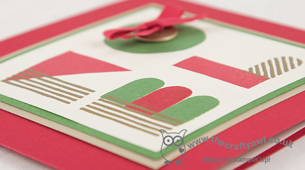
I decided to use the diagonal - red, ribbon or twine and emboss - for my card, which you can see below:
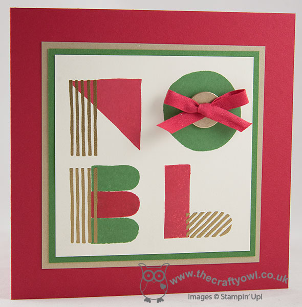
I decided to make a square card and wanted to try another sentiment-based card using the 'What's Your Type?' stamp set, this time using the word 'Noel' and more traditional Christmas colours of Real Red, Garden Green and gold. I stamped my sentiment onto Very Vanilla, with the lined elements of each letter stamped in Versamark and heat embossed in gold. I finished the 'O' with gold button threaded with Real Red 1/4" cotton ribbon and tied in a bow.
These cards are quite fun and not at all tricky when you get the hang of aligning the various stamps to make the letters. That's all from me today; back tomorrow with my Design Team card for The Paper Players - and a bonus card!
Until then, happy stampin'!
Stampin' Up! Supplies Used:
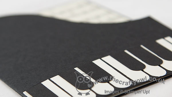
by Joanne James25. September 2014 14:17A quick post from me today as I am having the busiest of weeks! Today I'm sharing my entry for this week's challenge over at 'Less is More' where this week the challenge them is 'Let's face the music and dance' and the ladies are looking for cards with a music or dance theme. Now today's card is not overly original, in that I've seen many of them on Pinterest and the internet in general for a long time, but I needed a thank you card for someone who plays piano and as I've never made one of these cards before, I thought I'd create my version which just so happens to fit the bill for this week's LIM challenge. So here's my card:
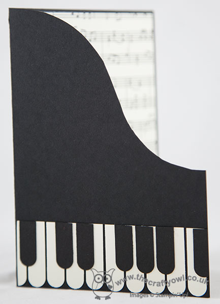
Quite difficult to photograph, so bear with me! This the front, in Basic Black, with the edge cut shaped like the lid of a grand piano, and then piano keys punched from a Word Window punch in Very Vanilla and Basic Black. Behind the cutaway section you can see the sheet music that is adhered to the inside of the card, which you can see more clearly below:
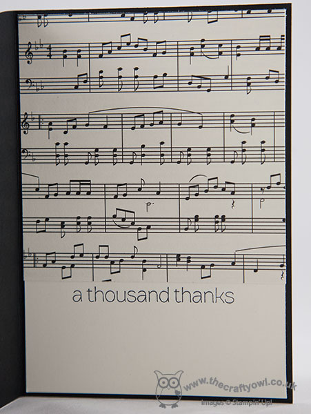
The sheet music is a piece of retired 'Modern Medley' DSP (I must confess to having hoarded the sheet music pages, I love them!), with space below for the sentiment and your message.
So a fun and simple piano card, where the 'white space' today is entirely black! Check out the other LIM entries this week for plenty of music and dance inspiration - I personally am loving the ballerinas on display!
One other thing - the Stampin' Up! UK Clearance rack updated last night - lots of new bargains at up to 80%, including 12 x 12" papers, washi tape and last season's Halloween papers and kits. You can check out all the bargains at my online store by clicking here - go and grab yourself a bargain!
Lastly, on the subject of THE Piano Man, Mr Billy Joel himself, if you're a fan and have never seen him play live, I can highly recommend it; I saw him in concert for the first time last year and can honestly say it was the best concert performance I have ever attended.
Back tomorrow with another project; until then happy stampin'!
Stampin' Up! Supplies Used:
dc3c3223-2cc3-4845-b514-ad0ce98f1fdd|0|.0|96d5b379-7e1d-4dac-a6ba-1e50db561b04
Tags: Word Window Punch, Punch Art, Modern Medley, Lots of Thanks, Clearance Rack, Product Shares, Promotions, Shop online, Stampin' Up, Stampin' Up Card, Stampin' Up Card ideas, Stampin' Up Supplies
Cards | Punch Art
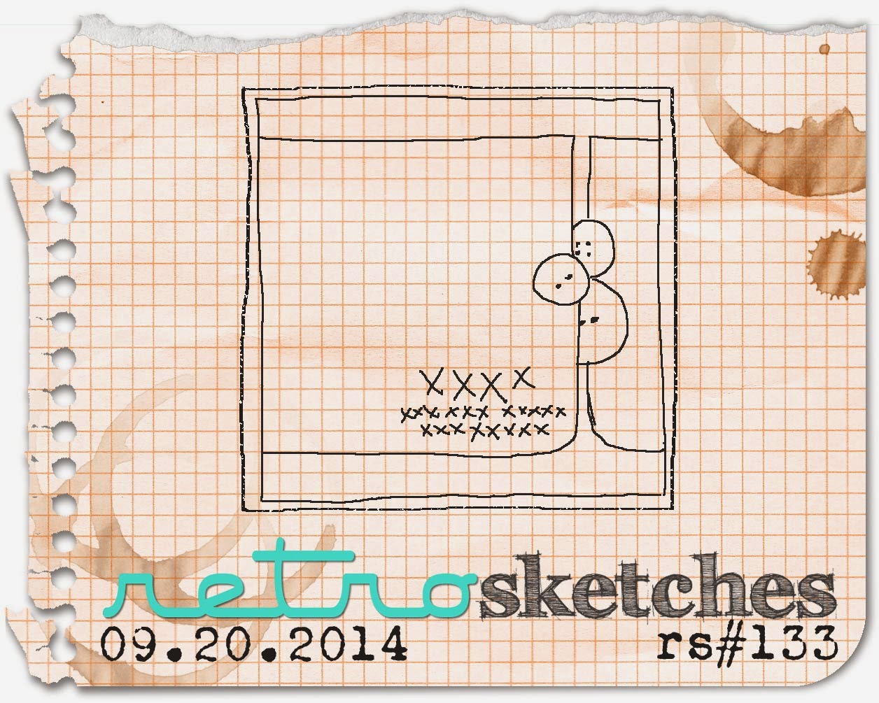
by Joanne James24. September 2014 10:00It's Wednesday and time for a new challenge over at the Colour Me...! Card Challenge. This week we have a playful colour palette for you to work with - I also chose to use this week's Retrosketches layout for my card:
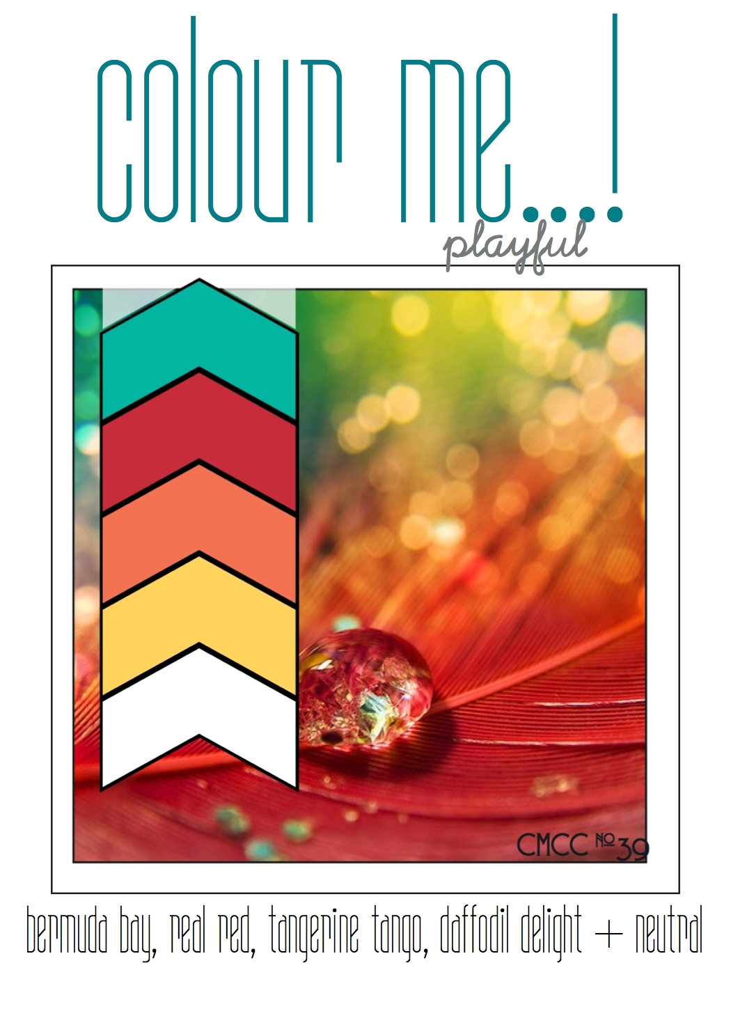
I love the bright colours of this week's colour palette, so decided to create a nice cheery card to really make the most of them - here's my card:
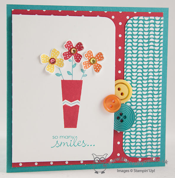
I used Bermuda Bay as the base colour for my card and decided to make a 4" square card for a change. I layered a sheet of Real Red polka dot paper from the Brights paper stack and a piece of Confetti Celebration DSP that features a fun Bermuda Bay design. I stamped the flower vase from Pictogram Punches, having inked it with my Stampin' Write markers to enable me to add the chevron detail on the vase and the flower stems in a different colour to the vase itself, then stamped and punched three flowers, finishing each with a rhinestone in the centre that had been coloured with my Blendabilities marker and adhered the flowers separately using glue dots. After stamping my sentiment from Petite Pairs, this left-handed section was adhered to the front of the card using dimensionals, to allow space for my selection of co-ordinating buttons to sit above and below it as per the sketch design.
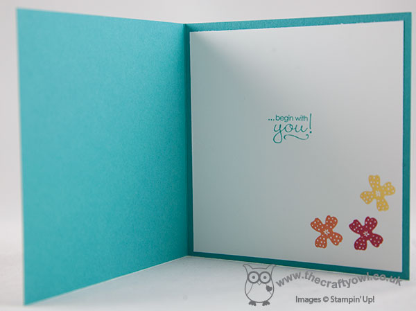
I even remembered to take a photo of the stamping on the inside of my card today:
That's my Colour Me...! card for this week - why not visit the other Colour Me...! designers and check out their takes on this week's colour combination:
We look forward to seeing your subtle creations. Right, i'm off to get some work done before this afternoon's hockey match (observer, not participant!)
Back tomorrow with another project; until then, happy stampin'!
Stampin' Up! Supplies Used:
2fdaabc9-aaf5-48d0-a644-494b14729943|0|.0|96d5b379-7e1d-4dac-a6ba-1e50db561b04
Tags: Shop online, Stampin' Up Card, Stampin' Up Card ideas, Stampin' Up Supplies, Stampin' Up, Pictogram Punches, Itty Bitty Accents Punch Pack, Confetti Celebration, Colour Me...!, Petite Pairs, Blendabilities
Cards | Stamping
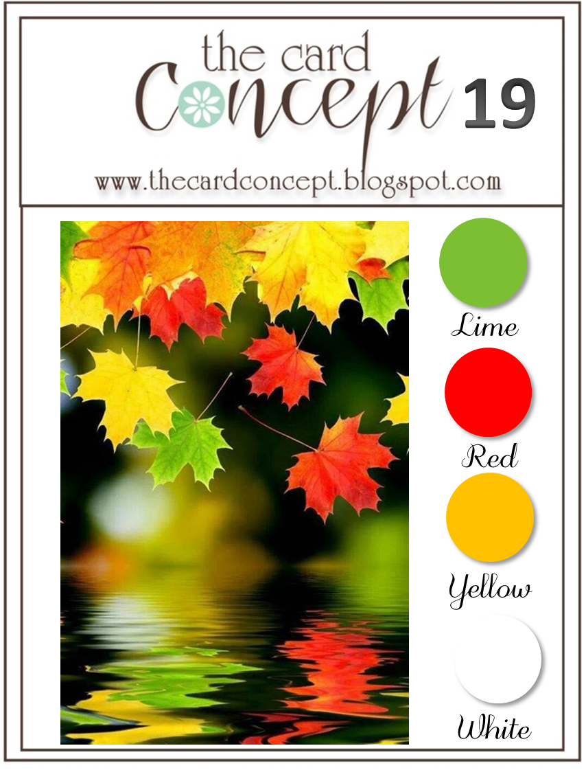
by Joanne James23. September 2014 13:30Hello everyone! Today I'm sharing my card for this week's challenge over at The Paper Craft Crew, for which I also used the current colour palette over at The Card Concept:
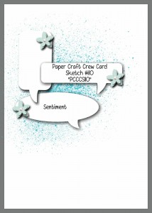
I thought the sketch layout with the word bubbles and the leafy inspiration photo would combine to create the perfect opportunity to showcase the sentiments in the 'Gratitude For Days' stamp set - a rather unsung hero from the current seasonal catalogue I think, but a set that I have used lots and lots. Here is my card:
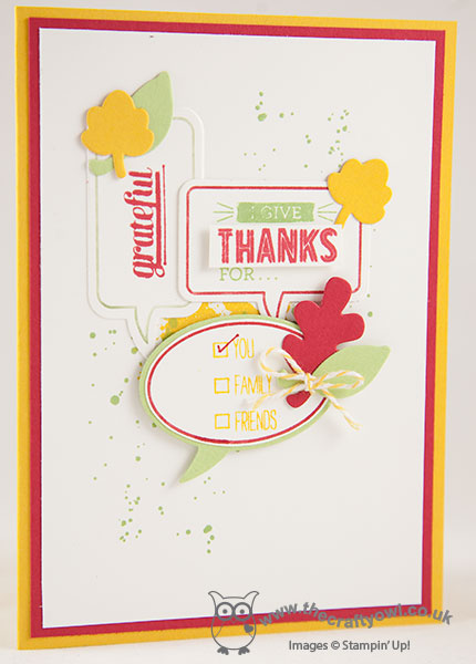
I used a combination of Real Red, Crushed Curry and Wild Wasabi for my card and inked the outlines of the Just Sayin' stamped word bubbles using my markers then stamped the insides with various 'gratitude' stamps in contrasting colours. I used some little leaves cut with my Fall Fest framelits as the embellishment for the word bubbles, and gradually layered them over a Gorgeous Grunge background to achieve my finished design. I think this still qualifies as 'clean and layered' as far as The Card Concept is concerned (if you've ever wondered about the definitions of the various cardmaking styles, you should check out their site - it gives some great guidelines), maybe bordering on 'freestyle collage', although probably not random enough to truly be a collage!
Hope you like my card; I'll pop back later with another quick make today for this week's challenge over at Create With Connie and Mary, so stay posted. until then, happy stampin'!
Stampin' Up! Supplies Used:
1e9c525a-9bc1-419e-9fbd-a468668813b6|0|.0|96d5b379-7e1d-4dac-a6ba-1e50db561b04
Tags: Thankyou cards, Just Sayin', Word Bubbles Framelits, Gratitude For Days, Fall, Fun Fall Framelits, Gorgeous Grunge, Big Shot, Stampin' Up, Stampin' Up Card, Stampin' Up Card ideas, Stampin' Up Supplies, Shop online
Cards | Stamping
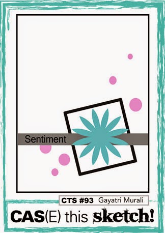
by Joanne James22. September 2014 07:30Happy Monday everyone! I enjoyed a restful Sunday yesterday and can honestly say I feel like I am starting the week on the front foot again for the first time in a few weeks! Today I'm sharing a cute clean and simple Halloween card that I made with this week's colours over at Colour Q and the sketch at CAS(E) this Sketch:
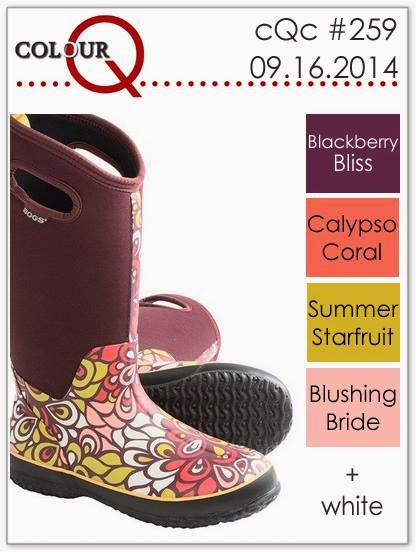
Despite the adorable wellie boots in the inspiration picture, when I saw this week's Colour Q colours I couldn't help but wonder if I could make them work for a Halloween card. This is what I came up with:
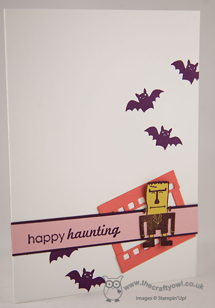
I stamped the Frankenstein stamp from 'Freaky Friends' in Blackberry Bliss onto some retired Summer Starfruit cardstock and fussy cut him out. I used a piece of film strip made using Calypso Coral cardstock and the On Film framelit, modified to make it smaller and placed the film strip behind my layered sentiment banner and then my figure on top. Lastly, I finished with some Blackberry Bliss bats to add to the Halloween theme.
I hope you like today's clean and simple Halloween card. I'm off to move mountains (of the craft and ironing pile variety!) Back tomorrow with another project; until then, happy stampin'!
Stampin' Up! Supplies Used:
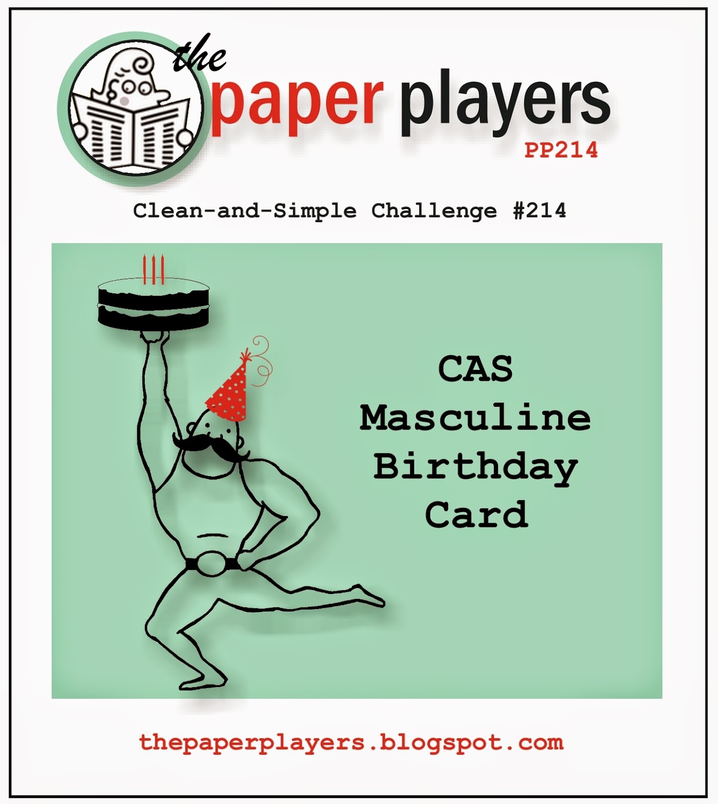
by Joanne James21. September 2014 07:00It's Sunday so I'm here with my card for this week's challenge over at The Paper Players, where Jaydee has the following clean and simple challenge for us:
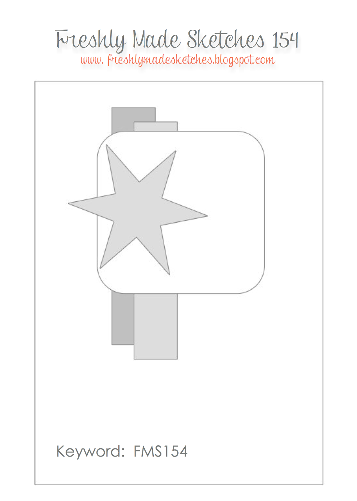
I also used the above sketch from Freshly Made Sketches again for my card this week and this week's card is a lot more 'clean' than last weeks - here is my card:
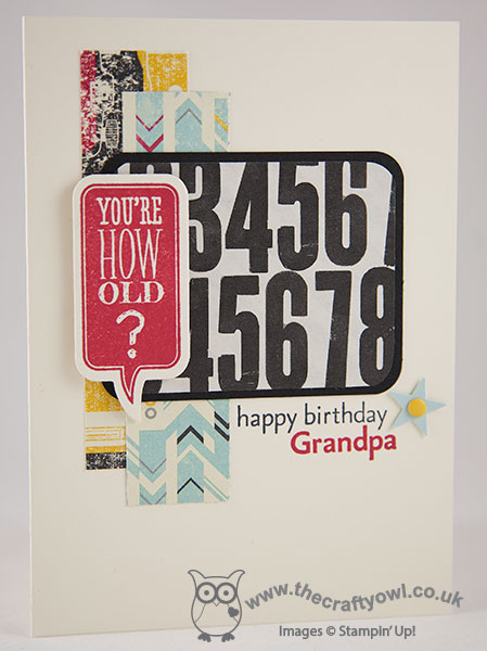
My card is really simple, with a piece of the numbered Typeset paper mounted on Basic Black as the central panel of my card, with a couple of strips of Flashback DSP behind to add some colour and the focal point word bubble 'You're How Old?' stamped in Real Red. I finished my card with the sentiment 'happy birthday Grandpa' (stamped with my vintage 'For My Family' stamp set - a keeper!) and a punched star.
Yesterday was my Dad's 70th birthday and I made this card for him from the children - they think 70 is positively ancient, so the word bubble was entirely appropriate! - however it occurred to me as I typed up my post that not only could you change out the sentiment to just say 'happy birthday' or include the role of any family member (dad, brother, uncle, etc.) this might also work as a fun tongue-in-cheek card with the sentiment as is. So beware any male that feels he's 'over the hill', because one of these cards could be heading your way Grandpa!
Do check out the other design team cards this week; as always, there is some great inspiration and I look forward to seeing your challenge entries in the gallery. Right, I'm off to prepare for Sunday lunch and hopefully enjoy a restful family day before the onset of a new week. Enjoy your weekends everyone!
Back tomorrow with another project; until then, happy stampin'!
Stampin' Up! Supplies Used:
3c67216b-06d0-4efb-9a73-71b4b3181f08|0|.0|96d5b379-7e1d-4dac-a6ba-1e50db561b04
Tags: Just Sayin', First Edition, Flashback, For My Family, Itty Bitty Accents Punch Pack, Candy Dots, corner punch, Shop online, Stampin' Up, Stampin' Up Card, Stampin' Up Card ideas, Stampin' Up Supplies, Typeset, Word Bubbles Framelits
Cards | Stamping
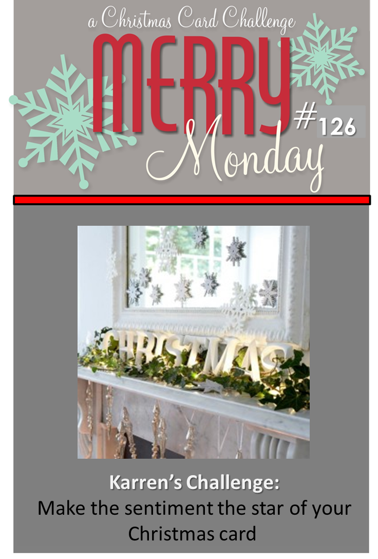
by Joanne James20. September 2014 21:51Here at last with today's post! A busy day today - homework, grocery shopping, we had friends round to make cake pops this afternoon (always fun!) and then a swimming gala this evening - so finally I'm sitting down for long enough to share today's card with you! Today's card is for this week's Merry Monday Christmas Challenge, where the theme from Karren this week is to let your sentiment take centre stage:
I was tempted to go with a few obvious choices for my card using some of the fabulous new sentiments in the current seasonal catalogue, but decided to take the opportunity to try something different that I've had in mind for a while. I made a sentiment all of my very own - take a look:
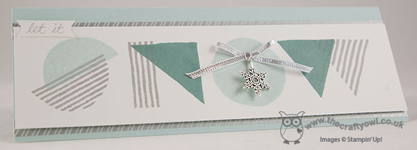
I decided to make a long, thin card and used the 'What's Your Type?' stamp set to stamp the word 'snow' using the various patterns and shapes in the set. I love this unusual graphic style type and it is great for making the sentiment the feature of your card. I stamped the various letters in a combination of Smoky Slate, Soft Sky and Lost Lagoon and finished the 'O' with one of the new snowflake embellishments and some silver ribbon. I mounted this section with dimensionals on a base of Soft Sky with a couple of strips of silver washi tape running along it. To complete my sentiment, I used my Smoky Slate Stampin' Write Marker to write 'let it' in my own handwriting on a little handcut banner and adhered to the top of the sentiment panel. A rather modern take on 'let it snow', granted, but I think it works and it's very different.
That's all from me; back tomorrow with this week's Design Team card for The Paper Players. Until then, happy stampin'!
Stampin' Up! Supplies Used:
by Joanne James19. September 2014 18:54Yay - it's Friday! I've had a productive craft day today, even if no housework managed to get done (ah well, there's always tomorrow for that!) and am finally finding time to write today's blog post. I used this week's sketch over at Retrosketches to make today's Christmas card and broke out my Festival of Trees stamp set for the first time. Here's the sketch I based my card on:
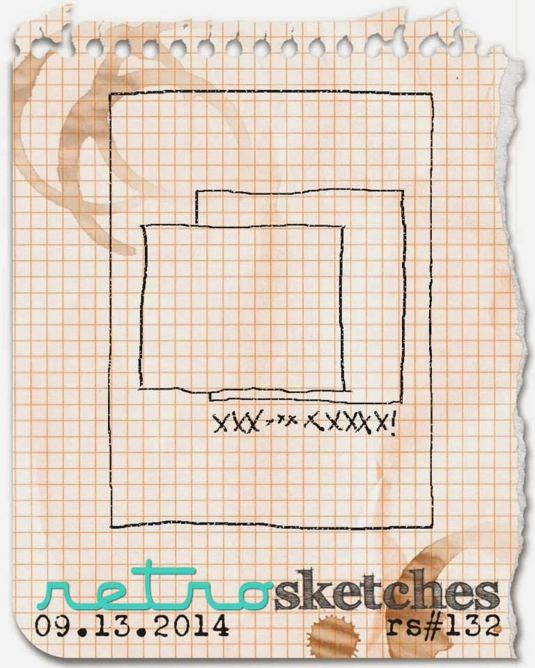
A great layered layout - and here's what I did with it:
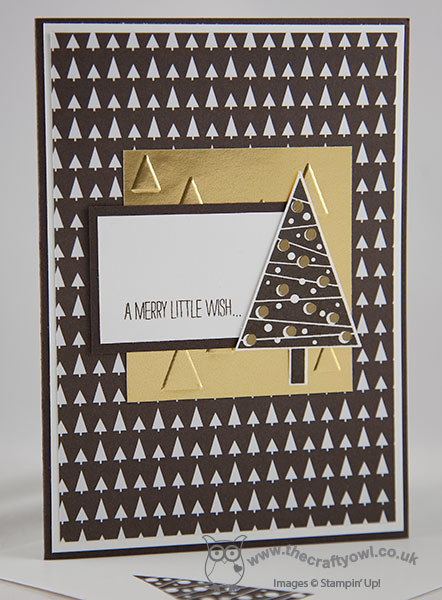
I based my card around the graphic Christmas tree design paper from the Trim The Tree DSP stack - these are so great for making cards! - and having layered this piece onto my Early Espresso card base and a mat of Whisper White, I embossed a piece of gold foil with the On Point embossing folder, which looks like little Christmas tree shapes, then followed this with a smaller piece of Whisper White mounted on Early Espresso and stamped with the first part of the sentiment that comes with the Festival of Trees stamp set. I then added my Christmas tree, which I stamped in Early Espresso on Whisper White, then stamped the baubles in Versamark and heat embossed them in gold - in real life they are really shiny and contrast beautiful with the dark brown of the tree. Oh and did I mention how easy it was to punch out with my co-ordinating tree punch? No? Well, it's a doddle!
An unconventional colour scheme for a Christmas card maybe, but I like it! Before I forget - I'm also joining up with the lovely Darnell's NBUS challenge - pretty much everything other than ink and solid colour cardstock that I used today was officially 'Never Before Used Stuff!'
Right - I'm off to catch up on some of the jobs that I should have been doing at home today. Back tomorrow with another Christmas card in an altogether more conventional colour scheme -until then, happy stampin'!
Stampin' Up! Supplies Used:
by Joanne James18. September 2014 10:37Well we're on the back end of the week already - yay! Thank you to all the new visitors to my blog yesterday who came to see my guest stamper card for The Color Throwdown and to those of you who left lovely comments on my blog - it's always nice to hear from my readers! I look forward to you becoming regular visitors.
Today's card is for this week's challenge over at 'Less is More' where the theme this week is 'beverages' and it's a one layer challenge. I pulled out one of my favourite Christmas retired sets, Scentsational Season, to make today's card; I thought a winter-warming hot chocolate should be the order of the day for my card, even if not outdoors as we are still enjoying a mild September (and long may it continue!). Here's my card:
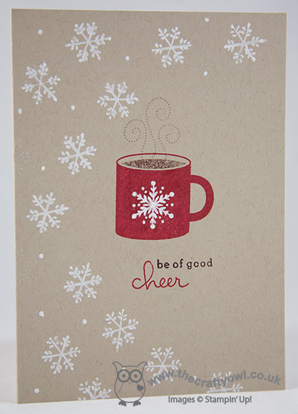
I used a Crumb Cake base and stamped my mug in Real Red, colouring the hot chocolate section of the mug separately with my Chocolate Chip Stampin' Write marker. I added my two-tone sentiment from the 'Endless Wishes' set, then using my Chalk Marker, I carefully coloured in the snowflake on the mug and randomly doodled a flurry of snowflakes around the edge of my card. I'm a tea drinker myself (in large quantities, usually about 10 cups a day!) but there's something really appealing about hot chocolate in the Winter time - I think it's the smell of cocoa and sugar which just cuts through cold air like nothing else!
Check out the gallery for more beverage inspiration - there are lots of fun cards there this week, and a whole range of beverages are featured including some altogether more alcoholic tipples too!
Back tomorrow with another project; until then, happy stampin'!
Stampin' Up! Supplies Used:
by Joanne James17. September 2014 10:00It's Wednesday and a busy day on my blog today! This is the second of today's posts featuring this week's Colour Me...! Design Team card (please click here for my earlier Colour Throwdown post). This week we have a Subtle colour palette for you to work with:
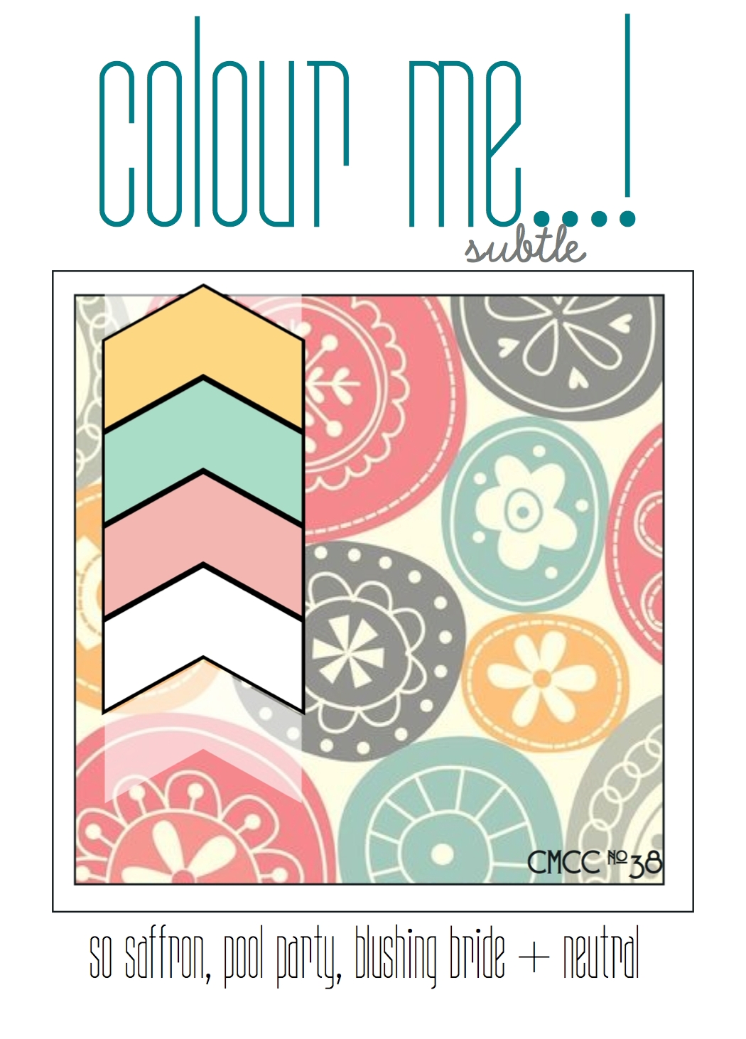
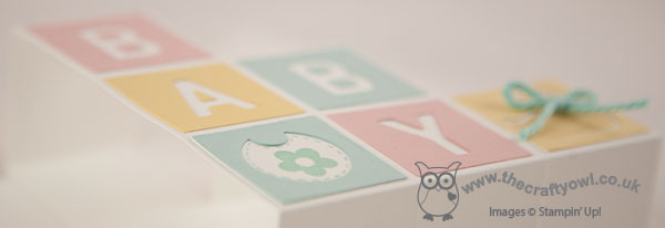
I decided that this week's colour palette would be perfect not only for a baby card, but specifically for a box/stair step card, as whenever I see one of those they remind me of baby blocks all stacked up. So here is my card:
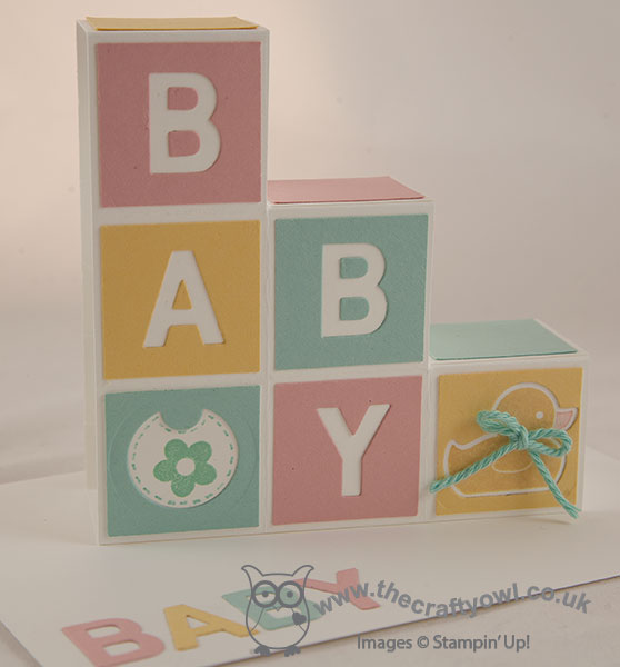
Nicely gender-neutral, with a Whisper White card base and background. I used the Little Letters framelits to cut out the letters for the word 'Baby' and rather than use the actual letters, I used the squares and the negative space to add more colour to my card. The letters didn't go to waste though, as I used them to decorate the envelope. For the remaining two squares, I used the Baby's First Framelits to create the duck and bib shapes, and stamped the co-ordinating stamps on the white layer below. I added some thick Pool Party baker's twine (retired - Sale-A-Bration item from earlier this year) but didn't add anything else as I wanted it to be able to remain post-friendly - despite its dimension, this card folds flat and fits into a standard C6 envelope.
That's my Colour Me...! card for this week - why not visit the other Colour Me...! designers and check out their takes on this week's colour combination:
We look forward to seeing your subtle creations.
Back tomorrow with another project; until then, happy stampin'!
Stampin' Up! Supplies Used: