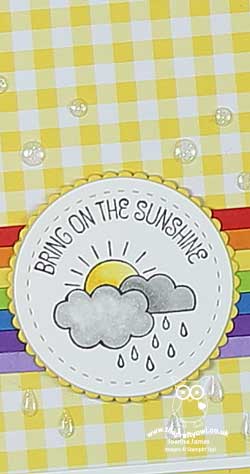
Painted Harvest Sunflowers For The Paper Players #PP364

by Joanne James1. October 2017 09:00

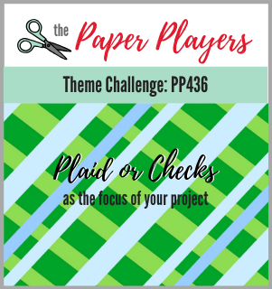
It's Sunday, the start of a new month and time for this week's new challenge over at The Paper Players! The queen of beautiful florals, the talented Sandy, is the hostess this week and her passion is reflected in her chosen theme this week:


I had the best of intentions of producing a fabulously over-the-top floral to honour the lovely Sandy today, but the last minute preparations for my stand at the Crafting Live Exhibition at Stoneleigh Park this weekend meant that my time rather ran away with me this week and instead I've resorted to sharing much more of a clean and simple card that I already had 'in the bag' as it were. Today's card uses one the runaway success bundles from the current seasonal catalogue - Painted Harvest. Take a look:


Here's the low-down on today's card:

Painted Harvest - What can I say other than I LOVE these sunflowers! The sentiments in this set are lovely but it's the sunflowers that get me: it is a two-step stamp set that gives a beautiful watercoloured effect and as they are photopolymer it's so easy to stamp. They are so forgiving - they look great however you line them up! If you're a first-time stamper, this would be a great set to cut your teeth on. 

Add A Leaf - The leaves in the stamp set also match up with the leaf punch which is the other item that can be bought in the Painted Harvest bundle for a saving of 10% - that's why we all love a bundle!

Autumnal Colour Combinations - These sunflowers can be stamped in both traditional and less traditional colours; here is my sample board showing how they look stamped in a number of autumnal coloured floral combinations:


Which one is your favourite? I also made a whole bunch of these cards, minus the twine, to send out to my customers with my seasonal catalogues and as thank you cards to be included with my open house orders - here are some of them up close so you can see the colour combinations in more detail. 

This one is a combination of Crushed Curry and Daffodil Delight:


This one is a combination of Crushed Curry and Peekaboo Peach:

This one is a combination of Crushed Curry and Tangerine Tango:

This one is a combination of Crushed Curry and Cajun Craze:

Lastly my favourite of all, this one is a combination of Crushed Curry and Cherry Cobbler:

This is by no means an exhaustive set of colour combinations. Let me know in the comments below which ones are your favourites or what other combinations you've tried that you would like to share.  

Also, if you live local to me in or around Northampton, I have a class using this set scheduled for Monday 6th November - read more about it here or contact me to book your place! 

Here is the visual summary of the key products used on today's project for you to pin for easy reference:
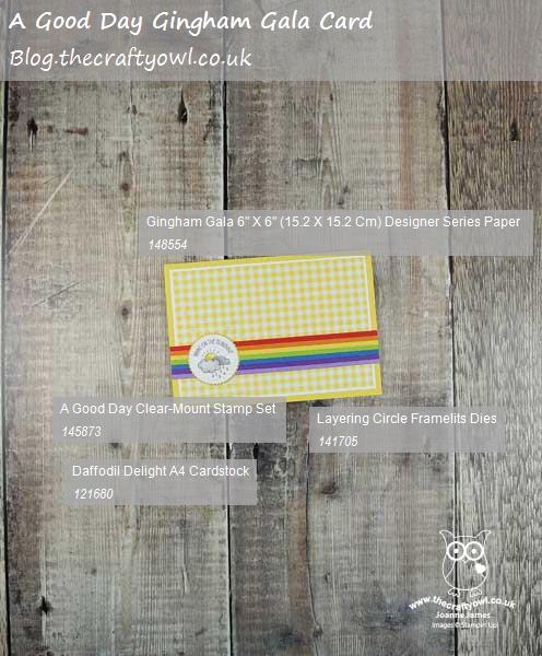
 

You can see all of my Product and 'How To' summaries on my 'How To - Tips and Techniques' Pinterest board in case you've missed any. 

Before you reach for your ink and papers, check out what our amazing team has created to inspire you this week:

The Paper Players Design Team
 
 
Here's a quick recap of our challenge rules:
 
1.  Create a new paper project
2.  Upload your creation to your blog with a link back to us and provide a direct link to the post featuring your challenge submission.
3.  Please link your card to no more than four challenges, TOTAL.
4.  Have FUN! 


I look forward to seeing what you create with this week's theme. Enjoy the rest of your weekend as it will be over all too quickly; I'll be spending a second day at the Crafting Live Show at Stoneleigh Park today - come and say hello to me on stand A10 if a visit is part of your weekend plans. I'll be back tomorrow with another project; until then, happy stampin'!


Stampin' Up! Supplies Used: 

Table built using Product Table Builder by The Crafty Owl - Independent Stampin' Up! Demonstrator.


At Home With You Doorstep Card - Three Ways To Incorporate Texture Into Your Projects

by Joanne James26. September 2017 05:00

Today I'm sharing a card from one of my recent monthly technique classes featuring the At Home With You bundle. This class was also all about ways to incorporate texture into your projects and so is perfect to link up with the team over at Just Add Ink this week where the theme is 'Just Add Texture':

Each of the cards that we made used texture in different ways: one using embossing paste, another using stencilling and dry embossing and this Autumnal new home doorstep card which actually features three different ways to incorporate texture into your project - take a look:


Aside from the obvious texture created by layering my diecut pieces, there are also more subtle textures added to this card. Here's the low-down on how I did it:

Adding Texture 1: Use Patterned Paper - I used a piece of the Wood Textures Designer Series Paper Stack for my front door - this is a quick and easy way to add texture to your project. I chose a piece of whitewashed wood pattern to stand out against my Bermuda Bay walls, however with each DSP stack containing 4 sheets each of 12 double-sided designs, you have 24 different wood effects to choose from - seriously spoilt for choice!

Adding Texture 2: Dry Embossing - To ground my door I added a strip of Crumb Cake cardstock across the lower part of my cardfront, but before I glued it in place I first embossed it with one of the hidden gem pieces in the Bike Ride Framelits set; did you know that this set, just like the Eclectic Layers Thinlits, includes a piece that embosses as opposed to diecuts? I've circled it so that you can see it in the set below:


This added a fun cobblestone-textured path outside my front door.

Adding Texture 3: Stamping - Lastly, I wanted my doormat to look like one of those rough, coir mats that are a traditional feature of a front doorstep. To achieve this look, I used one of the stamps in the 'Timeless Textures' stamp set and stamped it in Soft Suede onto Soft Suede cardstock, for a tone-on-tone textured look. I stamped off first so the effect is subtle, yet it adds a little detail that definitely contributes by adding further texture to my card.

There are lots of ways to add texture to your projects; I will have a few more to share in the other projects from this class and the gallery over at Just Add Ink also has lots of inspiration too.

Here is the visual summary of the key products used on today's project for you to pin for easy reference:
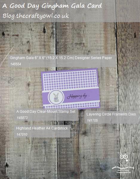
 

You can see all of my 'How To' summaries on my 'How To - Tips and Techniques' Pinterest board in case you've missed any. 

Enjoy your day and I'll be back tomorrow with another project. Until then, happy stampin'!


Stampin' Up! Supplies Used:

Table built using Product Table Builder by The Crafty Owl - Independent Stampin' Up! Demonstrator.

Coffee Cafe Friendship Card

by Joanne James25. September 2017 05:00

It's Monday and the start of a very busy week for me! Today I'm sharing a card that uses this week's sketch over at The Paper Craft Crew:

 Paper Craft Crew Sketch Challenge 260 ends September 26

This week is the week when the Macmillan cancer charity here in the UK are holding their 'World's Biggest Coffee Morning' here in the UK on Friday and I needed a card for a friend who is hosting an event. You can read all about the wonderful work this charity does here; meanwhile, here is my card: 


Here's the low-down on today's card:

Happiness Is ... - I knew I wanted to use this sentiment from the 'Coffee Cafe' stamp set on my banner today, so as much as I loved the sketch in its original orientation, I rotated it through 90 degrees to make it work for me. All of the basic elements are there though and I'll definitely be using this sketch again. 

Time For A Coffee Break - Today's card features two of the fabulous papers in the Coffee Break Designer Series Paper set - can you spot both? Here's a picture of the full set of papers:


I used the large spots to border my card and the second piece of paper is actually the adorable little coffee cup embellishment, cut straight from the paper. Even better still, there is a tiny coffee cup framelit that co-ordinates perfectly and makes getting a neat finish easy. Once I'd cropped my cup, I did another one out of extra-thick whisper white and glued them together before adding to my banner tag, for extra stability.

A Textured Pair - I added a little textured coffee stain stamping to the background base of my card - inspired by one of the patterned papers in the above set, but in fact stamped with the coffee ring stamp in the Timeless Textures set, along with a few splatters for good measure.

Such a fun card and quick to produce and will be perfect for my friend to wish her well in hosting her event later this week. I like it so much I'm going to make a few more of these for my other coffee-loving friends too - who doesn't enjoy coffee with friends?!

Here is the visual summary of the key products used on today's project for you to pin for easy reference:
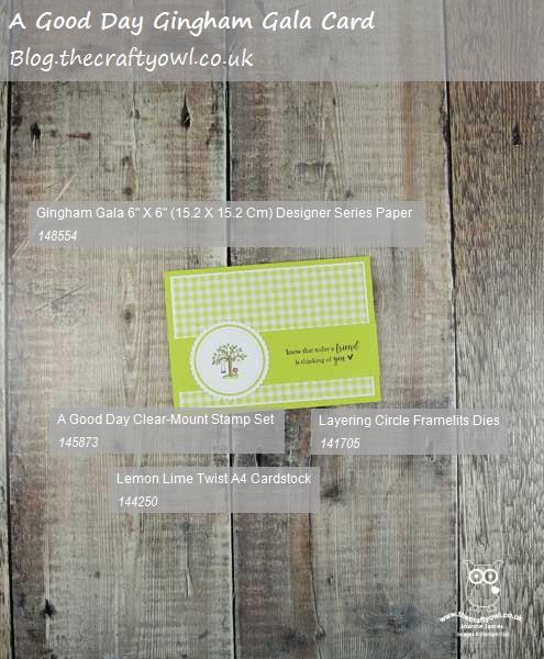
 

You can see all of my 'How To' summaries on my 'How To - Tips and Techniques' Pinterest board in case you've missed any. 

Enjoy your day and I'll be back tomorrow with another project. Until then, happy stampin'!


Stampin' Up! Supplies Used:

Table built using Product Table Builder by The Crafty Owl - Independent Stampin' Up! Demonstrator.

Iconic Christmas Square Card For The Paper Players #PP363

by Joanne James24. September 2017 09:00

It's Sunday and time for this week's new challenge over at The Paper Players! Our superstar leader the lovely Nance is the hostess this week and she has a sketch for us to work with:


I took the opportunity to make another Christmas card today, this time in a rather unusual colour scheme - take a look:


Here's the low-down on today's card:

Iconic Christmas - I decided to feature the tree from the Iconic Christmas set on my card today. Now I think this set is a little like Marmite - you either love it or you hate it! With all those teeny tiny iconic festive images I loved it the moment I saw it; you can stamp just the outlines, or you can use one or both of the infill stamps and a little two-step stamping to colour them in. You also have the option to use the co-ordinating Ornamental Christmas Framelits Dies to cut out some of them so that you can see the detail on a second layer below, as I've done on my card today. I honestly think the biggest hurdle with this set is that it's difficult to see it's true potential in the catalogue - you need to play with it to see how it all comes together. The set itself is more versatile than it looks - I'll be back to share more makes with it in coming weeks I'm sure. I tweaked the base of Nance's sketch to a 6" x 6" square rather than a rectangle, as the tree is a little too large for this layout to work comfortably on a standard A6 card, but all of the main elements are there so it works.

A Quilted Christmas - I used a piece of the Quilted Christmas 6" x 6" Designer Series Paper for my background panel, making sure to cut the pattern so that it was even and centralised within the panel. I matted it in white - not something I do often, but it really helps define the edge of this patterned paper and makes it stand out from the Pool Party card base.

Unorthodox Christmas Colours - When I initially sat down to make today's card, I knew exactly how I was going to work with the sketch, however I hadn't decided which patterned paper I wanted to use for the right-hand panel. I flicked through my swatches and decided on this one from the Quilted Christmas set and it inspired my PoolParty base and Lemon-Lime Twist Christmas tree. Not the most traditional of Christmas colour combinations although I love the bright and zingy Christmas tree. Here's my swatch in case you would like to use it as inspiration for your festive projects:


Here is the visual summary of the key products used on today's project for you to pin for easy reference:


You can see all of my Product and 'How To' summaries on my 'How To - Tips and Techniques' Pinterest board in case you've missed any. 

So what do you think? Do these colours work or are they are little too non-traditional for the festive season? I'd love to hear your thoughts. 

Before you reach for your ink and papers, check out what our amazing team has created to inspire you this week:

The Paper Players Design Team
 
 
Here's a quick recap of our challenge rules:
 
1.  Create a new paper project
2.  Upload your creation to your blog with a link back to us and provide a direct link to the post featuring your challenge submission.
3.  Please link your card to no more than four challenges, TOTAL.
4.  Have FUN! 

I look forward to seeing what you create with our sketch this week. Enjoy the rest of your weekend as it will be over all too quickly; we had our usual day of sport yesterday so today is about finishing our homework and then we have a change of sport this afternoon, with Ben going sailing with friends. Let's hope it stays fine, although I guess he will get wet whatever the weather! I'll be back tomorrow with another project; until then, happy stampin'!


Stampin' Up! Supplies Used:

Table built using Product Table Builder by The Crafty Owl - Independent Stampin' Up! Demonstrator.

Santa's Suit Jolly Christmas Washing Line Card

by Joanne James23. September 2017 19:30

It's the weekend at last! Today I'm sharing a card that I inadvertently posted yesterday before I had time to complete my write-up - oops! So here it is today with all the details. This card uses one of my personal favourites from the seasonal catalogue - Santa's Suit. Take a look:


Here's the low-down on today's card:

A Festive Clothes Line - Today's card features the sweetest ever washing line! Mrs Claus has been doing the laundry and Santa's all-important suit is air-drying ready for the big day - how adorable are all those little bits and pieces?! You could easily stamp this set as one layer directly below the washing line, but I chose to stamp mine and cut them out with the co-ordinating Santa Builder Framelits for a little extra definition. As for the little pegs - fiddly, yes, but so worth it!

Jolly Christmas Banner - I kept with a red, black and white colour scheme for my card today with just a little pop of Emerald Envy green for Santa's braces and my sentiment banner, that I cut out and layered with my Triple Banner Punch and hung amongst the washing on the line. 

Merry Little Christmas Gingham - The washing line is really the star of the show on today's card, however rather than layer directly onto my Real Red card base, I added a mat of the black-and white gingham pattern from the Merry Little Christmas set. It adds a modern, almost graphic element to the card which I love. Note how I centred the pattern on this panel too so that the border is equal all the way around the main image. Sometimes it's the little things that make the difference :-)

Here is the visual summary of the key products used on today's project for you to pin for easy reference:


You can see all of my 'How To' summaries on my 'How To - Tips and Techniques' Pinterest board in case you've missed any. 

Enjoy your evening and I'll be back tomorrow with another project for this week's new challenge over at The Paper Players. Until then, happy stampin'!


Stampin' Up! Supplies Used:

Table built using Product Table Builder by The Crafty Owl - Independent Stampin' Up! Demonstrator.

At Home With You Christmas Card and Matching Gift Bag Punch Board Gift Box

by Joanne James21. September 2017 18:59

Happy Friday everyone! I'm not sure where the time goes - I can't believe it's the end of the working week already - well, for some anyway! Today I'm sharing a another card along with a matching gift box from one of last month's monthly technique classes using the At Home With You bundle - take a look:


Here's the low-down on today's card:

At Home With You At Christmas - The At Home With You bundle is so versatile and works for lots of different seasons. Today's card features the gorgeous holly bough around the door, along with the holly wreath and the ornamental trees either side of the front door. I coloured them with my Stampin' Write markers and they were easily cut out with the framelits. I even decorated the inside and envelope for complete co-ordination.

More Ways To Add Texture - As with the last card I shared featuring this set (you can see that card here if you missed it), today's card has another three ways in which you can incorporate texture into your projects:

Adding Texture 1: Stamping To add to the Christmas feel, I wanted a red front door; by stamping my Real Red cardstock with the Hardwood stamp in Real Red, before stamping with the door outline in black, to add some tone-on-tone interest and texture for added kerb appeal.

Adding Texture 2: Dry Embossing On both my card and box I embossed the Smoky Slate base cardstock with my Brick Wall textured embossing folder to create some textured walls as a backdrop for my festive entrance.

Adding Texture 3: Embellish Sometimes on a card it helps to minimise bulk especially if you need it to be post-friendly, however this is rarely the case with packaging and the addition of bulky embellishments is less of an issue. On my gift box, in addition to a tag and ribbon, I added a boxwood wreath to my front door - I love the extra texture this adds.

A Matching Gift Box - It's always nice to be able to create fancy packaging for gifts and no more so than at this time of year. I made my simple gift box using the Gift Bag Punch Board (I just didn't score the side indents to make the bag shape) and created a little triangle roof for a lid (it's a simple hinged closure that is held in place with washi tape) that I stencilled some tile on using some Basic Grey ink and my brick pattern Patterned Party Decorative Mask and added a tag punched with the super-useful Everyday Label Punch:

This box measures approx. and is a reasonable size, big enough to accommodate most small gifts. Here's a picture of both items together:


Here is the visual summary of the key products used on today's project for you to pin for easy reference:


You can see all of my 'How To' summaries on my 'How To - Tips and Techniques' Pinterest board in case you've missed any. 

Enjoy the rest of your day and I'll be back tomorrow with another project. Until then, happy stampin'!


Stampin' Up! Supplies Used:

Table built using Product Table Builder by The Crafty Owl - Independent Stampin' Up! Demonstrator.

Driving Home For Christmas Card

by Joanne James21. September 2017 05:00

Today I'm sharing a card for this week's TGIF Challenge and uses the sketch layout over at Fusion:


I'm back with a Christmas card today featuring another of the festive Christmas Around The World DSP patterns - take a look:


Here's the low-down on today's card:

Driving Home For Christmas - I'm still in Christmas mode as far as my card making is concerned, but that didn't stop me joining with the TGIF team this week - with sleighs, donkeys and so much more besides, there are festive transportation options a-plenty! I decided to have another crack at using the Christmas Around The World designer series paper and specifically another of the larger designs featuring festive cars and bicycles, all transporting Christmas trees and piles of luggage and festive gifts across the sheet. The design on this sheet of paper totally makes me think of the Christmas song made famous by Chris Rea called 'Driving Home For Christmas' - I made this card and was humming the tune for ages afterwards (apologies if that's you now having read today's post!) Whilst I used a smaller piece of the paper compared to my nutcracker card earlier this week (you can see that card here), I still made sure I cut a piece that fitted with the theme of my card so that the little cards and bikes  are clearly identifiable.  

And Hearts Too - I matched my paper with a sentiment from the 'Hearts Come Home' stamp set, which also fit perfectly with my theme. I stamped it on a stitched circle and added a couple of Real Red enamel hearts and a trio of snowflakes from the 'Hang Your Stockings' set across the bottom for additonal decoration. 

There's Always Room For  A Bow - Lastly, I added a wooden bow from the co-ordinating Christmas Around The World embellishment set. A nice finishing touch to bring the elements together. 

Here is the visual summary of the key products used on today's project for you to pin for easy reference:


You can see all of my 'How To' summaries on my 'How To - Tips and Techniques' Pinterest board in case you've missed any. 

I have another busy day today so enjoy your day and I'll be back tomorrow with another project. Until then, happy stampin'!


Stampin' Up! Supplies Used:

Table built using Product Table Builder by The Crafty Owl - Independent Stampin' Up! Demonstrator.

Seasonal Layers Autumn Leaves For The Color Throwdown #CTD461

by Joanne James20. September 2017 17:00

Today I have something a little different for you! Do you remember this card from a couple of week's ago? Well, it won me the honour of being Featured Stamper for Challenge #459 over at The Color Throwdown and resulted in me being invited to be their Guest Star Stamper this week - woo hoo!

Here is the colour palette that has been chosen for this week's challenge:


I love these colours but wasn't sure I could make them work with anything other than a Halloween card and I haven't bought any new Halloween stamp sets this year (shock horror!); it's more about treat packaging and home decor here in the UK rather than cards, however I loved that gorgeous inspiration photo with its colourful autumn leaves and decided to use that as my starting point instead. This is what I came up with:


Here's the low-down on today's card:

Colour Blocked Leaves - I decided to meet these colours head-on and go with bold blocks of colour to really make a statement. Using my Seasonal Layers thinlits I cut a whole bunch of brightly coloured leaves to create my repeat pattern and glued them to my purple card base. It's almost like faux-embossing, only with each of the leaves a different colour.

Touches of Copper - I knew I wanted a sentiment for this card, so decided to use one of my current favourites from the 'Painted Harvest' stamp set; so perfect for fall/autumn and the season of Thanksgiving. I heat embossed it in copper and backed my sentiment panel with gold foil too, so that along with my single detailed leaf outline it would add a little definition to my card and stand out against the bright colours.

A Watercolour Accent - I needed something else to accompany my sentiment that would work with my bold colours and patterns, so decided to create a layered leaf accent using the larger leaf dies from the Seasonal Layers Thinlits set. I used my green, yellow and orange re-inkers to watercolour a piece of watercolour paper using my aquapainter, then layered it with the skeleton leaf diecut out of copper foil. I love the contrast with the background blocks of colour and the interest and dimension this adds to my card.  

I'm also linking today's card up with the gals over at SUO Challenges where the theme is Autumn colours - my second one this week, it must be the season! Here is the visual summary of the key products used on today's project for you to pin for easy reference:


You can see all of my 'How To' summaries on my 'How To - Tips and Techniques' Pinterest board in case you've missed any. 

Thank you to all the ladies at The Color Throwdown for inviting me to guest with them this week - do check out their blogs to see how they interpreted this colour combination, there is lots of great inspiration there!

Enjoy your evening and I'll be back tomorrow with another project. Until then, happy stampin'!


Stampin' Up! Supplies Used:

Table built using Product Table Builder by The Crafty Owl - Independent Stampin' Up! Demonstrator.

Half Full Glasses of Red Friendship Card

by Joanne James18. September 2017 20:20

Happy Monday everyone! I've had a busy start to my week with some batch cooking but also managed some much-needed time in my craft room. I managed a few productive hours so I've lots to share with you this week! Today I'm sharing a quick card that I might just manage to squeeze in for this week's challenge over at CAS Colours and Sketches


I've not managed to play along with these ladies for a few weeks and this sketch almost had me foxed, when I had a flash of inspiration this afternoon and came up with this fun - and quick! - one-layer card:


Here's the low-down on today's card:

A Glass of Red (or 7!) - I decided to ink up my 'Half Full' stamp set for today's card. I loved this stamp set the moment I saw it and knew I would use it not only for Christmas cards but, as a wine drinker who enjoys a glass of red now and then, on lots of other occasions too. These stamps also make for easy tags to pretty up a bottle of wine for a party hostess - but more on that another day. 

A Touch Of Shine - To add a little shine to my wine glasses, I painted them with my fine tip glue pen so that they took on the appearance of glass. It's quite difficult to see on the photograph, but adds a lot to the finish in real life.

Can You See It? - Some may say I was a little loose in my interpretation of this week's sketch, but I can assure you it's there: three elements, getting wider as they extend down the card, with images above and below the central sentiment. I did exercise a little creative licence with the positioning of the first, larger glass, however I think it works well this way. What do you think - should sketches be interpreted literally or do they allow for a modicum of creative interpretation? Do leave me a comment below - I'd love to hear your thoughts. 

Here is the visual summary of the key products used on today's project for you to pin for easy reference:


You can see all of my 'How To' summaries on my 'How To - Tips and Techniques' Pinterest board in case you've missed any. 

That's me done for today; I'll be back tomorrow with another project. Until then, happy stampin'!


Stampin' Up! Supplies Used:

Table built using Product Table Builder by The Crafty Owl - Independent Stampin' Up! Demonstrator.

Seasonal Chums Watercoloured Pumpkin CAS Card for The Paper Players PP362

by Joanne James17. September 2017 09:00

It's Sunday and time for this week's new challenge over at The Paper Players! It's the turn of my good friend, the awesome LeAnne, to host this week and she has a timely clean and simple challenge for us to work with:


I'm also playing along with the team over at Stamp Ink Paper today as I'm just in time to link up with their CAS Fall challenge and the lovely ladies over at SUO Challenges where the theme is Autumn colours.

When I think about harvest, I think about harvest loaves, vegetables from the garden ... and pumpkins! I love the photo inspiration that Nance found for this week's challenge and I decided I just had to have pumpkins on my card. I decided to go with something a little different - take a look:


Here's the low-down on today's card:

Pumpkins Are For Harvest, Not Just For Halloween - Most of the pumpkin stamps I have in my set are ones with carved faces, all ready for Halloween. This stamp from the new seasonal catalogue is one of the few that I own that isn't - do you recognise which set it comes from? It's actually from the 'Seasonal Chums' set on page 47, but it's not the front of the face on the Halloween tag - it's the back piece of the same tag. I've circled it below so that you can see which one I mean:


This part of the stamp makes for a perfect pre-carved pumpkin - all I needed to do was mask off the front portion of the stamp and stamp just the back image. I also created a mask out of a post-it note to enable me to stamp my trio of pumpkins overlapping each other, to create depth and dimension.

No Line Watercolouring -  I decided to use a little no-line watercolouring to give my pumpkins a natural look. I love this effect and it's so easy to achieve: simply stamp your chosen image in a pale colour such as Sahara Sand onto watercolour paper, then use your chosen inks and an aquapainter to colour your stamped images normally, making the lines 'disappear'. 

Colours of Fall - Warm yellows, oranges, reds, browns and olive greens are the colours I associate with autumn and I chose to focus on orange and brown on my card today. Here's my colour palette should you wish to save it as inspiration for your fall projects:


To finish my card I added a little lace and ribbon embellishment (retired bits and pieces); not something I usually do with a CAS card, but I felt my card needed a little something just to balance it visually. I love this card!

Here is the visual summary of the key products used on today's project for you to pin for easy reference:


You can see all of my Product and 'How To' summaries on my 'How To - Tips and Techniques' Pinterest board in case you've missed any. 

Before you reach for your ink and papers, check out what our amazing team has created to inspire you this week:

The Paper Players Design Team
 
 
Here's a quick recap of our challenge rules:
 
1.  Create a new paper project
2.  Upload your creation to your blog with a link back to us and provide a direct link to the post featuring your challenge submission.
3.  Please link your card to no more than four challenges, TOTAL.
4.  Have FUN! 


I look forward to seeing your clean and simple creations in the gallery this week. Enjoy the rest of your weekend as it will be over all too quickly; mine is sports-filled, with hockey, swimming and ice hockey yesterday and basketball and more hockey today! I'll be back tomorrow with another project; until then, happy stampin'!


Stampin' Up! Supplies Used: 

Table built using Product Table Builder by The Crafty Owl - Independent Stampin' Up! Demonstrator.

New Online Exclusives

There are new products available exclusively in the online store from 5 November - check them out here.

Latest Kits!

Stampin Cut and Emboss

The Layered Landscapes Kit and Nature's Paintings Kit are the latest kits in the online store - get yours here!

Shop Online

Access my online shop 24 x 7, 365 days of the year:

Current November hostess code:

9NKXDTTR

Shop Online

Mini Catalogue

BROWSE THE CATALOGUE

'Tis The Season - the new Stampin' Up! Mini Catalogue is here! For more details and to download your copy click here

Scrapbooking

Stampin' Up! has introduced a new range of 12x12" scrapbooking product and kit - the full range is now available to purchase online. To download a copy of the new digital Scrapbooking Catalogue click here.

2024-25 Annual Catalogue

BROWSE THE CATALOGUE

Click on the image to download your copy of the 2024-25 annual catalogue. For a full list of current SU! supplies, go to my online store. If you would like any help or advice, please drop me a line at joanne@thecraftyowl.co.uk or give me a call on 07773 421446 - I'd be happy to help.

Join My Team

It's always a great time to join Stampin’ Up! New team members can get £130 worth of products for only £99 + free business supplies + free shipping + all the fun being a part of Stampin’ Up! Stampin' Up! has something for everyone: join my growing team and benefit from my support to enjoy Stampin' Up! however you choose.

If you're interested, call me for a chat to understand how I can help you realise your goals. Alternatively, if you have already decided to sign up and you just can't wait, please click here for the link to the online form where you can sign up and order your starter kit right away! 

About Me

Hi I'm Joanne and live in Northampton and when I'm not looking after my husband and two beautiful children, am an avid crafter with a passion for all things Stampin' Up!

I must confess that I have never been a big rubber stamper - until I discovered Stampin' Up! that is. I love the fact that I can get such great results with co-ordinating stamps, inks, papers and punches - the possibilities are endless! Join me on my stamping journey as I share the things I love and be inspired to create amazing things yourself!

Follow Me

Monthly Newsletter

Box Builder

Click the button above to use Box Buster to create your custom box design using the Envelope Punch Board!

Kits Collection Now Available!

Stampin Cut and Emboss

The new Kits Collection from Stampin' Up! is now available!

Click here to see the current kits available and order yours online today.

I Design For


Stampin' Up Stuff

This is my personal blog and is not endorsed by Stampin’ Up! I hope you find it a plentiful source of ideas and personal inspiration but please don't copy my designs for contest submission or use for classes, publication or sale without express permission.