A Little Wild Baby Blue Elephant For Laurie's TicTacToe At The Paper Players

by Joanne James30. July 2017 10:00

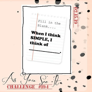
It's Sunday, I'm back after my two week vacation and excited to be back with my lovely team over at The Paper Players! This week we are all about team here at The Paper Players: the lovely Laurie was due to host this week but has unfortunately had to deal with a family bereavement and needed some time out so I am lending a helping hand. Laurie has done all the hard work and has designed a fun tic-tac-toe board to challenge us all as it's the fifth week of the month; I am picking up with the comments and visits to your blogs and get the honour of choosing this week's top pick. So, without further ado, here is this week's challenge board:


When considering my make for today, I just knew I would have to include the option of 'diecut' since I consider Laurie to be the absolute queen when it comes to diecutting, her creativity knows no bounds. I decided to go down the first vertical column and took the opportunity to make a baby card using the current sketch over at Fab Friday - it turns out I also fulfilled the bottom horizontal row too - take a look:


Here's the low-down on today's card:

A Little Wild - So how adorable is that little elephant?! I know - he is off the cuteness scale, for sure! He comes from the stamp set 'A Little Wild' and is part of a trio that includes a sweet bear and a lion too that is perfect for baby makes. The best part though? He is actually double-sided; each animal comes with a front and back and the co-ordinating Little Loves Framelits Dies will cut both pieces out as one, enabling them to be used as a gift tag too. I actually cut my elephant away here as I just wanted to the front, but I couldn't resist adding the reverse to the inside of my card:


Blue For A Boy - I decided to use a piece of the Bundle of Love Specialty Designer Series Paper for the blue for my card; it was tough not to use the gorgeous gold embossed foil pattern on the reverse, however I did use the Soft Sky/Very Vanilla/Gold colour combination to bring the elements of my card together. I added some subtle Soft Sky shading to my elephant using ink and a blender pen just to give him a little more depth and dimension.

Touches Of Gold - I wanted to add a touch of luxury to my card, the birth of a baby is a special occasion after all, and inspired by the designer series paper, added in a few gold elements - a die cut, layered scalloped circle, gold natural trim ribbon, some gold heat embossing and metallic enamel dots - to finish. 

Here is the visual summary of the key products used on today's project for you to pin for easy reference:


You can see all of my Product and 'How To' summaries on my 'How To - Tips and Techniques' Pinterest board in case you've missed any. 

I just love this card and can't wait to make a pink one for a girl and some co-ordinating packaging adorned with little elephant tags too!

Before you reach for your ink and papers, check out what our amazing team has created to inspire you this week:

The Paper Players Design Team
 
 
Here's a quick recap of our challenge rules:
 
1.  Create a new paper project
2.  Upload your creation to your blog with a link back to us and provide a direct link to the post featuring your challenge submission.
3.  Please link your card to no more than four challenges, TOTAL.
4.  Have FUN! 


I look forward to seeing what you create with our board this week. All of the Design Team love it when your return our visits and leave a friendly blog comment or two, however this week more than most it would be great if you could pop by Laurie's blog at Stampin' Up North and leave her a little Paper Players love - I know she would appreciate it. 

Enjoy the rest of your weekend; I have some trampolining to attend to (watching not bouncing thankfully!) and some preparation for the first of this month's technique classes on Tuesday.

I'll be back tomorrow with another project; until then, happy stampin'!


Stampin' Up! Supplies Used:

Table built using Product Table Builder by The Crafty Owl - Independent Stampin' Up! Demonstrator.

Label Me Pretty In-Colour Card Set

by Joanne James28. July 2017 06:00

Today I'm sharing a set of cards I made a while back to showcase the new in-colours at my Annual Catalogue launch event but just haven't got around to blogging. I also used this design as the basis for the cards that I sent out to my customers and anyone who had requested a catalogue from me with their copy of the new catalogue. Here's the first one:


 Here's the low-down on today's card:

Label Me Pretty - Label Me Pretty is one of the new bundles in the annual catalogue featured on page 27, comprising the 'Label Me Pretty' stamp set and the Pretty Label Punch. Just like the new daisy punch, the introduction of this punch to the Stampin' Up! punch collection has proved incredibly popular with demonstrators and customers alike, and it's easy to see why: this versatile label is great to use on cards or packaging alike, and the layering options that the stamp set and addition of a few circle punches gives allows for lots of creative possibilities.

In-Colour Quintet - As I mentioned above, I created the same card using each of the new in-colours. Having worked with them for some months now, my favourites are still Berry Burst and Lemon Lime Twist, the latter especially when combined with other colours such as Night of Navy - I just love it! Here's a shot showing glimpses of each of the cards in the collection:


Background Tip - The construction of my card is simple and the photograph fairly self-expanatory - well, it needs to be an easy make when mass-production is called for! I did just want to point out how I stamped the background flowers on the card base. If you look closely, you will see that they are the flowers from the 'Happy Birthday' stamp in the Label Me Pretty set, yet the wording isn't visible. I actually stamped the image, then turned it through 180 degrees so that the bottom of each image overlapped (you can't see this as it's covered by the label) to provide some extra florals to frame my label. This was a tip I picked up at Onstage in Amsterdam earlier this year from Donna Morgan at the Home Office I think, if my memory serves me correctly - so thank you Donna!

Here is the visual summary of the key products used on today's project for you to pin for easy reference:


You can see all of my 'How To' summaries on my 'How To - Tips and Techniques' Pinterest board in case you've missed any. 

So which of the in-colours is your favourite, or is there any one you find a real challenge to work with? Do leave me a comment below - I'd love to hear your thoughts!

Enjoy your day and I'll be back soon with another project. Until then, happy stampin'!


Stampin' Up! Supplies Used:

Table built using Product Table Builder by The Crafty Owl - Independent Stampin' Up! Demonstrator.

Eclectic Layers Thinlits Diamond Background: Part 3

by Joanne James27. July 2017 06:00

I've another Oh So Eclectic card for you today! Still looking at the different ways you can use the diamond-patterned die in the Eclectic Layers Thinlits to create backgrounds - today's example is actually my favourite! Take a look: 


Here's the low-down on today's card:

Create A Stencil - If you cut the diamond-patterned thinlit in the Eclectic Layers Thinlits set without the outline into a piece of acetate window sheet, you will have a permanent stencil that you can use to add even more interest to your backgrounds. You could use it with embossing paste - yes, that card will need to be featured in a part 4 blog post, to follow some time later when I've made the base into something! - or as I've done here, to create a blended coloured background using ink and sponges.

Tropical Colour Combo - I stuck with the Berry Burst and Peekaboo Peach colours that have featured on a number of my other cards featuring the Oh So Eclectic Product Suite and blended them with some Melon Mambo and Tangerine Tango, to give my card a bright, tropical feel. Here's my colour combination should you wish to save it for your future projects:


Gold Glimmer Flower Two Ways - I wanted to add a couple of hibiscus-inspired blooms to my sponged panel, so decided to choose two of the solid colours for the bases and accent each with both parts of the top layer diecut in gold glimmer. This really was easier than it looks to achieve: I adhered my gold glimmer paper to an adhesive sheet before running through my Big Shot, then having cut another top layer using a piece of scrap cardstock, used the this diecut as a guide to piece the small pieces into, before removing it. 

I think this card is one of my most favourite yet using this set; if I made it again though I would stencil my pattern more offset to the right rather than centrally, so that more of it would be visible once I'd added my embellishments. I still love it though!

Here is the visual summary of the key products used on today's project for you to pin for easy reference:


You can see all of my 'How To' summaries on my 'How To - Tips and Techniques' Pinterest board in case you've missed any. 

This is the last of my cards for a while that uses the Oh So Eclectic product suite, but I assure you this won't be the last of it! If you need no further convincing as to the versatility of this set, do click on the link to it below that will take you to my online store to purchase your very own bundle - include this month's code for an extra thank you in the post from me. Orders place before the end of the month will put you only £2 away from receiving a £4.50 money off bonus days coupon too, so be sure to add in a little something extra in order to take advantage of this great saving!

Until next time, happy stampin'!


Stampin' Up! Supplies Used:

Table built using Product Table Builder by The Crafty Owl - Independent Stampin' Up! Demonstrator.

Eclectic Layers Thinlits Diamond Background: Part 2

by Joanne James25. July 2017 06:00

I've another Oh So Eclectic card for you today! Still looking at the different ways you can use the diamond-patterned die in the Eclectic Layers Thinlits to create backgrounds - today's example is actually a CASE of a card featured on page 132 of the Stampin' Up! catalogue: 


Here's the low-down on today's card:

Colour Above - This card uses the diamond-patterned thinlit in the Eclectic Layers Thinlits set, again without the outline, to add interest to the mat layer of the card. On today's card I've used a piece of Extra Thick Whisper White below the diecut layer and cut the diecut out of a piece of the lovely faux watercoloured paper from the Naturally Eclectic designer series paper pack - this time the Emerald Envy piece,which was the other end of the paper I used for the background on my previous card. I added further detail to this layer by stamping leaves and dots directly onto it and added texture by sticking some of the diamonds that had been cut out back onto the base layer. Waste not, want not as the saying goes!

Embossed Leaves - Did you realise that two of the leaf thinlits and one of the diamond thinlits in the Eclectic Layers set are actually for embossing not die cutting? I've highlighted them on the image below - so useful for adding in texture to your designs:


I used the sprig of leaves on the background layer, again another way to add detail and texture without adding bulk.

The Midas Touch - A few final gold elements - foil, mini sequins and metallic thread - finish the card.

As my regular readers will know, I'm not usually into 'fussy' cards, however I love this set: it makes freestyle collage cards so easy, without having to sacrifice too much of my clean and layered style. 

Here is the visual summary of the key products used on today's project for you to pin for easy reference:


You can see all of my 'How To' summaries on my 'How To - Tips and Techniques' Pinterest board in case you've missed any. 

I'll be back soon with my final card (for now!) that uses the Oh So Eclectic product suite. Until then, happy stampin'!


Stampin' Up! Supplies Used:

Table built using Product Table Builder by The Crafty Owl - Independent Stampin' Up! Demonstrator.


Eclectic Layers Thinlits Diamond Background: Part 1

by Joanne James23. July 2017 06:00

Here's another Oh So Eclectic card from my technique class last week. One of the things we looked at was the different ways you can use the diamond-patterned die in the Eclectic Layers Thinlits to create backgrounds in a number of different ways. As such, I'm going to do a series of posts that each show an alternative example. Here's the first one: 


Here's the low-down on today's card:

Colour Below - The diamond-patterned thinlit in the Eclectic Layers Thinlits set, like the flower and diamond dies, can be used with or without the outline piece. Used with the outline it creates a delicate cutout, perfect for layering. Used without, it adds interest to the mat layer of the card and can be used to add detail to a background from which to add additional detail. On today's card I cut it out of a mat of Extra Thick Whisper White and placed a piece of the lovely faux watercoloured paper in Night of Navy from the Naturally Eclectic designer series paper pack behind it, allowing the graduated colour to show through.

Naturally Eclectic - The Naturally Eclectic designer series paper really is one of my favourites - I love the colour combinations and whilst some of the patterns are rather bold, the watercolour washes on the reverse are gorgeous. Here's a shot of these papers in all their glory:

Mini Sequins For Maxi Impact - The last thing that I want to highlight on my card today is the addition of some of the new gold mini sequins. Perfect for embellishing cards without adding a lot of bulk, these add a touch of glamour to any project and are the perfect addition to a collage-style card such as this one. I just love these and think I might be addicted to them! 

Here is the visual summary of the key products used on today's project for you to pin for easy reference:


You can see all of my 'How To' summaries on my 'How To - Tips and Techniques' Pinterest board in case you've missed any. 

Just a reminder too about this month's Bonus Days promotion: If the Oh So Eclectic bundle is on your shopping list, or any of the great bundles that Stampin' Up! has to offer, July is a great time to purchase; not only will you save 10% off the individual item prices by purchasing as a bundle, for every £45 you spend you will also receive a £4.50 coupon that can be used against next month's purchases too. A win-win! Furthermore, remember to add this month's hostess code JG7PHQKR to your order if shopping with me online to receive an extra little thank you in the post from me. 

I'll be back soon with another card that uses the Oh So Eclectic product suite. Until then, happy stampin'!


Stampin' Up! Supplies Used:

Table built using Product Table Builder by The Crafty Owl - Independent Stampin' Up! Demonstrator.

Clean And Simple Oh So Eclectic Diamond Card

by Joanne James22. July 2017 06:00

I've a quick clean and simple Oh So Eclectic card for you today! This one uses the diamond-jewel thinlit and the co-ordinating bejewelled paper from the Naturally Eclectic designer series paper pack. Take a look: 


There's really not much to say about this card - I wanted a quick design that showed a use for the paper and the jewel-shaped diamond thinlit and this is what I came up with! Nothing fancy and nice and easy to reproduce. This thinlit co-ordinates with the stamps in the 'You're Priceless' stamp set on page 160 of the Stampin' Up! Annual Catalogue which offers lots more creative options and some great sentiments, but since I didn't have this to hand, I used a sentiment from the Oh So Eclectic stamp set which would work to send to someone as a thank you. You don't need this stamp set to get mileage out of this thinlit though; I have a few other ideas for this particular thinlit too that I'll be sharing another time. 

Here is the visual summary of the key products used on today's project for you to pin for easy reference:


You can see all of my 'How To' summaries on my 'How To - Tips and Techniques' Pinterest board in case you've missed any. 

I'll be back soon with another card that uses the Oh So Eclectic product suite. Until then, happy stampin'!


Stampin' Up! Supplies Used:

Table built using Product Table Builder by The Crafty Owl - Independent Stampin' Up! Demonstrator.

Oh So Eclectic 2017-18 Stampin' Up! Annual Catalogue Cover Stepped Up CASE

by Joanne James21. July 2017 06:00

Today I have another Oh So Eclectic card from this month's technique class which is the second CASE from the front cover of the current 2017-18 Annual Stampin' Up! catalogue.

As I mentioned in my previous post, the eye-catching front cover was in part what attracted my ladies to the Oh So Eclectic Bundle in the first place, so it seemed only right that we should make some of the cards showcased. This card is so very detailed though even for a technique class and I'm sure at one point my ladies were wondering what they had let themselves in for! Here is my version of the card:

Here's the low-down on today's card:

Step It Up - This cover card embodies for me, a rather clean and layered kind of gal, what is the ultimate in stepped-up cards. It uses the Oh So Eclectic suite of products to the full and whilst its roots are in the Oh So Eclectic stamp set, it also utilises a number of other tools, accessories and techniques in its construction, including:

  • Naturally Eclectic Designer Series Paper
  • Die Cutting using the Eclectic Layers Thinlits and the Lovely Words Thinlits
  • Dry embossing using the Eclectic Layers Thinlits
  • Textured background using embossing paste and the Pattern Party Decorative Masks
  • Heat embossing using Versamark and white embossing powder for the sentiment
  • Rock and roll ink technique for the flower centre
  • Lot of accessories including gold foil, mini sequin trim, Berry Burst Crinkled Seam Binding Ribbon and wooden Touches of Nature Elements.

That's a lot of activity for one card and whilst time-consuming to create, results in a beautiful, multi-layered card that in addition to needing a box rather than an envelope to send it, also creates something with so much detail you can spend ages looking at it and truly admiring the level of skill that has gone into it.

We had a lot of fun making this card in our extended class and everyone was justly proud of the end result. 

Join A Class - If you are local to me and would like to know more about my classes, you can find details here on my website or here under 'events' on my Crafty Owl Facebook business page.


My next technique class is on Tuesday 1st August and features the Beautiful Bouquet Bundle, followed by one the following week on Monday 7th August featuring the Eastern Palace Suite. Booking for my Beautiful Bouquet class closes next Monday and there are still a couple of spaces available - why not join me?

Here is the visual summary of the key products used on today's project for you to pin for easy reference:


You can see all of my 'How To' summaries on my 'How To - Tips and Techniques' Pinterest board in case you've missed any. 

I'll be back soon with another card featuring the versatile Oh So Eclectic product suite. Until then, happy stampin'!


Stampin' Up! Supplies Used:

Table built using Product Table Builder by The Crafty Owl - Independent Stampin' Up! Demonstrator.

Oh So Eclectic 2017-18 Stampin' Up! Annual Catalogue Cover CASE

by Joanne James19. July 2017 11:00

Today I have another Oh So Eclectic card from this month's technique class which is actually a CASE of the card on the front cover of the current 2017-18 Annual Stampin' Up! catalogue:


The eye-catching front cover was in part what attracted my ladies to the Oh So Eclectic Bundle in the first place, so it seemed only right that we should make some of the cards showcased. I thought I would use today's post to actually talk about ways in which you can use the catalogue to help you on your creative journey and inform the sets that you buy when you shop for Stampin' Up! products.

Here's the low-down on today's card:

CASE The Catalogue - The catalogue is not only the place to find the details for all of the products that Stampin' Up! sells, it is also a valuable resource of tips, tricks and ideas and serves as a source of inspiration in and of itself. It's choc-full of great examples of how many of the products can be used and I always encourage my customers to use their catalogues to their full potential, whether in doing a 'Copy and Share Everything' or 'Copy And Selectively Edit' (both fit the acronym CASE) or to use the ideas as inspiration to create something different entirely. Today's card is my CASE of the one that sits in the middle of the front cover page. I changed out the sentiment for one that I have - I used one from the 'Butterfly Basics' stamp set, a 'go to' for me - but otherwise stayed pretty true to the sample.

A Sample For Everyone - The catalogue might seem a little overwhelming at first glance, with so many stamp sets, tools and accessories and lots of colourful images showing samples galore. The trick is to look out for the clever signposts that are dotted throughout the catalogue that help you navigate your way, whatever type of crafter you are. On pages 6 and 7, there are lots of useful pointers of things to look out for as you browse, whether you are new to crafting or someone looking for more creative freedom. Either way, the catalogue has you covered. Particular signposts that I would encourage you to pay attention to are the 'quick and easy' icon:


Equally, the 'step it up' icon shows how you can start with a simple project, then 'step it up' with additional tools and embellishments:


There are also lots of tips and information panels that describe how to do lots of techniques - invaluable if you don't get to attend a class and benefit from the knowledge of your Stampin' Up! demonstrator in person or aren't able to get online to look something up, read their blog or watch a YouTube video. Last but not least, the 'You Can Make It' panels show you a project and are accompanied by a shopping list of the supplies you will need in order to recreate it yourself. Stampin' Up! really does try and make it easy for you!

One Step Up - So the card above is the first or interim stepped-up version using the Oh So Eclectic stamp set. The central panel is stamped, however it also includes a stamped and diecut flower, a label printed with the Pretty Label Punch and a sentiment from an alternative set, along with some Naturally Eclectic Designer Series Paper, some Pool Party Solid Baker's Twine and some Emerald Envy ribbon. If you are a regular stamper and have lots of supplies, this card is a great example of how you can bring various sets and tools together, yet is still relatively quick and easy to produce. 

Here is the visual summary of the key products used on today's project for you to pin for easy reference:


You can see all of my 'How To' summaries on my 'How To - Tips and Techniques' Pinterest board in case you've missed any. 

I'll be back soon with another 'CASE The Catalogue Cover' card, this time showcasing the bells-and-whistles fully stepped up version using the Oh So Eclectic product suite. Until then, happy stampin'!


Stampin' Up! Supplies Used:

Table built using Product Table Builder by The Crafty Owl - Independent Stampin' Up! Demonstrator.

Oh So Eclectic Faux Textured Embossed Flowers

by Joanne James17. July 2017 12:00

I've had a few days of rest from blogging as I'm currently taking a well-earned vacation, hence no Paper Players post from me yesterday - the rest of the team have been busy though so do check out their cards for this week's Clean And Simple challenge here.

Today sees the resumption of my holiday blogging schedule - I still have some Oh So Eclectic cards to share with you, so whilst I can't promise to blog every day as I usually do, I will be sharing every few days so do pop by if you are enjoying this series showing the versatility of the Oh So Eclectic stamp set and the co-ordinating Eclectic Layers Thinlits.

Here's another Oh So Eclectic card from my technique class last week featuring a fun technique that I introduced my ladies to for the first time: 


Here's the low-down on today's card:

Faux Textured Embossing - Are you wondering which embossing folder I used to create my Oh So Eclectic embossed flowers? You'll be guessing for a while - as the answer is none at all! Texture is an important feature on a card, with the layers and crinkled ribbon additional textural components, however it can be achieved in other ways too. I introduced my class to the concept of faux texture embossing, where you create a pattern, usually using a repeating shape, from lots of diecuts. This gives the suggestion of embossing and adds an additional layer of texture. The trick is to ensure your shapes are adhered securely to your base. Running the whole piece through a Big Shot with new cutting plates also helps to embed the diecuts into the base.

A Crinkle of Berry Burst - I added some pleats of the new crinkle ribbon in Berry Burst to my card; this ribbon is so soft and ties beautiful bows. I like the effect of the crinkle ribbon but always feel like I need to iron it before use!

A Pop Of Lime - Again I used one of the sentiments from the Oh So Eclectic stamp set on my card, this time stamping in Night of Navy on Lemon-Lime Twist for a pop of colour.  

Here is the visual summary of the key products used on today's project for you to pin for easy reference:


You can see all of my 'How To' summaries on my 'How To - Tips and Techniques' Pinterest board in case you've missed any. 

I'll be back soon with another card that uses the Oh So Eclectic product suite. Until then, happy stampin'!


Stampin' Up! Supplies Used:

Table built using Product Table Builder by The Crafty Owl - Independent Stampin' Up! Demonstrator.

Oh So Eclectic Sponged Flowers

by Joanne James12. July 2017 20:00

Good evening one and all! I've spent today officially doing 'boy's things' but just wanted to check in with you for a quick share of another of the sample cards from my technique class earlier this week using my Oh So Eclectic Bundle - take a look:


Here's the low-down on today's card:

Many Eclectic Layers - As I showed you in the card I shared with you on Monday, the Eclectic Layers Thinlits can be used in a number of different ways: a number of them can be used nested, or alternatively just the border edge can be used  - as I've done with my pair of blue stamped flowers here - or even just the detailed section can be used alone. If you cut the detailed dies out of acetate, you can use your diecuts as re-usable stencils for either sponging or creating texture with embossing paste. Here I used mine as a stencil to sponge a two-toned flower pattern across my background to add some colour and interest. There really are so many different options when it comes to creating with these thinlits! 

Two-Tone Watercolour Flower - To create my two-tone blue flower, I inked my stamp in Soft Sky then added some Night of Navy with a sponge dauber to the centre of the stamp before stamping it. This produces a blended, almost watercoloured effect, similar to the flowers on the panel of Naturally Eclectic paper that runs down the centre of the card. 

Three Little Words - I used one of the sentiments from the Oh So Eclectic stamp set on my card and placed it straight across the middle of my card front. Sentiments aren't the main focus for this stamp set, however it's useful to sometimes have some small ones to balance out the other busier elements of a card.

Here is the visual summary of the key products used on today's project for you to pin for easy reference:


You can see all of my 'How To' summaries on my 'How To - Tips and Techniques' Pinterest board in case you've missed any. 

I'll be back tomorrow with another card that uses the same set with a different technique. Until then, happy stampin'!


Stampin' Up! Supplies Used:

Table built using Product Table Builder by The Crafty Owl - Independent Stampin' Up! Demonstrator.

New Online Exclusives

There are new products available exclusively in the online store from 5 November - check them out here.

Latest Kits!

Stampin Cut and Emboss

The Layered Landscapes Kit and Nature's Paintings Kit are the latest kits in the online store - get yours here!

Shop Online

Access my online shop 24 x 7, 365 days of the year:

Current November hostess code:

9NKXDTTR

Shop Online

Mini Catalogue

BROWSE THE CATALOGUE

'Tis The Season - the new Stampin' Up! Mini Catalogue is here! For more details and to download your copy click here

Scrapbooking

Stampin' Up! has introduced a new range of 12x12" scrapbooking product and kit - the full range is now available to purchase online. To download a copy of the new digital Scrapbooking Catalogue click here.

2024-25 Annual Catalogue

BROWSE THE CATALOGUE

Click on the image to download your copy of the 2024-25 annual catalogue. For a full list of current SU! supplies, go to my online store. If you would like any help or advice, please drop me a line at joanne@thecraftyowl.co.uk or give me a call on 07773 421446 - I'd be happy to help.

Join My Team

It's always a great time to join Stampin’ Up! New team members can get £130 worth of products for only £99 + free business supplies + free shipping + all the fun being a part of Stampin’ Up! Stampin' Up! has something for everyone: join my growing team and benefit from my support to enjoy Stampin' Up! however you choose.

If you're interested, call me for a chat to understand how I can help you realise your goals. Alternatively, if you have already decided to sign up and you just can't wait, please click here for the link to the online form where you can sign up and order your starter kit right away! 

About Me

Hi I'm Joanne and live in Northampton and when I'm not looking after my husband and two beautiful children, am an avid crafter with a passion for all things Stampin' Up!

I must confess that I have never been a big rubber stamper - until I discovered Stampin' Up! that is. I love the fact that I can get such great results with co-ordinating stamps, inks, papers and punches - the possibilities are endless! Join me on my stamping journey as I share the things I love and be inspired to create amazing things yourself!

Follow Me

Monthly Newsletter

Box Builder

Click the button above to use Box Buster to create your custom box design using the Envelope Punch Board!

Kits Collection Now Available!

Stampin Cut and Emboss

The new Kits Collection from Stampin' Up! is now available!

Click here to see the current kits available and order yours online today.

I Design For


Stampin' Up Stuff

This is my personal blog and is not endorsed by Stampin’ Up! I hope you find it a plentiful source of ideas and personal inspiration but please don't copy my designs for contest submission or use for classes, publication or sale without express permission.