Rose Wonder Wedding Wishes For Kylie Bertucci's International Blog Highlight LOVE

by Joanne James8. April 2016 09:30


Today the lovely Kylie Bertucci, an Australian Stampin' Up! demonstrator, is hosting an international blog highlight with the theme of 'love'. I am delighted to be taking part and since I have been working with the Rose Wonder stamp set and Rose Garden Thinlits a lot lately as they feature in one of my April Stamp technique Classes, I decided to use them to create a special wedding card to share with you today:

Whilst the photograph is lovely, I can't tell you just how pretty and sparkly this card is in real life! Every part of it shines. So here's the low down on today's card:

A White Wedding - Whilst white cards can be tricky to photograph, there is nothing more stunning for a special wedding card. I used shimmery white cardstock which has a wonderful subtle sparkle and lustre and is perfect for a special card. I also kept my roses white in colour, using Dazzling Diamonds glitter in its 'raw' state to add to the purity of my card. 

Roses, Roses - My regular blog followers will know that my style generally is very clean and layered and today's card is very typical of that. I decided to create an inset panel of roses using my Rose Garden Thinlits, cutting them to fit into a frame that I'd cut out using my Big Shot and Square Framelits. As an alternative to paper-piecing the outlines and centres, I decided to try something different: I backed my frame with acetate, turned it over and painted inside the rose outlines with Crystal Effects, then sprinkled it liberally with Dazzling Diamonds glitter and left it to dry. I then flipped it over again before adhering to my card. This creates a sparkle that will even outshine glimmer paper, but has the benefit of being contained within the frame so no worries about glitter shedding from the completed card. Bonus!

A Touch of Silver - The only colour other than white that I used on my card was silver, with silver foil for my background mat layer and for my heat embossed sentiment. Just enough to frame my card and enable my sentiment to stand out - well, you can't really read white-on-white can you?!  I did toy with adding some silver satin ribbon, but decided against it as it detracted from the clean lines of my frame. 

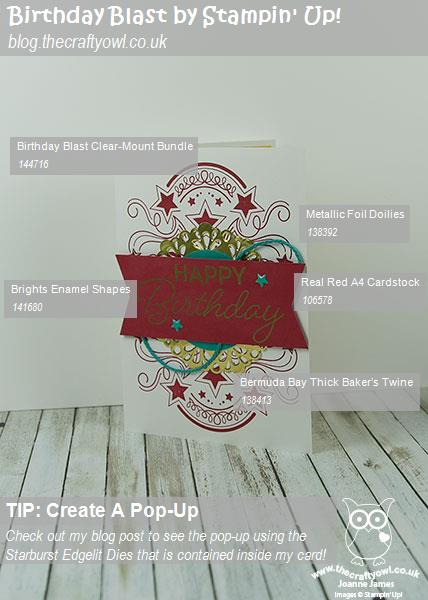
Here is the visual summary of the key products used on today's project for you to pin for easy reference:
You can see all of my 'How To' summaries on my 'How To - Tips and Techniques' Pinterest board in case you've missed any. 

Do check out the other cards in the blog hop for inspiration; I would love it if you could pop over and vote on my card in the gallery by clicking here - the designers of the cards with the most votes will get to participate in one of Kylie's monthly international blog hops, so your votes all count!

Back tomorrow with another project; until then, happy stampin'!


Stampin' Up! Supplies Used:

Table built using Product Table Builder by The Crafty Owl - Independent Stampin' Up! Demonstrator.

Stampin' Up! 2015-17 In Colours Washi Butterfly

by Joanne James7. April 2016 08:05

Today it's time for a new challenge over at Create With Connie and Mary and this week we have a great sketch for you:


So after everything I said about Delightful Dijon on my CCMC card last week, this week I've gone and used it again - out of choice! My card this week is all about our current in-colours, the 2015-17 In Colours to be exact:

I decided to create a washi tape striped inset background for my white butterfly, using the In Colour Designer Washi Tape that is an exclusive hostess gift which you can purchase with Stampin' Rewards when you host a Stampin' Up! party. I then chose the remaining elements of my card from there: a strip of white corrugated card for texture, a strip of watermelon wonder wide 1" stitched satin ribbon and for the back panel a piece of Colour Me Irresistible Specialty Designer Series Paper - I went with the Delightful Dijon because this is the only uncut piece in my pack! I finished my butterfly with a Mint Macaron  In-Colour Blossom Accent, finished with a rhinestone. I haven't added a sentiment to my card today as I wanted to add it to my stash of 'all purpose' cards, so will probably add one as I'm ready to send it.

Here is the visual summary of the key products used on today's project for you to pin for easy reference:


You can see all of my 'How To' summaries on my 'How To - Tips and Techniques' Pinterest board in case you've missed any. 

Do visit the other Design Team members to see how they interpreted this week's sketch; there's lots of inspiration over on their blogs too!

Enjoy your day and I'll be back tomorrow with another project; until then, happy stampin'!


Stampin' Up! Supplies Used:

  • Bold Butterfly Framelits Dies
  • 2015-2017 In Color Designer Washi Tape
  • Watermelon Wonder 1" Stitched Satin Ribbon
  • Color Me Irresistible Specialty Designer Series Paper
  • 2015-2017 In Color Blossom Accents
  • Kraft And White Corrugated Paper
  • Punch Corner Project Life
  • Rhinestone Basic Jewels
  • Whisper White A4 Thick Cardstock

Last Chance To Take Advantage of Wednesday Weekly Deals!

by Joanne James6. April 2016 08:00


It's Wednesday and time for this week's new collection of Wednesday Weekly Deals! There are changes afoot as far as Weekly Deals are concerned - due to improvements in stock control, this week and next are the last weeks that they will be offered. They will however be replaced with less frequent but better 'Specials' promotions on an adhoc basis - please make sure you're checking my blog regularly for details. So for the final two weeks, there really are some great deals - as always, these offers are valid for one week only. 

If you want to take advantage of any of the deals on offer, you can support my business by placing your order online by clicking here or using the link to my store on the right hand side of my blog page where it says 'Shop Online' or with me in person. Don't forget to add the new Hostess Code for April UD3KDWM4 if your order is under £150 and be sure to make sure that you don't check the 'no contact' box if you'd like to be kept updated with the progress of you order and receive a little thank you in the post from me. If you are local, then give me a call to place your order if you'd like to save on P&P.

Here's a summary of this week's one-week only Wednesday deals - click on each item to go to the online store to purchase:

Table built using Product Table Builder by The Crafty Owl - Independent Stampin' Up! Demonstrator.


If you're tempted to place an order, do check out the clearance rack online too - additional items have been added this week and there are some good bargains to be had!

It just so happens that I've used two of the products on this week's deals on my card today - check it out here!

That's all from me; back tomorrow with another project; until then, happy shopping!

Sending Smiles with the Zoo Babies Alligator!

by Joanne James6. April 2016 07:00

Today I have another clean and simple card for you, the second one this week using the sketch challenge over at CAS(E) This Sketch. As I mentioned yesterday, I love playing along with their sketches, which can sometimes leave me lost at first glance but then often take me in an unexpected direction. This week's sketch is definitely one of those! Here is the sketch:


I spent considerable time thinking about how I was going to interpret this sketch; the Design Team have some great takes on this sketch and I was fascinated by Michelle's Design Team card in particular and the way she created the channel for her airplane. In a similar vein I created my second card:

How cute is this?!! Here's the low-down on today's card:

See Ya Later Alligator - My alligator is from the 'Zoo Babies' stamp set. Super cute on a baby card but also works for a fun 'hello' style card too. His open jaws were just crying out to be used with this sketch! I added a tiny punched heart from the Confetti Hearts Border Punch for a little pop of colour too.

Chomp Chomp - What to use to create the teeth marks I needed for my alligator's bite? I used the scalloped thinlit in the Cutie Pie Thinlit set; this enabled me to create a mirrored border to reveal my sentiment beneath, which is from the 'Greatest Greetings' set. Don't all alligators look like they are smiling - before they open their mouths at least?!

'White' Space - Like Monday's card, today's features plenty of true 'white space' - or in this case 'green' space! You can read all about white space and its function of clean and simple cards here. Today is another example that fits with this week's challenge over at Less is More, so I will be linking up for the second time this week.

This is one of those cards that makes me feel warm and fuzzy inside - I just love it!

Here is the visual summary of the key products used on today's project for you to pin for easy reference:


You can see all of my 'How To' summaries on my 'How To - Tips and Techniques' Pinterest board in case you've missed any. 

What's more, two of the products I've used on today's card - The Confetti Hearts Border Punch and Greatest Greetings set - are available at a knock-down bargain price on Weekly Deals today - get the full details here

Back tomorrow with a card for this week's new challenge over at Create With Connie and Mary; until then, happy stampin'!


Stampin' Up! Supplies Used: 

Table built using Product Table Builder by The Crafty Owl - Independent Stampin' Up! Demonstrator.

Love You Sew - You're A Cut Above

by Joanne James5. April 2016 07:00

Today I have another clean and simple card for you, this time for this week's challenge over at CAS(E) This Sketch. I love playing along with their sketches, which can sometimes leave me lost at first glance but then often take me in an unexpected direction. This week's sketch is definitely one of those! Here is the sketch:


I spent considerable time thinking about how I was going to interpret this sketch and then ended up with not one but two very different creations! Here is the first one:

There are a number of key elements that make up this deceptively simple card:

A Cut Above - This great sentiment comes for the current hostess set in the Spring-Summer catalogue 'Love You Sew'. This exclusive set can only be purchased with Stampin' Rewards that are earned with qualifying party sales when you host your own Stampin' Up! party or place an individual order of £150 or more. Perfect for crafters, it includes a number of fun sentiments and craft-themed stamps and has been very popular with party hostesses throughout Sale-A-Bration. It is still available until the seasonal catalogue ends on May 31st, so if you would like to earn it for free then do get in touch to earn yours.

It's My Party - I love the bold and sassy colours and patterns of the It's My Party Suite and this card was perfect for a busy pattern, due to its simple design. What's more, the decision on which side to use was made easy - for today's card, both patterns are visible. Score! I simply cut a line across my DSP with my Stampin' Trimmer, then folded back the sides to create a 'v' in which to stamp my sentiment on the layer below.


Snip, Snip - The scissors stamp can be found in the 'Love You Sew' stamp set too and were the perfect embellishment for my split card front. I coloured them in with my Stampin' Write markers so that I could colour the handles and blades separately and positioned them'in action'.

Sew easy, sew simple! I just love this set and this sentiment makes for a perfect crafty congratulations - I shall probably make a few of these to keep on standby to celebrate my team members' achievements!

Here is the visual summary of the key products used on today's project for you to pin for easy reference:


You can see all of my 'How To' summaries on my 'How To - Tips and Techniques' Pinterest board in case you've missed any. 

I've had a day of hair braiding, manicures and baking in addition to a few household chores today. I'm sure tomorrow will be equally fun! Back tomorrow with another very different interpretation of the same sketch; until then, happy stampin'!


Stampin' Up! Supplies Used: 

Table built using Product Table Builder by The Crafty Owl - Independent Stampin' Up! Demonstrator.

Tags: , , , , , ,

Cards | Host a Party | hosting | Shop Online | Stamping

Washi Feather Be Brave Card

by Joanne James4. April 2016 07:00

Another Monday, another week - welcome lovely readers! I enjoyed a lovely day yesterday, with a family lunch, a long cycle ride, more planting of seedlings for the garden and yet more Easter chocolate (we are slowly getting through it!) Today's card is for this week's challenge over at Casology where the cue word is 'washi':

I was thrilled to have my weather cards last week chosen as Honourable Mentions (you can see those cards here and here) and couldn't resist playing along again this week as I try to hone my 'clean and simple' design skills. I'm also entering today's card into this week's challenge over at Simply Less Is More where this week's challenge is to use 'white space that isn't white'. Let me show you my card and then I'll explain a little more what that means:

The key features of today's project are as follows:

Washi Feather - I have lots of washi tape (I don't hoard it quite as badly as designer series paper, but close!) and rarely use it; I consulted with my 'Things to do with Washi Tape' Pinterest board where I have saved lots of ideas and thought it was about time I tried something a little different, so settled on creating the feather you see on today's card. I used some retired tape as I liked the subtle pattern on this one, but you could use any current tape for a similar effect. It's really easy to do: you just tape both sides of a piece of baker's twine or strand of jute ribbon as I did here, then use your paper snips to shape your feather. 

White Space That Isn't White - The creation of 'white space', that is an area of your card with no image, layer, pattern or embellishment, is one of the things that designers often find tricky with this kind of card. 'White space' doesn't refer to the colour of the base layer, although often a white base is used - rather it refers to leaving an large proportion of the card blank. I chose to use Pool Party as my colour of choice today and with the exception of my feather, trio of white Perfect Accents, sentiment and thin border frame, there is nothing else on my card front, meeting the 'white space' clean and simple brief.

Make A Statement - My clean and simple card needed a clean yet bold sentiment. My feather started me thinking about Red Indians (don't ask!) and Indian braves. I remembered this sentiment in the 'Enjoy The Little Things' stamp set; whilst designed to go with the kit of the same name, it stands alone and works well with my lone feather. I stamped it in Versamark and heat embossed in white I think this would be a great card to send to someone battling an illness or difficult circumstance, where a little encouragement is needed.

Here's the visual summary of the key supplies used to make this card for you to save for future reference:


You can see all of my 'How To' summaries on my 'How To - Tips and Techniques' Pinterest board in case you've missed any. 

This is the second full week of the Easter holidays for the James juniors. I'm not sure what our week will have in store, but you can be sure it will include more fun activities that don't include school work!

Enjoy your day and I'll be back tomorrow with another project; until then, happy stampin'!

Stampin' Up! Supplies Used:

Table built using Product Table Builder by The Crafty Owl - Independent Stampin' Up! Demonstrator.

Toy Story Woody Cowboy Birthday Card

by Joanne James3. April 2016 09:00

It's Sunday and time for a new challenge over at The Paper Players! It's the turn of the talented Laurie to host our challenge this week and she has a theme for you to play along with:


This card was easier for me than I thought it would be. I have only one stamp set that has a western theme, so it was that or punch art! And in spite of that I ended up making two cards! I apologise now to my UK readers - both of today's cards feature the Stampin' Up! stamp set 'Yee Haw', a photopolymer set that has only ever been available in the USA (although I'm pretty sure it's no longer available there now either). I am fortunate enough to own this set, courtesy of my fellow Paper Player LeAnne (thank you again LeAnne!) - as soon as I saw it I just knew I would have to have it!

My first card this week though would be easy to replicate without this stamp set. I was inspired by a birthday cake I saw on Pinterest to create a card that is reminiscent of the most famous of modern cowboys - the loveable Woody from Disney's Toy story:


I've used a couple of 'vintage' items from my craft stash to create today's card: some Poppy Parade cardstock (it was the right shade of red!) and some Adventure Bound DSP for his jeans but otherwise everything else is current. You could substitute these with Real Red and Island Indigo cardstock if you didn't have them available. When I make this kind of card, I often get asked questions about the detail - so here are my top 3 pointers if you want to create something similar:

Necktie - Woody's necktie is a simple triangle, onto which I stamped the cross from the 'Friends and Flowers' stamp set in white repeatedly, then added extra detail with a white gel pen and my black Stampin' Write marker. 

Waistcoat - I created my waistcoat using one of the cloud patterns in the 'Balloon Celebration' set (the one on the second row from the bottom below). It makes a perfect cow print! I twisted some white and black baker's twine to create the edging to my waistcoat.

Balloon Celebration Photopolymer Stamp Set by Stampin' Up!

Balloon Celebration by Stampin' Up!

Sherriff badge - I stamped the sherriff badge from the 'Yee Haw' stamp set in Versamark onto gold foil and heat embossed it in gold before fussy cutting and adhering to my card.

I also decorated the inside of my card with other images from this set:


I just love this card - even without a face Woody's clothes are so iconic I think it's easy to tell it's him. I'm tempted to make a co-ordinating pair that looks like Buzz Lightyear - perhaps I'll save that one until we have a cosmic theme!

Here is the visual summary of the key products used on this project for you to pin for easy reference:


You can see all of my 'How To' summaries on my 'How To - Tips and Techniques' Pinterest board in case you've missed any.  

I also made a second card using the 'Yee Haw' stamp set, this time using the sketch over at Freshly Made Sketches and the colours over at The Global Design Project that were perfect for a second cowboy card:


Here is the card I made:


A simple starry stamped background, a piece of embossed woodgrain, a lassooed sentiment and a bright orange cowboy hat with a paper-pieced band! I used a slightly different decoration for the inside of this card so thought I'd share that too:


Here is the visual summary of the key products used on this project for you to pin for easy reference:


Before you reach for your ink and papers, check out what our amazing team has created to inspire you this week:

The Paper Players Design Team
 
 
Here's a quick recap of our challenge rules:
 
1.  Create a new paper project
2.  Upload your creation to your blog with a link back to us and provide a direct link to the post featuring your challenge submission.
3.  Please link your card to no more than four challenges, TOTAL.
4.  Have FUN! 


I look forward to seeing what you create with this week's theme. We are off to basketball today but no hockey this week so a slightly more relaxed Sunday than usual.

Back tomorrow with another project; until then, happy stampin'!


Stampin' Up! Supplies Used:

For the Toy Story Woody card: 

Table built using Product Table Builder by The Crafty Owl - Independent Stampin' Up! Demonstrator.
 

Stampin' Up! Supplies Used:

For the Rootin' Tootin' Birthday card: 

Table built using Product Table Builder by The Crafty Owl - Independent Stampin' Up! Demonstrator.

Picture Perfect High Tide Starfish Card

by Joanne James2. April 2016 19:00

I've had a busy day today hence my late post - more time crafting and less time blogging, I'm afraid! Anyway, I just thought I would write a quick post to share a 'something old, something new' card that I made today using this week's Mojo Monday sketch:

My 'something new' is the 'Picture Perfect' stamp set that I had out on my desk preparing for May's technique class when we will be using that set. For today's card I paired it with some retired DSP from my hoard:

The details for today's card are as follows:

Something Old - This retired High Tide Designer Series Paper has lots of nautical and sealife patterns and I remembered this one featuring a coral starfish. The panels on this sketch lend themselves to co-ordinating DSP and I knew this card would give me the perfect opportunity to use up some of my old papers.

Something New - The starfish is the only image in the 'Picture Perfect' stamp set I've yet to use, so that was naturally my image of choice today. I stamped my starfish first in Blushing Bride, then overlaid the second image in Calypso Coral to tie it in with the coral starfish on my chosen DSP. I then cropped my image using my Circles Framelits.

Something Blue - Whilst I didn't borrow anything to make today's card, in keeping with the saying there is most definitely 'something blue': I used Pacific Point cardstock to give me a bright and solid base for my background to bring together my sentiment and patterned papers and ensure my card remained cohesive. 

Here is the visual summary of the key products used on this project for you to pin for easy reference:


Back tomorrow with another project; until then, happy stampin'!


Stampin' Up! Supplies Used:

Table built using Product Table Builder by The Crafty Owl - Independent Stampin' Up! Demonstrator.

Colour Combo - Zoo Babies Rhino Party Animal Birthday Card

by Joanne James1. April 2016 08:00

Happy Friday everyone and April Fools Day! Sale-A-Bration is over for another year and the end of the week is here - although this week has been much more laid back than usual; I do love school holidays! Today I have a fun card for this week's challenge over at Less is More, where the theme is to include polka dots on your card. I immediately thought about my Zoo Babies stamps, as a number of these animals have polka dots in their patterns. Here is my card:

I wanted to make a fun birthday card rather than a baby congratulations card this week - so tied a polka dot balloon to him! Here's the low-down on today's card:

Seeing Spots - If you look closely, the horns of my cute rhino have a polka dot pattern. The giraffe in this set is much more spotty, but I could resist the rhino :-) To ensure that polka dots were a clear feature of my card, I used some stripped jute ribbon to tie a balloon punched from Real Red Brights Designer Series Paper and punched with my balloon punch to the back of my party animal.

Party Animal - No party is complete without a party hat, right? My rhino is sporting one that he borrowed from the dinosaurs in the 'No Bones About It' stamp set. The 'happy birthday' sentiment on the front of my card is from the 'Balloon Builders' stamp set and is paired on the inside of my card with another great sentiment from this set 'Party Animal' - my rhino totally knows how to celebrate!

Tip Top Colour Combo - I chose Tip Top Taupe for my rhino today - warmer than grey yet still a true colour for this fun fella. I paired it with Bermuda Bay and Real Red for a pop of colour on my CAS card - here's my colour combo for you to save to use too:


I hope you like it - this is one of those cards that make me smile and I've been desperate to share all week!

Here is the visual summary of the key products used on today's project for you to pin for easy reference:


You can see all of my 'How To' summaries on my 'How To - Tips and Techniques' Pinterest board in case you've missed any. 

I'm also linking my card up today with the team over at SUO Challenges where the current theme is 'cute critters'. My rhino may not be warm and fluffy, but I think you'd have to agree he is definitely cute!!

Enjoy your day and I'll be back tomorrow with another project; until then, happy stampin'!


Stampin' Up! Supplies Used: 

Table built using Product Table Builder by The Crafty Owl - Independent Stampin' Up! Demonstrator.

Thanks For Helping Me Grow

by Joanne James31. March 2016 08:05

Today it's time for a new challenge over at Create With Connie and Mary and this week we have a colour combination for you:


Ok - so I'll be honest upfront: I'm not a fan of Delightful Dijon! Actually, I'm sure I've declared this to my regular readers before and I can honestly say I've only used it once on a card where I really loved the output (funnily enough a previous CCMC colour challenge - you can see that card here). I have therefore mixed feelings about today's card - and it's really the presence of the mustard that's the reason! So, here is today's creation:

The details for today's card are as follows:

Helping Me Grow - This is a stamp set you haven't seen me use before and there is good reason for that - I don't own it! I actually bought it as a Christmas gift for my mother-in-law, borrowed it back for an idea I had that I then didn't get to try out a few weeks ago but knew it would be just perfect for today's card. The large, over-size blooms in this set are perfect for a centre-piece of their very own; I stamped them in Lost Lagoon and used my Aquapainter to colour them in with the same colour for a soft, washed look. So thank you Kathy! 

Timeless Elegance - If you look really closely, you will see that there is a subtle pattern to the paper I used for my main stamped image. The Timeless Elegance designer series paper has Sahara Sand as one of its feature colours; it adds interest to my floral panel without overwhelming the stamped image and fits with the challenge colours.

The Perfect Label - The sentiment on my card is also from the 'Helping Me Grow' stamp set. There are some great sentiment combinations that can be made with this set; there are also a number of nice corner or border treatments, including the one I used on this card. What's more, the sentiment border is the perfect fit for the framelit in the Rose Garden Thinlits Dies set - bonus! 

So that's my card - not-so-Delightful Dijon and all!

Here is the visual summary of the key products used on today's project for you to pin for easy reference:


You can see all of my 'How To' summaries on my 'How To - Tips and Techniques' Pinterest board in case you've missed any. 

Do visit the other Design Team members to see what they did with this week's colours; there's lots of inspiration over on their blogs too!

Enjoy your day and I'll be back tomorrow with another project; until then, happy stampin'!


Stampin' Up! Supplies Used: 

  • Helping Me Grow Photopolymer Stamp Set
  • Rose Garden Thinlits Dies
  • Timeless Elegance Designer Series Paper
  • Delightful Dijon A4 Cardstock
  • Delightful Dijon 1" Dotted Lace Trim
  • Lost Lagoon Classic Stampin' Pad
  • Lost Lagoon A4 Cardstock
  • Very Vanilla A4 Cardstock
  • Sahara Sand A4 Cardstock
  • Pearl Basic Jewels
  • Venetian Crochet Trim

New Online Exclusives

There are new products available exclusively in the online store from 5 November - check them out here.

Latest Kits!

Stampin Cut and Emboss

The Layered Landscapes Kit and Nature's Paintings Kit are the latest kits in the online store - get yours here!

Shop Online

Access my online shop 24 x 7, 365 days of the year:

Current November hostess code:

9NKXDTTR

Shop Online

Mini Catalogue

BROWSE THE CATALOGUE

'Tis The Season - the new Stampin' Up! Mini Catalogue is here! For more details and to download your copy click here

Scrapbooking

Stampin' Up! has introduced a new range of 12x12" scrapbooking product and kit - the full range is now available to purchase online. To download a copy of the new digital Scrapbooking Catalogue click here.

2024-25 Annual Catalogue

BROWSE THE CATALOGUE

Click on the image to download your copy of the 2024-25 annual catalogue. For a full list of current SU! supplies, go to my online store. If you would like any help or advice, please drop me a line at joanne@thecraftyowl.co.uk or give me a call on 07773 421446 - I'd be happy to help.

Join My Team

It's always a great time to join Stampin’ Up! New team members can get £130 worth of products for only £99 + free business supplies + free shipping + all the fun being a part of Stampin’ Up! Stampin' Up! has something for everyone: join my growing team and benefit from my support to enjoy Stampin' Up! however you choose.

If you're interested, call me for a chat to understand how I can help you realise your goals. Alternatively, if you have already decided to sign up and you just can't wait, please click here for the link to the online form where you can sign up and order your starter kit right away! 

About Me

Hi I'm Joanne and live in Northampton and when I'm not looking after my husband and two beautiful children, am an avid crafter with a passion for all things Stampin' Up!

I must confess that I have never been a big rubber stamper - until I discovered Stampin' Up! that is. I love the fact that I can get such great results with co-ordinating stamps, inks, papers and punches - the possibilities are endless! Join me on my stamping journey as I share the things I love and be inspired to create amazing things yourself!

Follow Me

Monthly Newsletter

Box Builder

Click the button above to use Box Buster to create your custom box design using the Envelope Punch Board!

Kits Collection Now Available!

Stampin Cut and Emboss

The new Kits Collection from Stampin' Up! is now available!

Click here to see the current kits available and order yours online today.

I Design For


Stampin' Up Stuff

This is my personal blog and is not endorsed by Stampin’ Up! I hope you find it a plentiful source of ideas and personal inspiration but please don't copy my designs for contest submission or use for classes, publication or sale without express permission.