A Bermuda Bay Bike Ride For The Paper Players

by Joanne James13. August 2017 10:00

It's Sunday and time for this week's new challenge over at The Paper Players! Firstly, thanks to everyone who left such lovely comments on my High Tide square pop out swing card last week; I have a few more cards made using the same design and will be sharing a more detailed 'how to' for this fun fold, so stay tuned for more information on this one. Back to today: it's the turn of the awesomely-inspiring Sandy to host this week and she has a colour challenge for us to work with:


I must say I did find this colour palette rather challenging; the green got me thinking of flowers, but I was struggling to make the three colours work together. Instead I chose to focus on the blue and I took the opportunity to get out my Bike Ride stamp set and create a fun birthday card - take a look:


Here's the low-down on today's card:

Build A Bike Made Simple - This is the first time I've use my Bike Ride stamp set with the co-ordinating Build A Bike Framelits, as the cards I made with it previously were having returned from Onstage in Amsterdam where we received the stamp set only as an all-attendee giveaway but not the framelits. What a difference they make - I pieced together the pieces of my bicycle with ease and got to use the little wire basket too - love it!

Flip The Sketch And Chop The Bike - I used the sketch over at CAS Colours & Sketches for my layout today (I figured a bike is about as non-rectangular a shape as you can get!), rotating it through 180 degrees as I wanted my bike to be riding onto my card rather than off it. Patricia's sketch shows the shape appearing to hang off the edge of the card so there was nothing else for it - I chopped off the end of my bicycle! I think it works though - if anything, it adds to the sense of movement I think. 

Coffee Break Border - My card is predominantly blue, with the Pear Pizzazz and Calypso Coral featuring only in small quantities: the flowers in the basket, a heart enamel dot. I almost left it there, but I felt like I wanted to ground my bicycle and include a little more of one of the colours so added a strip of Coffee Break designer series paper with a subtle green and white stripe.


Here is the visual summary of the key products used on today's project for you to pin for easy reference:


You can see all of my Product and 'How To' summaries on my 'How To - Tips and Techniques' Pinterest board in case you've missed any. 

Before you reach for your ink and papers, check out what our amazing team has created to inspire you this week:

The Paper Players Design Team
 
 
Here's a quick recap of our challenge rules:
 
1.  Create a new paper project
2.  Upload your creation to your blog with a link back to us and provide a direct link to the post featuring your challenge submission.
3.  Please link your card to no more than four challenges, TOTAL.
4.  Have FUN! 

I look forward to seeing what you create with this week's colour palette. Enjoy the rest of your weekend - we are continuing with Ben's weekend of birthday celebrations, so lots of fun to be had here! I'll be back tomorrow with another project; until then, happy stampin'!


Stampin' Up! Supplies Used: 

Table built using Product Table Builder by The Crafty Owl - Independent Stampin' Up! Demonstrator.

Beautiful Bouquet One Sheet Wonder

by Joanne James11. August 2017 20:00

Friday already - where did the week go?! I've been having fun with my not-so-little ones - and today my youngest James Junior turned 10 years old so now I have two children in double digits - I really don't know where the time goes! We have had a fun day of games, football, dinner out and a trip to the cinema so all in all a lovely end to the week. Following a few absent days, I thought it was time for a quick post to share more of my makes with the Beautiful Bouquet stamp set. I actually used the set to create a one sheet wonder, that I turned into eight cards that I then duplicated for my thank you cards to go out with my customer orders this month. Here's one of the cards in the set:


Here's the low-down on today's card:

Bright Colour Combo - I chose a bright colour combination of hot pink, orange and red with a contrasting touch of blue for my set of cards - the Marina Mist blue is definitely the wild card here, however I think it breaks up the other colours in a good way. Here's the colour combination if you'd like to save it for future use:


Step It Up - I could have simply added my one sheet wonder panels to my card bases, along with a sentiment stamped on a basic square or punched circle, to complete my cards in record time. I decided to step them up slightly with the aid of my Stitched Shape Framelits, Layered Squares and Circles Framelits and some additional stamped flowers that I then diecut with the co-ordinating Bouquet Bunch Framelits. Completion took a little more time for sure, however I think it was worth it - sometimes it's the details that count and really make the difference.

The Wonder Of One Sheet - A one sheet wonder is a fun way to create your own patterned paper and can be a quick solution if you want to create a bunch of cards. I made up my own cut template for this one, with a set of easy cuts to make the most out of my single sheet of A4 cardstock. Here's a shot showing all the cards I made just to give you a flavour off the set:


I used a variety of base and mat colours - the tiny flowers make Beautiful Bouquet a great set to use for a one sheet wonder. Why not give it a try with some of your favourite colour combinations?

Here is the visual summary of the key products used on today's project for you to pin for easy reference:


You can see all of my 'How To' summaries on my 'How To - Tips and Techniques' Pinterest board in case you've missed any. 

I'll be back on Sunday with another project. Until then, happy stampin'!


Stampin' Up! Supplies Used:

Table built using Product Table Builder by The Crafty Owl - Independent Stampin' Up! Demonstrator.

Beautiful Bouquet Watercolour Stampin' Up! Annual Catalogue CASE

by Joanne James8. August 2017 15:10

Well, you can tell the children must be on their school summer holiday here in the UK as it's pouring with rain with no signs of let up! We have had an aborted trip to the zoo today and had to make do with indoor swimming and trampolining instead, which the James Juniors seem to have enjoyed despite the constant drizzle. It also means we are home slightly earlier than planned leaving me time to share a quick project with you and the lovely ladies over at As You See It who have a fun challenge theme this week:

It made me smile as this is definitely something I can identify with! I usually lose my mojo when I get delivery of a large new box of goodies during the pre-order period of a new Stampin' Up! catalogue; I have all these wonderful new sets and papers to play with and suddenly don't know where to start! When I get like this, I often turn to my Stampin' Up! catalogue for inspiration and CASE (Copy And Selectively Edit) a card from within. This is usually enough to get me back on track and get the ideas flowing. Here is one such card:


The eagle-eyed amongst you will recognise my card as a CASE of the card on page 93 of the 2017-18 Stampin' Up! Annual Catalogue that features the Beautiful Bouquet stamp set. I've changed a few things: I used a different palette of colours, layered my sentiment on a stitched circle and added some Powder Pink ribbon as opposed to linen thread along with a couple of sparkly faceted gems for good measure, but the basic layout and the loose spritzed watercolour technique is the same. 

Here is the visual summary of the key products used on today's project for you to pin for easy reference:


You can see all of my 'How To' summaries on my 'How To - Tips and Techniques' Pinterest board in case you've missed any. 

'CASE-ing the catalogue' is also a great way to try something different - this sample encouraged me to think about using the Beautiful Bouquet set in different ways, rather than simply stamping and die cutting. I am expecting delivery of my Autumn-Winter catalogue pre-order tomorrow, so I give it about 24 hours before the loss of crafting mojo kicks in and you can guess where I will be headed - yes, the pages of my new seasonal catalogue for inspiration!

Enjoy your day and I'll be back soon with another project. Until then, happy stampin'!


Stampin' Up! Supplies Used:

Table built using Product Table Builder by The Crafty Owl - Independent Stampin' Up! Demonstrator.

High Tide Square Pop Out Swing Card For The Paper Players PP356

by Joanne James6. August 2017 10:00

It's Sunday and time for this week's new challenge over at The Paper Players! The wonderful Nance is the hostess this week and she has a fun theme for us to work with:


The great outdoors can be interpreted in so many ways: I needed some masculine birthday cards so decided to dig out my High Tide stamp set and take a trip to the coast for my card today - take a look:


Today's card is a fancy fold and I've closed it above so that you can see what it looks like flat with the overstamped birds; the photo below shows it at an angle in it's popped-out position:


Here's the low-down on today's card:

High Tide - High Tide is a stamp set that can be used to build seascapes quickly and with ease, with the photopolymer stamps making it easy to see how the pieces align in order to create a scene and for the two-step stamping of the lighthouse. The set contains some lovely sentiments too, one of which I used on the inside of my card. I needed something more birthday-related for the front of my card, so went to one of my 'go to' sets, Butterfly Basics, for this one. I also over-stamped the gulls and wader birds onto the main image and the surrounding frame for extra interest.

A Fancy Fold - I wanted to use a fancy fold to add a little extra interest to today's card, so I decided to make a square pop-out swing card. I often find masculine cards difficult to add a 'special touch' to as embellishments tend to make them look quite feminine, but a fancy fold can sometimes be a good way of making a card special without adding to much in the way of frills or requiring a vast quantity of supplies. My card front measures 5 3/4" square (a slightly odd measurement to be fair, but I couldn't find any 12" x 12" in Sahara Sand so had to use a sheet of A4). I was cutting a few bases at a time so for speed used the largest square in my retired Squares Framelits set to cut the aperture in the front, but you could just as easily cut this out using you trimmer and leaving a 1" frame on all sides. Here is another shot so that you can see what the card looks like when properly opened:


A Nautical Colour Combination - I used a combination of primary colours and neutrals for my calming beach scene, with the addition of the birds top and bottom stamped in Basic Grey. Here's my colour combination to save for future inspiration:


Here is the visual summary of the key products used on today's project for you to pin for easy reference:


You can see all of my Product and 'How To' summaries on my 'How To - Tips and Techniques' Pinterest board in case you've missed any. 

Whilst I had all my supplies out I also made a flat clean and simple card using this set which I will share some other time, but it was fun to make something a little different to share today and I love that this card is flat for posting too. 

Before you reach for your ink and papers, check out what our amazing team has created to inspire you this week:

The Paper Players Design Team
 
 
Here's a quick recap of our challenge rules:
 
1.  Create a new paper project
2.  Upload your creation to your blog with a link back to us and provide a direct link to the post featuring your challenge submission.
3.  Please link your card to no more than four challenges, TOTAL.
4.  Have FUN! 


I look forward to seeing what you create with this week's theme. Enjoy the rest of your weekend - we spent the day at a country show yesterday so are going to be taking it easy today. I'll be back tomorrow with another project; until then, happy stampin'!


Stampin' Up! Supplies Used: 

Table built using Product Table Builder by The Crafty Owl - Independent Stampin' Up! Demonstrator.

Beautiful Bouquet Three Ways From Simple to Stepped Up

by Joanne James4. August 2017 08:00

Happy Friday everyone! School holidays have got the better of me this week and with an all-day technique class too and pre-order of my seasonal goodies from the new Autumn-Winter catalogue, I've just not had the opportunity for blogging. I've plenty of makes to share with you though and today to thank you for your patience this week I thought I would show you not one, not two but three cards - another trio from simple to stepped up, this time featuring the Beautiful Bouquet Bundle that you can find on pages 92-93 of the 2017 Annual Stampin' Up! catalogue.

The Beautiful Bouquet stamp set has a wonderful collection of both florals and sentiments that are suitable for a wide variety of occasions and when paired with the co-ordinating Bouquet Bunch Framelits Dies can be used to make the most amazing 3D floral bouquets. The set really does offer something for every kind of crafter; I started out with the following basic colour combination and set to work:


Clean and Simple - Quick And Easy - If you're short on time or new to crafting, this set is great for a simple one layer card like this one:


All you need to do is take a sheet of Extra Thick Whisper White for your card base, stamp your stems and a few carefully chosen blooms directly onto the card front along with a sentiment of your choice, add a few rhinestones and your card is done. Bright colours that compliment each other and some contrasting flower centres really help this simple card to have a big impact.

Step It Up - If you have a bit more time and are feeling more adventurous, using a few extra tools and embellishments will allow you to 'step up' your card and create something with a little more depth and detail, whilst still relatively easy to make:


My second card follows the same basic layout as the first, however this time I've used the framelits to cut out the bow and the flower heads and popped them up on dimensionals, and some circle punches to punch out my sentiment and layer it onto some Berry Burst cardstock for extra pop. In addition to the rhinestones, I've added a little tab of Daffodil Delight Double-Stitched Ribbon to my sentiment circle for an extra touch.

Going For Gold - Stepped Up To The Max - If you have the time and want to really explore a wide range of techniques, tools and embellishments, it's possible to use the Beautiful Bouquet Bundle to create something really special:


My third card is a CASE of the card on page 93 of the Stampin' Up! catalogue and really goes to town: the framelits have been used to diecut the entire bouquet, having stamped the flower heads first, and layered onto some background-stamped squares cut with the Layering Squares Framelits and an embossed background (my card uses the retired Large Polka Dot TIEF but you could of course use the current Polka Dot Basics Textured Impressions Embossing Folder as per the catalogue sample). There are some additional colours, doilies, linen thread and a sprinkling of the gorgeous glitter enamel dots that really help to make this card something special.

Here are the visual summaries of the key products used on today's projects for you to pin for easy reference:
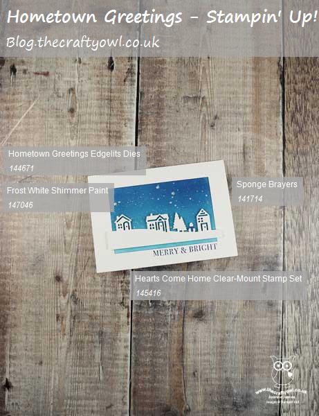


You can see all of my 'How To' summaries on my 'How To - Tips and Techniques' Pinterest board in case you've missed any. 

So which of the above cards is your favourite? Do leave me a comment below, I'd love to hear your thoughts. I love them all and as I have the bundle, like the fact that I can choose my style depending on how the mood - or in my case time available - takes me! I have a few more cards to share using this set, so stay tuned next week if florals are your thing.

Enjoy your day and I'll be back tomorrow with another project, quite possibly with something of a more seasonal nature. Until then, happy stampin'!


Stampin' Up! Supplies Used:

Table built using Product Table Builder by The Crafty Owl - Independent Stampin' Up! Demonstrator.

A Little Wild Baby Blue Elephant For Laurie's TicTacToe At The Paper Players

by Joanne James30. July 2017 10:00

It's Sunday, I'm back after my two week vacation and excited to be back with my lovely team over at The Paper Players! This week we are all about team here at The Paper Players: the lovely Laurie was due to host this week but has unfortunately had to deal with a family bereavement and needed some time out so I am lending a helping hand. Laurie has done all the hard work and has designed a fun tic-tac-toe board to challenge us all as it's the fifth week of the month; I am picking up with the comments and visits to your blogs and get the honour of choosing this week's top pick. So, without further ado, here is this week's challenge board:


When considering my make for today, I just knew I would have to include the option of 'diecut' since I consider Laurie to be the absolute queen when it comes to diecutting, her creativity knows no bounds. I decided to go down the first vertical column and took the opportunity to make a baby card using the current sketch over at Fab Friday - it turns out I also fulfilled the bottom horizontal row too - take a look:


Here's the low-down on today's card:

A Little Wild - So how adorable is that little elephant?! I know - he is off the cuteness scale, for sure! He comes from the stamp set 'A Little Wild' and is part of a trio that includes a sweet bear and a lion too that is perfect for baby makes. The best part though? He is actually double-sided; each animal comes with a front and back and the co-ordinating Little Loves Framelits Dies will cut both pieces out as one, enabling them to be used as a gift tag too. I actually cut my elephant away here as I just wanted to the front, but I couldn't resist adding the reverse to the inside of my card:


Blue For A Boy - I decided to use a piece of the Bundle of Love Specialty Designer Series Paper for the blue for my card; it was tough not to use the gorgeous gold embossed foil pattern on the reverse, however I did use the Soft Sky/Very Vanilla/Gold colour combination to bring the elements of my card together. I added some subtle Soft Sky shading to my elephant using ink and a blender pen just to give him a little more depth and dimension.

Touches Of Gold - I wanted to add a touch of luxury to my card, the birth of a baby is a special occasion after all, and inspired by the designer series paper, added in a few gold elements - a die cut, layered scalloped circle, gold natural trim ribbon, some gold heat embossing and metallic enamel dots - to finish. 

Here is the visual summary of the key products used on today's project for you to pin for easy reference:


You can see all of my Product and 'How To' summaries on my 'How To - Tips and Techniques' Pinterest board in case you've missed any. 

I just love this card and can't wait to make a pink one for a girl and some co-ordinating packaging adorned with little elephant tags too!

Before you reach for your ink and papers, check out what our amazing team has created to inspire you this week:

The Paper Players Design Team
 
 
Here's a quick recap of our challenge rules:
 
1.  Create a new paper project
2.  Upload your creation to your blog with a link back to us and provide a direct link to the post featuring your challenge submission.
3.  Please link your card to no more than four challenges, TOTAL.
4.  Have FUN! 


I look forward to seeing what you create with our board this week. All of the Design Team love it when your return our visits and leave a friendly blog comment or two, however this week more than most it would be great if you could pop by Laurie's blog at Stampin' Up North and leave her a little Paper Players love - I know she would appreciate it. 

Enjoy the rest of your weekend; I have some trampolining to attend to (watching not bouncing thankfully!) and some preparation for the first of this month's technique classes on Tuesday.

I'll be back tomorrow with another project; until then, happy stampin'!


Stampin' Up! Supplies Used:

Table built using Product Table Builder by The Crafty Owl - Independent Stampin' Up! Demonstrator.

Label Me Pretty In-Colour Card Set

by Joanne James28. July 2017 06:00

Today I'm sharing a set of cards I made a while back to showcase the new in-colours at my Annual Catalogue launch event but just haven't got around to blogging. I also used this design as the basis for the cards that I sent out to my customers and anyone who had requested a catalogue from me with their copy of the new catalogue. Here's the first one:


 Here's the low-down on today's card:

Label Me Pretty - Label Me Pretty is one of the new bundles in the annual catalogue featured on page 27, comprising the 'Label Me Pretty' stamp set and the Pretty Label Punch. Just like the new daisy punch, the introduction of this punch to the Stampin' Up! punch collection has proved incredibly popular with demonstrators and customers alike, and it's easy to see why: this versatile label is great to use on cards or packaging alike, and the layering options that the stamp set and addition of a few circle punches gives allows for lots of creative possibilities.

In-Colour Quintet - As I mentioned above, I created the same card using each of the new in-colours. Having worked with them for some months now, my favourites are still Berry Burst and Lemon Lime Twist, the latter especially when combined with other colours such as Night of Navy - I just love it! Here's a shot showing glimpses of each of the cards in the collection:


Background Tip - The construction of my card is simple and the photograph fairly self-expanatory - well, it needs to be an easy make when mass-production is called for! I did just want to point out how I stamped the background flowers on the card base. If you look closely, you will see that they are the flowers from the 'Happy Birthday' stamp in the Label Me Pretty set, yet the wording isn't visible. I actually stamped the image, then turned it through 180 degrees so that the bottom of each image overlapped (you can't see this as it's covered by the label) to provide some extra florals to frame my label. This was a tip I picked up at Onstage in Amsterdam earlier this year from Donna Morgan at the Home Office I think, if my memory serves me correctly - so thank you Donna!

Here is the visual summary of the key products used on today's project for you to pin for easy reference:


You can see all of my 'How To' summaries on my 'How To - Tips and Techniques' Pinterest board in case you've missed any. 

So which of the in-colours is your favourite, or is there any one you find a real challenge to work with? Do leave me a comment below - I'd love to hear your thoughts!

Enjoy your day and I'll be back soon with another project. Until then, happy stampin'!


Stampin' Up! Supplies Used:

Table built using Product Table Builder by The Crafty Owl - Independent Stampin' Up! Demonstrator.

Eclectic Layers Thinlits Diamond Background: Part 3

by Joanne James27. July 2017 06:00

I've another Oh So Eclectic card for you today! Still looking at the different ways you can use the diamond-patterned die in the Eclectic Layers Thinlits to create backgrounds - today's example is actually my favourite! Take a look: 


Here's the low-down on today's card:

Create A Stencil - If you cut the diamond-patterned thinlit in the Eclectic Layers Thinlits set without the outline into a piece of acetate window sheet, you will have a permanent stencil that you can use to add even more interest to your backgrounds. You could use it with embossing paste - yes, that card will need to be featured in a part 4 blog post, to follow some time later when I've made the base into something! - or as I've done here, to create a blended coloured background using ink and sponges.

Tropical Colour Combo - I stuck with the Berry Burst and Peekaboo Peach colours that have featured on a number of my other cards featuring the Oh So Eclectic Product Suite and blended them with some Melon Mambo and Tangerine Tango, to give my card a bright, tropical feel. Here's my colour combination should you wish to save it for your future projects:


Gold Glimmer Flower Two Ways - I wanted to add a couple of hibiscus-inspired blooms to my sponged panel, so decided to choose two of the solid colours for the bases and accent each with both parts of the top layer diecut in gold glimmer. This really was easier than it looks to achieve: I adhered my gold glimmer paper to an adhesive sheet before running through my Big Shot, then having cut another top layer using a piece of scrap cardstock, used the this diecut as a guide to piece the small pieces into, before removing it. 

I think this card is one of my most favourite yet using this set; if I made it again though I would stencil my pattern more offset to the right rather than centrally, so that more of it would be visible once I'd added my embellishments. I still love it though!

Here is the visual summary of the key products used on today's project for you to pin for easy reference:


You can see all of my 'How To' summaries on my 'How To - Tips and Techniques' Pinterest board in case you've missed any. 

This is the last of my cards for a while that uses the Oh So Eclectic product suite, but I assure you this won't be the last of it! If you need no further convincing as to the versatility of this set, do click on the link to it below that will take you to my online store to purchase your very own bundle - include this month's code for an extra thank you in the post from me. Orders place before the end of the month will put you only £2 away from receiving a £4.50 money off bonus days coupon too, so be sure to add in a little something extra in order to take advantage of this great saving!

Until next time, happy stampin'!


Stampin' Up! Supplies Used:

Table built using Product Table Builder by The Crafty Owl - Independent Stampin' Up! Demonstrator.

Eclectic Layers Thinlits Diamond Background: Part 2

by Joanne James25. July 2017 06:00

I've another Oh So Eclectic card for you today! Still looking at the different ways you can use the diamond-patterned die in the Eclectic Layers Thinlits to create backgrounds - today's example is actually a CASE of a card featured on page 132 of the Stampin' Up! catalogue: 


Here's the low-down on today's card:

Colour Above - This card uses the diamond-patterned thinlit in the Eclectic Layers Thinlits set, again without the outline, to add interest to the mat layer of the card. On today's card I've used a piece of Extra Thick Whisper White below the diecut layer and cut the diecut out of a piece of the lovely faux watercoloured paper from the Naturally Eclectic designer series paper pack - this time the Emerald Envy piece,which was the other end of the paper I used for the background on my previous card. I added further detail to this layer by stamping leaves and dots directly onto it and added texture by sticking some of the diamonds that had been cut out back onto the base layer. Waste not, want not as the saying goes!

Embossed Leaves - Did you realise that two of the leaf thinlits and one of the diamond thinlits in the Eclectic Layers set are actually for embossing not die cutting? I've highlighted them on the image below - so useful for adding in texture to your designs:


I used the sprig of leaves on the background layer, again another way to add detail and texture without adding bulk.

The Midas Touch - A few final gold elements - foil, mini sequins and metallic thread - finish the card.

As my regular readers will know, I'm not usually into 'fussy' cards, however I love this set: it makes freestyle collage cards so easy, without having to sacrifice too much of my clean and layered style. 

Here is the visual summary of the key products used on today's project for you to pin for easy reference:


You can see all of my 'How To' summaries on my 'How To - Tips and Techniques' Pinterest board in case you've missed any. 

I'll be back soon with my final card (for now!) that uses the Oh So Eclectic product suite. Until then, happy stampin'!


Stampin' Up! Supplies Used:

Table built using Product Table Builder by The Crafty Owl - Independent Stampin' Up! Demonstrator.


Eclectic Layers Thinlits Diamond Background: Part 1

by Joanne James23. July 2017 06:00

Here's another Oh So Eclectic card from my technique class last week. One of the things we looked at was the different ways you can use the diamond-patterned die in the Eclectic Layers Thinlits to create backgrounds in a number of different ways. As such, I'm going to do a series of posts that each show an alternative example. Here's the first one: 


Here's the low-down on today's card:

Colour Below - The diamond-patterned thinlit in the Eclectic Layers Thinlits set, like the flower and diamond dies, can be used with or without the outline piece. Used with the outline it creates a delicate cutout, perfect for layering. Used without, it adds interest to the mat layer of the card and can be used to add detail to a background from which to add additional detail. On today's card I cut it out of a mat of Extra Thick Whisper White and placed a piece of the lovely faux watercoloured paper in Night of Navy from the Naturally Eclectic designer series paper pack behind it, allowing the graduated colour to show through.

Naturally Eclectic - The Naturally Eclectic designer series paper really is one of my favourites - I love the colour combinations and whilst some of the patterns are rather bold, the watercolour washes on the reverse are gorgeous. Here's a shot of these papers in all their glory:

Mini Sequins For Maxi Impact - The last thing that I want to highlight on my card today is the addition of some of the new gold mini sequins. Perfect for embellishing cards without adding a lot of bulk, these add a touch of glamour to any project and are the perfect addition to a collage-style card such as this one. I just love these and think I might be addicted to them! 

Here is the visual summary of the key products used on today's project for you to pin for easy reference:


You can see all of my 'How To' summaries on my 'How To - Tips and Techniques' Pinterest board in case you've missed any. 

Just a reminder too about this month's Bonus Days promotion: If the Oh So Eclectic bundle is on your shopping list, or any of the great bundles that Stampin' Up! has to offer, July is a great time to purchase; not only will you save 10% off the individual item prices by purchasing as a bundle, for every £45 you spend you will also receive a £4.50 coupon that can be used against next month's purchases too. A win-win! Furthermore, remember to add this month's hostess code JG7PHQKR to your order if shopping with me online to receive an extra little thank you in the post from me. 

I'll be back soon with another card that uses the Oh So Eclectic product suite. Until then, happy stampin'!


Stampin' Up! Supplies Used:

Table built using Product Table Builder by The Crafty Owl - Independent Stampin' Up! Demonstrator.

New Online Exclusives

There are new products available exclusively in the online store from 5 November - check them out here.

Latest Kits!

Stampin Cut and Emboss

The Layered Landscapes Kit and Nature's Paintings Kit are the latest kits in the online store - get yours here!

Shop Online

Access my online shop 24 x 7, 365 days of the year:

Current November hostess code:

9NKXDTTR

Shop Online

Mini Catalogue

BROWSE THE CATALOGUE

'Tis The Season - the new Stampin' Up! Mini Catalogue is here! For more details and to download your copy click here

Scrapbooking

Stampin' Up! has introduced a new range of 12x12" scrapbooking product and kit - the full range is now available to purchase online. To download a copy of the new digital Scrapbooking Catalogue click here.

2024-25 Annual Catalogue

BROWSE THE CATALOGUE

Click on the image to download your copy of the 2024-25 annual catalogue. For a full list of current SU! supplies, go to my online store. If you would like any help or advice, please drop me a line at joanne@thecraftyowl.co.uk or give me a call on 07773 421446 - I'd be happy to help.

Join My Team

It's always a great time to join Stampin’ Up! New team members can get £130 worth of products for only £99 + free business supplies + free shipping + all the fun being a part of Stampin’ Up! Stampin' Up! has something for everyone: join my growing team and benefit from my support to enjoy Stampin' Up! however you choose.

If you're interested, call me for a chat to understand how I can help you realise your goals. Alternatively, if you have already decided to sign up and you just can't wait, please click here for the link to the online form where you can sign up and order your starter kit right away! 

About Me

Hi I'm Joanne and live in Northampton and when I'm not looking after my husband and two beautiful children, am an avid crafter with a passion for all things Stampin' Up!

I must confess that I have never been a big rubber stamper - until I discovered Stampin' Up! that is. I love the fact that I can get such great results with co-ordinating stamps, inks, papers and punches - the possibilities are endless! Join me on my stamping journey as I share the things I love and be inspired to create amazing things yourself!

Follow Me

Monthly Newsletter

Box Builder

Click the button above to use Box Buster to create your custom box design using the Envelope Punch Board!

Kits Collection Now Available!

Stampin Cut and Emboss

The new Kits Collection from Stampin' Up! is now available!

Click here to see the current kits available and order yours online today.

I Design For


Stampin' Up Stuff

This is my personal blog and is not endorsed by Stampin’ Up! I hope you find it a plentiful source of ideas and personal inspiration but please don't copy my designs for contest submission or use for classes, publication or sale without express permission.