Trimming The Town Vertical Slimline Cards Four Ways

by Joanne James3. August 2020 16:33

Today I'm sharing a card - or 4! for this week's fun challenge over at Freshly Made Sketches


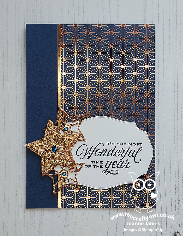
Yes the talented Linda Callaghan has left this week's sketch very much open to interpretation - as long as our cards are slimline; how fun! Slimline cards are very much on trend right now and whilst I've created a few horizontal ones recently, I haven't created any vertical ones. So I decided that's where I would start today and in fact, ended up creating 4 - take a look:


I decided to be brave and cut into this fabulous single sheet image from the new 'Trimming The Town' DSP pack that launches in the Autumn-Winter catalogue that launches tomorrow - here's the sheet I'm talking about:


And this is how I cut it:


This gave me 4 vertical slimline pieces and 3 additional pieces from the bottom section, that I will make up and share with you another day. I mounted each of my paper pieces on either Poppy Parade with a Misty Moonlight base, or Misty Moonlight with a Pool Party base. Here is each of the finished cards:

Card one:


Card two:


Card three: 


Card four:


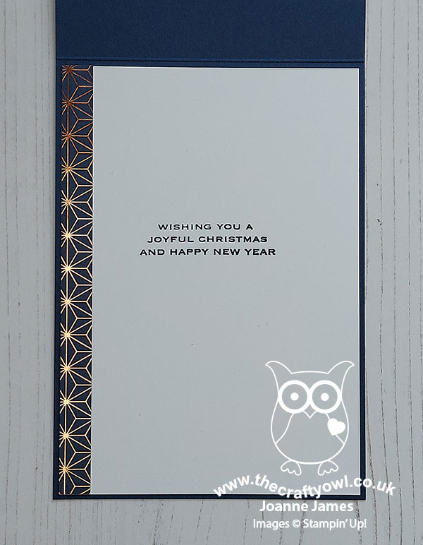
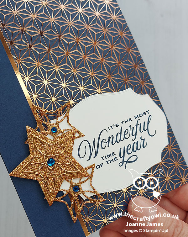
These cards are completely 'no stamping' (on the front at least) - I snipped the sentiments from another of the sheets in this DSP pack, and mounted them on dimensionals as you can see on the photo below:


And that, as they say, is that! The hardest thing was committing to cutting into the sheet of patterned paper! Four cards for my Christmas card stash - how excited are you that the new Autumn-Winter catalogue is launching tomorrow? Only one more sleep to go!

I've had a super busy day so am just squeezing today's post in between last-minute Stampin' up! orders to earn Bonus Days coupons - today is your last day! - and cooking dinner and fixing a bicycle tyre puncture - oh the life I lead! Enjoy your evening and I'll be back tomorrow with another project. Until then, happy stampin'!


Tags: , , , , , , ,

Cards | Shop Online | Stamping

Flight of Fancy Anniversary Cupid PP502

by Joanne James2. August 2020 09:00

Today it's Sunday and time for this week's new challenge over at The Paper Players! It's the turn of the fabulous Laurie to host this week and she has a fun theme challenge for you to work with:

    Horizontal Sketch featuring a large upside down triangle with a smaller triangle overlapping on the left with a banner behind the triangles.

I struggled a little with today's card as I don't know anyone getting married and I just couldn't seem to get into the zone! In the end I decide to flip the Paper Craft Crew Sketch and make an anniversary card using a new stamp from the upcoming Autumn-Winter catalogue - take a look:


Here's the low-down on today's card:

This cute cupid comes from the new 'Flight of Fancy' set. The set also features a whimsical angel and a witch on a broomstick, and whilst I think this cupid may have been designed with Valentine's Day in mind, paired with this sentiment from the 'Heartfelt' stamp set and a row of Stitched Be Mine stacked diecut hearts, I think he makes a sweet anniversary card too. Simply coloured with Blends and a liberal dose of clear Wink of Stella, plus some (retired) gold Wink of Stella to highlight his curls and bow, along with a sprinkling of rhinestones, makes for quite the cherub, don't you think?


Here is the visual summary of the key products used on today's project for you to pin for easy reference:
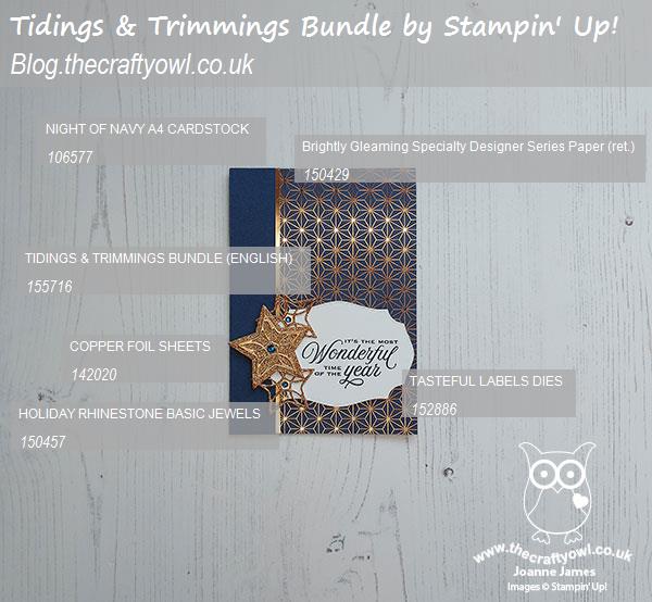
 

You can see all of my Product and 'How To' summaries on my 'How To - Tips and Techniques' Pinterest board in case you've missed any. 

Before you reach for your ink and papers, check out what our amazing team has created to inspire you this week:

Here's a quick recap of our challenge rules:
 
1.  Create a new paper project
2.  Upload your creation to your blog with a link back to us and provide a direct link to the post featuring your challenge submission.
3.  Please link your card to no more than four challenges, TOTAL.
4.  Have FUN!

You can see all of my 'How To' summaries on my 'How To - Tips and Techniques' Pinterest board in case you've missed any. 

Enjoy your day; I'll be back tomorrow with another project. Until then, happy stampin'!


Stampin' Up! Supplies Used: 

Table built using Product Table Builder by The Crafty Owl - Independent Stampin' Up! Demonstrator.

Black and White You're One in A Melon Cute Fruit

by Joanne James1. August 2020 20:00

Today I'm sharing a card that uses the current Colour Inkspiration challenge colour palette and the photo and sketch inspiration over at Fusion:

Image may contain: indoor, text that says "#82 CHAIALU CHALT Just Jade Melon Mambo Whisper White Basic Black"   

I spotted that cute little melon in the Fusion photo and immediately thought of the Colour Inkspiration colours and how combining the two could make a fun fruity card:


Here's the low-down on today's card:

Cute Fruit - I used my 'Cute Fruit' stamp set again to create my melon slices and stamped that fun punny sentiment in white on my horizontal black panel. I fussy cut the melon segments to allow them to be popped up on dimensionals.

#SimpleStamping - The 'Cute Fruit' stamp set features in the Stampin' Up! beginner's brochure and is great for those new to stamping. It makes easy one layer cards, but can also be easily 'stepped up' with some designer series paper and a little fussy cutting as I've done here. And everyone knows someone who is 'one in a melon', right?! 

A Little Extra Detail - I could have stopped there, but I found some retired raindrop epoxy shapes in my stash that I thought would be great to highlight the melon seeds. I coloured them black with my Blends marker and added them to the spaces outlined on the stamped image - I think the added shine and detail adds a nice extra little 'something':


If you don't have any of these in your stash you could always make some with a fine tip glue pen.

Here is the visual summary of the key products used on today's project for you to pin for easy reference:


You can see all of my 'How To' summaries on my 'How To - Tips and Techniques' Pinterest board in case you've missed any. 

Yesterday was a scorcher here in the UK and thankfully today was a little cooler so enabled me to run without flaking out in the heat first thing and then get a few gardening jobs done. It was even cool enough for me to spend a little time in my craft room! Following brunch, young Master James spent the day at the lake with one of his friends, waterskiing, jetski riding and bouncing on inflatables. He had a ball and will I'm sure sleep well tonight! I hope you have enjoyed your day and I'll be back tomorrow with my card for our new challenge at The Paper Players. Until then, happy stampin'!


Stampin' Up! Supplies Used:

Table built using Product Table Builder by The Crafty Owl - Independent Stampin' Up! Demonstrator.

Blue Flowers For Every Season AYSI 230

by Joanne James31. July 2020 12:00

Today I'm sharing my design team card for our new challenge over at As you See It where it's time for a sketch challenge:


I designed this week's sketch and decided to use some of the new in-colours and make a blue card - take a look:


 Here's the low-down on today's card:

Today's card features two different patterns from the Flowers For Every Season designer series paper stack. Some simple layering, a couple of co-ordinating floral embellishments from the Flowers For Every Season Memories and More pack and a simple heat-embossed sentiment from the 'Celebrate Sunflowers' set. And that's it - super simple! I must say, having seen the amazing cards from the rest of the team mine looks positively mediocre - they all came up with some fabulous takes on this week's sketch!

Here is the visual summary of the key products used on today's project for you to pin for easy reference:


You can see all of my 'How To' summaries on my 'How To - Tips and Techniques' Pinterest board in case you've missed any. 

 I'll be linking up with the team over at Inspire.Create as my card today features three of the 5 new in-colours: Misty Moonlight, Just Jade and Cinnamon Cider.

Here's a summary of our challenge rules:

  • Create any card, scrapbooking page, 3D project or packaging   project that fits the challenge.
  • Please include the challenge graphic and link back to the challenge in your blog post. Turn off word verification so we can leave you lots of lovely comments. Make sure you link the post not the whole blog to the Linky. Use #AYSIXXX when uploading to a public gallery.
  • If you’re unsure about ‘the rules’, check the details under the Challenge Guidelines tab on the As You See It Challenge homepage.
  • In a sketch challenge, you are welcome to rotate or flip a sketch. You can replace shapes used such as substituting a circle panel for a square panel. However, we must be able to still see the basis of the original sketch in your finished product.

We look forward to seeing your creations in the AYSI gallery.

Enjoy your day and I'll be back tomorrow with another project. Until then, happy stampin'!


Stampin' Up! Supplies Used:

Table to follow

Today's Plan: Consume Cocktails

by Joanne James30. July 2020 11:00

Today I'm just squeaking in my card for the current Fab Friday challenge, helped along by the sketch at Hand Stamped Sentiments:


I love these bold, bright colours, but they did cause me to procrastinate over how to use them to best effect! There are some lovely cards in the gallery that use them as accents against a primarily white background, which looks great. In the end I decided to go full-on colour and even add a little sparkle  - take a look:


Here's the low-down on today's card:

Anyone For Cocktails? - I decided to make another card using the 'Nothing's Better Than' stamp set and co-ordinating dies and featuring a colourful cocktail. These tropical colours reminded me of those fabulous rainbow-ombre type cocktails that you get that have red in the bottom, rising through orange to yellow and I wanted to recreate that on my card. It's really easy to do: just ink your stamp in yellow, then with a sponge dauber add orange and then lastly red to the bottom of the stamp respectively before stamping to achieve an easy ombre effect.

Ombre Sparkle - I cut into my Rainbow Glimmer Paper to create a fun, sparkly orange/yellow ombre diecut to mimic the colours and effect of my cocktail. I also added some clear WInk of Stella to my cocktail glass too for a little added shimmer - check it out here:


Stitched Rectangles Windows - Instead of adding mats to the top of my card as per the HSS sketch, I decided to get creative with my Rectangle Stitched Dies and create a custom aperture in my Bermuda Bay card base, then added some in-colour DSP in Bermuda Bay featuring the circle design, to echo my feature circle, behind.

Here is the visual summary of the key products used on today's project for you to pin for easy reference:

You can see all of my 'How To' summaries on my 'How To - Tips and Techniques' Pinterest board in case you've missed any. 

I was supposed to post this card yesterday but my day just seemed to run away with me - do you ever have days like that? I've just finished a fun online demonstration session this morning so wanted to squeeze this in before cracking on with the rest of today's activities, which unfortunately do not include consuming cocktails!! Ah well, never mind. Enjoy your day and I'll be back tomorrow with another project. Until then, happy stampin'!


Stampin' Up! Supplies Used:

To follow.


Dove Of Peace One Layer Christmas Card

by Joanne James28. July 2020 18:00

Today I'm sharing a card that I made at the weekend still with a 'Christmas In July' theme going on (desperately trying to get into Christmas crafting!) that is for a few current challenges:


The lovely team at Less Is More are doing a one layer card Christmas in July theme and I chose one of my retired stamps, 'Dove Of Peace', which I thought would make a lovely image for Time Out's challenge to be 'Peaceful'. It also gave me an opportunity to get out my Stampin' Blends for a spot of colouring which is what the ladies over at SUO Challenges are all about this week:


I coloured the detail on my dove with a combination of Bermuda Bay, (retired) Coastal Cabana and Pool Party Blends. I then took a dry aquapainter (the new fine one is perfect for this) and painted the remainder of the body of the dove in white shimmer paint. This was quite time consuming, but so worth it; the photo really doesn't do it justice - it has such a soft shimmer in real life. I think I'll make a few more of these in alternative colourways - they will be great for sending to my overseas friends. 

This is one of my favourite retired Christmas stamps and great for one layer cards; do you have a favourite stamp for one layer creations? Do leave me a comment and let me know - I'd love to hear about your favourite Christmas sets, old or new.

Here is the visual summary of the key products used on today's project for you to pin for easy reference:


You can see all of my 'How To' summaries on my 'How To - Tips and Techniques' Pinterest board in case you've missed any. 

Enjoy your evening and I'll be back tomorrow with another project. Until then, happy stampin'!


Friendly Silhouettes Palm Beach Sunset

by Joanne James28. July 2020 10:00

As the winds howl and the storm clouds threaten here today in the UK for the second day running, I'm here with thoughts of sunnier days and tropical vacations for today's card! My card was inspired by the following challenges:


That fabulous surfboard in the Inspired By photo is so eye-catching that it totally got me thing of tropical summer beaches and sunsets, so armed with the Inspired by sketch too and the Festive Friday inspo list (I used pink, circles, diecut and summer fun from the inspo list) - I created my dream summer landscape - take a look:


Here's the low-down on today's card:

Friendly Silhouettes - The palm tree dies form the Friendly Silhouettes dies gave me the perfect palm tree pair for my card. These are actually the negative space of the die, so I carefully kept the diecut and used it as a template to piece my palm branches into the correct place to make my scene.

Artistry Blooms - I decided to reach for my designer series papers for my sunset and chose one of the patterns from the Artistry Blooms stamp set. I chose my piece carefully and I can't quite believe how much like a sunset it looks; just what I had in mind and so much easier than creating one with a brayer! 

A Little Added Sparkle - After adding my sentiment to a couple of layered punched circles and popping it up on a dimensional, I looked at my card and felt like it needed a little something more. I reached for a few pots of sequins and carefully went through and chose a few in co-ordinating pinks and oranges and added them randomly across my card, for a little tone-on-tone sparkle. I love the finished result - you can see it better here:

Here is the visual summary of the key products used on today's project for you to pin for easy reference:


You can see all of my 'How To' summaries on my 'How To - Tips and Techniques' Pinterest board in case you've missed any. 

Enjoy your day. We have a day of tasks and errands today, nothing too exciting. I'll be back tomorrow with another project. Until then, happy stampin'!


Stampin' Up! Supplies Used:

Table built using Product Table Builder by The Crafty Owl - Independent Stampin' Up! Demonstrator.

Sweet Silhouettes Go In The Direction Of Your Dreams

by Joanne James27. July 2020 07:00

Happy Monday everyone! It's the start of a new week and I am here with a card using some 'oldie but goodie' products from the annual catalogue for a couple of challenges:

Tic-Tac-Toe Challenge   

I went down the centre of The Paper Craft Crew's TicTacToe board - watercolour background, favourite colour (Melon Mambo Pink), Anything But Floral - and whilst I don't have any fairground-related stamps, was totally inspired by those pink swings in the Just Us Girls photo - take a look:


Here's the low-down on today's card:

Sweet Silhouettes - I diecut a tree using my Sweet Silhouettes Dies for the uppermost layer on my card and cut it first so that I could check my positioning even though I added it last. I snipped a small branch off the left hand side in order to enable my card to still fit in a standard envelope when complete.

In The Pink - Melon Mambo is one of my favourite pink colours and I thought it would be the perfect colour for a feminine, watercoloured background behind my swinging girl. I also added a touch of Magenta Madness to the top of the panel to emphasise the ombre effect of my panel and used a Melon Mambo card base. Once my watercoloured panel was dry, I spritzed it liberally with shimmer spray; it's difficult to see on the main photo but give this card such a beautiful lustre - you can see it a little better on the image below:


Silhouette Scenes - To compliment my pink background, I used my Stamparatus to add a well-inked stamp of the young girl on her swing. I stamped it a few times to get a good solid image; the slight flecking is due to the texture of the watercolour paper which prevents a truly solid print being achieved. I also stamped a suitable sentiment from the same set below and added a few sequins to further compliment the pink.

This card is heading to a valued member of my team who is constantly striving and reaching for bigger and better things - I hope she likes it!

Here is the visual summary of the key products used on today's project for you to pin for easy reference:


You can see all of my 'How To' summaries on my 'How To - Tips and Techniques' Pinterest board in case you've missed any. 

Enjoy your day; I have an online class today amongst other things so today will be a busy one! I'll be back tomorrow with another project. Until then, happy stampin'!


Stampin' Up! Supplies Used:

Table built using Product Table Builder by The Crafty Owl - Independent Stampin' Up! Demonstrator.

Tags: , , , , ,

Cards | Shop Online | Shop Stampin' Up! Online | Stamping

Gift Wrapped Meets Trimming The Town Sneak Peek

by Joanne James26. July 2020 15:00

There are lots of Christmas In July challenges about at the moment so I thought I would combine a couple and squeeze in an extra post today and share a couple of sneak peeks from the upcoming Autumn-Winter Catalogue with you in the process:


The team over at The Spot are looking for any kind of Christmas card creation and The Card Concept has a great inspiration photo that lead me to take my inspiration from one of the presents under the tree (front row, second from the right) to create a card and a matching gift card holder using some fun new products - take a look:


Here's the low-down on today's card firstly:

Trimming The Town - The designer series paper that covers the front of my card is from a new pack called 'Trimming The Town' - a pack full of contemporary designs featuring cosy villages and winter scenes. Some are really large and some really small and detailed, like the fun design I used to mimic wrapping paper on my gift parcel card.

Gift Wrapped Bow (And A Trick) - My bow comes from a new stamp set called 'Gift Wrapped' and is stamped in Real Red on Whisper White cardstock and punched out with the new co-ordinating Gift Bow Builder Punch. I added a handcut tag and some 'ribbon' too - and therein lies the trick! I actually used a current DSP for the ribbon strips that co-ordinate with my bow; can you tell which one? It's actually the reverse of one of the patterns in the Playful Pets DSP pack - isn't that a great shortcut? I added a little more stamping on the inside of my card too:


Gift Card Holder - I thought my gift-inspired card would be great to go with a co-ordinating gift-card holder too - I always need a few of these at Christmas time:

I can't take the credit for the design; it's based on one designed by the talented Erica Cerwin of Pink Buckaroo Designs (you can see the measurements for her original project on her blog here). It's a great little make, where the lid pulls out of a sleeve and you can add a message and your chosen gift card:

I think these make a cute pair of projects and are a great start to my Christmas crafting. I'm slowly but surely increasing my Christmas crafting - it always seems harder to do when the sun is shining outside though!

Here is the visual summary of the key products used on today's project for you to pin for easy reference:


You can see all of my 'How To' summaries on my 'How To - Tips and Techniques' Pinterest board in case you've missed any. 

Enjoy your day and I'll be back tomorrow with another project. Until then, happy stampin'!


Stampin' Up! Supplies Used:

To be updated 4th August.

Whale of A Time Turtles Galore PP501

by Joanne James26. July 2020 09:00

Today it's Sunday and time for this week's new challenge over at The Paper Players! It's the turn of the wonderful Anne Marie to host and this week it's my favourite, a sketch challenge:


I deliberated over this week's sketch then decided to go with an idea that I had been mulling over - take a look at my finished card:


Here's the low-down on today's card:

Whale of A Time - My whole card this week was based on a couple of my favourite patterns in the Whale Of A Time DSP pack. There are some amazing patterns in this pack but the ones featuring the turtles stole my heart the minute I set eyes upon them! I have had so many special encounters with turtles when scuba diving that these graceful sea creatures will always be special to me. I could happily never have cut these papers, but when I saw Anne Marie's sketch this week I saw a way to use these patterns in a fun way. I used the piece with the small turtles swimming on the current for my base, then added a section featuring the larger turtles for the central section. I wanted it to appear almost as if the turtles on the central panel were a magnified version of the turtles behind. Furthermore, I was careful to choose which piece to cut for my central panel; doesn't that green turtle in the centre appear to be looking at you head on? Here's a close-up so you can see what I mean:

Flip The Sketch - It was the diagonal on the sketch that made me think of the paper design featuring the turtles travelling on the current, but they weren't swimming in the right direction. To solve the issue, I flipped the sketch along the vertical edge and inverted all of the elements. I also made the central rectangle smaller and borderless (I didn't want to obscure the diagonal of turtles too much) and my sentiment banner slightly longer to accommodate my chosen sentiment. My interpretation of the sketch is less literal this week, however you can still clearly see all of the elements.

It's Not All About The Paper - Whilst the front of my card most definitely focuses on my chosen papers, this card is not all about the paper! I added some stamping to the corner of my envelope and added this cute punny sentiment inside along with some colourful shoals of fish to complete my card:

Whilst at first glance my card may appear simple, it actually took a lot of thought to bring my ideas to fruition. So what do you think? Do you like the end result? Do leave me a comment below - I would love to hear your thoughts!

Here is the visual summary of the key products used on today's project for you to pin for easy reference:


You can see all of my Product and 'How To' summaries on my 'How To - Tips and Techniques' Pinterest board in case you've missed any. 

Before you reach for your ink and papers, check out what our amazing team has created to inspire you this week:

Here's a quick recap of our challenge rules:
 
1.  Create a new paper project
2.  Upload your creation to your blog with a link back to us and provide a direct link to the post featuring your challenge submission.
3.  Please link your card to no more than four challenges, TOTAL.
4.  Have FUN!

You can see all of my 'How To' summaries on my 'How To - Tips and Techniques' Pinterest board in case you've missed any. 

Enjoy your day; we are hoping to dodge the thunderstorms and go cycling today as well as do some baking amongst other things. I'll be back tomorrow with another project. Until then, happy stampin'!


Stampin' Up! Supplies Used: 

Table built using Product Table Builder by The Crafty Owl - Independent Stampin' Up! Demonstrator.

New Online Exclusives

There are new products available exclusively in the online store from 5 November - check them out here.

Latest Kits!

Stampin Cut and Emboss

The Layered Landscapes Kit and Nature's Paintings Kit are the latest kits in the online store - get yours here!

Shop Online

Access my online shop 24 x 7, 365 days of the year:

Current November hostess code:

9NKXDTTR

Shop Online

Mini Catalogue

BROWSE THE CATALOGUE

'Tis The Season - the new Stampin' Up! Mini Catalogue is here! For more details and to download your copy click here

Scrapbooking

Stampin' Up! has introduced a new range of 12x12" scrapbooking product and kit - the full range is now available to purchase online. To download a copy of the new digital Scrapbooking Catalogue click here.

2024-25 Annual Catalogue

BROWSE THE CATALOGUE

Click on the image to download your copy of the 2024-25 annual catalogue. For a full list of current SU! supplies, go to my online store. If you would like any help or advice, please drop me a line at joanne@thecraftyowl.co.uk or give me a call on 07773 421446 - I'd be happy to help.

Join My Team

It's always a great time to join Stampin’ Up! New team members can get £130 worth of products for only £99 + free business supplies + free shipping + all the fun being a part of Stampin’ Up! Stampin' Up! has something for everyone: join my growing team and benefit from my support to enjoy Stampin' Up! however you choose.

If you're interested, call me for a chat to understand how I can help you realise your goals. Alternatively, if you have already decided to sign up and you just can't wait, please click here for the link to the online form where you can sign up and order your starter kit right away! 

About Me

Hi I'm Joanne and live in Northampton and when I'm not looking after my husband and two beautiful children, am an avid crafter with a passion for all things Stampin' Up!

I must confess that I have never been a big rubber stamper - until I discovered Stampin' Up! that is. I love the fact that I can get such great results with co-ordinating stamps, inks, papers and punches - the possibilities are endless! Join me on my stamping journey as I share the things I love and be inspired to create amazing things yourself!

Follow Me

Monthly Newsletter

Box Builder

Click the button above to use Box Buster to create your custom box design using the Envelope Punch Board!

Kits Collection Now Available!

Stampin Cut and Emboss

The new Kits Collection from Stampin' Up! is now available!

Click here to see the current kits available and order yours online today.

I Design For


Stampin' Up Stuff

This is my personal blog and is not endorsed by Stampin’ Up! I hope you find it a plentiful source of ideas and personal inspiration but please don't copy my designs for contest submission or use for classes, publication or sale without express permission.