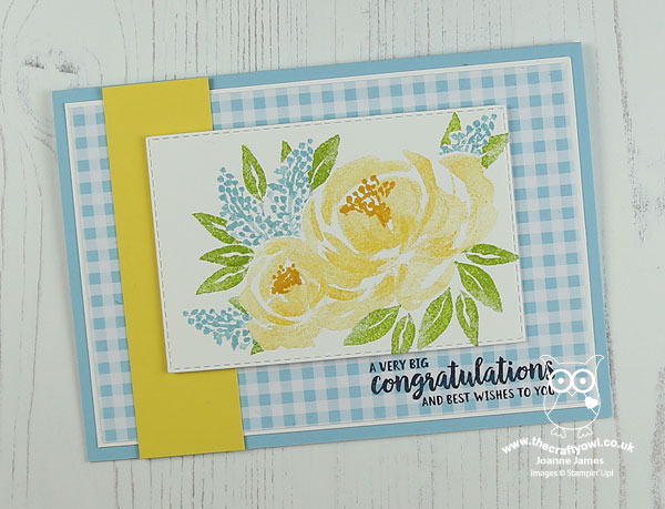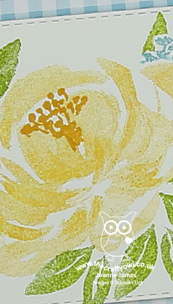
Time For Last Orders!

by Joanne James31. May 2018 09:50

Public service announcements first today - bear with me, there will be a creative post to follow for those that are here for the pretty stuff! It's sharing lots of new product too, so you're going to want to stay tuned!

Counting down now - only 1 day to go until the new 2018-19 Annual Stampin' Up! catalogue launches!


I have already sent out copies to everyone on my catalogue mailing list who has purchased from me in the last 6 months - if you haven't received one, then do give me a call on 07773 421446 or drop me an email and I will pop one in the post to you today.

This also means the following: 

Today is the last day that you can order from the 2017-18 Stampin' Up! catalogue - this includes any of the 'Bundle and Save 10%' bundles. Even though many of the products they contain are being carried over to the new annual catalogue, they will not be available as a discounted bundle.

It is also the last day that you can order from the 2018 Spring-Summer Seasonal Stampin' Up! catalogue - a number of the products in this brochure are being carried over to the new annual catalogue, however we will be saying goodbye to many items. There are still a few items available at a discount on the Retiring List here - today is your last chance to grab a bargain! 

Today is also the final day to purchase any of the special Share What You Love Suite bundles. You can read more about these fabulous bundles in my blog post here which also contains the link to the store should you wish to purchase any of the bundles. Whilst all of the items contained in each bundle will be available to purchase individually once the new annual catalogue launches, the bundles along with the free gifts won't. So if you what to start Sharing What You Love, get yours today!

If you are placing an order online today, don't forget to use this month's online hostess code T3H6GHNT to receive a little thank you from me. 

I will be back shortly with today's creative post - it's so good, it deserves a post all of its very own, so be sure to check it out!


Share What You Love Lovely Floral Embossed Card

by Joanne James30. May 2018 20:00

It's half term here so I'm feeling stretched again this week, hence no blog post yesterday. I was also sending out my new annual catalogues to everyone who has ordered from me in the last 6 months so that they will be with you in time for when the catalogue goes live on Friday - can't wait! If you haven't ordered from me in the last 6 months and don't already have a Stampin' Up! demonstrator but would like to receive a catalogue, then send me your details to joanne@thecraftyowl.co.uk and I will arrange to post one out to you.

Today I'm sharing one of my favourite cards made with some of the products in the fabulous Share What You Love Suite that has been on early release this month - take a look:


Here's the low-down on today's card:

Lovely Floral - Dynamic Indeed - You all know how much I love designer series paper and the papers in this suite are no exception, however for today's card I wanted to showcase the fabulous Lovely Floral Textured Impressions Embossing Folder and needed it to take centre stage, without a paper pattern to distract from it. The embossed detail is just gorgeous - I think this folder may move into my top 3! Whether on its own or tucked behind some additional layers as on my card today, it makes a card all on its own. I think it would make a fabulous design for wedding stationery too and so easy to mass produce.

Embellish With Love - I also used a number of the accessories from the Share What You Love Embellishment Kit: the label, twine and metallic rose brought my card together really quickly. Add some of the velvet ribbon, some coloured pearls and a sliver of pearl doily and it steps up the embossing folder to make for a quick card with lots of interest and detail.

A Beautiful Day - The only stamping is the simple layered floral and sentiment on my diecut piece - I stamped my petals in two different strengths by stamping off the outer petals first for added interest.

You have just one more day to take advantage of the Share What You Love Bundles, including free products and the exclusive 'Statement of My Heart' stamp set, before these items can be purchased individually in the new annual catalogue. This suite will also feature in one of my Monthly Product Technique Clasess in June - check out the details on my Facebook page or contact me if you would like to know more.

Here is the visual summary of the key products used on today's project for you to pin for easy reference:
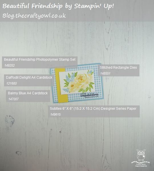
 

You can see all of my 'How To' summaries on my 'How To - Tips and Techniques' Pinterest board in case you've missed any. 

Enjoy your day and I'll be back tomorrow with another project. Until then, happy stampin'!


Stampin' Up! Supplies Used:

Table built using Product Table Builder by The Crafty Owl - Independent Stampin' Up! Demonstrator.

Beautiful Bouquet Goes Bananas For Customer Thank You Cards

by Joanne James28. May 2018 21:30

Happy Memorial Day to all my US readers! Today has been a Bank Holiday here in the UK too and despite the severe flash flooding of yesterday evening (I haven't sen rain like it!!), today the sun managed to come out again and this afternoon was warm once more, so I've been otherwise occupied today. I've just time for a quick share of some humorous 3"x3" customer thank you cards that I made recently using up some of my Tutti-Frutti designer series papers and a punny sentiment from Beautiful Bouquet:

I wasn't sure how I was going to use that banana patterned paper then suddenly thought of this sentiment from Beautiful Bouquet and thought  - well, why not?! I'm not sure I would thank someone with a bunch of bananas as opposed to a bunch of flowers, but it made me giggle - maybe I'll have to give it a try! 

Here's a selection of my cards together:


They all fit perfectly into a 3"x3" envelope and are just the right size for adding to the bagged orders for my face-to-face customers.

Here is the visual summary of the key products used on today's project for you to pin for easy reference:


You can see all of my 'How To' summaries on my 'How To - Tips and Techniques' Pinterest board in case you've missed any. 

I'll be back tomorrow with another project. Until then, happy stampin'!


Stampin' Up! Supplies Used:

Table built using Product Table Builder by The Crafty Owl - Independent Stampin' Up! Demonstrator.

Pink Abstract Impressions For The Paper Players PP395

by Joanne James27. May 2018 09:00

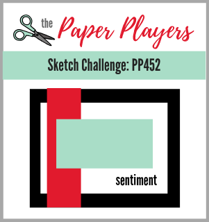
It's Sunday and time for this week's new challenge over at The Paper Players! It's the turn of my awesome friend LeAnne to host this week and she has my favourite, a sketch challenge, for you to work with:


I struggled a little with my card this week; I think too much time spent on admin and not enough crafting, coupled with new catalogue syndrome (so many new things to play with and a ton of things on their way out, sometimes it's hard to know where to start!) left me feeling a little stuck for inspiration. Eventually I decided to go pink and have a play with my stamps and papers from the new Garden Impressions Suite - take a look:


Here's the low-down on today's card:

Garden Impressions - The new Garden Impressions Suite is a collection of papers and images inspired by Impressionist art. The abstract florals and paper patterns are reminiscent of Monet's fabulous flowers and garden at Giverny, with broad brushstrokes and bold use of colour. I know this is going to be one of my favourite sets in the new catalogue.

Abstract Flowers - Having chosen the pink floral paper, I set about creating a single stamped abstract flower on a layered circle, stamping off the first layer and stamping layers two and three at full strength. These stamps are super-easy to line up and I just love the loose abstract effect. 

A Pink Pair - I used a combination of white and the two pinks in the designer series paper, melon Mambo and Powder Pink, as the colours for my card today - here they are if you would like to save them for your future inspiration:


Here is the visual summary of the key products used on today's project for you to pin for easy reference:


You can see all of my Product and 'How To' summaries on my 'How To - Tips and Techniques' Pinterest board in case you've missed any. 

I'm still not sure about this card - I added the ribbon as I felt it needed a little something, but I don't know if it works? Maybe it's just too pink?! I do love that sentiment though.

Before you reach for your ink and papers, check out what our amazing team has created to inspire you this week:

Here's a quick recap of our challenge rules:
 
1.  Create a new paper project
2.  Upload your creation to your blog with a link back to us and provide a direct link to the post featuring your challenge submission.
3.  Please link your card to no more than four challenges, TOTAL.
4.  Have FUN!

I can't wait to see what you create with this week's sketch and look forward to visiting your blogs this week! Enjoy the rest of your weekend - we have a Bank Holiday here in the UK so are looking forward to an extra day and hopefully some BBQ weather too. I'll be back tomorrow with another project; until then, happy stampin'!


Stampin' Up! Supplies Used: 

Table built using Product Table Builder by The Crafty Owl - Independent Stampin' Up! Demonstrator.

Statement of My Heart Home Decor Frame

by Joanne James24. May 2018 12:30

Today a quick post from me to share something a little different - a 3D framed home decor piece featuring the Statement of My Heart single stamp that is available exclusively this month with the 'Gotta Have It All' Bundle that forms part of the early release of the Share What You Love Suite. 

You can find full details of the bundles that are on offer in my previous blog post here - I was inspired to create this piece, which features the Stampin' Up! Statement of the Heart for my office, using the stamp and some of the fabulous Share What You Love Specialty Designer Series Paper:


I went for something of a vintage theme, stamping my words and then after sponging the edges of my white cardstock with some Crumb Cake ink, framing the verse with the oval piece of Delightfully Detailed Laser-cut Specialty Paper. I backed this piece with a sheet of the Share What You Love Specialty DSP, and to finish, I added some of the lovely pearlescent embossed flowers that I fussy cut from the DSP, some pearls and a little Rich Razzleberry velvet ribbon, before framing in a rather elaborate frame.

A little different in style for me, but so pretty and a great way to immortalise these wonderful words. If you would like to create a home decor piece like this one, you only have until the end of the month to purchase the bundle and receive this exclusive stamp set for free, so hop on over to the online store before it's gone for good.

Enjoy your day and I'll be back tomorrow with another project. Until then, happy stampin'!


Stampin' Up! Supplies Used:

Table built using Product Table Builder by The Crafty Owl - Independent Stampin' Up! Demonstrator.

A Petal Garden Note For You #GDP139

by Joanne James23. May 2018 07:30

Today I'm sharing a card that uses the sketch over at As You See It that I also created with the Global Design Project theme this week in mind:


I was intrigued by the sketch at AYSI and thought I'd go one step further than the lovely LeAnne's card and not only use up some of my retiring DSP, but use it to create a kind of relief pattern that added interest to my main image - take a look:


Here's the low-down on today's card:

Petal Garden - I had some sheets of Petal Garden DSP left over and most of them had a single stem image like the one on my card. I thought this sketch would be an alternative way to add interest to the basic paper pattern by adding dimensional panels in the same design. I really like the finished effect - although it did challenge my mathematical skills to ensure that all of the pieces were the correct size and correctly spaced, whilst the image remained aligned. For a card with very little stamping, the mosaic element was rather time-consuming - a good thing that I like jigsaws!

A Note For You - This card is all about the paper, so a small sentiment was the order of the day. I chose the simple 'For You' from the Graceful Garden stamp set, masking each word so that they would sit one on top of the other and fit into my 3/4" punched circle. I added a little of the new velvet ribbon beneath it.

When Is A Scalloped Circle Not A Scalloped Circle? - My sentiment needed a border so that it didn't get lost on my card, but I didn't have anything small enough to fit. Then I remembered a trick I have used on a previous card - I used the outer framelit of the wreath in the Santa's Sleigh Thinlits, circled below:


A clever trick! It's always worth checking your framelits to see if they can be used for purposes other than those intended :-)

I needed a 'just because' card and this one fits the bill nicely; it's always good to have a few of this type of card on hand. 

Here is the visual summary of the key products used on today's project for you to pin for easy reference:


You can see all of my 'How To' summaries on my 'How To - Tips and Techniques' Pinterest board in case you've missed any. 

Enjoy your day; I'm off to watch the cricket this afternoon so hoping that the sun continues to shine and it's a little less windy than last week! I'll be back tomorrow with another project. Until then, happy stampin'!


Stampin' Up! Supplies Used:

Table built using Product Table Builder by The Crafty Owl - Independent Stampin' Up! Demonstrator.

Hand Delivered Eclipse Birthday Wishes For A Discerning Teenager

by Joanne James22. May 2018 07:30

Today I'm sharing a card for the current challenge over at Just Add Ink where they are asking us to embrace the eclipse technique. I also used the sketch over at Fusion for my layout and it is perfect for the numbers and letters challenge over at Stamps Ink Paper too:


Firstly, a shout out to the lovely team over at Just Add Ink for choosing this card as the winner for challenge 407 - what an honour and I'm thrilled you liked my delicately different take on the Love What You Do stamp set. I was unable to play along with last week's colour challenge, but was keen to have another go at the eclipse technique this week with a birthday card for a discerning teenager - take a look:


Here's the low-down on today's card:

A Sneak Peak At Hand Delivered - I decided to give you a 'sneak peak' of a new stamp set today that is actually one of the exclusive hostess sets from the new Stampin' Up! annual catalogue. A fun set that has a selection of items being carried by a young lady, everything from balloons to cakes to message boards, with a variety of different skirt designs and sentiments that offer a ton of creative combinations for lots of different occasions. Best of all, it's photopolymer too, so aligning the pieces is super easy - bonus!

I think this will be one of my favourite hostess sets in the catalogue - I have so many cards in the pipeline for this one, you are definitely going to want to host a party so that you can get your hands on it too. It's worth pointing out I did make a slight modification to my stamped image on this card, in that in order to fully accommodate my numbers within the bouquet of balloons, I added a couple of extra balloons to left and right - this really wasn't tricky though, I simply masked the original image and then stamped again slightly offset on each side (the uppermost green and orange balloons on my card).  

Last Chance For Large Numbers - The eclipse technique is where a word or some element of design is 'hidden' within the broader design and built up in layers so that it stands out in relief and is therefore visible as part of the overall card. I made an eclipse card previously using my Large Letters Framelits - you can see that card here - so today decided to go with the Large Numbers Framelits as I needed a card for a friend of my daughter who becomes a teenager this week. Such a milestone birthday is worthy of a number, so I decided to 'hide' mine in the collection of balloons being carried to the birthday girl, stepped up on three layers of Berry Burst cardstock.

Oh how I will miss these numbers! I can't quite believe they are retiring and they will most definitely be a 'keeper' in my collection. Incredibly, they are still available but be warned - you only have until the end of the month to add them to your crafting arsenal if you would like them; one things for sure, they are a purchase you won't regret and will get loads of use from them. 

Picture Perfect Palette - I used the colours in the Picture Perfect DSP stack that featured in my vertical border as the palette for my card and simply coloured my image with my Stampin' Write Markers, adding a liberal dose of clear Wink of Stella to my balloons. Here is the colour swatch if you would like to save it for your future project inspiration:


Lastly, I finished the inside of my card with this sentiment from the Cake Soiree stamp set:


So what do you think? I'd love to hear your thoughts by leaving a comment below. Also, be sure to check out the Just Add Ink designers and gallery for lots more inspiration with the eclipse technique.

Here is the visual summary of the key products used on today's project for you to pin for easy reference:


You can see all of my 'How To' summaries on my 'How To - Tips and Techniques' Pinterest board in case you've missed any. 

Enjoy your day and I'll be back tomorrow with another project. Until then, happy stampin'!


Stampin' Up! Supplies Used:

Table built using Product Table Builder by The Crafty Owl - Independent Stampin' Up! Demonstrator.

Remarkable You CAS Sympathy Card

by Joanne James21. May 2018 07:30

Good morning and happy Monday everyone! I am up and about and blogging nice and early today as I have a busy day and evening so need to be organised! Today I'm sharing a card using this week's colour challenge over at CAS Colours and Sketches that would also be perfect for our current challenge over at The Paper Players too:


As I had the 'Remarkable You' stamp set out on my desk for the second of my cards yesterday, it struck me that the above colour combo was perfect for those lovely arum lilies so I set about making today's card - take a look:


Here's the low-down on today's card:

Making 'White Space' Blue - One of the principles of clean and simple design is to have plenty of 'white space' visible on your card. White space doesn't have to be white in colour though; in order for my design to work today, I wanted my white lilies to stand out and what better way than to place them against a bright blue Pacific Point coloured background? The blue plays a central role on my card with the other two colours adding just the merest hint of colour, whilst still allowing my card to feel CAS. 

Clean and Simple Paper Piecing - I stamped my lilies directly onto my card base and again onto Whisper White cardstock. I then fussy cut my white lilies, and after colouring the stems in Pear Pizzazz and adding some So Saffron highlights to my blooms with a blender pen, I paper-pieced them in place onto my card base. This is a great way to get all of the detail of the sketch-like outline whilst also ensuring the flowers stood out adequately against the blue background. A simple white embossed sentiment finishes the front of my card.

Words of Sympathy - These lilies make a beautiful sympathy card; one of my go-to sentiment sets for this type of card is 'Flourishing Phrases' -  this set has some wonderful and thoughtful sentiments, and no more so than for those sometimes tricky cards where words are never really enough. Here's the inside of my card - I love how the words fit with the shape of the flowers too:


I always find sympathy cards difficult to make to order so like to have a few on standby for when the need arises. I particularly like to use colour on my sympathy cards too, so this one definitely ticks all the boxes for me and will head to my card box for future use.

Here is the visual summary of the key products used on today's project for you to pin for easy reference:


You can see all of my 'How To' summaries on my 'How To - Tips and Techniques' Pinterest board in case you've missed any. 

Enjoy your day and I'll be back tomorrow with another project. Until then, happy stampin'!


Stampin' Up! Supplies Used:

Table built using Product Table Builder by The Crafty Owl - Independent Stampin' Up! Demonstrator.

Farewell Definitely Dahlia, Hello Pineapple Punch PP394

by Joanne James20. May 2018 09:00

It's Sunday and time for this week's new challenge over at The Paper Players! I'm back following my week off and raring to go. It's the turn of the wonderful Laurie to host this week and she has a clean and simple challenge for you to work with:


Remember in addition to the theme of "blooms", this week is a Clean-and-Simple (CAS) challenge!  What do we mean by CAS?

  • Minimal layers and embellishments
  • Plenty of open space, aka "white" space
  • Simple and uncluttered

I have a couple of cards of cards to share with you today (and another tomorrow!) that fit this week's theme. I decided to use the retiring 'Definitely Dahlia' stamp for my cards today, and was very much inspired by our badge this week created by the oh-so-talented Nance. Here's my single clean and simple bloom:


Here's the low-down on today's card:

Farewell Definitely Dahlia - I will miss the 'Definitely Dahlia' background stamp, as it is so great for CAS cards. Whether you simply stamp 'as is' (see my uber-CAS card below) or do as I have here, where I inked with two colours to create a two-tone effect, this is a stamp that needs little else for a clean and simple card - the stamp really does much of the work.

Hello Pineapple Punch - I used one of the new in-colours, Pineapple Punch, to create the base layer of colour for my dahlia, stamping off once before adding some Melon Mambo pink with a sponge dauber to the petal edges to create a pretty two-tone effect. This adds a little more depth and interest to the final stamped image. I really like the new in-colours this year - they work so well as a collection and compliment many of the other colours in our palette.

Amazing You - I finished my card with a stamped and diecut sentiment from the 'Celebrate You' thinlits set - can't wait for these to become available in the new catalogue, you know how much I love a diecut thinlit :-) 

Here is the visual summary of the key products used on today's project for you to pin for easy reference:


You can see all of my Product and 'How To' summaries on my 'How To - Tips and Techniques' Pinterest board in case you've missed any. 

Before I go, here's another version of the same card, this time super clean-and-simple in style, that I made for the current mix it up challenge over at Sugar Pea Designs, using both sketch and photo inspiration:

Whilst I didn't choose a rose for my flower, I did go with the pale pink and a single bloom, and I used the sketch. Here's my card:


I simply stamped my dahlia in retiring Pink Pirouette ink, stamping off once to get a pale flower, heat embossed my sentiment from another retiring stamp set, Remarkable You, in silver and mounted on a Pink Pirouette card base. 

Here is the visual summary of the key products used on today's project for you to pin for easy reference:

Before you reach for your ink and papers, check out what our amazing team has created to inspire you this week:

Here's a quick recap of our challenge rules:
 
1.  Create a new paper project
2.  Upload your creation to your blog with a link back to us and provide a direct link to the post featuring your challenge submission.
3.  Please link your card to no more than four challenges, TOTAL.
4.  Have FUN!
 
I can't wait to see your clean and simple creations and look forward to visiting your blogs this week! Enjoy the rest of your weekend - it looks like we are going to enjoy another day of sunshine here in the UK so I will be looking forward to spending some time in my garden, amongst other things. I'll be back tomorrow with another project; until then, happy stampin'!


Stampin' Up! Supplies Used: 

Table built using Product Table Builder by The Crafty Owl - Independent Stampin' Up! Demonstrator.

Wedding Invites Made Easy - All It Takes Is A Little Planning!

by Joanne James19. May 2018 18:00


Good evening everyone! Well, today has been a special day here in the UK - we celebrated the royal wedding of HRH Prince Harry and Meghan Markle. Whilst I'm not a devoted Royal watcher, I do think the Monarchy has an important role to play and one thing's for sure: I love a wedding, royal or otherwise! I enjoyed watching the wedding from my office as I was crafting this morning and ooh'ed and ahh'ed at the flowers, the dresses and those adorable and so well-behaved bridesmaids and page boys. Such a glorious day for it too and the bride was truly stunning.

Since weddings are the order of the day, I thought it would make a great topic for today's blog post too so I'm sharing with you the invites I designed recently for a bride who was keen to create her own stationery for the big day.

Making your own wedding stationery is a great way to create something individual and personal to you - take a look at the design we agreed upon:


The key things to remember when designing your own wedding stationery are as follows:

Make It Your Own - When you make your own wedding stationery, you are able to create something unique and personal to you in a way that off-the-shelf invitations will never be able to deliver. You can choose colours that co-ordinate with your scheme for the day and flowers or emblems that tie in with your chosen theme. For this wedding, the bride was keen to incorporate pale pink, but otherwise had no fixed views on design. This is one of the things I love about being a Stampin' Up! demonstrator - I love to design cards and projects, so working to a bride-to-be's brief is always an exciting prospect. It's great for the bride too - often they are keen to make their own stationery but have never done this (or sometimes any papercrafting) before, so they are keen to work with someone who can take their ideas and make them into a workable, reproductable, design. 

Keep It Simple - The key to good wedding stationery design is to keep it simple. Sometimes you may only have to make 20 invitations, but sometimes it is 120! For any kind of mass production, it's important to have a design that can be easily reproduced many times, each time as good as the last, so keeping it simple is key. For this invitation, we used the Detailed Floral Thinlits to create a gatefold-style card, with a Powder Pink Fresh Florals Designer Series Paper insert that was adhered on one side. When opened, the invitation wording was then on the inside.

Finishing Touches - Whilst the design is simple and easy to reproduce, the finishing touches are all-important to add that of luxury: the outer gatefold was cut from Shimmery White cardstock, with the addition of Powder Pink Shimmer Ribbon to create the tied closure that co-ordinates with the DSP lining. We also added a small round punched tag, with the words 'Mr & Mrs' from the 'Beautiful Bouquet' set stamped on it in pink, using a length of silver thread.  

These invitations were really not too tricky at all to make, armed with the right tools and a few pairs of hands. The most important thing to consider when making your own wedding stationery is to plan ahead - don't underestimate the time it takes to mass produce invitations and other stationery items and be sure to allow enough time to actually put it all together. This is the perfect activity to involve friends and bridesmaids in - after all, many hands make light work!

Here is the visual summary of the key products used on today's project for you to pin for easy reference:


You can see all of my 'How To' summaries on my 'How To - Tips and Techniques' Pinterest board in case you've missed any. 

If you are reading this and thinking you would like some help in designing your own wedding invitations, please don't hesitate to get in touch - I'd love to discuss your requirements and help you create the unique, bespoke stationery of your dreams.

Enjoy your day and I'll be back tomorrow with another project. Until then, happy stampin'!


Stampin' Up! Supplies Used:


Table built using Product Table Builder by The Crafty Owl - Independent Stampin' Up! Demonstrator.

New Online Exclusives

There are new products available exclusively in the online store from 5 November - check them out here.

Latest Kits!

Stampin Cut and Emboss

The Layered Landscapes Kit and Nature's Paintings Kit are the latest kits in the online store - get yours here!

Shop Online

Access my online shop 24 x 7, 365 days of the year:

Current November hostess code:

9NKXDTTR

Shop Online

Mini Catalogue

BROWSE THE CATALOGUE

'Tis The Season - the new Stampin' Up! Mini Catalogue is here! For more details and to download your copy click here

Scrapbooking

Stampin' Up! has introduced a new range of 12x12" scrapbooking product and kit - the full range is now available to purchase online. To download a copy of the new digital Scrapbooking Catalogue click here.

2024-25 Annual Catalogue

BROWSE THE CATALOGUE

Click on the image to download your copy of the 2024-25 annual catalogue. For a full list of current SU! supplies, go to my online store. If you would like any help or advice, please drop me a line at joanne@thecraftyowl.co.uk or give me a call on 07773 421446 - I'd be happy to help.

Join My Team

It's always a great time to join Stampin’ Up! New team members can get £130 worth of products for only £99 + free business supplies + free shipping + all the fun being a part of Stampin’ Up! Stampin' Up! has something for everyone: join my growing team and benefit from my support to enjoy Stampin' Up! however you choose.

If you're interested, call me for a chat to understand how I can help you realise your goals. Alternatively, if you have already decided to sign up and you just can't wait, please click here for the link to the online form where you can sign up and order your starter kit right away! 

About Me

Hi I'm Joanne and live in Northampton and when I'm not looking after my husband and two beautiful children, am an avid crafter with a passion for all things Stampin' Up!

I must confess that I have never been a big rubber stamper - until I discovered Stampin' Up! that is. I love the fact that I can get such great results with co-ordinating stamps, inks, papers and punches - the possibilities are endless! Join me on my stamping journey as I share the things I love and be inspired to create amazing things yourself!

Follow Me

Monthly Newsletter

Box Builder

Click the button above to use Box Buster to create your custom box design using the Envelope Punch Board!

Kits Collection Now Available!

Stampin Cut and Emboss

The new Kits Collection from Stampin' Up! is now available!

Click here to see the current kits available and order yours online today.

I Design For


Stampin' Up Stuff

This is my personal blog and is not endorsed by Stampin’ Up! I hope you find it a plentiful source of ideas and personal inspiration but please don't copy my designs for contest submission or use for classes, publication or sale without express permission.