Whale of A Time Turtles Galore PP501

by Joanne James26. July 2020 09:00

Today it's Sunday and time for this week's new challenge over at The Paper Players! It's the turn of the wonderful Anne Marie to host and this week it's my favourite, a sketch challenge:


I deliberated over this week's sketch then decided to go with an idea that I had been mulling over - take a look at my finished card:


Here's the low-down on today's card:

Whale of A Time - My whole card this week was based on a couple of my favourite patterns in the Whale Of A Time DSP pack. There are some amazing patterns in this pack but the ones featuring the turtles stole my heart the minute I set eyes upon them! I have had so many special encounters with turtles when scuba diving that these graceful sea creatures will always be special to me. I could happily never have cut these papers, but when I saw Anne Marie's sketch this week I saw a way to use these patterns in a fun way. I used the piece with the small turtles swimming on the current for my base, then added a section featuring the larger turtles for the central section. I wanted it to appear almost as if the turtles on the central panel were a magnified version of the turtles behind. Furthermore, I was careful to choose which piece to cut for my central panel; doesn't that green turtle in the centre appear to be looking at you head on? Here's a close-up so you can see what I mean:

Flip The Sketch - It was the diagonal on the sketch that made me think of the paper design featuring the turtles travelling on the current, but they weren't swimming in the right direction. To solve the issue, I flipped the sketch along the vertical edge and inverted all of the elements. I also made the central rectangle smaller and borderless (I didn't want to obscure the diagonal of turtles too much) and my sentiment banner slightly longer to accommodate my chosen sentiment. My interpretation of the sketch is less literal this week, however you can still clearly see all of the elements.

It's Not All About The Paper - Whilst the front of my card most definitely focuses on my chosen papers, this card is not all about the paper! I added some stamping to the corner of my envelope and added this cute punny sentiment inside along with some colourful shoals of fish to complete my card:

Whilst at first glance my card may appear simple, it actually took a lot of thought to bring my ideas to fruition. So what do you think? Do you like the end result? Do leave me a comment below - I would love to hear your thoughts!

Here is the visual summary of the key products used on today's project for you to pin for easy reference:


You can see all of my Product and 'How To' summaries on my 'How To - Tips and Techniques' Pinterest board in case you've missed any. 

Before you reach for your ink and papers, check out what our amazing team has created to inspire you this week:

Here's a quick recap of our challenge rules:
 
1.  Create a new paper project
2.  Upload your creation to your blog with a link back to us and provide a direct link to the post featuring your challenge submission.
3.  Please link your card to no more than four challenges, TOTAL.
4.  Have FUN!

You can see all of my 'How To' summaries on my 'How To - Tips and Techniques' Pinterest board in case you've missed any. 

Enjoy your day; we are hoping to dodge the thunderstorms and go cycling today as well as do some baking amongst other things. I'll be back tomorrow with another project. Until then, happy stampin'!


Stampin' Up! Supplies Used: 

Table built using Product Table Builder by The Crafty Owl - Independent Stampin' Up! Demonstrator.

Cute Fruit with Oranges, Lemons and Limes

by Joanne James24. July 2020 20:56

I had some new goodies arrive yesterday and finally got some time to play this afternoon so I'm just popping by to share a quick card that I made for this week's Freshly Made Sketches challenge with the current colour palette over at Color Throwdown:


I was intrigued by those circles on Jen's sketch and I had an idea that I thought might work with one of my new stamp sets - take a look:


Here's the low-down on today's card:

Cute Fruit - The 'Cute Fruit' stamp set is so fun! The set includes lots of different fruit and in addition to the fruit and some great punny sentiments, there are also a selection of cute faces - I mean, what's better than a banana? Well, a banana with a face of course!! I haven't used the faces on today's card, but rest assured they will make an appearance at some point.  

Let's Talk Sketch - I was musing over how to represent those little circles when it occurred to me they could be slices of oranges, lemons and limes. I decided to try out my idea, but this necessitated me altering my card base to a horizontal rather than vertical one, to allow me to scale my fruit accordingly and still keep the elements of the sketch in proportion. You can still see the sketch layout though and how it inspired my card. I would never have thought about using this set in this way so the sketch was a great way to stretch my creative thinking. 

Citrus Sparkle - I stamped each of my small citrus slices in Granny Apple Green and retired Pineapple Punch and Grapefruit Grove and punched them out with my retired 1" punch. I decided to create a large orange slice for the larger circle in the sketch and did this by layering some circles of cardstock and adding some segments cut from retired glimmer paper that I coloured orange with some ink and a sponge dauber for some extra sparkle which you can see better on the photo below:

I added some clear Wink of Stella to my stamped citrus slices too for some added lustre and my card was complete. So what do you think of today's citrus-y card? Does it work for you? Do leave me a comment - I'd love to hear your thoughts.

Here is the visual summary of the key products used on today's project for you to pin for easy reference:


You can see all of my 'How To' summaries on my 'How To - Tips and Techniques' Pinterest board in case you've missed any. 

Enjoy your evening and I'll be back tomorrow with another project. Until then, happy stampin'!


Stampin' Up! Supplies Used:

Table built using Product Table Builder by The Crafty Owl - Independent Stampin' Up! Demonstrator.

A Mountain Air Adventure Times Two TTT 74

by Joanne James23. July 2020 18:00

It's Thursday and time for a new challenge over at TicTacToe! It's the turn of Team X to host this week and I am the featured designer. This is the fun board that we are playing along with: 


I decided to go long and skinny with today's card and went both across the first row - mountain/sunshine/adventure - and down the first column - mountain/hot air balloon/pink and create a summer evening landscape - take a look:


Here's the low-down on today's card:

Brayered Sunset - I started by taking a selection of inks and a sponge brayer to create my sunset sky. I masked a space for my sun and after stamping in my mountains reverse-masked the mountains and sky and sponged in my dark pink setting sun.

Mountain Air - I used the mountains from the 'Mountain Air' stamp set to create my mountain landscape. This is an interesting set of reversible stamps that I initially bought for scrapbooking as you can make great scenes with them, but they also work for cards and especially the 'long and skinny' design that is all the rage currently. I created depth by stamping off and only adding the detailing to the foremost layer. I used a combination of blues to create a silhouette-type feel and stamped in a trio of hot air balloons from the retired 'Above The Clouds' stamp set in blue too to add to the effect.

Sweet Silhouette Adventure - I added a diecut 'adventure' from the Sweet Silhouettes Dies set to the front of my card as it seemed to fit with my scene. This would be a great card to send to someone about to embark on a gap year who is planning to travel; I'm not sure there are any teens able to do this currently, so will have to add this to my box for the future when we can all move more freely again. In the meantime, we can but dream of adventures far and wide!

I actually created a couple of brayered backgrounds whilst I was getting inky, so here's a second, slightly smaller card with the same design and a more pink sky:

Finally here's both of my cards together - which one do you prefer?

Here is the visual summary of the key products used on today's project for you to pin for easy reference:


You can see all of my Product and 'How To' summaries on my 'How To - Tips and Techniques' Pinterest board in case you've missed any. 

A tictactoe board offers so many creative possibilities - how does this week's board inspire you? Why not have a go? We would love to see you in the gallery and who knows - you might be selected for Designer's Choice and be eligible to be a guest designer on a future challenge. 

Enjoy your evening; I'll be back tomorrow with another project. Until then, happy stampin'!


Stampin' Up! Supplies Used: 

Table built using Product Table Builder by The Crafty Owl - Independent Stampin' Up! Demonstrator.

Give Thanks With Arrange A Wreath Square Card

by Joanne James20. July 2020 18:15

Happy Monday everyone! Mine has been a busy one and has run away with me somewhat; I just realised if I didn't get today's post written I would miss linking up with the wonderful team over at Freshly Made Sketches where I used the fabulous Jen T's sketch as the starting point for my card today:

This is such a great sketch! I have been playing with the new 'Arrange A Wreath' set for the past week or so in readiness for my upcoming class using this set and thought Jen's square design would be the perfect place to showcase it - take a look:


Here's the low-down on today's card:

Plaid Tidings - The colour inspiration came from this fabulous plaid design from the forthcoming DSP pack 'Plaid Tidings' that will debut next month in the new Autumn-Winter catalogue. It contains some great patterns and colour schemes and I loved the autumnal colours of this one.

Build A Wreath - I used the Wreath Builder dies to cut two wreaths and layer them, to which I added my stamped leaves and a bow made from the edge of some Pretty Peacock scallop edge ribbon. 

Autumn Leaves - I stamped a collection of leaves, some in solid colour and some that I used my sponge daubers to add colour to the edges to create that variagated coloured look that is often a feature of autumn leaves. The colours maybe a little atypical with the Pretty Peacock in the mix, but it does provide a lovely contrast to the warm tones of Cajun Craze and Crushed Curry and I think overall it works - don't you? I also added a little detail to the inside:


Here is the visual summary of the key products used on today's project for you to pin for easy reference:


You can see all of my 'How To' summaries on my 'How To - Tips and Techniques' Pinterest board in case you've missed any. 

Enjoy your evening and I'll be back tomorrow with another project. Until then, happy stampin'!


Stampin' Up! Supplies Used:

Table built using Product Table Builder by The Crafty Owl - Independent Stampin' Up! Demonstrator.

B Is For Birthday - Happy 500th Birthday Paper Players PP500

by Joanne James19. July 2020 09:00

Today it's Sunday and time for this week's new challenge over at The Paper Players! It's the turn of the fabulous Jaydee to host and this week it's a special one - it's our 500th challenge! Can you believe it? 500 challenges! Paper Players has been one of my favourite challenges ever since I started blogging; it was the first challenge I ever entered - that card was for the sketch challenge PP164 and you can see my card here if you'd like a trip down memory lane. I've been designing with this fabulous team since challenge PP203 (you can see that card here) and they seriously are a special bunch!

It's clean and simple week and in light of our milestone we simply had to go with a celebratory theme:


I combined our theme with this week's colours over at The Spot and the sketch over at CAS Colours and Sketches and came up with a fun birthday card - take a look:


REMEMBER THIS IS CLEAN AND SIMPLE WEEK - What do we mean by Clean and Simple?

  • Minimal layers and embellishments
  • Plenty of open space, aka "white" space
  • Simple and uncluttered

With that in mind, here's the low-down on today's card:

B Is For... - I used the new set 'Monogram Messages' to spell out my birthday greeting today and thought the colours over at The Spot were perfect for a bold and colourful birthday card for a discerning teenage girl - and I have lots of those to make cards for these days! I heat embossed my greeting in gold on black and layered my oval on a scalloped one of gold foil. I used a few layers on today's card but I kept my design clean with blocks of colour to maintain the CAS feel.

A Rainbow Glimmer Tip - I added a couple of glimmer balloons punched with my Balloon Bouquet punch, one in Magenta Madness and one in Pool Party - I just love the effect of all that sparkle! I have a little tip for you when punching glimmer paper: if you gently run a Stampin' Blend in a co-ordinating colour around the edge, it will colour any white fibres and blend the edge perfectly with the glitter on the front of the card. I added a couple of gold twine bows and threads too.


Don't Forget The Inside - I added a sentiment from 'Zany Zebras' to the inside of my card, along with a couple of stamped balloons with hand-drawn strings to continue the party feel:


I love this funky colour scheme and simple layout - perfect for a clean and simple yet special birthday card.

Here is the visual summary of the key products used on today's project for you to pin for easy reference:


You can see all of my Product and 'How To' summaries on my 'How To - Tips and Techniques' Pinterest board in case you've missed any. 

Before you reach for your ink and papers, check out what our amazing team has created to inspire you this week:

Here's a quick recap of our challenge rules:
 
1.  Create a new paper project
2.  Upload your creation to your blog with a link back to us and provide a direct link to the post featuring your challenge submission.
3.  Please link your card to no more than four challenges, TOTAL.
4.  Have FUN!

You can see all of my 'How To' summaries on my 'How To - Tips and Techniques' Pinterest board in case you've missed any. 

Enjoy your day; the weather is due to change and we are expecting rain here today, so we may be restricted to indoor activities although we have no special plans - sometimes that is the best kind of day. I'll be back tomorrow with another project. Until then, happy stampin'!


Stampin' Up! Supplies Used: 

Table built using Product Table Builder by The Crafty Owl - Independent Stampin' Up! Demonstrator.

Have a Hoot Owl Family Christmas Card Sneak Peek

by Joanne James18. July 2020 18:00

A late post from me today as we've been busy cycling and enjoying a dinner of homemade pizzas in our new pizza oven! I'm sharing a card using this gorgeous colour palette over at Colour Inkspiration and the current Paper Craft Crew sketch:

No photo description available.   Vertical sketch with horizontal scallop rectangle placed in bottom left corner with banner behind.

Whilst that lovely colour palette would work really well for an autumnal card, following my Autumn-Winter pre-order unboxing live session online this week, I couldn't resist making my first Christmas card with my new supplies - take a look:


Here's the low-down on today's card:

Have A Hoot - The cute little owls on today's card are courtesy of a new stamp set called 'Have A Hoot' - aren't they just the cutest?! I heat embossed them in white onto Crumb Cake to highlight the little snowflakes and coloured the owls with my Blends. Check out the punny sentiment too!

So Many Snowflakes - I stamped some background snowflakes tone-on-tone onto my Real Red card base and added a diecut snowflake in (retired) white glimmer paper and cut with my new So Many Snowflakes dies as an accent. I also added a sprinkle of snowflake sequins for a little sparkle.

Stitched So Sweetly - My stitched scalloped panel is courtesy of the Stitched So Sweetly dies; I added a couple of strips of Cinnamon Cider cardstock and DSP behind just to highlight the colour and anchor the panel - here's a close up: 


Here is the visual summary of the key products used on today's project for you to pin for easy reference:


You can see all of my 'How To' summaries on my 'How To - Tips and Techniques' Pinterest board in case you've missed any. 

Enjoy your evening and I'll be back tomorrow with another project. Until then, happy stampin'!


Stampin' Up! Supplies Used:

Table built using Product Table Builder by The Crafty Owl - Independent Stampin' Up! Demonstrator.

Seaside Notions And A Speedy Trio of Seahorses AYSI230

by Joanne James17. July 2020 12:00

Today I'm sharing my design team card for our new challenge over at As you See It where it's time for a speed challenge:


A card in under 10 minutes - always a challenge! I took my inspiration from the ocean scenes and beautiful shades of turquoise in the Hand Stamped Sentiments photo and set to work - take a look:


Here's the low-down on today's card:

Seaside Notions - I purchased the stamp set 'Seaside Notions' a while ago, following so many marvellous cards that my friend and fellow AYSI teamie Jan Clothier had made with this set, but I had yet to ink it up so this challenge gave me the perfect opportunity. I love this seahorse and whilst my rough blue colouring with my watercolour pencils is not typical of these shy creatures in the wild, I wanted to contrast with my Crumb Cake background and white embossing. I'm also linking up with the team over at SUO Challenges where their current challenge is 'Animals'.

Quickfire Crafting - As always, the secret of quick card making is to be organised! I got everything out on my desk before I started and I already had the stitched rectangle in my card box leftover from another project, along with the card base and mats, so my energies went into speedy stamping and heat embossing with a quick scribble of colour. I used my blender pen to even out the pencil lines and added a little Wink of Stella to the backbone of each seahorse for some added sparkle:


From The Mouths of Babes - So how long did my card take me? I squeezed it in under the wire at 9 minutes 24 seconds - and left the usual craftermath in my wake:


When having the discussion over dinner with the James Juniors as to who I would send this card to, they immediately agreed it should go to one of my scuba diving friends who lives in Canada, called Cathy. They then proceeded to question why I was making a card with three seahorses on anyway; as I explained that I needed three of something and my card needed to be completed in under 10 minutes, Rebecca promptly announced "Well that's easy - why didn't you just make a one layer Christmas card with the three wise men on it? You'd have been done in minutes!" Oh if only I'd engaged her earlier in the crafty process!

Here is the visual summary of the key products used on today's project for you to pin for easy reference:


You can see all of my 'How To' summaries on my 'How To - Tips and Techniques' Pinterest board in case you've missed any. 

Here's a summary of our challenge rules:

  • Create any card, scrapbooking page, 3D project or packaging project that fits the challenge.
  • Please include the challenge graphic and link back to the challenge in your blog post. Turn off word verification so we can leave you lots of lovely comments. Make sure you link the post not the whole blog to the Linky. Use #AYSIXXX when uploading to a public gallery.
  • If you’re unsure about ‘the rules’, check the details under the Challenge Guidelines tab on the As You See It Challenge homepage.

We look forward to seeing your creations in the AYSI gallery.

Enjoy your day and I'll be back tomorrow with another project. Until then, happy stampin'!


Stampin' Up! Supplies Used:

Table built using Product Table Builder by The Crafty Owl - Independent Stampin' Up! Demonstrator.


Lovely You Baby Wipe Technique Cards

by Joanne James15. July 2020 09:00

Today I'm sharing a couple of cards that I made using the sketch layout over at TGIF Challenges this week:

I thought this was the perfect layout to showcase a couple of panels I made in one of my online Zoom demonstrations yesterday morning - take a look:


Here's the low-down on today's card:

Lovely You - Further to my class featuring the 'Lovely You' stamp set last week, I have been continuing my online demonstrations showcasing additional ideas and techniques that can be used with this set. The little leaves and flowers in this stamp set are useful for so many things and particularly good for creating patterned backgrounds.

Baby Wipe Technique - I created a variegated ink pad using a trio of reinkers and a stack of baby wipes that I then used t create my multi-coloured background. If you've never tried this technique, I recommend you give it a go - it is really fun and you can achieve a unique result each time. Here are the colours I used to create my ink pad:


Delightful Tag Topper Punch - When is a tag not a tag? Well, when it's used to create an interesting design feature on a card! I love the way the sketch has this split panel - perfect for 2 tags punched with the Delightful Tag Topper punch and after heat embossing with my sentiment, I tied them both together with some soft white seam binding ribbon.

I liked the sketch so much I created two panels then mounted each separately, one onto an Old Olive base and one on to Mint Macaron. The ladies on my call were unanimous in their preference for the Old Olive base, but I thought I'd share the alternative with you too:


Lastly, here's both cards together:


Here is the visual summary of the key products used on today's project for you to pin for easy reference:


You can see all of my 'How To' summaries on my 'How To - Tips and Techniques' Pinterest board in case you've missed any. 

I am loving my online sessions with my ladies; we are having an Autumn-Winter pre-order unboxing on Thursday this week - if you would like to join us just let me know!

Enjoy your day and I'll be back tomorrow with another project. Until then, happy stampin'!


Stampin' Up! Supplies Used:

Table built using Product Table Builder by The Crafty Owl - Independent Stampin' Up! Demonstrator.

Peony Garden Stampin Blends Thank You Card PP499

by Joanne James12. July 2020 09:00

Today it's Sunday and time for this week's new challenge over at The Paper Players! It's the turn of the fabulous LeAnne to host this week and she has a subtle colour challenge for you to work with:
       

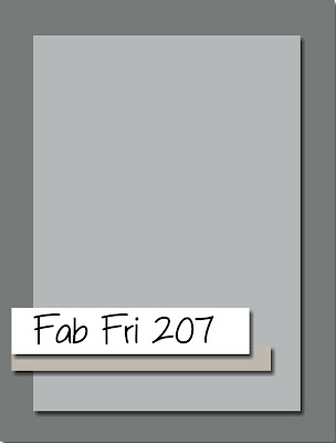
I had been trying to decide on how best to use the fabulous sketch over at Fab Friday (so many possibilities!) which was crying out for the showcasing of some designer series paper (and my regular readers will know that my love of paper means I had A LOT to choose from!) and then when I saw this week's challenge over at Just Add Ink I knew I had the answer of how best to use LeAnne's colours this week. I went with flowers and texture and set to work - this is what I came up with:


Here's the low-down on today's card:

Peony Garden and Customise With Colour - The soft florals and subtle colouring of the Peony Garden papers were the perfect starting point for the main panel of my card. I used my Stampin' Blends in the challenge colours to customise my paper, adding yellow centres to the flowers, Smoky Slate leaves and then the 'negative space' between the flowers was coloured in with Seaside Spray. 

Subtle Texture And Detail - Whilst the DSP is clearly the star of this card, the panel and sentiment gave plenty of opportunity to add additional interest in terms of texture and detail. I embossed a panel of Seaside Spray cardstock with my favourite Subtles embossing folder and added a strip of co-ordinating scalloped linen ribbon to the bottom edge. I also added a few (retired) in-color faceted gems to my sentiment banner, and wrapped the embossed panel with white twine tied into a bow beneath this.

Magnolia Words - The sentiment on my card today comes from the 'Good Morning Magnolia' stamp set and whitst the outside is a standard thank you, I just had to share the lovely words that grace the inside of my card:


What a lovely way to complete a card!

Here is the visual summary of the key products used on today's project for you to pin for easy reference:
 

You can see all of my Product and 'How To' summaries on my 'How To - Tips and Techniques' Pinterest board in case you've missed any. 

Before you reach for your ink and papers, check out what our amazing team has created to inspire you this week:

Here's a quick recap of our challenge rules:
 
1.  Create a new paper project
2.  Upload your creation to your blog with a link back to us and provide a direct link to the post featuring your challenge submission.
3.  Please link your card to no more than four challenges, TOTAL.
4.  Have FUN!

You can see all of my 'How To' summaries on my 'How To - Tips and Techniques' Pinterest board in case you've missed any. 

Also - you may well have noticed from this week's challenge badge that we are on our 499th challenge this week; next week we will be celebrating our milestone 500th challenge, so be sure to come back to share in our celebrations!

Enjoy your day; I am baking today as a special friend of mine is celebrating her birthday today and as she happens to share her day with her son, her own celebrations often take something of a back seat, so I like to go the extra mile. I'll be back tomorrow with another project. Until then, happy stampin'!


Stampin' Up! Supplies Used: 

Table built using Product Table Builder by The Crafty Owl - Independent Stampin' Up! Demonstrator.


Lovely You Stitched Heart Triangle Panel Card

by Joanne James10. July 2020 20:47

Today I'm sharing a card that started out with the colour palette over at CAS Colours and Sketches and Lee Ann's sketch this week over at Freshly Made Sketches:


I ended up creating a sheet of my own DSP too so will also be linking up over at the new-to-me challenge The Spot too. Here's my card: 

Here's the low-down on today's card:

Lovely You DSP - I was immediately drawn to the CAS Colours and Sketches colour palette this week as I'm a big fan of Brights and whilst Pacific Point was one of the three ink pads that I first purchased when I was new to Stampin' Up! so many years ago, it's a colour I don't often use these days. I would never have chosen this trio of colours to work with, but I absolutely love the vibrant, bright combination and will definitely use it again. I held an online class featuring the 'Lovely you' stamp set earlier this week and as is my 'new normal' since my move to online classes, I always host a number of additional demonstration sessions in between classes for anyone to attend that use the same set and highlight other ways it can be used. In our class we created a DSP using one colour per stamp then created a one sheet wonder set of cards, by cutting our DSP in a certain way to give various panels. I wanted to show that these stamps would also be great as multi-coloured images using Stampin' Write markers to colour each of the parts of the flowers on each stamp with a different colour. I shared a sample I made earlier in the week using this technique for a single flower (if you missed it you can see that card that I posted earlier this week here) and knew that these more intense colours would work to great effect and work for the same idea of creating your own piece of patterned paper. Here's my finished paper before I cut it into sections:


Stampin' Write Markers Two Ways - In addition to inking the individual flower elements, I also used my Stampin' Write markers to ink my sentiment easily using two different colours, highlighting the word 'heart' in Gorgeous Grape - this is so much easier to do with a marker than with ink pads.  

A Stitched Heart - I decided this sentiment would work perfectly in a heart shape, so created an outlined heart using my Stitched Be Mine dies. I need to shorten my sentiment to fit it into my heart, so inked it twice in stages and stamped it in such a way that it would both fit into the heart shape and accommodate a fussy cut flower for decoration - you can see the detail below:


Finally I added a couple of blue sequins and a white twine bow to complete the decoration on my card. 

I actually made two cards, since once that rectangle was cut into triangles I had another 2 opposing triangles and didn't want to let them go to waste so made a second card too with an identical centrepiece:


Here are both cards together:


I finished these cards and love them - they are so me!! Here is the visual summary of the key products used on today's project for you to pin for easy reference:


You can see all of my 'How To' summaries on my 'How To - Tips and Techniques' Pinterest board in case you've missed any. 

Lastly, I've been experimenting with some video lately and I did make a little time lapse video (no audio - that proved a little too challenging for my technical skills!) that shows how I put my card together:

Do you find this kind of thing useful? I'd be really interested to know whether this is the kind of thing you would like to see more of. 

Enjoy your day - the sun is shining here - finally! - so I may do some gardening, combined with a little cooking later on. I'll be back tomorrow with another project. Until then, happy stampin'!


Stampin' Up! Supplies Used:

Table built using Product Table Builder by The Crafty Owl - Independent Stampin' Up! Demonstrator.

New Online Exclusives

There are new products available exclusively in the online store from 5 November - check them out here.

Latest Kits!

Stampin Cut and Emboss

The Layered Landscapes Kit and Nature's Paintings Kit are the latest kits in the online store - get yours here!

Shop Online

Access my online shop 24 x 7, 365 days of the year:

Current November hostess code:

9NKXDTTR

Shop Online

Mini Catalogue

BROWSE THE CATALOGUE

'Tis The Season - the new Stampin' Up! Mini Catalogue is here! For more details and to download your copy click here

Scrapbooking

Stampin' Up! has introduced a new range of 12x12" scrapbooking product and kit - the full range is now available to purchase online. To download a copy of the new digital Scrapbooking Catalogue click here.

2024-25 Annual Catalogue

BROWSE THE CATALOGUE

Click on the image to download your copy of the 2024-25 annual catalogue. For a full list of current SU! supplies, go to my online store. If you would like any help or advice, please drop me a line at joanne@thecraftyowl.co.uk or give me a call on 07773 421446 - I'd be happy to help.

Join My Team

It's always a great time to join Stampin’ Up! New team members can get £130 worth of products for only £99 + free business supplies + free shipping + all the fun being a part of Stampin’ Up! Stampin' Up! has something for everyone: join my growing team and benefit from my support to enjoy Stampin' Up! however you choose.

If you're interested, call me for a chat to understand how I can help you realise your goals. Alternatively, if you have already decided to sign up and you just can't wait, please click here for the link to the online form where you can sign up and order your starter kit right away! 

About Me

Hi I'm Joanne and live in Northampton and when I'm not looking after my husband and two beautiful children, am an avid crafter with a passion for all things Stampin' Up!

I must confess that I have never been a big rubber stamper - until I discovered Stampin' Up! that is. I love the fact that I can get such great results with co-ordinating stamps, inks, papers and punches - the possibilities are endless! Join me on my stamping journey as I share the things I love and be inspired to create amazing things yourself!

Follow Me

Monthly Newsletter

Box Builder

Click the button above to use Box Buster to create your custom box design using the Envelope Punch Board!

Kits Collection Now Available!

Stampin Cut and Emboss

The new Kits Collection from Stampin' Up! is now available!

Click here to see the current kits available and order yours online today.

I Design For


Stampin' Up Stuff

This is my personal blog and is not endorsed by Stampin’ Up! I hope you find it a plentiful source of ideas and personal inspiration but please don't copy my designs for contest submission or use for classes, publication or sale without express permission.