Clean and Simple Dressed To Impress for PP474

by Joanne James19. January 2020 10:00

Today it's Sunday and time for this week's new challenge over at The Paper Players! It's the turn of the fabulous Laurie to host this week and she has a fun clean and simple challenge for you to work with:


I knew immediately where I was going with today's card and using the current layout over at CAS Colours & Sketches ended up making not one but two cards!  Laurie's theme gave me the perfect excuse to break out my new 'Dressed To Impress' stamp set and co-ordinating Best Dressed designer series papers to create a couple of clean and simple cards perfect for a fashionista. Here's the first one, featuring the lipstick:


I coloured my image with my Stampin' Blends and added just a small piece of designer paper behind to preserve the all-important white space. Finally I stamped the scrolled word in a contrasting colour and popped it up over my black sentiment for added interest.

I liked this card so much I made another, this time featuring the shoe:


On each of my cards, I stamped my lipstick/shoe image on a post-it note and masked my main image to stamp a second one. My first lipstick looked lonely and as for the shoes, it had to be a pair - I mean, who buys a single shoe?! 

And here's another picture of both cards together:


So which one do you prefer? I liked the solid pink lipstick DSP on the first one ... until I used the shoes DSP which whilst it has larger images, is on a white background so feels a little 'cleaner'. So now I'm not so sure - as always, I welcome your thoughts! Here is the visual summary of the key products used on today's projects for you to pin for easy reference:


You can see all of my Product and 'How To' summaries on my 'How To - Tips and Techniques' Pinterest board in case you've missed any. 

Before you reach for your ink and papers, check out what our amazing team has created to inspire you this week:

Here's a quick recap of our challenge rules:
 
1.  Create a new paper project
2.  Upload your creation to your blog with a link back to us and provide a direct link to the post featuring your challenge submission.
3.  Please link your card to no more than four challenges, TOTAL.
4.  Have FUN!

You can see all of my 'How To' summaries on my 'How To - Tips and Techniques' Pinterest board in case you've missed any. 

Enjoy your day; we have a family lunch planned and a day of homework for the Juniors and ironing for me! Hope you have an enjoyable rest of your weekend. I'll be back tomorrow with another project. Until then, happy stampin'!


Stampin' Up! Supplies Used: 

Table built using Product Table Builder by The Crafty Owl - Independent Stampin' Up! Demonstrator.

Another Beautifully Braided Masked Spotlight Duo - Times Two!

by Joanne James18. January 2020 20:00

It's been bitterly cold all day today here in the UK and both of the James Juniors have braved the outdoors to play hockey for their respective teams (a 2-1 win and a 0-0 draw respectively) but instead of braving the freeze to watch today I decided to hibernate and make a few cards!

I couldn't resist the colour palette over at Color Throwdown so decided to create another pair of cards using the masked spotlight technique that I shared with you earlier this week - you can read that post by clicking here if you missed it. I had some lovely comments on those cards and they were a 'Fab Four' pick over at the Fab Friday challenge so I used the same 'Beautifully Braided' stamp set, but this time heat embossed in gold and used a layered circle framelit to create my spotlight. I first did an experiment on So Saffron coloured cardstock to see what it would look like with a coloured background. Here is the first card on a Night of Navy base:


And the second on a Night of Navy base with a Bermuda Bay mat:


Here is the pair together:


I quite like the effect, but the inks are not as vibrant as they are on a white base. I made a second pair that are exactly the same design, but on a Whisper White base so that you can see what I mean - here's the first one:


And the second one on a Bermuda Bay card base:


I love the brightness of the colours on this pair. I added a few of the Holiday Rhinestones or gold sequins to each card for a little subtle added bling to finish my cards. In hindsight, I should have sponged a narrower central section of Bermuda Bay so that the circle elements had a little more of all three colours on them, but that aside I really love this colour combo with the gold on a white base. Here they are together:

So what do you think - do you have a favourite pair? Leave me a comment below, I would love to hear your thoughts. 

Here is the visual summary of the key products used on today's project for you to pin for easy reference:


You can see all of my 'How To' summaries on my 'How To - Tips and Techniques' Pinterest board in case you've missed any. 

Enjoy your evening and I'll be back tomorrow with another project for our new challenge this week over at The Paper Players. Until then, happy stampin'!


Stampin' Up! Supplies Used:

Table built using Product Table Builder by The Crafty Owl - Independent Stampin' Up! Demonstrator.

Many Hearts to Say You Are Loved AYSI 217

by Joanne James17. January 2020 12:00

Today I'm sharing my design team card for our new challenge over at As you See It where it's time for a timely theme challenge:


I used the current Freshly Made Sketches layout for my card and despite Heather's beautiful rustic heart image on today's badge, I chose to go full on red for today's love theme - take a look:


 Here's the low-down on today's card:

A Card That Is All Heart - When I saw the new Detailed Hearts Die in the Stampin' Up! Spring-Summer mini catalogue, I knew I would have to have it! This is such a versatile die for layering and works not only for Valentine's Day but lots of other occasion cards too. It's also great for making multiple cards at a time: by running it through the die cutting machine with a few different colours of co-ordinating cardstock, you can switch out and mix up the hearts and have a few cards made with relatively little extra effort - and I'm all for saving time! Here I paired mine with some retired Real Red Glimmer paper left over from my Christmas crafting and switched out some of the hearts and left others empty for the white mat layer to show through. I like the added texture this gives whilst retaining the monochromatic look. 

A Crafty Curveball - Whilst I love the Detailed Hearts Die 'as it comes', I feel obliged to point out that I didn't use it that way on today's card! I saw Jacquie's sketch over at FMS this week and paled at that vertical curve, knowing that I didn't have any dies that would work. Whilst considering my options (one of which was sponging - check out Amy O'Neill's card on the FMS challenge page (link above) to see a great example of this) I suddenly had a brainwave! The Detailed Hearts Die has an irregular edge to it anyway, but I carefully strategically snipped away some of the hearts along the right hand side to create a more defined curve. I also stuck some of the hearts that I'd removed elsewhere to my base in some of the gaps, to further emphasise it. Clever, right? Well, I thought so ;-) You can see the actual pattern of the die in the product table link below, so be sure to check that out.

You Are Loved - I wanted my hearts to be the star of today's card, so kept my sentiment simple. I didn't want to use this card as a Valentine's card, so by using the 'You are loved' sentiment from the 'Forever Lovely' stamp set, I can use it anytime to let someone know how much they mean to me. This card will probably make it's way to Rebecca in her school bag at some point - even as a teenager, she still has a soft spot for anything with sequins, sparkle and glitter!

Here is the visual summary of the key products used on today's project for you to pin for easy reference:


You can see all of my 'How To' summaries on my 'How To - Tips and Techniques' Pinterest board in case you've missed any. 

Before you put your creative thinking caps on, why not check out the blogs of the other As You See It team members:

Amy Jasper

Heather Cooper

Jan Clothier

Jane Knudsen

LeAnne Pugliese

Here's a summary of our challenge rules:

  • Create any card, scrapbooking page, 3D project or packaging project that fits the challenge.
  • Fill in the blanks with the words that are right for you and then create your project with those words in mind. Tell us, in your blog or on your site, what words you used.
  • Please include the challenge graphic and link back to the challenge in your blog post. Turn off word verification so we can leave you lots of lovely comments. Make sure you link the post not the whole blog to the Linky. Use #AYSIXXX when uploading to a public gallery.
  • If you’re unsure about ‘the rules’, check the details under the Challenge Guidelines tab on the As You See It Challenge homepage.
  • In a colour challenge, black or other neutral can be used in outlines and sentiments but no other colours should be included. Stampin’ Up colours are used for reference but colours that are a close match are welcome.
  • In a sketch challenge, you are welcome to rotate or flip a sketch. You can replace shapes used such as substituting a circle panel for a square panel. However, we must be able to still see the basis of the original sketch in your finished product.
  • In a Fill in the Blank challenge, complete the sentence in the Challenge Banner with the phrase that is true for you and create your project using the words you used. Tell us what you said in your blog or on your site.

We look forward to seeing your creations in the AYSI gallery.

Enjoy your day; I'm still wading through paperwork, but will be taking a break to visit the hairdressers for my monthly trim - my one luxury that I look forward to each month! Not only does it keep my hair looking good, it's a great opportunity for a natter - I've known my hairdresser for 20 years and now consider her a good friend! We often joke that she could cut my hair with her eyes closed, although thankfully she's never tried it! Anyone else out there have a hairdresser who they wouldn't want to give up? If mine ever shut up shop, I'd be beside myself! I'll be back tomorrow with another project. Until then, happy stampin'!


Stampin' Up! Supplies Used:

Table built using Product Table Builder by The Crafty Owl - Independent Stampin' Up! Demonstrator.

Beautifully Braided Masked Spotlight Card Duo

by Joanne James16. January 2020 11:10

Today I'm squeezing in a card for the current colour challenge over at Fab Friday:


I have a little story behind today's card and although I ended up with two cards for my efforts it's not where I started out at all. I'll come to my story shortly but firstly here's the first of today's cards:


And so to my story! Are you sitting comfortably? Here's the low-down on today's card:

A Colour Conundrum - I often find colours more of a challenge as a starting point for a card and a combo either speaks to me or it doesn't. The minute I saw these colours, I immediately thought how great they would look with the 'Best Dressed' stamp set on a clean and simple card with lots of white space. That is, until I saw the fabulous card that my blog friend the talented Windy Ellard created using this set in these colours for this very challenge (you can see Windy's card in the FabFriday gallery and link to it on her blog directly here). I just adore this card and whilst the one I created looked nothing like it, I loved Windy's card so much mine looked mediocre in comparison. So, I went back to the drawing board!

Spotlight on Beautifully Braided - I used the 'Beautifully Braided' stamp set and co-ordinating Braided Border Punch in my monthly technique stamp class that I held earlier this week and I promised the ladies that attended that I would create lots of other samples for my blog that would give them further ideas on how they could use their bundle in other ways. I'm also on a mission to use colours other than green with it - we are in universal agreement that we dislike the very green-based samples in the Stampin' Up! Spring-Summer catalogue where this bundle debuts (sorry Stampin' Up!) I thought the flower stem in the stamp set would be perfect for the spotlight technique, where you highlight a portion of the image and either colour it or leave it uncoloured on the spotlighted portion of the image. Here I've heat embossed the image in black and then created an inner and outer element that I have diecut with the Stitched Rectangle Dies so that I could use both elements on two separate cards - a spotlight and reverse spotlight, if you will.

Masked Spotlight - We focused on the spotlight technique in class using another card which I will share another day, but for today's cards I took that one step further and once I'd heat embossed my image on the layer that I was going to use either as my top layer frame or inner section, I carefully masked the heat embossed image with a post-it note cut to the image exactly and then used my sponge brayers to create a graduated background comprising the 3 challenge colours. When the post-it is removed, you are left with a completely white image surrounded by a beautifully sponged panel of colour. Here is the second of my cards that shows the central rectangle piece:


I mounted each of my cards on different coloured card bases - here's a photo of them together:


So what do you think? Do you like one more than the other? These cards did take a while to create, but I love them both. And they are completely different to Windy's :-).

Here is the visual summary of the key products used on today's project for you to pin for easy reference:


You can see all of my 'How To' summaries on my 'How To - Tips and Techniques' Pinterest board in case you've missed any. 

Enjoy your day and I'll be back tomorrow with another project for our new challenge over at As You See It. Until then, I'm off to turn my attention to the dreaded tax returns (I can't put it off any longer!) Happy stampin'!


Stampin' Up! Supplies Used:

Table built using Product Table Builder by The Crafty Owl - Independent Stampin' Up! Demonstrator.

P-P-P-Pick Up A Christmas Penguin Or Two!

by Joanne James13. January 2020 08:00

Today I'm sharing a couple of cards that I made for my 2020 Christmas card stash; I always try and make some Christmas cards throughout the year, although I must confess I often get sidetracked as the year goes on! I was encouraged by a few challenges that are currently running:


The theme over at Christmas Kickstart Challenge is 'penguin parade' so I decided to use one of my (now retired) penguin stamps from the 'Making Everyday Bright' stamp set, along with the CASology cue word 'repeat' to create this little festive gang - take a look:


I used my Stamparatus to get all of my penguins in an even row across the centre of my Whisper White card base, and taking my cue from the current challenge over at Less Is More, used my Calypso Coral and Blueberry Bushel Stampin' Write markers to add colour to their hats. I punched out the central one and gave him a coral retired enamel heart to hold. I stamped my sentiment, from the (retired) 'Christmas Crowd' set in Blueberry Bushel and popped it up on dimensionals, using it to ground my row of penguins, and finished the inside with another sentiment from this set:


I had a few aborted attempts at getting my penguins in a neat line, but I liked the above card when I was done so I used my Christmas Bulb Builder Punch to punch out some of my leftovers and this time stuck them in a neat line (in hindsight I should have done this the first time, it would have been much quicker!) and coloured them in with a festive Real Red and Call Me Clover colour combo:


Here are both of my cards together:


Here is the visual summary of the key products used on today's project for you to pin for easy reference:


You can see all of my 'How To' summaries on my 'How To - Tips and Techniques' Pinterest board in case you've missed any. 

The 'Making Spirits Bright' stamp set is one of the (many!) retired stamp sets I own that didn't see much love first time around, so it was fun to revisit it for today's cards. 

I have the first of my monthly card classes today using the Beautifully Braided Bundle so will be sharing some of those creations with you later this week. In the meantime, enjoy your day and I'll be back tomorrow with another project. Until then, happy stampin'!


Stampin' Up! Supplies Used:

No product table today as the stamp sets used on today's cards are retired; current colours are listed above.


Congratulations Peaceful Poppies for PP473

by Joanne James12. January 2020 10:00

Today it's Sunday and time for this week's new challenge over at The Paper Players! It's the turn of the fabulous Anne Marie to host this week and she has what I'm sure will be a popular colour challenge for you to work with:


The reason I think Anne Marie's colour palette will be popular this week is that all of her key colours feature in the new Peaceful Poppies designer series paper from Stampin' Up! and try as I might to go in a different direction, I couldn't help but cut into my pack for today's card. With the help of Judy's great sketch over at Freshly Made Sketches this week, I was able to let the paper do all the talking - take a look:


Here's the low-down on today's card:

Peaceful Poppies - Peaceful Poppies is one of the headline suites of the new Stampin' Up! Spring Mini Catalogue and it appears on the front cover. Beautiful line-art images accented by watercolour effects, all inspired by a field of poppies, the suite contains not one, but two bundles along with a range of co-ordinating accessories. My regular readers will know that I am a lover of designer series paper and I think the Peaceful Poppies paper is some of the most beautiful I've ever seen. One of the designs looks just like a painting and is perfect for card fronts and I cut a piece of this, featuring both Poppy Parade and Rich Razzleberry coloured poppies.

Neutral Black - My paper choice was so pretty, I couldn't bring myself to add much more to the front of my card. I used a Poppy Parade card base and added a double mount to frame my patterned paper, in Old Olive and Basic Black. I also decided to heat emboss my sentiment in white on black, as opposed to stamping the other way around - using black to 'frame' my picture and sentiment ties in to the black line-drawn design of the paper, so whilst used sparingly my neutral choice plays an important role.

Beautiful Inside And Out - Having done very little stamping on the front of my card, I decided a little interior decoration along with my split/masked sentiment was needed to redress the balance:

I added a poppy to the front of my envelope too - no naked envelopes here this week!

Here is the visual summary of the key products used on today's project for you to pin for easy reference:


You can see all of my Product and 'How To' summaries on my 'How To - Tips and Techniques' Pinterest board in case you've missed any. 

Before you reach for your ink and papers, check out what our amazing team has created to inspire you this week:

Here's a quick recap of our challenge rules:
 
1.  Create a new paper project
2.  Upload your creation to your blog with a link back to us and provide a direct link to the post featuring your challenge submission.
3.  Please link your card to no more than four challenges, TOTAL.
4.  Have FUN!

You can see all of my 'How To' summaries on my 'How To - Tips and Techniques' Pinterest board in case you've missed any. 

Enjoy your day; we had a day of sport yesterday so today should be a quieter one. I spent yesterday making final preparations for my class tomorrow, however if I'm lucky I might squeeze in a little extra crafting today - here's hoping! I'll be back tomorrow with another project. Until then, happy stampin'!


Stampin' Up! Supplies Used: 

Table built using Product Table Builder by The Crafty Owl - Independent Stampin' Up! Demonstrator.

Frosted Foliage Single Branch One Layer Card

by Joanne James6. January 2020 07:00

Today I have a quick card for the current challenges over at Color Throwdown and CASology:


It's a Christmas card and uses a now retired stamp set, but these colours and the Color Throwdown badge inspired me to experiment with a clean and simple one layer technique that I've been wanting to try for some time - take a look:


I masked a corner frame then sponged Cherry Cobbler ink to create a graduated effect, then used the single branch from Frosted Foliage to over-stamp the edge. I stamped the branch in Early Espresso, then coloured the berries with my Cherry Cobbler Blends. I added some highlights with my chalk marker, but you can't really see these since I decided to add a liberal dose of Dazzling Diamonds to look like frost. I balanced my rectangle with my sentiment to complete my card.

Here is the visual summary of the key products used on today's project for you to pin for easy reference:


You can see all of my 'How To' summaries on my 'How To - Tips and Techniques' Pinterest board in case you've missed any. 

So what do you think? Does the same-colour sponging work to add interest to my one layer card? Do leave me a comment below - I'd love to hear your thoughts.

Enjoy your day and I'll be back tomorrow with another project. Until then, happy stampin'!


Stampin' Up! Supplies Used:

Table built using Product Table Builder by The Crafty Owl - Independent Stampin' Up! Demonstrator.

Sale-A-Bration Lovely Lily Pad Shaker Card

by Joanne James5. January 2020 20:00

Today I'm sharing a second card (get me!) that uses the current sketch over at Inspire.Create and I'm squeezing in a link up:


I'm not that organised; I intended to blog this yesterday, but clearing away the Christmas decorations and a pre-season hockey get-together in the evening meant I ran out of time :-) Anyway, I digress! I used a trio of fun Sale-A-Bration items to create a Monet-inspired waterlily shaker card - take a look:


Here's the low-down on today's card:

Lily Impressions - With so many lovely free products to choose from, Sale-A-Bration is always a special time and today my card features three of the items you can obtain FREE with a £45 Stampin' Up! purchase. Whilst the sketch was the starting point for my card, the design is inspired by the lovely Lily Impressions Designer Series Paper. The impressionistic images and rich colours of these papers make elegant, bold backgrounds and I chose one of the waterlily patterns for my cardfront. I love the loose Monet-like brushstroke effect and if you look closely you can see the paper has the appearance of canvas, just like an oil painting. 

Lovely Lily - I didn't do a huge amount of stamping on this card. Aside from the sentiment (from the 'Botanical Bliss' stamp set) I stamped the large outlined waterlily in Melon Mambo on the inside on my shaker. I added a little one to my envelope and inside too, this time using both sides of the stamp to both outline and colour - yes, this set is reversible so will do both simply by reversing the stamp. 

Lilypad Dies - The third lily item in the Sale-A-Bration is the Lilypad Dies. A collection of outline and more detailed dies of both waterlily blooms, leaves and lilypads, along with an interesting diecut/border piece too. The dies are free with a £90 purchase, whereas the stamps and papers can be yours with two £45 purchases respectively. I used the largest outline to create the window for my shaker element and added some retired Melon Mambo sequins for the interactive element for a little co-ordinated sparkle.

Here is the visual summary of the key products used on today's project for you to pin for easy reference:


You can see all of my 'How To' summaries on my 'How To - Tips and Techniques' Pinterest board in case you've missed any. 

Enjoy your day and I'll be back tomorrow with another project. Until then, happy stampin'!


Stampin' Up! Supplies Used:

Table built using Product Table Builder by The Crafty Owl - Independent Stampin' Up! Demonstrator.

Welcome Little One For Our First Paper Players Challenge of 2020 PP472

by Joanne James5. January 2020 10:00

Today it's Sunday and time for our first challenge of 2020 over at The Paper Players! It's the turn of the fabulous Jaydee to host this week and she has a fun theme challenge for you to work with:


Our theme is 'something new' - a new year, a new season, new job, new baby - so many possibilities! I took some new product to make a card to welcome the arrival of a new baby, using Brian's layout over at CAS(E) This Sketch this week as my starting point and this is what I came up with - take a look:


Here's the low-down on today's card:

Welcome Witty-cisms - The sweet pram stamp I used on today's card sis from a new stamp set called 'Witty-cisms', inspired by one of Stampin' Up!'s Million Dollar Sales Achievers, Lisa Fast. A collection of fun stamps with witty sayings and cute hand-drawn illustrations, they are perfect for lots of different occasions and also for a spot of quick colouring if that's your thing. These images are great for quick and simple cards and can also be dressed up with a few layers and embellishments into something more detailed as I've done here.

Baby Blue - I chose to go monochromatic with today's colours and feature Coastal Cabana on my card as I had all the right bits and pieces in my collection (I used some retired Brights DSP but the current gingham would look lovely too). I stamped my image in Basic Grey as opposed to black to soften the image, which is something I often do on a baby card. I love cards like this - it would be just as easy to make in pink or a neutral too.

A Simple Embellishment Trio - I used some of the new white crinkle ribbon for a soft bow and a silver 'made with love' charm and felt border from the Follow Your Art Embellishment Kit to add the finishing touches to my card - I think that little heart charm is a neat play on words for a new arrival.

Here is the visual summary of the key products used on today's project for you to pin for easy reference:
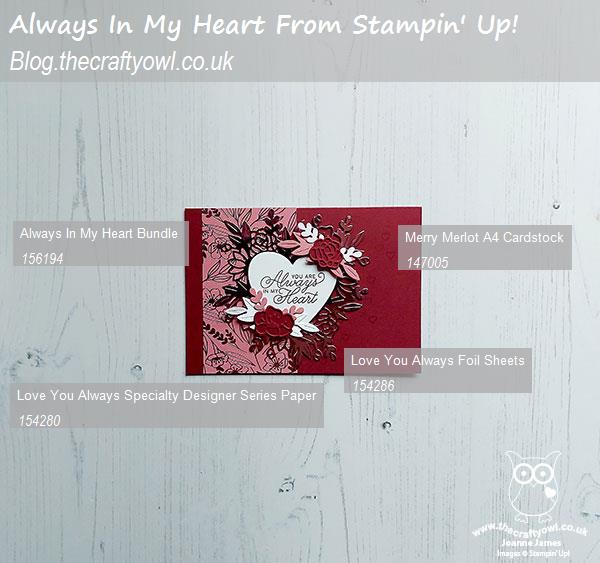
 

You can see all of my Product and 'How To' summaries on my 'How To - Tips and Techniques' Pinterest board in case you've missed any. 

Before you reach for your ink and papers, check out what our amazing team has created to inspire you this week - including our fabulous new trio of guest designers, Allisa, Stef and Mary:

Here's a quick recap of our challenge rules:
 
1.  Create a new paper project
2.  Upload your creation to your blog with a link back to us and provide a direct link to the post featuring your challenge submission.
3.  Please link your card to no more than four challenges, TOTAL.
4.  Have FUN!

You can see all of my 'How To' summaries on my 'How To - Tips and Techniques' Pinterest board in case you've missed any. 

Enjoy your day; we are looking forward to a leisurely family lunch today before we are all back to school and work at various points next week. I have a card prepared though so will be back tomorrow with another project. Until then, happy stampin'!


Stampin' Up! Supplies Used: 

Table built using Product Table Builder by The Crafty Owl - Independent Stampin' Up! Demonstrator.

Feels Like Frost New Year Inspiration AYSI 216

by Joanne James3. January 2020 12:00


This is my second post today - if you missed it, you can read my earlier post about Sale-A-Bration and the new Spring-Summer mini catalogue here. In this post I'm sharing my design team card for our first challenge of the new year over at As you See It where it's time for a seasonally-themed recipe challenge:


I used Amy's versatile layout over at Freshly Made Sketches for the design of my card, then grabbed my recipe ingredients and set to work. This is what I came up with:


Here's the low-down on today's card:

A Hint of Hammered Metal - Today's card uses some unusually wintery product, considering it is the launch day for the Spring-Summer mini catalogue, but whilst lots of the items used are from the Autumn-Winter seasonal catalogue, it's still all available (kind of!). Firstly the hammered metal embossing folder that I used for my silver foil background layer is a carryover product and continues to be available to purchase. You can't see much of the effect on today's card, but it does look great on a larger panel, adding lots of great texture and detail. 

Au Revoir Feels Like Frost - I decided to use a piece of foiled snowflake Feels Like Frost DSP for the main rectangle on the front of my card. Whilst we have bid farewell to this popular paper, it is for the first time an 'au revoir' rather than a goodbye forever - it is one of the favourite items that will return again with the launch of the 2020 Autumn-Winter mini catalogue - yay! So if you don't have a stash of this paper already, you've only another 7 months to wait until you can buy some more!!

New Year Inspiration - The sentiment on today's card is taken from a brand new set, called 'Beautifully Braided'. I had this set out on my desk as it features in my January technique card class and couldn't resist using these uplifting words on my card today. As the Headmaster at Ben's school often says to the children, "If you can be only one thing, be kind" - words to live by, in 2020 and beyond I think. Finally, a sprinkling of rhinestones completes my card.

Here is the visual summary of the key products used on today's project for you to pin for easy reference:


You can see all of my 'How To' summaries on my 'How To - Tips and Techniques' Pinterest board in case you've missed any. 

Before you put your creative thinking caps on, why not check out the blogs of the other As You See It team members:

Amy Jasper

Heather Cooper

Jan Clothier

Jane Knudsen

LeAnne Pugliese

Here's a summary of our challenge rules:

  • Create any card, scrapbooking page, 3D project or packaging project that fits the challenge.
  • Fill in the blanks with the words that are right for you and then create your project with those words in mind. Tell us, in your blog or on your site, what words you used.
  • Please include the challenge graphic and link back to the challenge in your blog post. Turn off word verification so we can leave you lots of lovely comments. Make sure you link the post not the whole blog to the Linky. Use #AYSIXXX when uploading to a public gallery.
  • If you’re unsure about ‘the rules’, check the details under the Challenge Guidelines tab on the As You See It Challenge homepage.

We look forward to seeing your creations in the AYSI gallery.

Enjoy your day and I'll be back tomorrow with another project. Until then, happy stampin'!


Stampin' Up! Supplies Used:

Table built using Product Table Builder by The Crafty Owl - Independent Stampin' Up! Demonstrator.


New Online Exclusives

There are new products available exclusively in the online store from 5 November - check them out here.

Latest Kits!

Stampin Cut and Emboss

The Layered Landscapes Kit and Nature's Paintings Kit are the latest kits in the online store - get yours here!

Shop Online

Access my online shop 24 x 7, 365 days of the year:

Current November hostess code:

9NKXDTTR

Shop Online

Mini Catalogue

BROWSE THE CATALOGUE

'Tis The Season - the new Stampin' Up! Mini Catalogue is here! For more details and to download your copy click here

Scrapbooking

Stampin' Up! has introduced a new range of 12x12" scrapbooking product and kit - the full range is now available to purchase online. To download a copy of the new digital Scrapbooking Catalogue click here.

2024-25 Annual Catalogue

BROWSE THE CATALOGUE

Click on the image to download your copy of the 2024-25 annual catalogue. For a full list of current SU! supplies, go to my online store. If you would like any help or advice, please drop me a line at joanne@thecraftyowl.co.uk or give me a call on 07773 421446 - I'd be happy to help.

Join My Team

It's always a great time to join Stampin’ Up! New team members can get £130 worth of products for only £99 + free business supplies + free shipping + all the fun being a part of Stampin’ Up! Stampin' Up! has something for everyone: join my growing team and benefit from my support to enjoy Stampin' Up! however you choose.

If you're interested, call me for a chat to understand how I can help you realise your goals. Alternatively, if you have already decided to sign up and you just can't wait, please click here for the link to the online form where you can sign up and order your starter kit right away! 

About Me

Hi I'm Joanne and live in Northampton and when I'm not looking after my husband and two beautiful children, am an avid crafter with a passion for all things Stampin' Up!

I must confess that I have never been a big rubber stamper - until I discovered Stampin' Up! that is. I love the fact that I can get such great results with co-ordinating stamps, inks, papers and punches - the possibilities are endless! Join me on my stamping journey as I share the things I love and be inspired to create amazing things yourself!

Follow Me

Monthly Newsletter

Box Builder

Click the button above to use Box Buster to create your custom box design using the Envelope Punch Board!

Kits Collection Now Available!

Stampin Cut and Emboss

The new Kits Collection from Stampin' Up! is now available!

Click here to see the current kits available and order yours online today.

I Design For


Stampin' Up Stuff

This is my personal blog and is not endorsed by Stampin’ Up! I hope you find it a plentiful source of ideas and personal inspiration but please don't copy my designs for contest submission or use for classes, publication or sale without express permission.