Carried Away Up And Away Hot Air Balloon

by Joanne James15. February 2017 21:57

Wednesday evening already? Where did the beginning of this week go?! That's what having the James Juniors home from school on half term does for you! We have been having fun with more still to come this week. Time I got back to sharing a card or two with you though; here's one that I made in my Sale-A-Bration class earlier this month featuring a selection of the gorgeous balloon papers that can be yours free during Sale-A-Bration with an order of £45 or more:


 Here's the low-down on today's card:

Carried Away With Colour - I love designer series paper at the best of times, but I could get totally carried away with this one! The bright and colourful prints in the Carried Away designer series paper pack are just gorgeous; great for cards but they also make great scrapbook backgrounds too. Check out this gorgeous palette of colours to be found in the 6 designs in this paper pack:


Lift Me Up Too - We all know how Stampin' Up! does such a great job of product co-ordination in terms of inks, cardstock and accessories; there are also times when suites of products co-ordinate too. The Carried Away papers are designed to co-ordinate perfectly with the Lift Me Up Bundle in the Spring-Summer Occasions catalogue. The diecut and stamped balloons along with some useful sentiments in a great modern font, make it easy to pull together professional-looking cards. Here I left some of the diecut balloon open so that the papers below would peek through and used the stamp set for the sentiment and to decorate the envelope and inside of my card.

Everyone Loves A Freebie - Would you like to get your hands on the Carried Away Designer Series Paper? If you buy all the other supplies I used on today's card, you'll earn enough to qualify for a free Sale-A-Bration item - like the Carried Away Designer Series Paper. Just click on the items in the table below to go directly to my online shop and add these items to your basket.

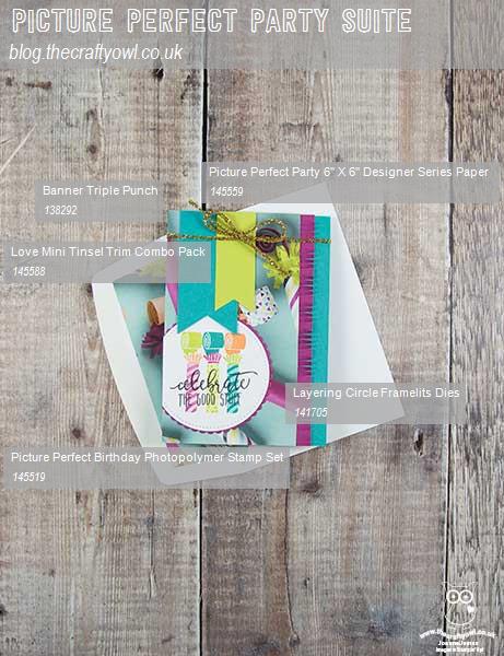
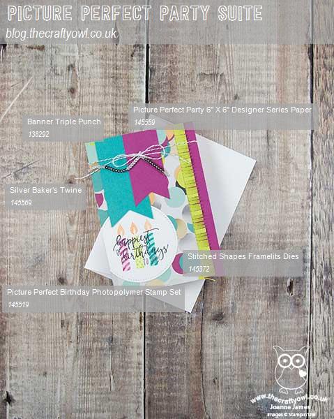
Here is the visual summary of the key products used on today's project for you to pin for easy reference:
 

You can see all of my 'How To' summaries on my 'How To - Tips and Techniques' Pinterest board in case you've missed any. 

I'll be back tomorrow with another project using these fabulous papers. Until then, happy stampin'!


Stampin' Up! Supplies Used:

Table built using Product Table Builder by The Crafty Owl - Independent Stampin' Up! Demonstrator.

Hot Glue Embossed Sunset Watercolour

by Joanne James12. February 2017 09:00

It's Sunday and time for this week's new challenge over at The Paper Players! It's the turn of the super-sweet and talented Nance to host this week and she has a fun colour challenge for us to work with:


I absolutely love Nance's colour combination this week - so unusual! I considered a variety of things to do with my card - mostly floral - but decided to be brave and try something different: hot glue embossing. I used this week's sketch over at CAS(E) This Sketch as it had a perfect vertical panel for my design - take a look:


Here's the low-down on today's card:

Hot glue embossing is a fun technique to combine with watercolouring. The idea is simply that you take your hot glue gun and 'draw' a pattern onto a piece of watercolour paper. Once set, you reheat the glue with your heat tool, sprinkle with embossing powder then reheat to set. I decided that I would draw a sunset with my glue gun, by creating the sun on the horizon and then some reflection and I heat embossed this with copper embossing powder.

I then used my aquapainter and Blushing Bride and Smoky Slate reinkers to colour my sky and water. I finished my card with a sentiment  from Flourishing Phrases, which I also heat embossed in copper. Finally I used a piece of copper foil to border my sentiment and watercoloured panel. 

This card is rather abstract for me, yet such fun to create and I think it makes a lovely sympathy card - I've been needing a few too many of these lately. So what do you think? Is this a technique you would like to try?

Here is the visual summary of the key products used on today's project for you to pin for easy reference:


You can see all of my Product and 'How To' summaries on my 'How To - Tips and Techniques' Pinterest board in case you've missed any. 

Before you reach for your ink and papers, check out what our amazing team has created to inspire you this week:

The Paper Players Design Team
 
 
Here's a quick recap of our challenge rules:
 
1.  Create a new paper project
2.  Upload your creation to your blog with a link back to us and provide a direct link to the post featuring your challenge submission.
3.  Please link your card to no more than four challenges, TOTAL.
4.  Have FUN! 


I look forward to seeing what you create with this week's colour palette. Enjoy the rest of your weekend as it will be over all too quickly; we are attending a basketball match this afternoon with Ben captaining his team (hopefully to victory!) I'll be back tomorrow with another project; until then, happy stampin'!


Stampin' Up! Supplies Used: 

Table built using Product Table Builder by The Crafty Owl - Independent Stampin' Up! Demonstrator.

You're One In A Dozen

by Joanne James11. February 2017 20:00

I've had a rare relaxing day today: mostly about food, family fun and a little stamping time too. I made a card for this week's challenge over at Freshly Made Sketches where there have a great sketch this week:


Here's my card:


Here's the low-down on today's card:

A Perfect Mix - I got this set for the little baking images; as a keen baker I knew I would have lots of fun with these. I love the punny sentiments too and they make for some cute little love notes - I couldn't resist the 'one in a dozen' for my card today.

A Stitched Rectangle - I used one of the square Stitched Shape Framelits to create my elongated stitched rectangle. This is really easy to do and a great way to get even more value out of your framelits. All you need to do is cut your cardstock to the required width, then place your square stitched framelit at one end and partially cut, stopping before the end, then move the framelit to the other end and partially cut again towards the middle.

A Little Foxy - I was originally going to use the grey heart pattern on the reverse of the sheet of A Little Foxy designer paper on my card, to accentuate the blue of my egg. On something of a whim I flipped it over before I glued it and decided I liked this diagonal lined pattern better with the added colour. Well, we can all change our minds!

I think this would make a fun masculine Valentine or just a note to let someone know how special they are.

Here is the visual summary of the key products used on today's project for you to pin for easy reference:


You can see all of my 'How To' summaries on my 'How To - Tips and Techniques' Pinterest board in case you've missed any. 

I'll be back tomorrow with this week's card for a new challenge over at The Paper Players. Until then, happy stampin'!


Stampin' Up! Supplies Used:

Table built using Product Table Builder by The Crafty Owl - Independent Stampin' Up! Demonstrator.

Adult Colouring With Inside The Lines

by Joanne James8. February 2017 11:47

I'm back at my desk this morning so I'm getting in a nice early post (well, early for me!) Today I'm sharing a couple of cards using one of the great free Sale-A-Bration items, the Inside The Lines Designer Series Paper:

Adult colouring is a hot trend: adult colouring books feature consistently in the Amazon top selling books list across all categories. Did you know though that there are proven health and psychological benefits to colouring? Colouring is a great stress-reliever: colouring is said to calm the amygdala, the part of the brain related to the fear/stress response while stimulating the parts of the brain responsible for creativity and logic. A 2005 study documented a reduction in anxiety in subjects after a short time of colouring geometric patterns. In addition to reducing stress, there is also evidence to suggest that even a short colouring session is good for sharpening focus and encouraging creativity, making it popular with high flying business and creative professionals alike. Colouring can also make a great alternative to meditation, the psychological benefits of which are well documented; the ability to 'do' something without the need for active concentration produces a similar benefit to meditation in the brain, so if you are someone who finds it it difficult to 'switch off' and calm your mind, colouring may help you find your 'inner peace'.

I am the proud owner of a 'mindfulness' adult colouring book and a page a day calendar (you can read about that in my previous post here) however being the crafty soul that I am, I'm always looking at how I can use my coloured images in a constructive way, rather than just leave them completed in my book. That's one of the reasons that the Inside The Lines paper appeals to me: with 12 sheets each measuring 12" x 12", 3 each of 4 designs, they are great for making into cards or home decor projects once your colouring is complete. Here's the first of my cards, coloured with Stampin' Up!'s new watercolour pencils and my aquapainter, adhered to a Rich Razzleberry card base and a simple sentiment banner featuring one of my go-to sentiment sets, Tin of Cards:


The paper is pretty enough though to stand up in its own right; this CASE of a card by Louise Sharp (you can see her original card here) leaves the main panel of the paper blank, with just a small area of the pattern coloured and cut out and used to embellish the sentiment panel:


Here are some additional samples created by the Home Office Creative Team that show just some of the ways that this paper can be transformed with colour:


As if that wasn't enough, the lovely people at Stampin' Up! have even created a video demonstrating some fun techniques that can be used with this paper - take a look:

Here is the visual summary of the key products used on today's project for you to pin for easy reference:


You can see all of my 'How To' summaries on my 'How To - Tips and Techniques' Pinterest board in case you've missed any. 

If you like adult colouring or just want to rediscover your 'inner child', then all you have to do is place an order for £45 or more and you can receive the Inside The Lines paper for FREE! If you are ordering online, simply add the item code (143830) to your shopping basket once you've added your other items and it will add it free of charge. If you are ordering online (it's easy to do: just click on the shopping basket link in the 'Shop Online' basket on the right of this page, or alternatively click on any of the product links in the supply table below) don't forget to add this month's hostess code 4X3KWTZY in order to receive an extra little thank you in the post separately from me. 

So what are you going to create with Inside The Lines? Do let me know in the comments below - I'd love to hear your thoughts.

Enjoy your day and I'll be back tomorrow with another project. Until then, happy stampin'!


Stampin' Up! Supplies Used:

Table built using Product Table Builder by The Crafty Owl - Independent Stampin' Up! Demonstrator.

Falling in Love Anniversary Card

by Joanne James7. February 2017 21:01

Another busy day today with a class this morning, a quick lunch with friends and school runs and piano lessons amongst other things! Today I'm sharing a card that I made for the current challenge over at As You See It. This is one of my favourite challenges (I love the sketches this team come up with) and having had a few problems at the back end of last year, I am delighted they are now back on fighting form with their challenge in full swing. I missed the first challenge of the year but was determined to play along with this one. Here is the current AYSI sketch:

This sketch is a great opportunity to use a stamped panel or to showcase a piece of designer series paper. I went with the latter and needed an anniversary card - here's what I came up with:


Here's the low-down on today's card:

Falling In Love - I used a piece of Falling in Love paper for the panel on my card. A marriage of romance and shabby chic (the catalogue byline, not mine) these pretty patterns featuring ditsy florals, lace and bokeh patterns have an ethereal and dreamy quality. I paired mine with Very Vanilla and Tip Top Taupe cardstock; interestingly this isn't one of the feature colours in the suite (the neutral is Sahara Sand) but I think the slightly stronger brown works well.

Falling For You - My sentiment comes from one of the two stamp sets in this product suite, Falling For You. It includes some beautiful paired sayings, including this one that I stamped on the inside of my card to go with my outer anniversary wishes:


Ribbons and Lace - I wanted to keep my card flat and post-friendly, so chose to embellish it simply with a flat bow in the Very Vanilla 1/4" satin ribbon and a couple of the lace doilies. The new doilies have a very pretty pattern and are also printed Very Vanilla on one side and white on the other, so quite versatile.

Here is the visual summary of the key products used on today's project for you to pin for easy reference:


You can see all of my 'How To' summaries on my 'How To - Tips and Techniques' Pinterest board in case you've missed any. 

Enjoy your day and I'll be back tomorrow with another project. Until then, happy stampin'!


Stampin' Up! Supplies Used:

Table built using Product Table Builder by The Crafty Owl - Independent Stampin' Up! Demonstrator.

Sealed With Love Lidded Notelet Box Using The Envelope Punch Board

by Joanne James6. February 2017 20:00

Happy Monday everyone! I've had a busy day today with the first of this month's classes. I'll share some of those projects later in the week, but for today I wanted to share a simple little lidded box that I made with my Envelope Punch Board to hold some cute little Valentine's love notes. Now I didn't do the best job of photographing this one - the lid edges get a little lost against the background:


Here's the box with one of the little notelets inside:


Here's the low-down on today's project:

Sending Love Notes - Way back at Onstage last November we made three little notelets using the Sealed with Love Bundle. I modified mine slightly, cutting down the panels of Sending Love patterned paper and adding each one to a 3 1/2" Whisper White card base. I designed a few more using the other stamps in the set and made a bunch of co-ordinating envelopes and decided to make a little box to keep them all in. 

Love My Envelope Punch Board - Not only did I use my Envelope Punch Board to make my designer series paper envelopes (each made to fit a card of 3 1/2" square and requiring a 6" square piece of paper) but I also used my Box Buster tool to help me design a 4" square lidded box to hold them in. I love making lidded boxes usign the EPB rather than a scoreboard, as it makes them much more sturdy and rigid. It's really easy to do - you just need to make your lid 1/8" larger than your base for a snug fit.

Ribbon and Hearts - I continued the red and white theme of my project by adding a triple loop of Sending Love Ribbon with a double bow to adorn my sassy red Valentine-embossed heart to complete my box embellishment.

Here is the visual summary of the key products used on today's project for you to pin for easy reference:


You can see all of my 'How To' summaries on my 'How To - Tips and Techniques' Pinterest board in case you've missed any. 

I will be using these little notes to hide in my children's school bags and pencil cases this month; they love to find a surprise note when they least expect it; I might even slip in a little chocolate treat too. I'm also linking up with the team over at SUO Challenges again where they are also celebrating Valentine's this week.

I'll be back tomorrow with another project. Until then, happy stampin'!


Stampin' Up! Supplies Used:

Table built using Product Table Builder by The Crafty Owl - Independent Stampin' Up! Demonstrator.

A Gift Of Love Quilt-Inspired Valentine's Card

by Joanne James5. February 2017 09:00

It's Sunday and time for this week's new challenge over at The Paper Players! It's the turn of my sweet friend Claire to host this week and she has a timely theme challenge for us to work with:


I've been sharing lots of Valentine's-themed cards with you in recent weeks, almost all of which have featured the Sealed With Love bundle and Sending Love Designer Series Paper. For today though I wanted to go back to some products in the annual catalogue that would make a Valentine's card but are not designed specifically with that in mind. I had a few bits and pieces out on my desk, then when I saw this week's inspiration photo over at Fusion I knew exactly where I was headed - I even used the sketch layout too (turned through 90 degrees). Here's what I came up with:


Here's the low-down on today's card:

A Quilt Of Love - I drew inspiration from a number of elements of the Fusion photo for my card: the border of pink flowers (courtesy of the Jar of Love stamp set), the cream textured panel (created with the Happy Heart Textured Impressions Embossing Folder) and the red flower-entwined heart as a focal point. My colour scheme also came directly from the photo - here it is if it's one you would like to save to use too:


Have A Heart - I die cut the heart from the Sunshine Wishes Thinlits set and embellished this with flowers from the Jar of Love set and leaves from Swirly Bird too. 

A Gift Of A Sentiment - The sentiment on my pale pink banner comes from the exclusive hostess set 'A Gift of Love'. I love the soft script of the sentiments in this set and think this one is such a lovely way to let someone know how much they mean to you. 

I think this is a pretty Valentine's card that makes a softer alternative to the bright red and white colour schemes of my previous cards. I'm also linking up with the team over at SUO Challenges where they are also celebrating Valentine's this week.

Here is the visual summary of the key products used on today's project for you to pin for easy reference:


You can see all of my Product and 'How To' summaries on my 'How To - Tips and Techniques' Pinterest board in case you've missed any. 

Before you reach for your ink and papers, check out what our amazing team has created to inspire you this week:

The Paper Players Design Team
 
 
Here's a quick recap of our challenge rules:
 
1.  Create a new paper project
2.  Upload your creation to your blog with a link back to us and provide a direct link to the post featuring your challenge submission.
3.  Please link your card to no more than four challenges, TOTAL.
4.  Have FUN! 


I look forward to seeing what you create with our fun theme this week. Enjoy the rest of your weekend as it will be over all too quickly; we have a morning of sport and one of the James Juniors has a trampolining birthday party to attend this afternoon. I'll be back tomorrow with another project; until then, happy stampin'!


Stampin' Up! Supplies Used: 

Table built using Product Table Builder by The Crafty Owl - Independent Stampin' Up! Demonstrator.

So Very Much Shadow Technique Thank You Card

by Joanne James4. February 2017 17:00

My cold has really got the better of me these last couple of days, hence the absence of blog posts. Back with it today though; I have a quick share of another card made with a free Sale-A-Bration set that also uses a fun and easy technique - take a look:


Here's the low-down on today's card:

A Shadow Thank You - I stamped the large thank you stamp from the 'So Very Much' in Blushing Bride then moved it very slightly up and to the left and stamped again in Sweet Sugarplum. A simple technique but effective, don't you agree? The thing that I really like about this stamp set - apart from the fact that it's FREE of course! - is the alternative option stamps to complete the thank you sentiment. The 'from all of us' in particular is an unusual stamp that you don't see very often.

A Teeny Tiny Gift - I decided I would add a little symbol of a gift next to the second part of my sentiment - this is taken from another Sale-A-Bration set, Any Occasion. This set is predominantly a collection of banners that work really well on pocket notelet-sized cards, but includes a few teeny tiny embellishments - the present, two hearts and a tassel - that work really well on lots of projects.

A Playful Palette - My strip of border paper is from the Playful Palette designer series paper stack and was the inspiration for my entire colour scheme. This card design would be a great way to use up odd strips of paper left over from other projects though and would work in lots of different colourways.

Here is the visual summary of the key products used on today's project for you to pin for easy reference:


You can see all of my 'How To' summaries on my 'How To - Tips and Techniques' Pinterest board in case you've missed any. 

Enjoy your day and I'll be back tomorrow with this week's project for the new challenge over at The Paper Players. Until then, happy stampin'!


Stampin' Up! Supplies Used:

Table built using Product Table Builder by The Crafty Owl - Independent Stampin' Up! Demonstrator.

Two Ways With Avant Garden - Yours Free During Sale-A-Bration

by Joanne James2. February 2017 14:00

I've had a couple of blog-free days on account of having to juggle a few things around as I have one of my Juniors at home poorly this week. I think they may have given it to me too, but that's a story for another day! To make it up to you I'm sharing not one but two cards today, both using the most popular of the Sale-A-Bration free stamp sets. Here's the first one, a CASE of the card shown on page 5 of the Sale-A-Bration catalogue:


Here's the low-down on the above card:

Botanical Flower - The Avant Garden stamp set contains two very different flower stamps: the flower stem on the above card is a fine line drawing, almost like the ones you find in botanical plant identification books. Here it is simply coloured with a blender pen and my Daffodil Delight and Old Olive watercolour pencils, then fussy cut using my trusty paper snips. The second flower is a much more fluid, almost watercolour effect bloom - this is the one you can see on the card below, which is a CASE of the card on page 4 of the Sale-A-Bration catalogue, with the layout of the banner horizontal instead of diagonal and an alternative colourway. 

Easy Woodgrain - Do you recognise the background on this card? The ladies in my recent Sale-A-Bration class were keen to understand how I had created this background so full of texture; they were very surprised when I pointed out that it was actually one of the patterns in the Serene Scenery Designer Series Paper stack. This pad is choc-full of great patterns and designs, that make light work out of creating interesting backgrounds. So easy, it almost feels like cheating!

Texture Abounds - Whilst the paper adds texture in the pattern, this card has a lovely collage feel with all the other elements of added texture: a woodgrain embossed circle, a strip of burlap ribbon and piece of lace trim, along with a snippet of doily, some linen thread and a sprinkling of pearls. 

Here is the visual summary of the key products used on today's project for you to pin for easy reference:


You can see all of my 'How To' summaries on my 'How To - Tips and Techniques' Pinterest board in case you've missed any. 

Here's the second card using the same stamp set but with a completely different feel:


Here is the visual summary of the key products used on today's project for you to pin for easy reference:


It's no wonder Avant Garden is so popular: lots of creative ways with florals, not forgetting a useful trio of sentiments that work on lots of different types of card. Lots of my customers have already ordered this set; if you're not one of them but it appeals to you, then all you have to do is place an order for £45 or more and you can receive it for FREE! If you are ordering online, simply add the item code (143272) to your shopping basket once you've added your other items and it will add it free of charge. If you are ordering online (it's easy to do: just click on the shopping basket link in the 'Shop Online' basket on the right of this page, or alternatively click on any of the product links in the supply table below) don't forget to add this month's hostess code 4X3KWTZY in order to receive an extra little thank you in the post separately from me. 

So which one of these cards do you prefer? Do let me know in the comments below - I'd love to hear your thoughts.

Enjoy your day and I'll be back tomorrow with another project. Until then, happy stampin'!


Stampin' Up! Supplies Used:

Table built using Product Table Builder by The Crafty Owl - Independent Stampin' Up! Demonstrator.

Clean and Simple Dragonfly Dreams

by Joanne James30. January 2017 07:00

Today I'm sharing a card that uses the sketch over at CAS(E) This Sketch and the clean and simple challenge over at CASology:


I'm a big fan of the sketches over at CAS(E) This Sketch and had quite a few interpretations on this one and for today chose to combine with the codeword over at CASology: Glisten. I love how a single word can really make you think creatively and sometimes takes your cardmaking into unexpected directions - here's my card:


Here's the low-down on today's card:

All That Glistens - When I consider the word 'glistens', I think of shining light, usually on water or frost, or maybe something transparent or translucent. I decided this sketch would be perfect to showcase a lone dragonfly, with sparkly, translucent wings. I stamped my dragonfly in Versamark onto vellum and heat embossed it in gold, then coated the wings with a liberal dose of clear Wink of Stella. I used Shimmer White cardstock which also has a subtle lustre and added some clear accents to act as raindrops and tie in with the theme. It is so difficult to capture the shimmer in a photograph - here's a close up:


Here's a further close-up of the dragonfly's wings, where you can just about see the sparkle from the clear Wink of Stella - it really looks so beautiful in real life:

A Dragonfly Dream - The single dragonfly is from the Dragonfly Dreams set in the Spring-Summer catalogue and was easily cut out using the co-ordinating Detailed Dragonfly Thinlit Dies. This is one of a number of bundles in the seasonal catalogue - if you buy both items you will save 10%. A great baargain - add a little something to it and you can benefit from a free Sale-A-Bration item too (with an order of £45 or more).

A Trick Of The Light - I added a panel of Serene Scenery designer series paper to the base of my card, to add a little colour and tie in with the theme with this 'bokeh' effect, which is often the resulting effect when light is photographed as it glistens on water or rain. Patterned paper can still feature in a 'clean and simple' design; the trick is to use sparingly; a good rule of thumb is to restrict its use to no more than one third of the overall card design.

Here is the visual summary of the key products used on today's project for you to pin for easy reference:


You can see all of my 'How To' summaries on my 'How To - Tips and Techniques' Pinterest board in case you've missed any. 

Enjoy your day and I'll be back tomorrow with another project. Until then, happy stampin'!


Stampin' Up! Supplies Used:

Table built using Product Table Builder by The Crafty Owl - Independent Stampin' Up! Demonstrator.

New Online Exclusives

There are new products available exclusively in the online store from 5 November - check them out here.

Latest Kits!

Stampin Cut and Emboss

The Layered Landscapes Kit and Nature's Paintings Kit are the latest kits in the online store - get yours here!

Shop Online

Access my online shop 24 x 7, 365 days of the year:

Current November hostess code:

9NKXDTTR

Shop Online

Mini Catalogue

BROWSE THE CATALOGUE

'Tis The Season - the new Stampin' Up! Mini Catalogue is here! For more details and to download your copy click here

Scrapbooking

Stampin' Up! has introduced a new range of 12x12" scrapbooking product and kit - the full range is now available to purchase online. To download a copy of the new digital Scrapbooking Catalogue click here.

2024-25 Annual Catalogue

BROWSE THE CATALOGUE

Click on the image to download your copy of the 2024-25 annual catalogue. For a full list of current SU! supplies, go to my online store. If you would like any help or advice, please drop me a line at joanne@thecraftyowl.co.uk or give me a call on 07773 421446 - I'd be happy to help.

Join My Team

It's always a great time to join Stampin’ Up! New team members can get £130 worth of products for only £99 + free business supplies + free shipping + all the fun being a part of Stampin’ Up! Stampin' Up! has something for everyone: join my growing team and benefit from my support to enjoy Stampin' Up! however you choose.

If you're interested, call me for a chat to understand how I can help you realise your goals. Alternatively, if you have already decided to sign up and you just can't wait, please click here for the link to the online form where you can sign up and order your starter kit right away! 

About Me

Hi I'm Joanne and live in Northampton and when I'm not looking after my husband and two beautiful children, am an avid crafter with a passion for all things Stampin' Up!

I must confess that I have never been a big rubber stamper - until I discovered Stampin' Up! that is. I love the fact that I can get such great results with co-ordinating stamps, inks, papers and punches - the possibilities are endless! Join me on my stamping journey as I share the things I love and be inspired to create amazing things yourself!

Follow Me

Monthly Newsletter

Box Builder

Click the button above to use Box Buster to create your custom box design using the Envelope Punch Board!

Kits Collection Now Available!

Stampin Cut and Emboss

The new Kits Collection from Stampin' Up! is now available!

Click here to see the current kits available and order yours online today.

I Design For


Stampin' Up Stuff

This is my personal blog and is not endorsed by Stampin’ Up! I hope you find it a plentiful source of ideas and personal inspiration but please don't copy my designs for contest submission or use for classes, publication or sale without express permission.