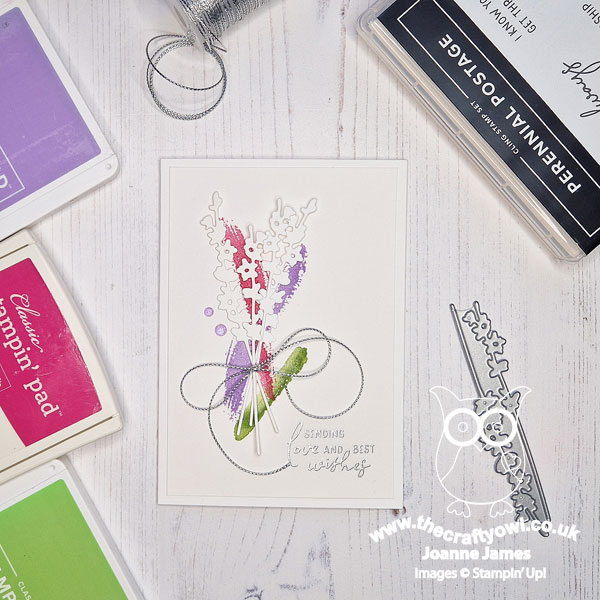
Today I'm sharing a clean and simple card that I made using the current Color Throwdown colour palette (which coincidentally is very similar to our colour palette over at CC&S this week) and the layout over at Freshly Made Sketches, where the lovely Cecile has provided the sketch:


Anyone who reads my blog regularly know how much I love a Freshly Made Sketch layout and especially when it's designed by Cecile - I just love her clean and simple style and always feel that her sketches really challenge me to hone my CAS skills. I was so tempted to go with one of the foliage branches in the Gorgeously Made die bundle, but instead thought I would 'go white' with my new Painted Lavender Dies - take a look:
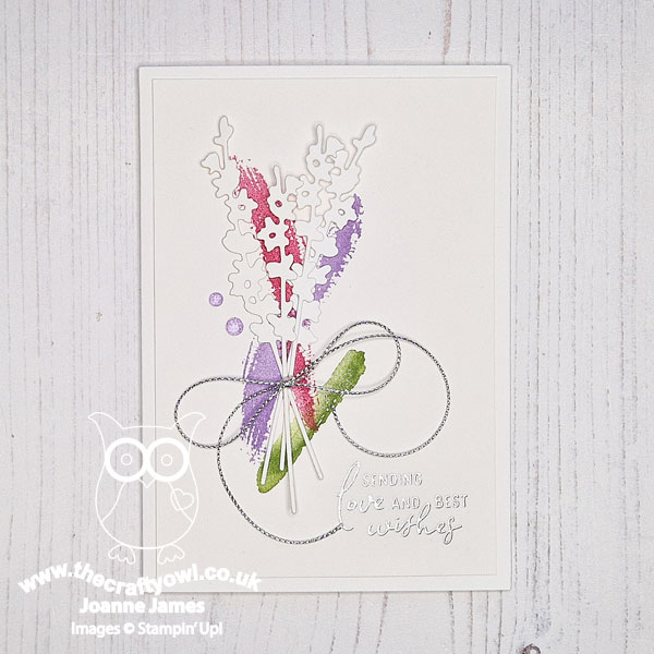
Here's the low-down on today's card:
Tackling The Sketch - The first thing I had to decide was what to do with the three straight elements in the sketch. There are so many ways these could be represented: designer paper offcuts, watercolour swooshes, stamps, stencils - so many possibilities! I decided to go with 'stamped swooshes' of colour to represent the petals and foliage of my lavender stems. I used a couple of retired stamp sets for my brushstrokes, as they really go where I want if I'm free forming and I like the finished effect. If you are interested in other alternatives, I would urge you to check out the FMS Design Team cards - they really have outdone themselves this week, with such a variety of takes on the sketch.
White Lavender - Having laid down my colour, I decided to add a bunch of lavender stems cut from thick white cardstock. This really adds to the clean and simple feel and is a technique that Cecile often uses in her cardmaking.
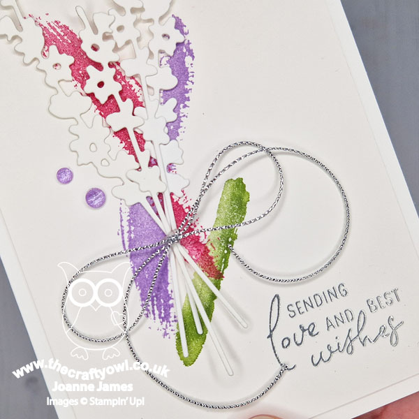
Finishing Touches - To finish, I added a couple of gems, a silver twine trim bow and a silver heat-embossed sentiment from the new 'Perennial Postage' set. This is slightly difficult to see on my main photo because of the lighting, but is clearer on the close-up below:
This is one of those cards that took much longer to make the first time than it would to make a second one, but I think sometimes that's the beauty of a good clean and simple card; just because a design is clean and simple, doesn't mean it is devoid of thought or care. And there endeth today's lesson!
Here is the visual summary of the key products used on today's project for you to pin for easy reference:
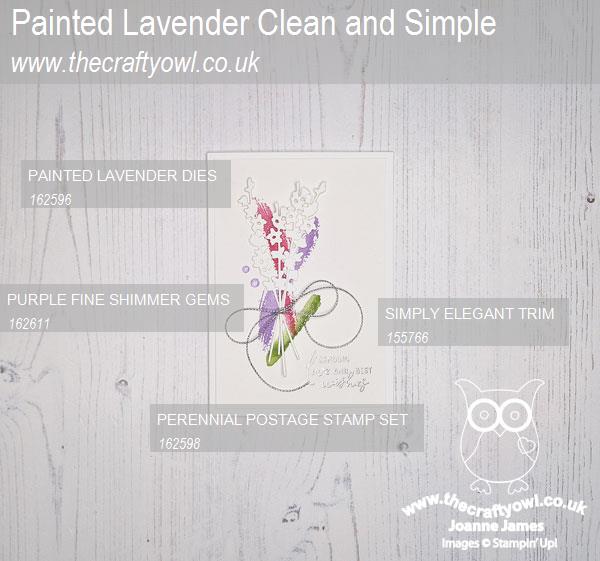
You can see all of my 'How To' summaries on my 'How To - Tips and Techniques' Pinterest board in case you've missed any.
Enjoy your day and I'll be back tomorrow with another project. Until then, happy stampin'!
Stampin' Up! Supplies Used:
