Friendly Silhouettes Palm Beach Sunset

by Joanne James28. July 2020 10:00

As the winds howl and the storm clouds threaten here today in the UK for the second day running, I'm here with thoughts of sunnier days and tropical vacations for today's card! My card was inspired by the following challenges:


That fabulous surfboard in the Inspired By photo is so eye-catching that it totally got me thing of tropical summer beaches and sunsets, so armed with the Inspired by sketch too and the Festive Friday inspo list (I used pink, circles, diecut and summer fun from the inspo list) - I created my dream summer landscape - take a look:


Here's the low-down on today's card:

Friendly Silhouettes - The palm tree dies form the Friendly Silhouettes dies gave me the perfect palm tree pair for my card. These are actually the negative space of the die, so I carefully kept the diecut and used it as a template to piece my palm branches into the correct place to make my scene.

Artistry Blooms - I decided to reach for my designer series papers for my sunset and chose one of the patterns from the Artistry Blooms stamp set. I chose my piece carefully and I can't quite believe how much like a sunset it looks; just what I had in mind and so much easier than creating one with a brayer! 

A Little Added Sparkle - After adding my sentiment to a couple of layered punched circles and popping it up on a dimensional, I looked at my card and felt like it needed a little something more. I reached for a few pots of sequins and carefully went through and chose a few in co-ordinating pinks and oranges and added them randomly across my card, for a little tone-on-tone sparkle. I love the finished result - you can see it better here:

Here is the visual summary of the key products used on today's project for you to pin for easy reference:
 

You can see all of my 'How To' summaries on my 'How To - Tips and Techniques' Pinterest board in case you've missed any. 

Enjoy your day. We have a day of tasks and errands today, nothing too exciting. I'll be back tomorrow with another project. Until then, happy stampin'!


Stampin' Up! Supplies Used:

Table built using Product Table Builder by The Crafty Owl - Independent Stampin' Up! Demonstrator.

Sweet Silhouettes Go In The Direction Of Your Dreams

by Joanne James27. July 2020 07:00

Happy Monday everyone! It's the start of a new week and I am here with a card using some 'oldie but goodie' products from the annual catalogue for a couple of challenges:

Tic-Tac-Toe Challenge   

I went down the centre of The Paper Craft Crew's TicTacToe board - watercolour background, favourite colour (Melon Mambo Pink), Anything But Floral - and whilst I don't have any fairground-related stamps, was totally inspired by those pink swings in the Just Us Girls photo - take a look:


Here's the low-down on today's card:

Sweet Silhouettes - I diecut a tree using my Sweet Silhouettes Dies for the uppermost layer on my card and cut it first so that I could check my positioning even though I added it last. I snipped a small branch off the left hand side in order to enable my card to still fit in a standard envelope when complete.

In The Pink - Melon Mambo is one of my favourite pink colours and I thought it would be the perfect colour for a feminine, watercoloured background behind my swinging girl. I also added a touch of Magenta Madness to the top of the panel to emphasise the ombre effect of my panel and used a Melon Mambo card base. Once my watercoloured panel was dry, I spritzed it liberally with shimmer spray; it's difficult to see on the main photo but give this card such a beautiful lustre - you can see it a little better on the image below:


Silhouette Scenes - To compliment my pink background, I used my Stamparatus to add a well-inked stamp of the young girl on her swing. I stamped it a few times to get a good solid image; the slight flecking is due to the texture of the watercolour paper which prevents a truly solid print being achieved. I also stamped a suitable sentiment from the same set below and added a few sequins to further compliment the pink.

This card is heading to a valued member of my team who is constantly striving and reaching for bigger and better things - I hope she likes it!

Here is the visual summary of the key products used on today's project for you to pin for easy reference:


You can see all of my 'How To' summaries on my 'How To - Tips and Techniques' Pinterest board in case you've missed any. 

Enjoy your day; I have an online class today amongst other things so today will be a busy one! I'll be back tomorrow with another project. Until then, happy stampin'!


Stampin' Up! Supplies Used:

Table built using Product Table Builder by The Crafty Owl - Independent Stampin' Up! Demonstrator.

Tags: , , , , ,

Cards | Shop Online | Shop Stampin' Up! Online | Stamping

Gift Wrapped Meets Trimming The Town Sneak Peek

by Joanne James26. July 2020 15:00

There are lots of Christmas In July challenges about at the moment so I thought I would combine a couple and squeeze in an extra post today and share a couple of sneak peeks from the upcoming Autumn-Winter Catalogue with you in the process:


The team over at The Spot are looking for any kind of Christmas card creation and The Card Concept has a great inspiration photo that lead me to take my inspiration from one of the presents under the tree (front row, second from the right) to create a card and a matching gift card holder using some fun new products - take a look:


Here's the low-down on today's card firstly:

Trimming The Town - The designer series paper that covers the front of my card is from a new pack called 'Trimming The Town' - a pack full of contemporary designs featuring cosy villages and winter scenes. Some are really large and some really small and detailed, like the fun design I used to mimic wrapping paper on my gift parcel card.

Gift Wrapped Bow (And A Trick) - My bow comes from a new stamp set called 'Gift Wrapped' and is stamped in Real Red on Whisper White cardstock and punched out with the new co-ordinating Gift Bow Builder Punch. I added a handcut tag and some 'ribbon' too - and therein lies the trick! I actually used a current DSP for the ribbon strips that co-ordinate with my bow; can you tell which one? It's actually the reverse of one of the patterns in the Playful Pets DSP pack - isn't that a great shortcut? I added a little more stamping on the inside of my card too:


Gift Card Holder - I thought my gift-inspired card would be great to go with a co-ordinating gift-card holder too - I always need a few of these at Christmas time:

I can't take the credit for the design; it's based on one designed by the talented Erica Cerwin of Pink Buckaroo Designs (you can see the measurements for her original project on her blog here). It's a great little make, where the lid pulls out of a sleeve and you can add a message and your chosen gift card:

I think these make a cute pair of projects and are a great start to my Christmas crafting. I'm slowly but surely increasing my Christmas crafting - it always seems harder to do when the sun is shining outside though!

Here is the visual summary of the key products used on today's project for you to pin for easy reference:


You can see all of my 'How To' summaries on my 'How To - Tips and Techniques' Pinterest board in case you've missed any. 

Enjoy your day and I'll be back tomorrow with another project. Until then, happy stampin'!


Stampin' Up! Supplies Used:

To be updated 4th August.

Whale of A Time Turtles Galore PP501

by Joanne James26. July 2020 09:00

Today it's Sunday and time for this week's new challenge over at The Paper Players! It's the turn of the wonderful Anne Marie to host and this week it's my favourite, a sketch challenge:


I deliberated over this week's sketch then decided to go with an idea that I had been mulling over - take a look at my finished card:


Here's the low-down on today's card:

Whale of A Time - My whole card this week was based on a couple of my favourite patterns in the Whale Of A Time DSP pack. There are some amazing patterns in this pack but the ones featuring the turtles stole my heart the minute I set eyes upon them! I have had so many special encounters with turtles when scuba diving that these graceful sea creatures will always be special to me. I could happily never have cut these papers, but when I saw Anne Marie's sketch this week I saw a way to use these patterns in a fun way. I used the piece with the small turtles swimming on the current for my base, then added a section featuring the larger turtles for the central section. I wanted it to appear almost as if the turtles on the central panel were a magnified version of the turtles behind. Furthermore, I was careful to choose which piece to cut for my central panel; doesn't that green turtle in the centre appear to be looking at you head on? Here's a close-up so you can see what I mean:

Flip The Sketch - It was the diagonal on the sketch that made me think of the paper design featuring the turtles travelling on the current, but they weren't swimming in the right direction. To solve the issue, I flipped the sketch along the vertical edge and inverted all of the elements. I also made the central rectangle smaller and borderless (I didn't want to obscure the diagonal of turtles too much) and my sentiment banner slightly longer to accommodate my chosen sentiment. My interpretation of the sketch is less literal this week, however you can still clearly see all of the elements.

It's Not All About The Paper - Whilst the front of my card most definitely focuses on my chosen papers, this card is not all about the paper! I added some stamping to the corner of my envelope and added this cute punny sentiment inside along with some colourful shoals of fish to complete my card:

Whilst at first glance my card may appear simple, it actually took a lot of thought to bring my ideas to fruition. So what do you think? Do you like the end result? Do leave me a comment below - I would love to hear your thoughts!

Here is the visual summary of the key products used on today's project for you to pin for easy reference:


You can see all of my Product and 'How To' summaries on my 'How To - Tips and Techniques' Pinterest board in case you've missed any. 

Before you reach for your ink and papers, check out what our amazing team has created to inspire you this week:

Here's a quick recap of our challenge rules:
 
1.  Create a new paper project
2.  Upload your creation to your blog with a link back to us and provide a direct link to the post featuring your challenge submission.
3.  Please link your card to no more than four challenges, TOTAL.
4.  Have FUN!

You can see all of my 'How To' summaries on my 'How To - Tips and Techniques' Pinterest board in case you've missed any. 

Enjoy your day; we are hoping to dodge the thunderstorms and go cycling today as well as do some baking amongst other things. I'll be back tomorrow with another project. Until then, happy stampin'!


Stampin' Up! Supplies Used: 

Table built using Product Table Builder by The Crafty Owl - Independent Stampin' Up! Demonstrator.

Cute Fruit with Oranges, Lemons and Limes

by Joanne James24. July 2020 20:56

I had some new goodies arrive yesterday and finally got some time to play this afternoon so I'm just popping by to share a quick card that I made for this week's Freshly Made Sketches challenge with the current colour palette over at Color Throwdown:


I was intrigued by those circles on Jen's sketch and I had an idea that I thought might work with one of my new stamp sets - take a look:


Here's the low-down on today's card:

Cute Fruit - The 'Cute Fruit' stamp set is so fun! The set includes lots of different fruit and in addition to the fruit and some great punny sentiments, there are also a selection of cute faces - I mean, what's better than a banana? Well, a banana with a face of course!! I haven't used the faces on today's card, but rest assured they will make an appearance at some point.  

Let's Talk Sketch - I was musing over how to represent those little circles when it occurred to me they could be slices of oranges, lemons and limes. I decided to try out my idea, but this necessitated me altering my card base to a horizontal rather than vertical one, to allow me to scale my fruit accordingly and still keep the elements of the sketch in proportion. You can still see the sketch layout though and how it inspired my card. I would never have thought about using this set in this way so the sketch was a great way to stretch my creative thinking. 

Citrus Sparkle - I stamped each of my small citrus slices in Granny Apple Green and retired Pineapple Punch and Grapefruit Grove and punched them out with my retired 1" punch. I decided to create a large orange slice for the larger circle in the sketch and did this by layering some circles of cardstock and adding some segments cut from retired glimmer paper that I coloured orange with some ink and a sponge dauber for some extra sparkle which you can see better on the photo below:

I added some clear Wink of Stella to my stamped citrus slices too for some added lustre and my card was complete. So what do you think of today's citrus-y card? Does it work for you? Do leave me a comment - I'd love to hear your thoughts.

Here is the visual summary of the key products used on today's project for you to pin for easy reference:


You can see all of my 'How To' summaries on my 'How To - Tips and Techniques' Pinterest board in case you've missed any. 

Enjoy your evening and I'll be back tomorrow with another project. Until then, happy stampin'!


Stampin' Up! Supplies Used:

Table built using Product Table Builder by The Crafty Owl - Independent Stampin' Up! Demonstrator.

A Mountain Air Adventure Times Two TTT 74

by Joanne James23. July 2020 18:00

It's Thursday and time for a new challenge over at TicTacToe! It's the turn of Team X to host this week and I am the featured designer. This is the fun board that we are playing along with: 


I decided to go long and skinny with today's card and went both across the first row - mountain/sunshine/adventure - and down the first column - mountain/hot air balloon/pink and create a summer evening landscape - take a look:


Here's the low-down on today's card:

Brayered Sunset - I started by taking a selection of inks and a sponge brayer to create my sunset sky. I masked a space for my sun and after stamping in my mountains reverse-masked the mountains and sky and sponged in my dark pink setting sun.

Mountain Air - I used the mountains from the 'Mountain Air' stamp set to create my mountain landscape. This is an interesting set of reversible stamps that I initially bought for scrapbooking as you can make great scenes with them, but they also work for cards and especially the 'long and skinny' design that is all the rage currently. I created depth by stamping off and only adding the detailing to the foremost layer. I used a combination of blues to create a silhouette-type feel and stamped in a trio of hot air balloons from the retired 'Above The Clouds' stamp set in blue too to add to the effect.

Sweet Silhouette Adventure - I added a diecut 'adventure' from the Sweet Silhouettes Dies set to the front of my card as it seemed to fit with my scene. This would be a great card to send to someone about to embark on a gap year who is planning to travel; I'm not sure there are any teens able to do this currently, so will have to add this to my box for the future when we can all move more freely again. In the meantime, we can but dream of adventures far and wide!

I actually created a couple of brayered backgrounds whilst I was getting inky, so here's a second, slightly smaller card with the same design and a more pink sky:

Finally here's both of my cards together - which one do you prefer?

Here is the visual summary of the key products used on today's project for you to pin for easy reference:


You can see all of my Product and 'How To' summaries on my 'How To - Tips and Techniques' Pinterest board in case you've missed any. 

A tictactoe board offers so many creative possibilities - how does this week's board inspire you? Why not have a go? We would love to see you in the gallery and who knows - you might be selected for Designer's Choice and be eligible to be a guest designer on a future challenge. 

Enjoy your evening; I'll be back tomorrow with another project. Until then, happy stampin'!


Stampin' Up! Supplies Used: 

Table built using Product Table Builder by The Crafty Owl - Independent Stampin' Up! Demonstrator.

Give Thanks With Arrange A Wreath Square Card

by Joanne James20. July 2020 18:15

Happy Monday everyone! Mine has been a busy one and has run away with me somewhat; I just realised if I didn't get today's post written I would miss linking up with the wonderful team over at Freshly Made Sketches where I used the fabulous Jen T's sketch as the starting point for my card today:

This is such a great sketch! I have been playing with the new 'Arrange A Wreath' set for the past week or so in readiness for my upcoming class using this set and thought Jen's square design would be the perfect place to showcase it - take a look:


Here's the low-down on today's card:

Plaid Tidings - The colour inspiration came from this fabulous plaid design from the forthcoming DSP pack 'Plaid Tidings' that will debut next month in the new Autumn-Winter catalogue. It contains some great patterns and colour schemes and I loved the autumnal colours of this one.

Build A Wreath - I used the Wreath Builder dies to cut two wreaths and layer them, to which I added my stamped leaves and a bow made from the edge of some Pretty Peacock scallop edge ribbon. 

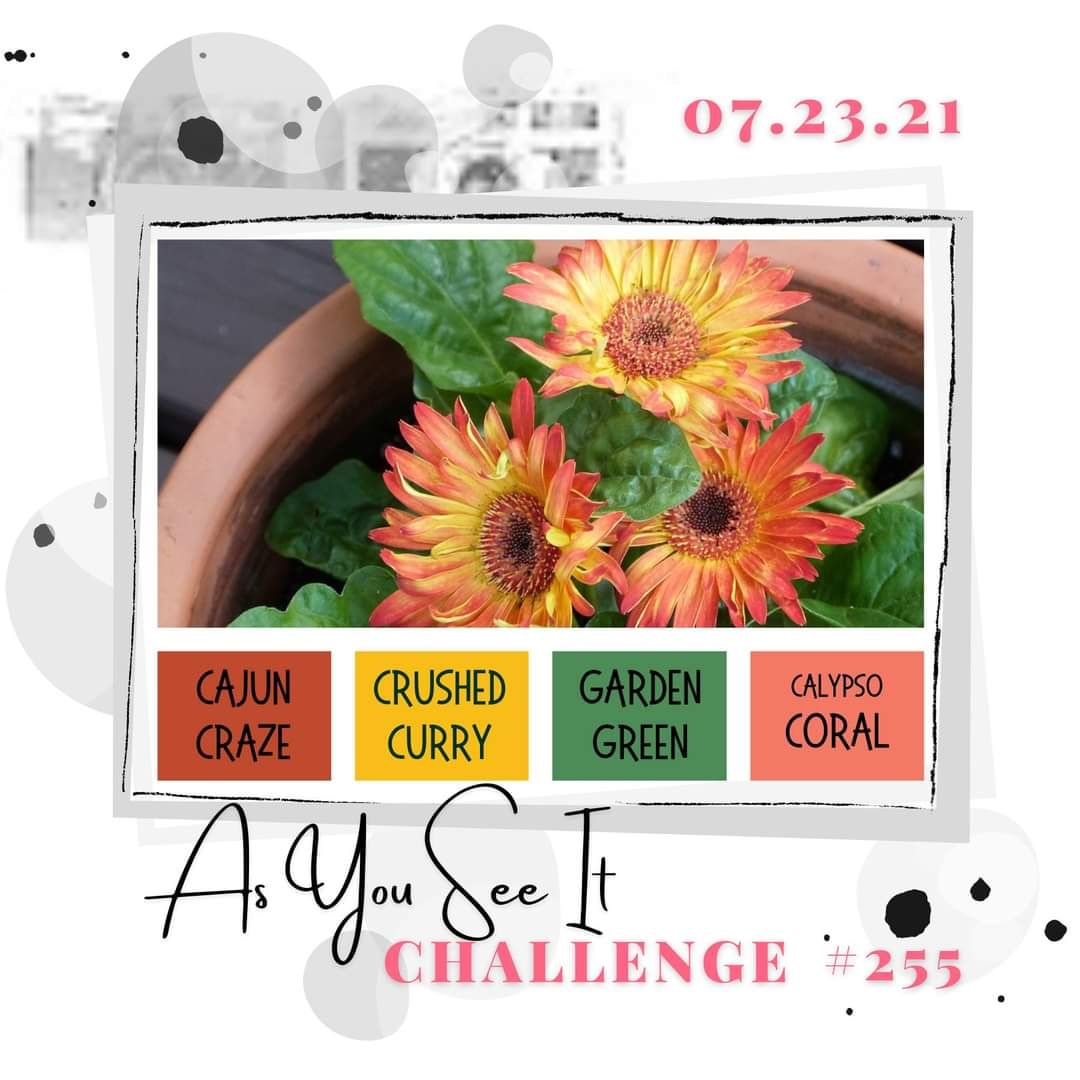
Autumn Leaves - I stamped a collection of leaves, some in solid colour and some that I used my sponge daubers to add colour to the edges to create that variagated coloured look that is often a feature of autumn leaves. The colours maybe a little atypical with the Pretty Peacock in the mix, but it does provide a lovely contrast to the warm tones of Cajun Craze and Crushed Curry and I think overall it works - don't you? I also added a little detail to the inside:


Here is the visual summary of the key products used on today's project for you to pin for easy reference:


You can see all of my 'How To' summaries on my 'How To - Tips and Techniques' Pinterest board in case you've missed any. 

Enjoy your evening and I'll be back tomorrow with another project. Until then, happy stampin'!


Stampin' Up! Supplies Used:

Table built using Product Table Builder by The Crafty Owl - Independent Stampin' Up! Demonstrator.

B Is For Birthday - Happy 500th Birthday Paper Players PP500

by Joanne James19. July 2020 09:00

Today it's Sunday and time for this week's new challenge over at The Paper Players! It's the turn of the fabulous Jaydee to host and this week it's a special one - it's our 500th challenge! Can you believe it? 500 challenges! Paper Players has been one of my favourite challenges ever since I started blogging; it was the first challenge I ever entered - that card was for the sketch challenge PP164 and you can see my card here if you'd like a trip down memory lane. I've been designing with this fabulous team since challenge PP203 (you can see that card here) and they seriously are a special bunch!

It's clean and simple week and in light of our milestone we simply had to go with a celebratory theme:


I combined our theme with this week's colours over at The Spot and the sketch over at CAS Colours and Sketches and came up with a fun birthday card - take a look:


REMEMBER THIS IS CLEAN AND SIMPLE WEEK - What do we mean by Clean and Simple?

  • Minimal layers and embellishments
  • Plenty of open space, aka "white" space
  • Simple and uncluttered

With that in mind, here's the low-down on today's card:

B Is For... - I used the new set 'Monogram Messages' to spell out my birthday greeting today and thought the colours over at The Spot were perfect for a bold and colourful birthday card for a discerning teenage girl - and I have lots of those to make cards for these days! I heat embossed my greeting in gold on black and layered my oval on a scalloped one of gold foil. I used a few layers on today's card but I kept my design clean with blocks of colour to maintain the CAS feel.

A Rainbow Glimmer Tip - I added a couple of glimmer balloons punched with my Balloon Bouquet punch, one in Magenta Madness and one in Pool Party - I just love the effect of all that sparkle! I have a little tip for you when punching glimmer paper: if you gently run a Stampin' Blend in a co-ordinating colour around the edge, it will colour any white fibres and blend the edge perfectly with the glitter on the front of the card. I added a couple of gold twine bows and threads too.


Don't Forget The Inside - I added a sentiment from 'Zany Zebras' to the inside of my card, along with a couple of stamped balloons with hand-drawn strings to continue the party feel:


I love this funky colour scheme and simple layout - perfect for a clean and simple yet special birthday card.

Here is the visual summary of the key products used on today's project for you to pin for easy reference:


You can see all of my Product and 'How To' summaries on my 'How To - Tips and Techniques' Pinterest board in case you've missed any. 

Before you reach for your ink and papers, check out what our amazing team has created to inspire you this week:

Here's a quick recap of our challenge rules:
 
1.  Create a new paper project
2.  Upload your creation to your blog with a link back to us and provide a direct link to the post featuring your challenge submission.
3.  Please link your card to no more than four challenges, TOTAL.
4.  Have FUN!

You can see all of my 'How To' summaries on my 'How To - Tips and Techniques' Pinterest board in case you've missed any. 

Enjoy your day; the weather is due to change and we are expecting rain here today, so we may be restricted to indoor activities although we have no special plans - sometimes that is the best kind of day. I'll be back tomorrow with another project. Until then, happy stampin'!


Stampin' Up! Supplies Used: 

Table built using Product Table Builder by The Crafty Owl - Independent Stampin' Up! Demonstrator.

Have a Hoot Owl Family Christmas Card Sneak Peek

by Joanne James18. July 2020 18:00

A late post from me today as we've been busy cycling and enjoying a dinner of homemade pizzas in our new pizza oven! I'm sharing a card using this gorgeous colour palette over at Colour Inkspiration and the current Paper Craft Crew sketch:

No photo description available.   Vertical sketch with horizontal scallop rectangle placed in bottom left corner with banner behind.

Whilst that lovely colour palette would work really well for an autumnal card, following my Autumn-Winter pre-order unboxing live session online this week, I couldn't resist making my first Christmas card with my new supplies - take a look:


Here's the low-down on today's card:

Have A Hoot - The cute little owls on today's card are courtesy of a new stamp set called 'Have A Hoot' - aren't they just the cutest?! I heat embossed them in white onto Crumb Cake to highlight the little snowflakes and coloured the owls with my Blends. Check out the punny sentiment too!

So Many Snowflakes - I stamped some background snowflakes tone-on-tone onto my Real Red card base and added a diecut snowflake in (retired) white glimmer paper and cut with my new So Many Snowflakes dies as an accent. I also added a sprinkle of snowflake sequins for a little sparkle.

Stitched So Sweetly - My stitched scalloped panel is courtesy of the Stitched So Sweetly dies; I added a couple of strips of Cinnamon Cider cardstock and DSP behind just to highlight the colour and anchor the panel - here's a close up: 


Here is the visual summary of the key products used on today's project for you to pin for easy reference:


You can see all of my 'How To' summaries on my 'How To - Tips and Techniques' Pinterest board in case you've missed any. 

Enjoy your evening and I'll be back tomorrow with another project. Until then, happy stampin'!


Stampin' Up! Supplies Used:

Table built using Product Table Builder by The Crafty Owl - Independent Stampin' Up! Demonstrator.

Seaside Notions And A Speedy Trio of Seahorses AYSI230

by Joanne James17. July 2020 12:00

Today I'm sharing my design team card for our new challenge over at As you See It where it's time for a speed challenge:


A card in under 10 minutes - always a challenge! I took my inspiration from the ocean scenes and beautiful shades of turquoise in the Hand Stamped Sentiments photo and set to work - take a look:


Here's the low-down on today's card:

Seaside Notions - I purchased the stamp set 'Seaside Notions' a while ago, following so many marvellous cards that my friend and fellow AYSI teamie Jan Clothier had made with this set, but I had yet to ink it up so this challenge gave me the perfect opportunity. I love this seahorse and whilst my rough blue colouring with my watercolour pencils is not typical of these shy creatures in the wild, I wanted to contrast with my Crumb Cake background and white embossing. I'm also linking up with the team over at SUO Challenges where their current challenge is 'Animals'.

Quickfire Crafting - As always, the secret of quick card making is to be organised! I got everything out on my desk before I started and I already had the stitched rectangle in my card box leftover from another project, along with the card base and mats, so my energies went into speedy stamping and heat embossing with a quick scribble of colour. I used my blender pen to even out the pencil lines and added a little Wink of Stella to the backbone of each seahorse for some added sparkle:


From The Mouths of Babes - So how long did my card take me? I squeezed it in under the wire at 9 minutes 24 seconds - and left the usual craftermath in my wake:


When having the discussion over dinner with the James Juniors as to who I would send this card to, they immediately agreed it should go to one of my scuba diving friends who lives in Canada, called Cathy. They then proceeded to question why I was making a card with three seahorses on anyway; as I explained that I needed three of something and my card needed to be completed in under 10 minutes, Rebecca promptly announced "Well that's easy - why didn't you just make a one layer Christmas card with the three wise men on it? You'd have been done in minutes!" Oh if only I'd engaged her earlier in the crafty process!

Here is the visual summary of the key products used on today's project for you to pin for easy reference:


You can see all of my 'How To' summaries on my 'How To - Tips and Techniques' Pinterest board in case you've missed any. 

Here's a summary of our challenge rules:

  • Create any card, scrapbooking page, 3D project or packaging project that fits the challenge.
  • Please include the challenge graphic and link back to the challenge in your blog post. Turn off word verification so we can leave you lots of lovely comments. Make sure you link the post not the whole blog to the Linky. Use #AYSIXXX when uploading to a public gallery.
  • If you’re unsure about ‘the rules’, check the details under the Challenge Guidelines tab on the As You See It Challenge homepage.

We look forward to seeing your creations in the AYSI gallery.

Enjoy your day and I'll be back tomorrow with another project. Until then, happy stampin'!


Stampin' Up! Supplies Used:

Table built using Product Table Builder by The Crafty Owl - Independent Stampin' Up! Demonstrator.


New Online Exclusives

There are new products available exclusively in the online store from 5 November - check them out here.

Latest Kits!

Stampin Cut and Emboss

The Layered Landscapes Kit and Nature's Paintings Kit are the latest kits in the online store - get yours here!

Shop Online

Access my online shop 24 x 7, 365 days of the year:

Current November hostess code:

9NKXDTTR

Shop Online

Mini Catalogue

BROWSE THE CATALOGUE

'Tis The Season - the new Stampin' Up! Mini Catalogue is here! For more details and to download your copy click here

Scrapbooking

Stampin' Up! has introduced a new range of 12x12" scrapbooking product and kit - the full range is now available to purchase online. To download a copy of the new digital Scrapbooking Catalogue click here.

2024-25 Annual Catalogue

BROWSE THE CATALOGUE

Click on the image to download your copy of the 2024-25 annual catalogue. For a full list of current SU! supplies, go to my online store. If you would like any help or advice, please drop me a line at joanne@thecraftyowl.co.uk or give me a call on 07773 421446 - I'd be happy to help.

Join My Team

It's always a great time to join Stampin’ Up! New team members can get £130 worth of products for only £99 + free business supplies + free shipping + all the fun being a part of Stampin’ Up! Stampin' Up! has something for everyone: join my growing team and benefit from my support to enjoy Stampin' Up! however you choose.

If you're interested, call me for a chat to understand how I can help you realise your goals. Alternatively, if you have already decided to sign up and you just can't wait, please click here for the link to the online form where you can sign up and order your starter kit right away! 

About Me

Hi I'm Joanne and live in Northampton and when I'm not looking after my husband and two beautiful children, am an avid crafter with a passion for all things Stampin' Up!

I must confess that I have never been a big rubber stamper - until I discovered Stampin' Up! that is. I love the fact that I can get such great results with co-ordinating stamps, inks, papers and punches - the possibilities are endless! Join me on my stamping journey as I share the things I love and be inspired to create amazing things yourself!

Follow Me

Monthly Newsletter

Box Builder

Click the button above to use Box Buster to create your custom box design using the Envelope Punch Board!

Kits Collection Now Available!

Stampin Cut and Emboss

The new Kits Collection from Stampin' Up! is now available!

Click here to see the current kits available and order yours online today.

I Design For


Stampin' Up Stuff

This is my personal blog and is not endorsed by Stampin’ Up! I hope you find it a plentiful source of ideas and personal inspiration but please don't copy my designs for contest submission or use for classes, publication or sale without express permission.