by Joanne James23. January 2023 09:00
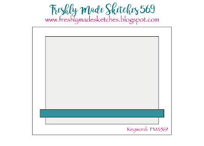
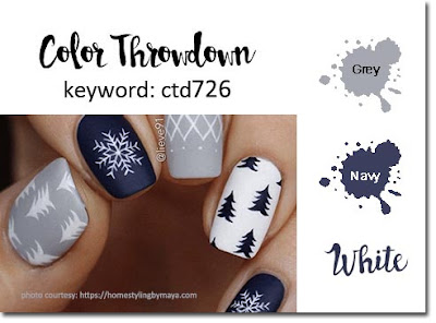
Happy Monday everyone! Today I'm sharing another card using Jacquie's layout over at Freshly Made Sketches, this time paired with the palette over at Color Throwdown:
I thought Jacquie's layout was perfect to showcase a beautiful piece of designer series paper and I had just the sheet - take a look:
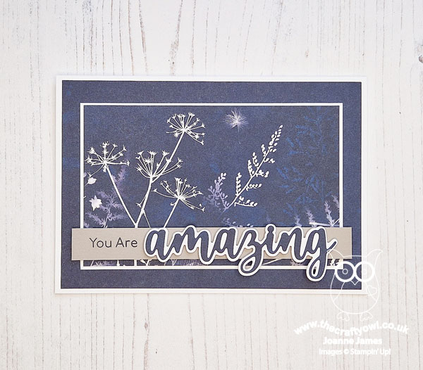
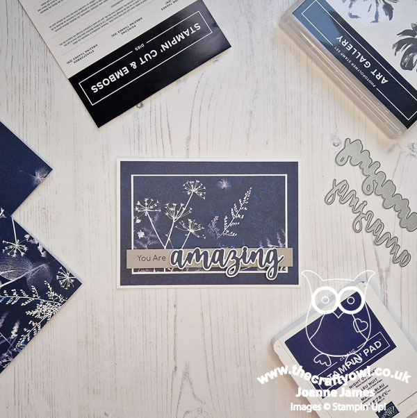
Here's the low-down on today's card:
Do you ever buy a pack of paper that you just don't want to cut into? This particular design in the Sun Prints pack was one of those for me! The botanical prints are so delicate and the cyanotype style of the papers gives them a beautiful soft and organic feel. I carefully chose a corner of my sheet and cut it to fit my centre panel, using a piece without a print for my mat layer and diecut sentiment. The Color Throwdown palette immediately made me think of the SunPrints papers, as grey is also a colour that features in this pack, albeit not on the sheet I wanted to use. The banner across the front of the sketch was a great way to incorporate the grey and add a touch of contrast though so both elements fitted together perfectly:
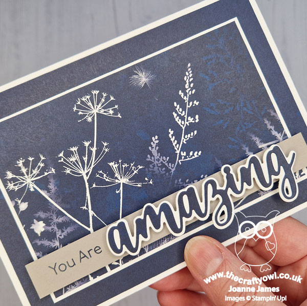
That paper is so beautiful - sometimes you have to just #loveitchopit!
Here is the visual summary of the key products used on today's project for you to pin for easy reference:
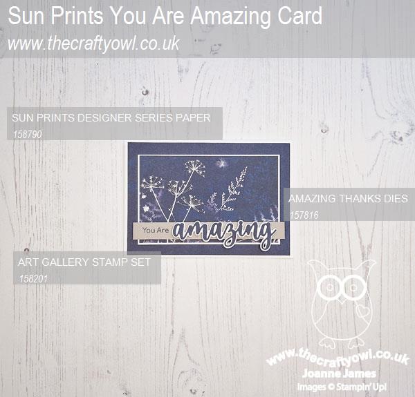
You can see all of my 'How To' summaries on my 'How To - Tips and Techniques' Pinterest board in case you've missed any.
Enjoy your day. Mine will be filled with household chores, but needs must! I'll be back tomorrow with another project. Until then, happy stampin'!
Stampin' Up! Supplies Used:
