by Joanne James1. May 2019 07:00
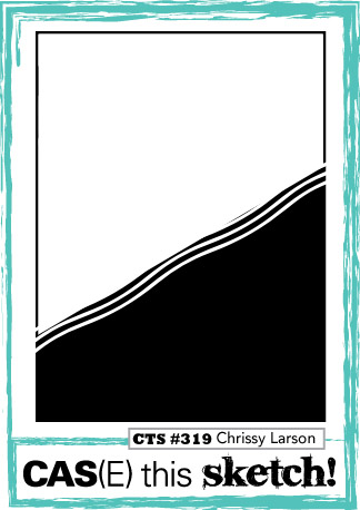
Today I'm sharing a quick clean and simple card for this week's challenge over at CAS(E) This Sketch that also works for another entry into the Addicted to CAS challenge which is all about contrasts:


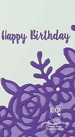
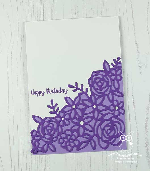
This sketch was perfect for a tone-on-tone Springtime Impressions floral Corner diecut contrasted with a white front panel:

I diecut the edge of my white panel to but up to my gorgeous Grape diecut and adhered both pieces to my Highland Heather card base, paper-piecing a few of the flower centres and stamping my birthday sentiment to finish. I also trimmed the left-hand corner of the diecut to fit my portrait orientation.
That's all there is to it!
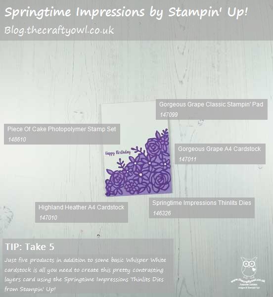
Here is the visual summary of the key products used on today's project for you to pin for easy reference:

You can see all of my 'How To' summaries on my 'How To - Tips and Techniques' Pinterest board in case you've missed any.
Enjoy your day and I'll be back tomorrow with another project. Until then, happy stampin'!
Stampin' Up! Supplies Used: