by Joanne James30. January 2017 07:00
Today I'm sharing a card that uses the sketch over at CAS(E) This Sketch and the clean and simple challenge over at CASology:


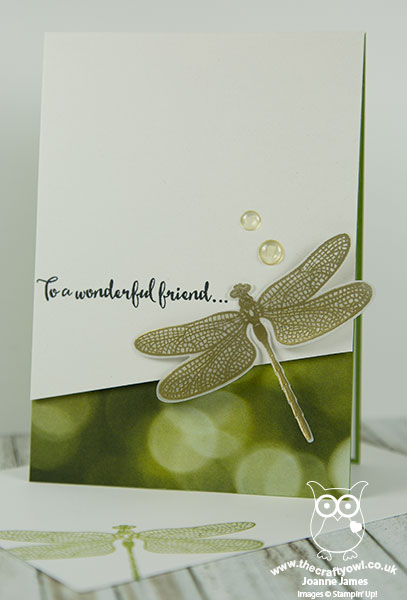
I'm a big fan of the sketches over at CAS(E) This Sketch and had quite a few interpretations on this one and for today chose to combine with the codeword over at CASology: Glisten. I love how a single word can really make you think creatively and sometimes takes your cardmaking into unexpected directions - here's my card:

Here's the low-down on today's card:
All That Glistens - When I consider the word 'glistens', I think of shining light, usually on water or frost, or maybe something transparent or translucent. I decided this sketch would be perfect to showcase a lone dragonfly, with sparkly, translucent wings. I stamped my dragonfly in Versamark onto vellum and heat embossed it in gold, then coated the wings with a liberal dose of clear Wink of Stella. I used Shimmer White cardstock which also has a subtle lustre and added some clear accents to act as raindrops and tie in with the theme. It is so difficult to capture the shimmer in a photograph - here's a close up:

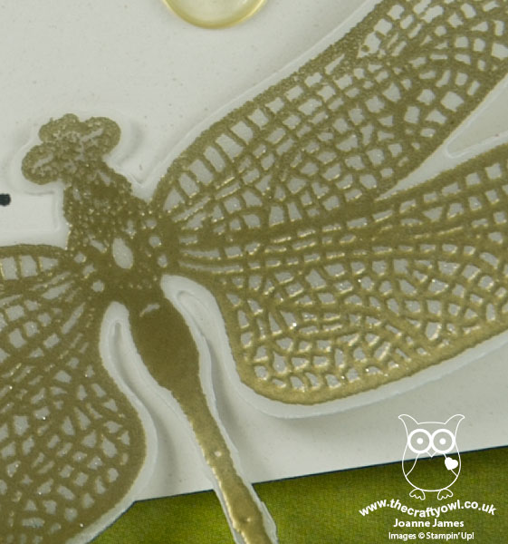
Here's a further close-up of the dragonfly's wings, where you can just about see the sparkle from the clear Wink of Stella - it really looks so beautiful in real life:

A Dragonfly Dream - The single dragonfly is from the Dragonfly Dreams set in the Spring-Summer catalogue and was easily cut out using the co-ordinating Detailed Dragonfly Thinlit Dies. This is one of a number of bundles in the seasonal catalogue - if you buy both items you will save 10%. A great baargain - add a little something to it and you can benefit from a free Sale-A-Bration item too (with an order of £45 or more).
A Trick Of The Light - I added a panel of Serene Scenery designer series paper to the base of my card, to add a little colour and tie in with the theme with this 'bokeh' effect, which is often the resulting effect when light is photographed as it glistens on water or rain. Patterned paper can still feature in a 'clean and simple' design; the trick is to use sparingly; a good rule of thumb is to restrict its use to no more than one third of the overall card design.
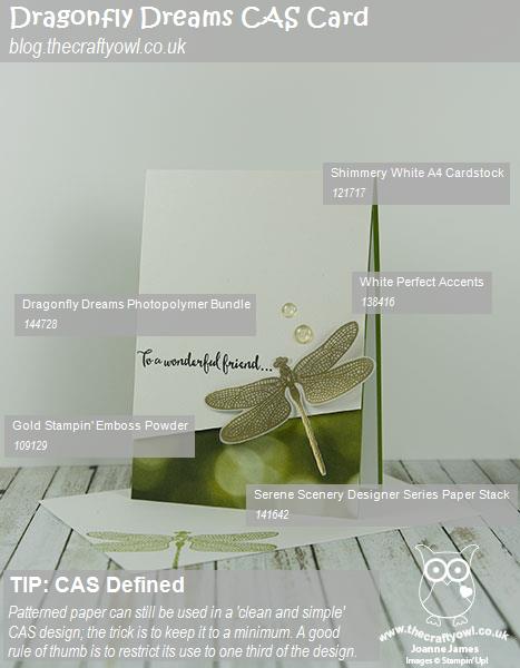
Here is the visual summary of the key products used on today's project for you to pin for easy reference:

You can see all of my 'How To' summaries on my 'How To - Tips and Techniques' Pinterest board in case you've missed any.
Enjoy your day and I'll be back tomorrow with another project. Until then, happy stampin'!
Stampin' Up! Supplies Used: