Today I'm sharing a second card that combines a couple of challenges:
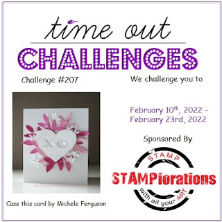
The trend in focus over at Just Us Girls is to use a die as a stencil and over at Time Out the challenge is to case a card by the fabulous Michele Ferguson of I Card Everyone. I have been experimenting with stencils - and dies as stencils - quite a bit lately, with varying degrees of success so the JUGS team are most definitely onto something! I had also been playing around with ideas to CASE Michele's beautiful card over at Time Out - if you've never seen Michele's work, you should definitely pay a visit to her blog or look her up on social media - she makes the most amazing creations and is just the nicest person! In an effort to create something that was unique but had a clear nod to Michele's card, I decided to combine both challenges. This is what I came up with:
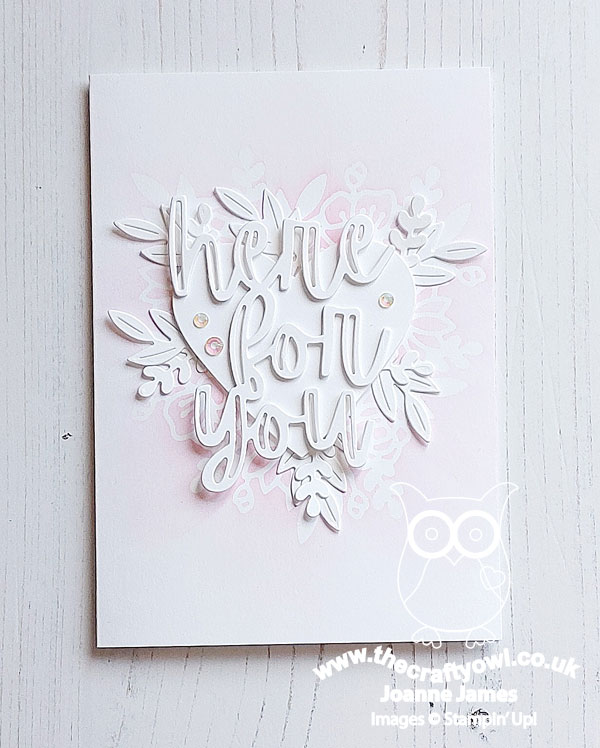
Here's the low-down on today's card:
A Floral Heart - I decided that the Floral Hearts Dies that I've used a few times lately might work as a stencil. I used the die to make a stencil, replacing the heart in the centre then using a blending brush with some Polished Pink ink to add ink and fade from the centre outwards. This is what the finished stencilled panel looked like:
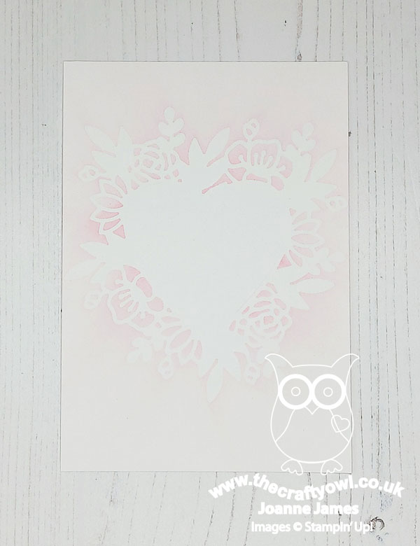
I love the effect of the soft, pale pink and subtle stencilled pattern, although it was tricky to capture on the finished card.
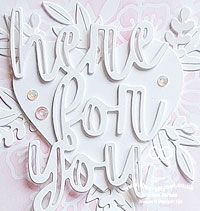
Here For You - I decided to add a 'here for you' diecut sentiment from the Here Together Dies to a white heart for the centrepiece of my stencilled card, tucking in a few additional pieces of white diecut foliage behind my heart and a trio of iridescent rhinestones to finish:
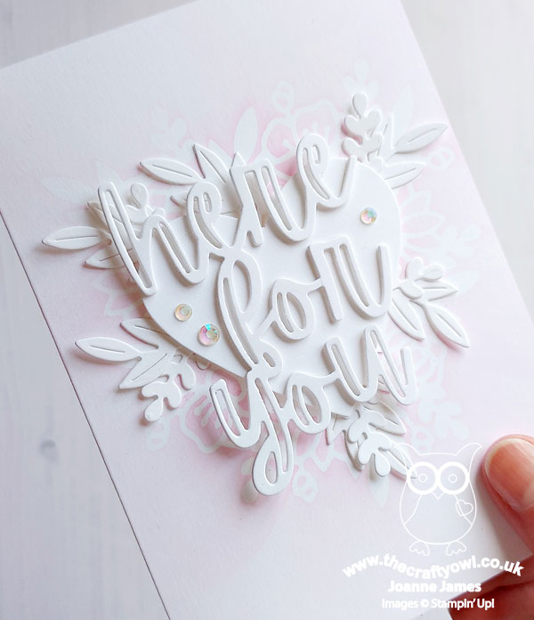
With an alternative sentiment this card would work for a variety of occasions, including a wedding or anniversary I think.
To 'CASE' - I've talked about it here before, but the expression to 'CASE' or Copy And Share Everything' is really about using someone's work to inspire you to create something unique with a nod to the original in a variety of ways. When looking at Michele's original card, I retained the white heart as a focal point with a white-on-white sentiment, and used a combination of pink and white foliage/florals around the outer edge of the heart. Whilst there are similarities, there are also aspects of my card that are unique, such as the ink and stencilling. Side by side, my inspiration is clear - but I also created something that has its own sense of individuality too. I'm not sure that my card does Michele's justice, but it was a fun exercise!
Here is the visual summary of the key products used on today's project for you to pin for easy reference:
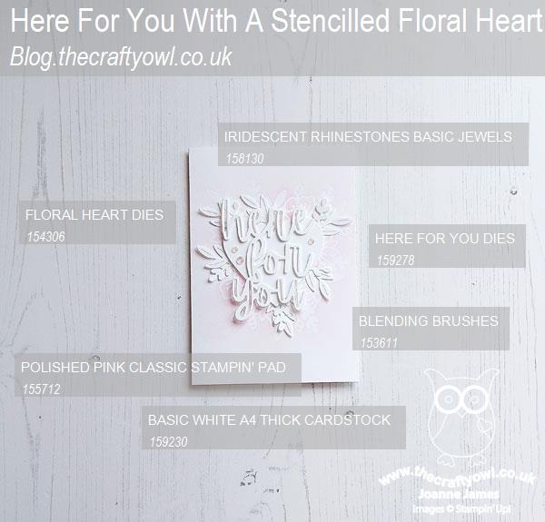
You can see all of my 'How To' summaries on my 'How To - Tips and Techniques' Pinterest board in case you've missed any.
Enjoy your evening and I'll be back tomorrow with another project for our new challenge over at Festive Friday. Until then, happy stampin'!
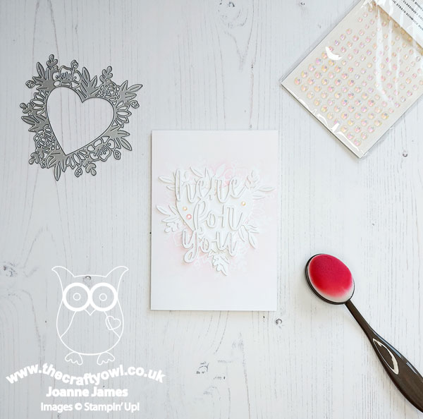
Stampin' Up! Supplies Used: