by Joanne James8. June 2021 12:00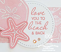
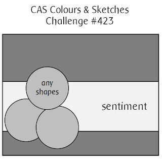
It's Tuesday and time for a new challenge over at CAS Colours & Sketches. Apologies that I'm a little later going live with my post this week - I'm blaming the sunshine! This week's challenge is a sketch challenge and Shannon has asked that we use a trio of shapes to anchor a horizontal strip. Feel free to flip or rotate the sketch when making your card.

For my card today I decided to go pink and create something that suits the 'Beach' challenge over at Addicted to CAS too - take a look:
Here's the low-down on today's card:
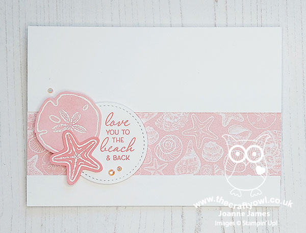
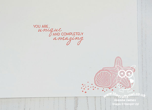
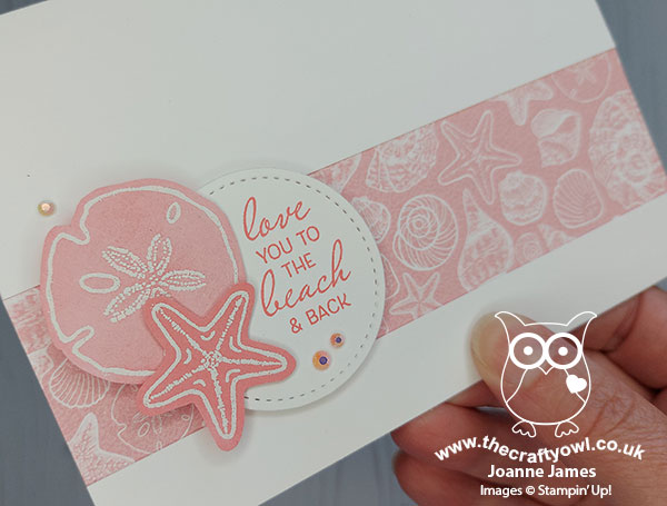
Sketch Liberties - I did take a couple of liberties with Shannon's sketch this week: I decided to use 2 shells and a stitched circle for my trio of shapes and instead of using 3 shells and adding my sentiment to the horizontal panel, I stamped it onto my stitched circle. This was primarily because I wanted to use this specific sentiment and it fitted better on a circle! The basic elements of the sketch are all visible though and it's easy to see how it inspired my card. I used another of the sentiments from the 'Friends Are Like Seashells' stamp set on the inside of my card - this set has such lovely sayings:
A Question of CAS - I used a piece of Sand and Sea designer series paper for the horizontal panel of my card. There is a school of thought that says DSP shouldn't be used on a CAS card, however this patterned paper lover is of the view that it's ok if it's used sparingly, and there is still plenty of 'white space' on the remainder of the card and other general rules of clean and simple card making, such as minimal layers and embellishments are also adhered to. What do you think? Is there a place for DSP on a CAS card? I'd love to hear your thoughts.
Monochromatic Pink - One of my favourite techniques to maintain a CAS feel to a card is to use a monochromatic colour scheme. Today's card used the Flirty Flamingo pink that features in my patterned paper. I stamped my sentiment in it and heat embossed my sand dollar and starfish in white onto Flirty Flamingo cardstock, adding varying degrees of sponged white kraft ink to mute it and create some subtle colour variation. A trio of tiny (retired) white and pink faceted gems complete my card:
I am also linking up today's card over at Less Is More where it's lucky dip week and they are asking us to feature our favourite CAS card technique - I think using a monochromatic colour scheme is a useful technique when creating a clean and simple card (I'm just hoping they think there's enough white space to justify that DSP - the LIM team have high CAS standards!)
Here is the visual summary of the key products used on today's project for you to pin for easy reference:
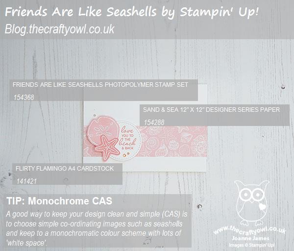
You can see all of my 'How To' summaries on my 'How To - Tips and Techniques' Pinterest board in case you've missed any.
Right - off to prepare the dinner prior to the school run, piano lessons and an extra hockey match on the schedule today - thank heavens for in-car air conditioning! Enjoy your day and I'll be back tomorrow with another project. Until then, happy stampin'!
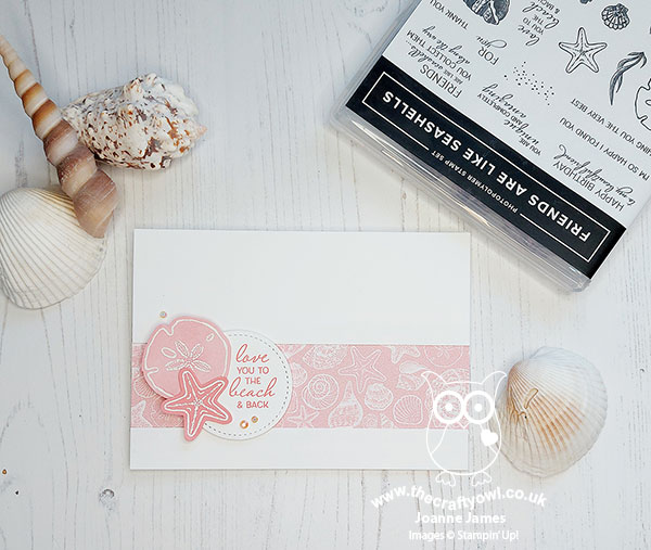
Stampin' Up! Supplies Used: