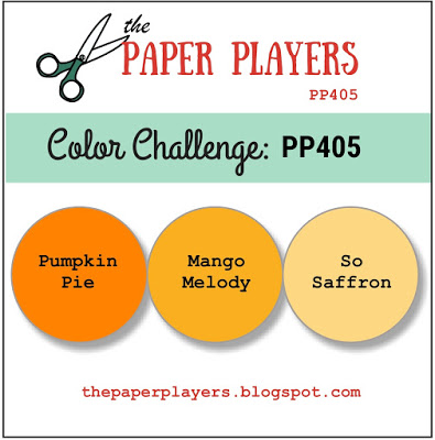
It's Sunday and time for this week's new challenge over at The Paper Players! It's the turn of my wonderful and talented friend LeAnne to host this week and she has a gorgeous colour challenge for us to work with:

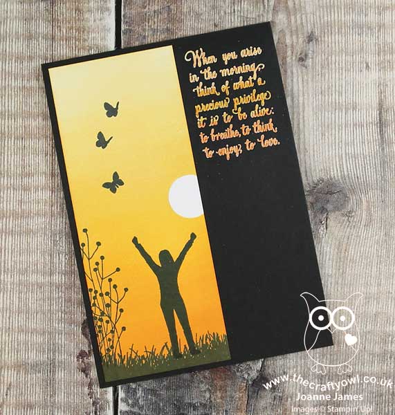
I fell in love with this trio of orange/yellows that LeAnne chose and whilst I was tempted to go floral, I decided instead to use the sketch inspiration over at Fusion for my layout and create a pretty sunrise and silhouette scene using the Enjoy Life stamp set - take a look:
Here's the low-down on today's card:
A Million Dollar Stamp Set - I decided to use a combination of images from the 'Enjoy Life' stamp set on my card today. This stamp set, with its beautiful collection of silhouettes and inspirational sentiments, was designed by Connie Fitzgerald, one of Stampin' Up!'s Million Dollar Sales Achievers, as a celebration of this milestone achievement. I absolutely love this set and it was one of the first on my wishlist when the annual catalogue was launched - thank you Connie for such a great set!
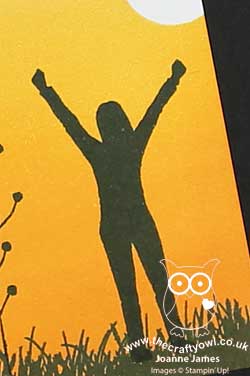
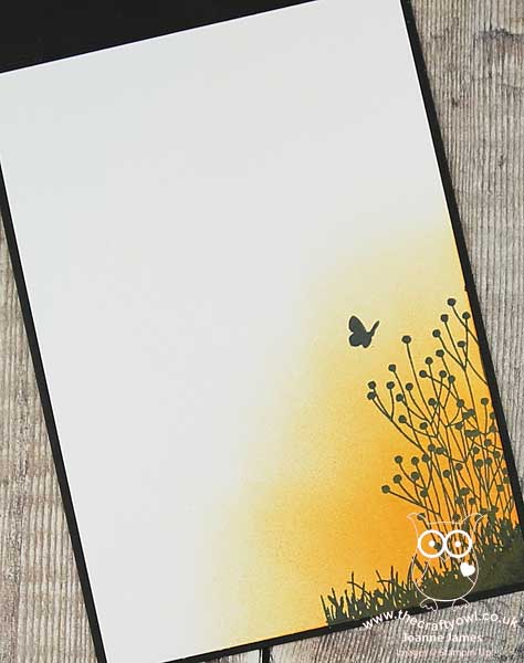
Sunrise, Sunset Made Easy - I wanted to create a vertical panel with a sunrise that featured all three of the challenge colours, so I punched a 3/4" circle and masked off my sun and used a sponge brayer to build up a graduated sunrise, blending each of the colours in turn starting with the lightest colour at the top. Sponge brayers are so great for this; they make light work of the art of ink blending, and can be washed out when you're done. I also brayered the colours on the diagonal of the bottom corner of the inside panel too and added a little interior detail:
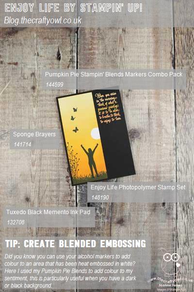
Blended Ombre Embossing - My card today is ultra-clean, with minimal layers and detail to allow my inked panel to really shine, but I'd also like to share another great tip with you; did you notice I created a blended ombre of colour on my sentiment that mimics my sunrise? Curious as to how I created it? With a Basic Black card base, I originally heat-embossed the sentiment in white, but this was too stark. I decided to use my Pumpkin Pie Blends to carefully colour the lettering and change its colour. Did you know you can use your Stampin' Blends alcohol markers in this way? This tones down the brightness of the white and adds a co-ordinating pop of colour that wouldn't have been possible with ink alone on such a dark background.
Here is the visual summary of the key products used on today's project for you to pin for easy reference:
You can see all of my Product and 'How To' summaries on my 'How To - Tips and Techniques' Pinterest board in case you've missed any.
Before you reach for your ink and papers, check out what our amazing team has created to inspire you this week:
The Paper Players Design Team
Here's a quick recap of our challenge rules:
1. Create a new paper project
2. Upload your creation to your blog with a link back to us and provide a direct link to the post featuring your challenge submission.
3. Please link your card to no more than four challenges, TOTAL.
4. Have FUN!
I usually struggle with colour challenges, but this bright, monotone pallet really spoke to me - so many creative possibilities! I can't wait to see what you create with this week's colours and look forward to visiting your blogs this week. Enjoy the rest of your weekend as it will be over all too quickly. I'll be back tomorrow with another project; until then, happy stampin'!
Stampin' Up! Supplies Used: