Beautiful Boughs Meets Rooted in Nature for a Woodland Christmas PP466

by Joanne James3. November 2019 09:00

Today it's Sunday and time for this week's new challenge over at The Paper Players! It's the turn of the fabulous Anne Marie to host this week and she has a fun theme challenge for you to work with:


I had a few ideas for Ann Marie's 'woodsy' theme today and decided to really go all-out to incorporate as many wood-themed elements into my card as possible. I decided to continue with another Christmas card to add to my collection and ended up creating something a little different (for me!) - take a look:


Here's the low-down on today's card:

Knock on Wood - My card has lots of elements that tie in to the wood theme: some woodland background dry embossing, a panel of retired Wood Textures DSP, the tree trunk stamp from Rooted in Nature (stamped in Crumb Cake and then sponged with Early Espresso around the edge), as well as some greenery and a couple of pine cones that could easily be spotted on a walk through the woods.

Texture, Texture - There are lots of layers and textural elements on today's card too: in addition to the dry embossing, I added shimmery white embossing paste to my greenery for  textured snow and the glimmer paper and twine bow also adds contrast. I originally started out using Jen's sketch over at Freshly Made Sketches (you can see that sketch here), but ended up adding so many layers and bits and pieces I rather lost my usual 'clean' look. Whilst I love the finished result, I will need to go back to the drawing board if I'm to put in an FMS entry this week!

Woodland Sparkle - All that wood made for a rather neutral card, with only the greens adding colour to the mix of browns. I decided to add a silver glimmer 'merry' diecut for some festive sparkle, along with some frosted epoxy droplet 'berries' and a silver and linen twine bow. I really like the finished effect.

Here is the visual summary of the key products used on today's project for you to pin for easy reference:


You can see all of my Product and 'How To' summaries on my 'How To - Tips and Techniques' Pinterest board in case you've missed any. 

I'm also linking up today's card to the Festive Friday Challenge (my card features silver, wood, texture, circles and green from the inspo list) and the challenge over at Paper Craft Crew where I went across the middle of the board: embossing paste/rustic/gone wild and the top left-bottom right diagonal: found in the forest/rustic/sponging)

Before you reach for your ink and papers, check out what our amazing team has created to inspire you this week:

Here's a quick recap of our challenge rules:
 
1.  Create a new paper project
2.  Upload your creation to your blog with a link back to us and provide a direct link to the post featuring your challenge submission.
3.  Please link your card to no more than four challenges, TOTAL.
4.  Have FUN!

Enjoy your day; we are enjoying the last day of the half-term holiday before returning the school tomorrow. We have some hockey planned and a trip to the farm shop, along with preparations for my classes this week. I'll be back tomorrow with another project. Until then, happy stampin'!


Stampin' Up! Supplies Used: 

Table built using Product Table Builder by The Crafty Owl - Independent Stampin' Up! Demonstrator.

Rustic Butterfly Wreath Friend Card

by Joanne James11. May 2019 10:00

Today I'm sharing a card for the current challenge over at Fusion where I used both the sketch and inspiration photo for my card:


Given that it features butterflies, it's also my second link up with Stamp Ink Paper this week. My card turned out to be a more literal interpretation of the Fusion brief than I'd intended - take a look:


Here's the low-down on today's card:

A Quick Butterfly Wreath - My original plan was to create a wreath of layered diecut butterflies using the tiny butterflies in the Butterfly Beauty Thinlits set that I used on other cards that I shared with you earlier this week, however when I put it together the butterflies were a little too small and overwhelmed by the overall proportions of my card. As I was browsing my collection of patterned papers to decide what to use for the horizontal banner, I came across some leftover Botanical Butterfly paper from Sale-A-Bration. I punched out some small butterflies using my duet butterfly punch (this is finally back in stock now in the UK - hurrah!) and they were the perfect size for my project. I love the realistic details on each and because all I did was punch the out the effect took no time to create; perfect! I then used a plain piece of So Saffron cardstock for the horizontal panel to tie in with the colours. 

Wood Textures - I used a piece of Wood Textures designer series papers for my background, inspired by the door in the Fusion photo. I recall when I saw these papers unveiled at an Onstage event a couple of years ago, a fellow demo friend Karen was in raptures about them and all the awesome projects she could imagine making with them. I remember thinking she was mad, as I didn't think they were something I would use much - how little faith I had! As it turns out I've used these papers lots in my crafting and will be sad to see them go when they retire next month - yes, I have stocked up and suggest you do the same too!

Textured Textures - Whilst it's difficult to see in the photo, I added extra texture and interest to my Wood Textures DSP by running it through my BigShot with the Pinewood Planks embossing folder before adding to my card. This is something I often do if I'm using this paper for a background - it adds a lovely tactile dimension and interest to an otherwise simple card.

Here is the visual summary of the key products used on today's project for you to pin for easy reference:


You can see all of my 'How To' summaries on my 'How To - Tips and Techniques' Pinterest board in case you've missed any. 

Enjoy your day and I'll be back tomorrow with another project for this week's new challenge over at The Paper Players where I am hostess this week and I have a fun colour palette for you! Until then, happy stampin'!


Stampin' Up! Supplies Used:

Table built using Product Table Builder by The Crafty Owl - Independent Stampin' Up! Demonstrator.

Hand Delivered Teacher Thank You Card For PP438

by Joanne James21. April 2019 09:00


Today it's Easter Sunday and time for this week's new challenge over at The Paper Players! It's the turn of the fabulous Anne-Marie to host this week and she has a clean and simple challenge for you to work with:
       

Remember: this is clean and simple week. What do we mean by 'clean and simple' ? Create a card that has:

  • Minimal layers and embellishments
  • Plenty of open space, also known as 'white space'
  • Is simple and uncluttered

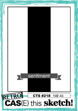
I struggled initially with Anne-Marie's challenge this week; I think not getting into my craft room all week hasn't helped! I had an idea for a card and then once I'd made it I really wasn't sure about it; I'll share that card tomorrow and would love you to come by and take a look and tell me what you think. Meanwhile, after a break and a change of stamp set, along with this week's CAS(E) This Sketch layout and the CAS Colours and Sketches colour palette, I created a second card and felt much happier about the whole thing! So here's that card:
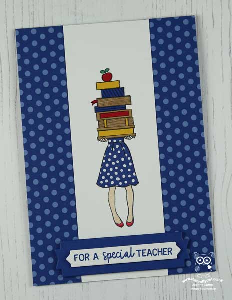
 

Here's the low-down on today's card:

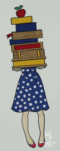
Paper Piecing - Not to be confused with 'paper piercing', paper piecing is the technique of stamping an image and then stamping either the whole or partial image again on coloured or patterned paper and fussy cutting it to piece it together on the main base image. I used it for both the skirt that my teacher is wearing (Blueberry Bushel in-colour DSP) and the pile of books she is carrying (a mix of Wood Textures DSP and solid colour cardstock). This is a fun way to add pattern to areas of your stamped image and can be used with a wide variety of stamps - those with larger areas suitable for colouring, such as those in the Hand Delivered hostess set, are particularly good. 

Primary Brights - I love this colour combination; the trio of primary colours is very bright and also seemed appropriate for a teacher thankyou card. I added further interest to my books by using a couple of different scraps of Wood Textures DSP for additional subtle detail. 

A Teacher Thank You - The sentiments in the 'Hand Delivered' stamp set suggest that the pile of books is intended to make a graduate congratulations card, yet I think they are perfect for a teacher card too. There is a thank you sentiment in this set, but I opted to use the words from the 'Picked For You' set instead, so that I could use a teacher-specific greeting on my front banner (both of the banner elements come from the Lakeside framelits set) and continued this theme with the wording on the inside too:
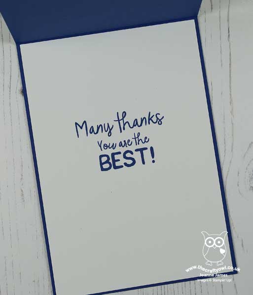
This card is sure to brighten someone's teacher's day! Both of the James Juniors have male form tutors this year, but Ben has plenty of female subject teachers who are worthy of a little end-of-year gift, so I think it might be heading to one of those. Both of these stamp sets are so useful for teachers cards, and both are set to retire with the current annual catalogue so if they're on your wishlist make sure you put them in your shopping basket before it's too late.

Here is the visual summary of the key products used on today's project for you to pin for easy reference:
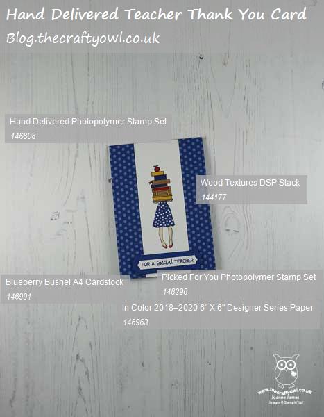
 

You can see all of my Product and 'How To' summaries on my 'How To - Tips and Techniques' Pinterest board in case you've missed any. 

Before you reach for your ink and papers, check out what our amazing team has created to inspire you this week:

Here's a quick recap of our challenge rules:
 
1.  Create a new paper project
2.  Upload your creation to your blog with a link back to us and provide a direct link to the post featuring your challenge submission.
3.  Please link your card to no more than four challenges, TOTAL.
4.  Have FUN!

You can see all of my 'How To' summaries on my 'How To - Tips and Techniques' Pinterest board in case you've missed any. 

Enjoy your day; we will be having an Easter egg hunt, followed by a roast for lunch and then an afternoon in the garden making the most of the wonderfully warm weather we have been blessed with the last couple of days - we need to make the most of it as I'm sure it won't last! Wishing you a pleasant Easter bank holiday weekend however you choose to spend it. I'll be back tomorrow with another project. Until then, happy stampin'!


Stampin' Up! Supplies Used: 

Table built using Product Table Builder by The Crafty Owl - Independent Stampin' Up! Demonstrator.

Let It Ride Watercolour CAS Card

by Joanne James8. January 2019 20:00

We are still enjoying the tail end of the Christmas holidays for the youngest of the James Juniors so today we've been making the most of the fine and sunny day with a long walk and catching up with a movie that we've both wanted to see for some time - there will be time for crafting later in the week! Luckily I got a couple made at the weekend and am on a bit of an animal theme this week inspired by this week's challenge that we have over at The Paper Players and today I'm sharing a card using the sketch for this week's challenge over at CAS(E) This Sketch:


I went for a clean and simple card and a little watercolouring, with one of my favourite new stamp sets from the new Spring-Summer catalogue along with a new 'must have' staple  - take a look:


Here's the low-down on today's card:

Let It Ride - The galloping horse on the front of today's card is courtesy of the new 'Let It Ride' set. You might be surprised that I like this set so much, as no-one in our family rides or owns horses (although Rebecca did have lessons for a while and made many requests for her own pony until she discovered hockey - phew!) I do have lots of friends that ride though and know I will get lots of use out of this set. I especially like the inspirational phrases that accompany these sketched images - I mean, 'Live life as if someone left the gate open' - what a great quote to live by!

Easy Watercolouring - I stamped my image onto watercolour paper and used my aquapainter to colour my horse, adding a little green to ground him. The sketchy nature of the images in this set really lend themselves to a watercoloured finish, without the need to be too precise. I layered the colour gradually until I was happy with the intensity, allowing each layer to dry briefly before adding more colour.

A New Craft Cupboard Staple - I cropped my main image with that perennial staple of my tool cupboard, my Stitched Circle Framelits.  My regular readers know how much I love these stitched shapes - they are great for adding an extra detail to a simple shape. Stitching generally is very on-trend in the craft world right now, and the new Spring-Summer catalogue debuts a new kid on the block though that is going to come a close second on my 'top 10 framelits' list I think: the new Rectangle Stitched Framelits Dies set includes 13 dies, each of which feature stitching both inside and outside the frame and offer lots more ways to expand your creative options. I used them here to crop my sentiment panel, before heat-embossing my sentiment onto it. 

Here is the visual summary of the key products used on today's project for you to pin for easy reference:


You can see all of my 'How To' summaries on my 'How To - Tips and Techniques' Pinterest board in case you've missed any. 

Enjoy your evening; tomorrow is the last day of the school holidays (finally!) and following my open house in the morning we will be spending the afternoon with friends. I'll be back soon with another project. Until then, happy stampin'!


Stampin' Up! Supplies Used:

Table built using Product Table Builder by The Crafty Owl - Independent Stampin' Up! Demonstrator.

Wishing You Well Thanksgiving Wreath PP417

by Joanne James4. November 2018 09:00

Today it's Sunday and time for this week's new challenge over at The Paper Players - yay! It's the turn of my wonderful friend Claire to host this week and she has a timely theme challenge for you to work with that I know she would love you to play along with:


I know that Claire loves Thanksgiving and whilst it isn't something we celebrate here in the UK, the underlying theme of being grateful and thankfulness is one we should all celebrate. I used both the sketch layout and photo inspiration over at Fusion and CASual Fridays as starting points for today's card: warm autumn leaves and wood textures feature heavily on my card this week - take a look:


Here's the low-down on today's card:

Textured Layers -  I wanted to create texture on my card and did something quite unusual for me: used not one, but two embossing folders on my background panels. To recreate the grey weatherboard effect, I used my Simple Stripes embossing folder on a panel of Smoky Slate. For my feature panel, I used a piece of Wood Textures Designer Series Paper and added further texture by running this through my Pinewood Planks embossing folder. I love the effect this gives - it adds so much interest and detail.

A Wreath of Twigs and Leaves - I stamped the wreath from the Wishing You Well stamp set in Early Espresso onto a stitched circle of Very Vanilla and punched out the middle using my 1 1/4"  circle punch, so that more of the textured wood panel could be seen. I coloured a selection of pearls in various sizes with my Pumpkin Pie, Daffodil Delight and Cajun Craze Blends markers to suggest leaves and then added a trio of actual leaves cut with my Seasonal Layers Thinlits to frame my sentiment (I sponged the edges of the leaves to add depth).

Something For The Thanksgiving Table - When I started my card, I wanted to create a wreath like the one in the Fusion inspiration photo. I made a wreath in autumnal colours using my sprig punch that I really loved, but when it came to adding it to my card, it was a little too bulky so I went back to the drawing board. I didn't want my punched wreath to go to waste though, so instead I attached it to a band of Very Vanilla stamped with my Buffalo Check stamp in Crushed Curry, added a banner sentiment and a braided linen twine bow and made a napkin ring - perfect for the Thanksgiving table. Here's a photo of my finished napkin ring:


I'm linking my napkin ring up with the ladies over at SUO Challenges where they are looking for home decor items for the Thanksgiving table. This was so easy to make yet really effective - you could make a while bunch of these to decorate the Thanksgiving table in a relatively short space of time. 

Here is the visual summary of the key products used on today's project for you to pin for easy reference:


You can see all of my Product and 'How To' summaries on my 'How To - Tips and Techniques' Pinterest board in case you've missed any. 

Before you reach for your ink and papers, check out what our amazing team has created to inspire you this week:

Here's a quick recap of our challenge rules:
 
1.  Create a new paper project
2.  Upload your creation to your blog with a link back to us and provide a direct link to the post featuring your challenge submission.
3.  Please link your card to no more than four challenges, TOTAL.
4.  Have FUN!

You can see all of my 'How To' summaries on my 'How To - Tips and Techniques' Pinterest board in case you've missed any. 

Enjoy your day; it is the last day of the James Juniors' half term and there is hockey to be played along with a little down time before the return to school tomorrow. I'll be back here tomorrow with another project. Until then, happy stampin'!


Stampin' Up! Supplies Used - For the card: 

Table built using Product Table Builder by The Crafty Owl - Independent Stampin' Up! Demonstrator.
 

Stampin' Up! Supplies Used - For the napkin ring: 

Table built using Product Table Builder by The Crafty Owl - Independent Stampin' Up! Demonstrator.

Rustic Share What You Love Card

by Joanne James7. May 2018 20:00

Happy Monday everyone! Today it's a Bank Holiday and therefore a national holiday here in the UK so we have enjoyed a long weekend along with some wonderful sunshine to boot! Today I'm sharing a card using Jen's sketch over at Freshly Made Sketches that also works for the 'O' challenge over at Just Add Ink - I've been so busy out enjoying the sunshine I didn't make time to photograph my card in time to link up at FMS, despite hoping that I was going to manage to play along with these 2 challenges for the second week running as they are a couple of my favourites. You should definitely check them out, their Design Teams are awesome! Here are this week's challenge badges:


I was intrigued by Jen's sketch this week as whilst a simple oval it occurred to me that I rarely use ovals in my card making, so I thought I would give it a go. I've included the photo inspiration for last week's challenge over at StampInkPaper because although I'm not linking up there, it was this inspiration photo that led me to create today's style of card that I am ultimately going to link up over at Just Add Ink with my 'o' for 'oval' - take a look:


Here's the low-down on today's card:

Sharing What You Love - I have been busy making lots of samples with the fabulous 'Share What You Love' set that is on early release to customers this month using the products and colours in the bundles, so wanted to make something a little different. This card is all about the textures and so I kept my colour palette neutral: wood, white, vanilla, linen and a little Old Olive. Another way to share what I love!

A Rustic Theme - I don't use my Wood Textures papers anywhere near enough and decided to use them both for the background and my heat-embossed flowers. I added a little linen thread and the texture of my oval surround along with a little fussy cutting and a few pearls adds to the rustic feel of my card.

Delightfully Detailed Ovals - I have a new paper love: the Delightfully Detailed Laser-cut Specialty Paper is just beautiful! For my card, I used one of the oval pieces and used it to frame my focal point - it's just so pretty.

Here is the visual summary of the key products used on today's project for you to pin for easy reference:


You can see all of my 'How To' summaries on my 'How To - Tips and Techniques' Pinterest board in case you've missed any. 

This card is a little different for me but it's nice to experiment once in a while and step outside of my comfort zone. What do you think - did it work? I'd love to hear your thoughts below.

I hope you've all had wonderful days and that the weather is as glorious where you are! I'll be back tomorrow with another project. Until then, happy stampin'!


Stampin' Up! Supplies Used:

Table built using Product Table Builder by The Crafty Owl - Independent Stampin' Up! Demonstrator.

Sale-A-Bration Lots of Lavender Catalogue CASE

by Joanne James19. February 2018 12:00

A new week and a new blog post! Today I'm sharing a card that uses this week's challenge over at Color Throwdown and also fits the current challenge over at SUO Challenges, where the team are CASing the Stampin' Up! catalogue:

I decided to CASE the card on page 223 of the Stampin' Up! Annual Catalogue - take a look:


Here's the low-down on today's card:

Lots Of Lavender - The lilac of the inspiration photo looked so fresh I decided I would stick with the florals too and use my Lots of Lavender stamp set. Love this set - and it didn't cost me anything either as it's one of the sets you can get free with an order of £45 or more during Sale-A-Bration - bonus! Whilst we have some new Sale-A-Bration free item options available as of last week (you can read all about them here) the original items, including this lovely lavender, are still available too. So much to choose from! I stamped my lavender in Sweet Sugarplum for a more pinky-lilac and after stamping went back in with my marker pen and blender pen to add a little extra colour here and there. I stamped my stems in Wild Wasabi and added a few tiny pearls in between the floral stems too. 

Shades Of Grey - I incorporated some soft grey tones with my background paper, choosing one of the grey-coloured wood patterns from the Wood Textures DSP Stack and a bow of grey and white gingham. Maybe not quite 50 shades on today's card, but grey is there nonetheless!

CASE: Copy and Share With Everyone - There are lots of definitions for this acronym, this is the one the team at SUO Challenges are using for their challenge. My card bears a number of similarities to the card on page 223 of the annual catalogue: I used a floral image, stamped onto a central panel cut with the Lots of Labels Framelits, and popped this up on a DSP background. I also added a sprinkle of sequins to embellish, although I substituted the sentiment banner with my gingham bow as I wanted my card to be sentiment-free. As you can see there are some distinct similarities, yet my card is distinctly individual to me. All of the catalogues are a great source of inspiration with lots of cards and samples that you can use as a starting point to create your own work - especially good if you are short on time or in a creative rut! Give it a try - I'd love to see what you create!

Here is the visual summary of the key products used on today's project for you to pin for easy reference:


You can see all of my 'How To' summaries on my 'How To - Tips and Techniques' Pinterest board in case you've missed any. 

I love this colour combination and actually thought of lots of ways I could use it so it's definitely one I will keep. 

Enjoy your day; mine will be spent preparing for classes and my upcoming weekend craft retreat. Barring technical disasters, I will be back tomorrow with another project though. Until then, happy stampin'!


Stampin' Up! Supplies Used:

Table built using Product Table Builder by The Crafty Owl - Independent Stampin' Up! Demonstrator.

Best Birds Go Clean and Simple For The Paper Players

by Joanne James18. June 2017 10:00

It's Sunday and time for this week's new challenge over at The Paper Players! It's the turn of the lovely Jaydee to host this week and she has a clean and simple challenge for us to work with:


This was a great week for a CAS challenge - I was short on time and the glorious weather we've been having here in the UK these last few days has meant that my south-facing craft room has been like a sauna and not conducive to extended periods of crafting. I needed something that was quick to create so I reached for my Best Birds stamp set and co-ordinating Birds and Blooms Framelits along with this week's sketch over at CAS Colours and Sketches and this is what I came up with:


Here's the low-down on today's card:

Take One Stamp Set - My fellow Paper Player, the lovely LeAnne, has made so many fabulous cards with the Best Birds stamp set (you can see them via the link to her blog below), she finally convinced me that I had to add this set to my collection. This is the first time I've used this set and I'm not disappointed. A pair of birds, a branch, flowers, a great variety of sentiments and an interesting background stamp mean this set gives lots of options for layering and creating scenes, and all with a single stamp set. Thank you LeAnne for being such an enabler! I coloured my little bird to look like a blue tit with my inks and aquapainter - I love these birds!

Add Some DimensionI stamped the hatched background stamp directly onto my card base then cut out the branch and my bird with the co-ordinating Birds and Blooms Thinlits Dies, adhering the branch directly to the base and popping my bird up on dimensionals for a little lift without too many layers so that it still feels CAS.

Texture Without Depth - I added a strip of the photographic Wood Textures Designer Series Paper to the edge of my card which give the illusion of texture and a trio of glitter enamel dots for a little sparkle and interest without compromising the overall clean and simple feel of my card.

Here is the visual summary of the key products used on today's project for you to pin for easy reference:


You can see all of my Product and 'How To' summaries on my 'How To - Tips and Techniques' Pinterest board in case you've missed any. 

Before you reach for your ink and papers, check out what our amazing team has created to inspire you this week:

The Paper Players Design Team
 
 
Here's a quick recap of our challenge rules:
 
1.  Create a new paper project
2.  Upload your creation to your blog with a link back to us and provide a direct link to the post featuring your challenge submission.
3.  Please link your card to no more than four challenges, TOTAL.
4.  Have FUN! 


I look forward to seeing your clean and simple creations in the gallery this week. It's Father's Day here in the UK so we shall be spoiling Mr James today and hopefully continuing to enjoy the glorious sunshine we have been experiencing recently. I'll be back tomorrow with another project; until then, happy stampin'!


Stampin' Up! Supplies Used: 

Table built using Product Table Builder by The Crafty Owl - Independent Stampin' Up! Demonstrator.

New Online Exclusives

There are new products available exclusively in the online store from 5 November - check them out here.

Latest Kits!

Stampin Cut and Emboss

The Layered Landscapes Kit and Nature's Paintings Kit are the latest kits in the online store - get yours here!

Shop Online

Access my online shop 24 x 7, 365 days of the year:

Current November hostess code:

9NKXDTTR

Shop Online

Mini Catalogue

BROWSE THE CATALOGUE

'Tis The Season - the new Stampin' Up! Mini Catalogue is here! For more details and to download your copy click here

Scrapbooking

Stampin' Up! has introduced a new range of 12x12" scrapbooking product and kit - the full range is now available to purchase online. To download a copy of the new digital Scrapbooking Catalogue click here.

2024-25 Annual Catalogue

BROWSE THE CATALOGUE

Click on the image to download your copy of the 2024-25 annual catalogue. For a full list of current SU! supplies, go to my online store. If you would like any help or advice, please drop me a line at joanne@thecraftyowl.co.uk or give me a call on 07773 421446 - I'd be happy to help.

Join My Team

It's always a great time to join Stampin’ Up! New team members can get £130 worth of products for only £99 + free business supplies + free shipping + all the fun being a part of Stampin’ Up! Stampin' Up! has something for everyone: join my growing team and benefit from my support to enjoy Stampin' Up! however you choose.

If you're interested, call me for a chat to understand how I can help you realise your goals. Alternatively, if you have already decided to sign up and you just can't wait, please click here for the link to the online form where you can sign up and order your starter kit right away! 

About Me

Hi I'm Joanne and live in Northampton and when I'm not looking after my husband and two beautiful children, am an avid crafter with a passion for all things Stampin' Up!

I must confess that I have never been a big rubber stamper - until I discovered Stampin' Up! that is. I love the fact that I can get such great results with co-ordinating stamps, inks, papers and punches - the possibilities are endless! Join me on my stamping journey as I share the things I love and be inspired to create amazing things yourself!

Follow Me

Monthly Newsletter

Box Builder

Click the button above to use Box Buster to create your custom box design using the Envelope Punch Board!

Kits Collection Now Available!

Stampin Cut and Emboss

The new Kits Collection from Stampin' Up! is now available!

Click here to see the current kits available and order yours online today.

I Design For


Stampin' Up Stuff

This is my personal blog and is not endorsed by Stampin’ Up! I hope you find it a plentiful source of ideas and personal inspiration but please don't copy my designs for contest submission or use for classes, publication or sale without express permission.