It's Sunday and time for this week's new challenge over at The Paper Players! It's the turn of the super-sweet and talented Nance to host this week and she has a fun colour challenge for us to work with:
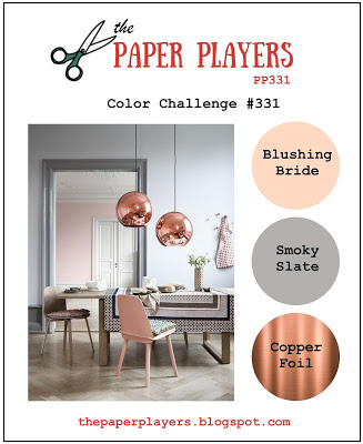

I absolutely love Nance's colour combination this week - so unusual! I considered a variety of things to do with my card - mostly floral - but decided to be brave and try something different: hot glue embossing. I used this week's sketch over at CAS(E) This Sketch as it had a perfect vertical panel for my design - take a look:
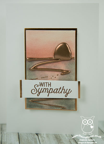
Here's the low-down on today's card:
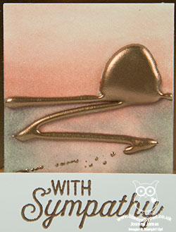
Hot glue embossing is a fun technique to combine with watercolouring. The idea is simply that you take your hot glue gun and 'draw' a pattern onto a piece of watercolour paper. Once set, you reheat the glue with your heat tool, sprinkle with embossing powder then reheat to set. I decided that I would draw a sunset with my glue gun, by creating the sun on the horizon and then some reflection and I heat embossed this with copper embossing powder.
I then used my aquapainter and Blushing Bride and Smoky Slate reinkers to colour my sky and water. I finished my card with a sentiment from Flourishing Phrases, which I also heat embossed in copper. Finally I used a piece of copper foil to border my sentiment and watercoloured panel.
This card is rather abstract for me, yet such fun to create and I think it makes a lovely sympathy card - I've been needing a few too many of these lately. So what do you think? Is this a technique you would like to try?
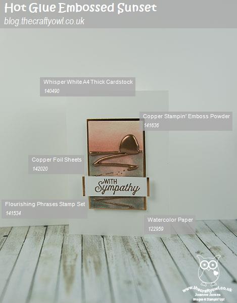
Here is the visual summary of the key products used on today's project for you to pin for easy reference:
You can see all of my Product and 'How To' summaries on my 'How To - Tips and Techniques' Pinterest board in case you've missed any.
Before you reach for your ink and papers, check out what our amazing team has created to inspire you this week:
The Paper Players Design Team
Here's a quick recap of our challenge rules:
1. Create a new paper project
2. Upload your creation to your blog with a link back to us and provide a direct link to the post featuring your challenge submission.
3. Please link your card to no more than four challenges, TOTAL.
4. Have FUN!
I look forward to seeing what you create with this week's colour palette. Enjoy the rest of your weekend as it will be over all too quickly; we are attending a basketball match this afternoon with Ben captaining his team (hopefully to victory!) I'll be back tomorrow with another project; until then, happy stampin'!
Stampin' Up! Supplies Used: