by Joanne James19. February 2014 21:02Good evening blog readers! My busy days continue as this week the James juniors are off school as it's half term. Today has been a day of piano and singing practice, book reading and review writing, nail painting and telling the time problems, with a little basketball and a couple of baskets of ironing thrown in! Crafting time is in short supply this week, so today I'm sharing with you a stepped up version of a card that we made in my Sale-A-Bration card class this month. This card was a CASE of this one by Mary Fish, although I tweaked a few things, primarily the colour scheme as I wanted to use the Pistachio Pudding DSP from the Sale-A-Bration set. Here is my card:
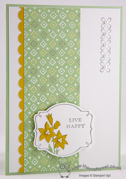
I stamped the image twice, once on Whisper White for the label, which I cut out using the Big Shot and Deco label Framelits and once on Summer Starfruit, which is the piece that I used to cut the flowers from. I paper-pieced all four of the flowers on this card and coloured the leaves and stems with a Pistachio Pudding marker, then finished with a few pearls. I think this would make quite a nice Easter card too, with an alternative sentiment.
Back tomorrow with another project; until then, happy stampin'!
Stampin' Up! Supplies Used:
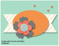
by Joanne James28. January 2014 22:06After all the news-related posts of the day, I thought I would share a quick creative post of a card I made using some of the new products that feature in the Stampin' Up! Spring-Summer catalogue released today. Today's card is my entry for this week's sketch challenge over at Create With Connie and Mary; last week I was delighted to be chosen as one of the 'Top 3 Picks' for the colour challenge with the card I featured here. This week's challenge is to design a card using the following sketch layout:
Here is my finished card:
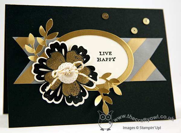
So if you were expecting spring pastels, I'm afraid you're already disappointed!! This card is something of a departure for me - I don't often use black as a card base, but I was inspired recently by this card created by Justin Krieger (check out his blog here - I love his style.) and decided that black would provide the perfect backdrop to showcase lots of the new gold products that feature in the new seasonal catalogue.
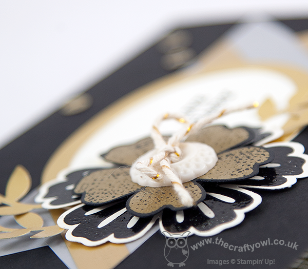
I stayed quite faithful to the sketch and edged my oval in gold foil and embellished with a layered flower using the Flower Shop and Mixed Bunch stamp sets. I embossed the bottom flower in black on Very Vanilla and the top layer in gold on black to give it a luxurious feel - the photo at the bottom of this post really shows the detail. I finished with a vintage button threaded with the new gold baker's twine and some gold foil leaves punched from my two step bird punch. The background banner is made from one of the gold vellum sheets, another new product; each pack contains 3 designs (it also includes a spot and a heart pattern) and I love them! I finished by adding my floating dots of gold sequins, which I removed from the thread so that I could use them individually. Oh and I almost forgot - the 'Live happy' sentiment is one of those included in the Sale-A-Bration stamp set, 'You're Lovely'.
I hope you like my card; if you would like to see what the designers and other participants did with this sketch, pop over to the CCMC page for more design inspiration.
Back tomorrow with a video tutorial for you and an exciting make using a new stamp set from the Spring-Summer seasonal catalogue. Until then, happy stampin'!
Stampin' Up! Supplies Used:
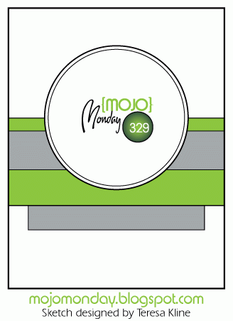
by Joanne James25. January 2014 20:28Hurray it's the weekend! Don't we all feel a little like that sometimes? We have a weekend of normality in the James household and that's fine by me - I even managed to squeeze in a few hours in my craft room this afternoon, so I'm certainly not complaining! Today I have another Sale-A-Bration sneak-peek for you - this time a stamp from a set called 'Hello Lovely'. I used this week's sketch over at Mojo Monday for the layout for my card - here is the sketch:
And here is the card I created:
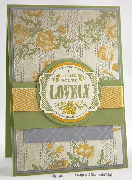
I took the colours for my card from the Afternoon Picnic DSP, although I used Smokey Slate as opposed to Basic Grey as I didn't want the grey to overshadow the other colours. The main stamp is shaped and sized perfectly to fit the Deco labels framelits. I cut out my stamped image using the framelits but mounted on two circles in Crushed Curry and Pear Pizzazz to emphasize the central circle shape that is the focal point of the sketch.
Wondering where I got the embossing folder that I used to emboss the grey section beneath the main banner? It's actually the Stylish Stripes TIEF, that I ran through the Big Shot then turned my piece of cardstock through 90 degrees and embossed it again to give me a criss-cross pattern, echoing the background detail of the DSP and the lattice on the stamp itself.
I'll be sharing more cards using this stamp set in coming weeks; meanwhile, only four more days until Sale-A-Bration goes live and you too will be able to get this and many other exciting sets free when you spend £45.
Back tomorrow with another card; until then, happy stampin'!
Stampin' Up! Supplies Used:
52785594-8914-478c-b4c6-93ce4426501e|0|.0|96d5b379-7e1d-4dac-a6ba-1e50db561b04
Tags: Afternoon Picnic, Deco Labels Framelits, Stampin' Up, Stampin' Up Card, Stampin' Up Card ideas, Stampin' Up Supplies, Shop online, Stylish Stripes TIEF, Circles Framelits, You're Lovely, Sale-a-bration 2014
Cards | Sale-a-bration | Stamping