by Joanne James25. October 2021 17:00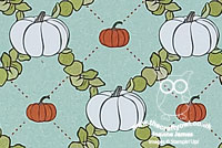
Today I have a quick 'extra' post to share a card that I made for the current challenge over at Fusion that I'm also linking up over at Global Design Project where their theme is 'Hey Pumpkin' #GDP315:
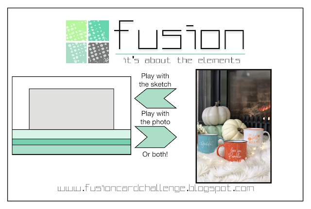

I love both the Fusion sketch and inspiration photo, but as I have no current pumpkin products in my collection, I went on the hunt through my retired paper for some featuring neutral coloured pumpkins and ended up making a card that comprises entirely retired product, save the basic colours which are all current (Mint Macaron, Old Olive, Basic White and Cajun Craze):
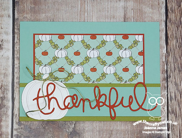
I found this lovely retired paper in the 'Country Lane' paper pack, and paired it with a white layered pumpkin, diecut with the Patterned Pumpkins dies and tied with some retired old olive twine, and finished the whole thing off with an oversize sentiment cut with the Expressions Thinlits Dies.
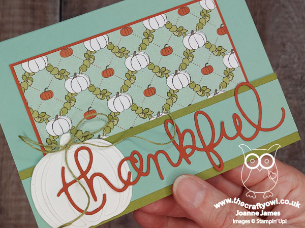
Thank you Fusion for the inspiration to use up more of my hoarded paper and give some of my retired tools some love - this card is for you my readers, who am I am thankful continue to follow along and sometimes even comment as I share my crafty musings and creations with you!
by Joanne James10. February 2016 21:00
I've had a busy day today with a couple of meetings and a long task list, but many jobs ticked off so very productive! I even managed to fit in a quick spot of crafting this evening so rustled up this fun card for this week's sketch over at As you See It:


Whilst I started out with the sketch (as is often my way!), I also have a few more linkups, as I used the Color Throwdown colours too for my card, the technique that is being featured over at Happy Little Stampers and my card fits with the theme over at Stamps, Ink, Paper. It's not often that this happens, but all of these came together neatly for today's card which is definitely destined for a Valentine - take a look:
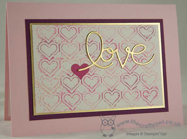
I created some simple layering using Pink Pirouette, Rich Razzleberry and Gold foil cardstock to frame my central panel, which I created by inking the solid heart side of my Happy Heart embossing folder and using it to stamp the pattern onto a piece of Shimmery White cardstock. I tried a few different versions, some that I spritzed with water and some without, and this one which was stamped on 'dry' was my favourite. To finish I added a melon Mambo punched heart and my diecut 'love' sentiment from the retired Expressions thinlits - retired it may be, but I will never part with mine, I just love those diecut words and this one was perfect for today's card.
This is one of those cards that was really fun to make - a little time getting well and truly inky can bring such pleasure! I just love the effect from the inked embossing folder too - I think it makes an unusual background and is a great way to get further mileage out of your embossing folders. In real life this card has a wonderful lustre and sparkle too - difficult to see in the photograph though, so you'll just have to take my word for it!
That's all from me today; back bright and early tomorrow with this week's new challenge over at Create With Connie and Mary. Until then, happy stampin'!
Stampin' Up! Supplies Used:
0128b5d4-c3f1-4817-92ba-41fd2b6b686e|0|.0|96d5b379-7e1d-4dac-a6ba-1e50db561b04
Tags: Expressions Thinlits Dies, Anniversary, Valentines, Valentine's, Happy Heart TIEF, Itty Bitty Accents Punch Pack, Shop online, Shop Stampin' Up online, Stampin' Up, Stampin' Up Supplies, Stampin' Up Card ideas, Stampin' Up Card
Cards | Shop Online | Stamping
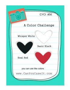
by Joanne James11. February 2015 09:15I still have a couple more Valentine's cards to share with you this week, all of them quick and easy to execute though if you are making a last-minute card for your loved one! Today's card has been made using this week's sketch over at CAS(E) This Sketch and I am also entering it into the 'Hugs and Kisses' challenge over at Addicted to CAS and the colour challenge at Can You CASE IT:
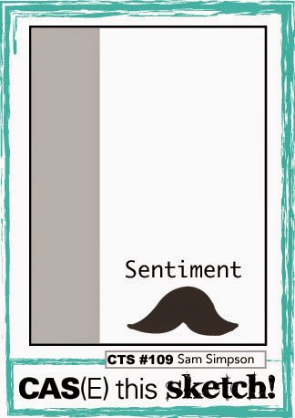
This is one of those 'go to' sketch layouts for clean and simple cards and is also great for showcasing designer series paper, as I've done here with the hugs & kisses pattern from the 'Stacked With Love' DSP stack. Take a look:
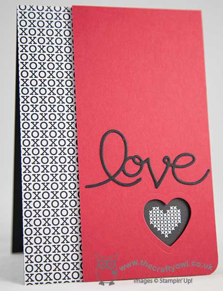
For the other half of my base layer, I used another of the black and white patterns in the stack, and used a heart framelit to create a die cut in my top red layer that allowed an element of the paper design to show through. I finished my card with a 'vintage' love die cut with my now retired Expressions thinlits - these are still available on the clearance rack and can be picked up for a bargain £13.79 and lastly rounded the bottom right corner of my card. Not a stamp in sight either - no risk of inky fingers with this one!
Simple but effective I hope you will agree! Back tomorrow with another Valentine's card to share with you; until then, happy stampin'!
Stampin' Up! Supplies Used:
c6b90e9c-8f55-489c-af26-b8a0ba4afda3|0|.0|96d5b379-7e1d-4dac-a6ba-1e50db561b04
Tags: Anniversary, Valentines, Valentine's, Stampin' Up Supplies, Stampin' Up Card ideas, Stampin' Up Card, Stampin' Up, Stacked With Love, Shop online, Hearts Framelits, Expressions Thinlits Dies, Big Shot
Cards | Punch Art
by Joanne James16. August 2014 21:54I've spent a pleasant afternoon today with the ladies at my local hair and beauty salon celebrating their 3rd anniversary since opening (Pamper Me Hair & Beauty in Northampton - if you're local look them up, they're a lovely bunch). So another quick share today - I'm linking up with The Card Concept where the theme is to make a wedding card:
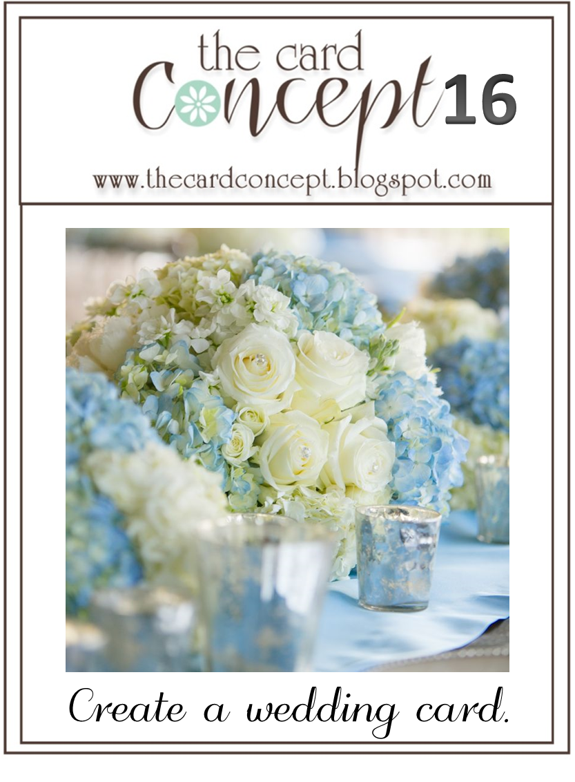
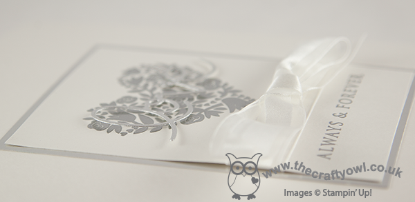
As much as I loved the photo inspiration for this challenge, I wanted to use Shimmery White and silver for my card - I had a clear idea in mind of what I wanted to create. Here's my card:
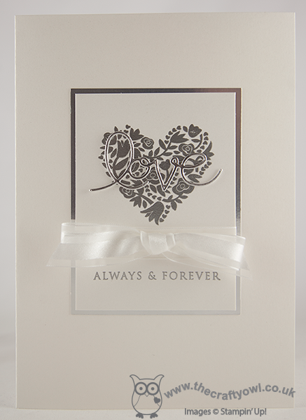
This card uses some of my favourite 'vintage' stamps and tools of all time - Expressions Thinlits and that beautiful Flowerfull Heart stamp. The card is still my usual clean and layered style, but I do think the silver elements and the bow give a real 'classy and elegant' feel. This is one of those cards that looks so much better in real life - so very opulent, even with a relatively simple design.
That's all from me today - back tomorrow with my Design Team post this week for The Paper Players - and it's a fun one!
Until then, happy stampin'!
Stampin' Up! Supplies Used:
by Joanne James10. August 2014 08:00Yay - it's Sunday and time for a new challenge over at The Paper Players! Today Nance has an interesting colour challenge for us:
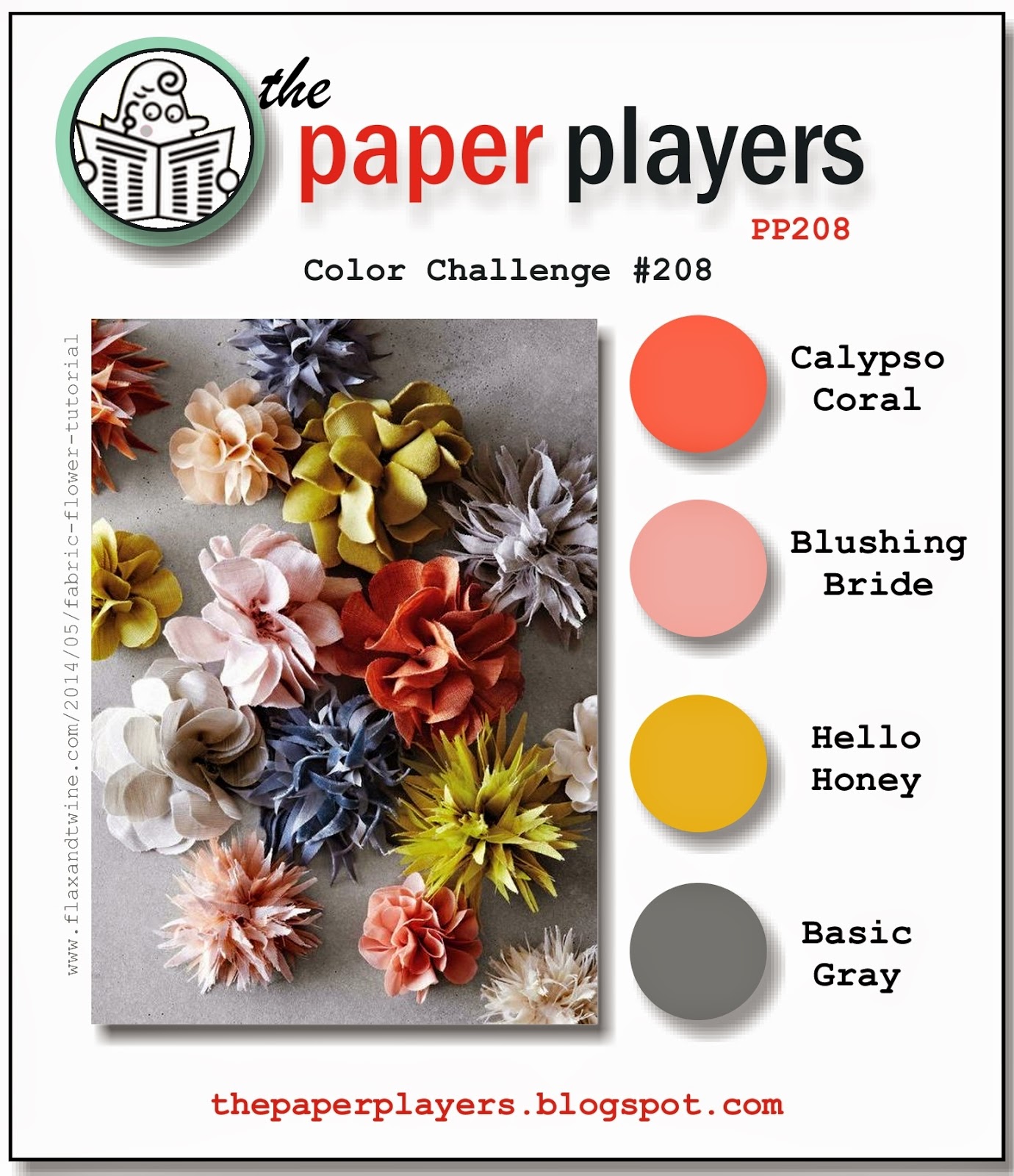
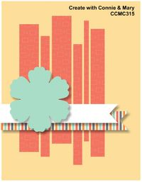
Today I have an unusual card to share with you, in more ways than one! When I saw Nance's colour palette, I immediately thought of the Simply Created Banner Kit that I used for the decorations for Rebecca's recent birthday party; I knew I had a few offcuts and leftover pieces of DSP from the kit and that Calypso Coral, Blushing Bride and Basic Grey were 3 of the feature colours of the add-on kit, so using this week's sketch over at Create with Connie and Mary as my starting point (perfect for using up scraps!) I set to work. Here is my finished card:
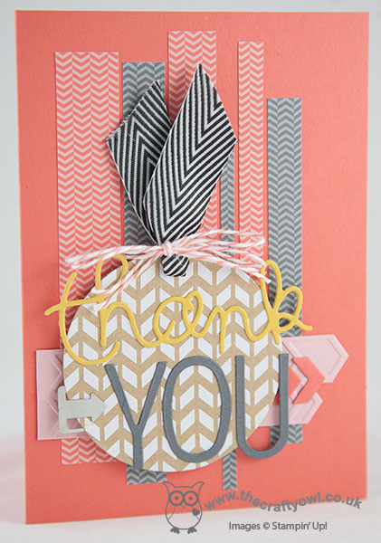
Using Calypso Coral as my base, I layered a number of strips of DSP in varying widths/lengths across the front of my card, alternating between the Calypso Coral/Blushing Bride chevron pattern and the Basic Grey/Smoky Slate chevron pattern. I then embossed a strip of Blushing Bride cardstock with the Arrows Embossing Folder and cut one end to a point. I layered some Calypso Coral chevrons that I had cut out with one of the framelits from the Circle Thinlit card, then created a tag, again using a pre-printed leftover tag from the kit. I added some black chevron ribbon (a little bit of a liberty as far as the colour scheme is concerned, but the closest match I could get from my stash!) and tied it with some retired Calypso Coral baker's twine in a double bow. I finished my tag with a die cut 'thank' in Hello Honey, part of the 'thankful' framelit from the now retired Expressions Thinlits set (still available on the European Clearance Rack if you fancy snapping up a bargain!) and the YOU cut out of Basic Grey with my Big Shot and the new Perfect Print Alphabet Bigz die. lastly, I added an Essentials Hardware Clip to my tag before adhering it to my card with dimensionals.
I love the idea of collage cards but find them really difficult to create, so am quite pleased with the way this arrow-filled card turned out. Also, on completion I realised that I hadn't done any stamping at all on this card - how unusual is that??! For more inspiration from the Design Team and to see the fabulous cards they've made using this colour palette, pop on over to The Paper Players blog to see what they've created and to link up your own card.
Back tomorrow with a fun birthday card; until then, happy stampin'!
Stampin' Up! Supplies Used:
4dcd9f68-b080-4270-8357-93f19d13890c|0|.0|96d5b379-7e1d-4dac-a6ba-1e50db561b04
Tags: Calypso Coral Celebration Add-on Kit, Perfect Print Alphabet Bigz, Expressions Thinlits Dies, Essentials Hardware Clips, Arrows TIEF, Circle Thinlit Card, Big Shot, Shop online, Stampin' Up, Stampin' Up Card, Stampin' Up Card ideas, Stampin' Up Supplies, Celebrations Basics kit
Cards | Punch Art
by Joanne James30. May 2014 12:00Yay - it's Friday again! Boy did that come around quick! This week has been half term and having James Juniors at home for the week seems to make the week fly by! Anyway, the weather is supposed to improve this weekend so that will be good. I have a busy, busy day today with retiring lists, preorders, class preparations and more besides, so let's get to it! Today I'm sharing a card that I made for this week's challenge over at 'Less is More' where it's recipe week and we're asked to include a die cut on our card. I've also combined with the vibrant colour palette over at Colour Q this week:
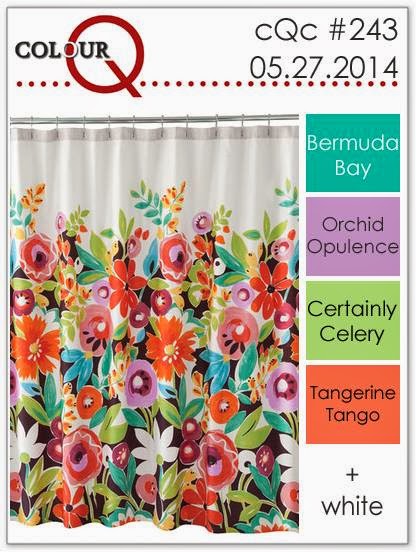
I just loved the bold flowers on that shower curtain in the inspiration photo! I had to substitute a couple of the colours, as they have retired and I don't have them; I used Rich Razzleberry and Wild Wasabi in place of Orchid Opulence and Certainly Celery, so my purple is not quite so electric but my card is just as colourful - take a look:
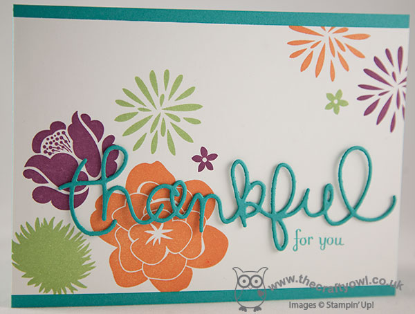
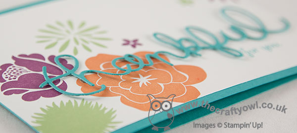
I actually used the same CAS(E) This Sketch layout, turned through 90 degrees, that I used for yesterday's butterfly card for today's background, although it looks totally different here. I used Simple Stems to stamp my flowers, along with the little flower from the Summer Silhouettes stamp set, then used Bermuda Bay for my card base, my die cut 'thankful' - the Expressions Thinlit Dies are currently available on the clearance rack, if you would like to pick up a set for the bargain price of £13.79, I love mine! - and stamped the 'for you' in Bermuda Bay using the Fabulous Phrases stamp set.
This is one of those cards that I finished and just love - the colours, layout, the diecut word, it's so me! Do you ever make a card and like it so much that you think you'll struggle to give it away? I think the recipient of this one will have to be someone special, so if it lands in your mailbox then you should consider yourself very lucky!!
Right - I'm off to peruse the retiring lists and write out my pre-order for goodies from the new catalogue too (and maybe do a little housework!). Back tomorrow with another card; until then, happy stampin'!
Stampin' Up! Supplies Used:
07beaf7b-d99f-4ad9-8388-f05a235941e8|0|.0|96d5b379-7e1d-4dac-a6ba-1e50db561b04
Tags: Simple Stems, Summer Silhouettes, Expressions Thinlits Dies, Fabulous Phrases, Shop online, Stamp-a-ma-jig, Stampin' Up, Stampin' Up Card, Stampin' Up Card ideas, Stampin' Up Supplies, Clearance Rack
Cards | Stamping
by Joanne James14. May 2014 21:40I've had a busy couple of days preparing swaps and finishing my preparations for the Stampin' Up! event at Telford on Saturday and I've still got more to do! Today I'm sharing my card for this week's challenge over at Less is More, where Chrissie and the team are looking for one layer thank you cards. I decided to try something something a little different, using my retired but never-to-be parted with Expressions Thinlits. Here is my card:
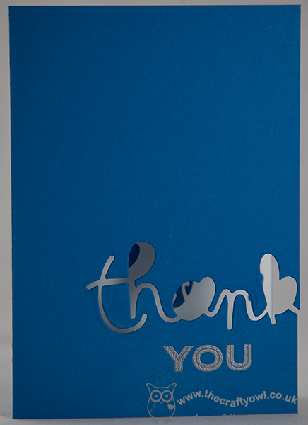
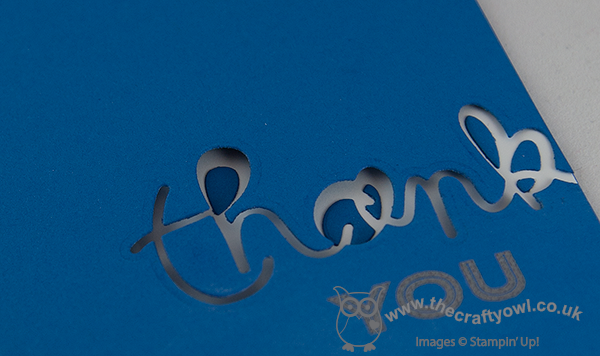
I decided to make a thank you card that would be suitable for a male, or at the very least gender neutral - so I went for a nice bright blue. Now I know the eagle-eyed amongst you are thinking - but the framelit says 'thankful', right? Well that's true - as I only wanted the 'thank' part, I positioned it over the edge of the card and cut it to the edge so that it looks as if the writing is going off the edge of the card. I adhered the cut-out pieces from the middle of the word to the inside of the card, to maintain the definition of the lettering - you can see it more clearly on the photo below:
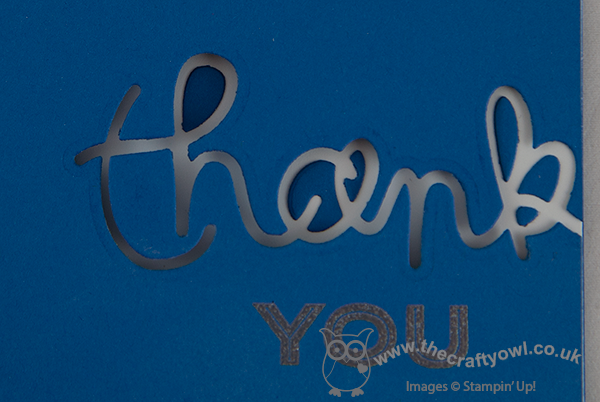
To finish my sentiment, I inked up the 'you' from the 'thank you' sentiment in the 'Simply Celebrate' set and heat embossed it with silver embossing powder. A clean and simple thank you card that's just a little bit different! I'm also linking my card up to 'Addicted to CAS', where the current challenge is appropriately 'off the edge'. Right, I'm off to get my nails done!
Back tomorrow with another project; until then, happy stampin'!
Stampin' Up! Supplies Used:
by Joanne James22. January 2014 09:43I'm sticking with the Valentine's theme today as today's card is also this week's entry for The Paper Players weekly challenge, where Sandy has asked us to create a one layer Valentine's card:
I decided to use the heart as per the challenge tile, but today's card is also showing you how to use one of my favourite Stampin' Up! products, the Expressions Thinlits dies, in a different way. You've seen me use the die cut word itself as in yesterday's card, and I've also used the negative space created by the die cut (you can see an example of that here). Today I thought I would show you how you can use them to create a mask, which gives yet another effect and one that is particularly suited to a one-layer card. Here is my card:
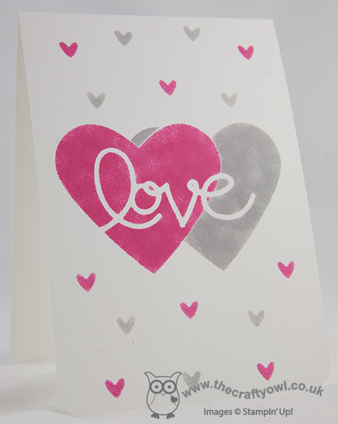
I cut out the die cut word 'love', along with two overlapping hearts cut with my Hearts Framelits and created a mask. Then using Melon Mambo and Smoky Slate ink and a couple of sponge daubers, I carefully sponged around the die cuts to give the illusion of two overlapping hearts, with love running through the centre. I created a second mask using the small heart from the Owl Builder Punch; I could have used a stamp, but I wanted to retain the soft sponged effect so created another stencil then simply sponged a few random hearts across some of the remaining white space. I rounded the bottom corners of the card, but otherwise left well alone; as the Paper Players point out this week, less is more!
I'm really pleased with how this card turned out and it shows yet another way you can use the thinlits to achieve an alternative effect. If you too are 'in love' with 'love' and the other words in the Expressions Thinlits set, don't forget these are only available until 1st February when the current seasonal Autumn-winter catalogue ends - click on the link below to my online store if you would like to purchase. I know I wouldn't be without mine - they can be used in so many ways.
Back tomorrow with another one layer card; until then, happy stampin'!
Stampin' Up! Supplies Used:
59edc7bc-b5db-4717-93b4-ad2ce2d82116|0|.0|96d5b379-7e1d-4dac-a6ba-1e50db561b04
Tags: Hearts Framelits, Expressions Thinlits Dies, Owl Punch, Sponging, Stampin' Up, Stampin' Up Card, Shop online, Stampin' Up Card ideas, Stampin' Up Supplies, Valentines, Valentine's, one layer cards
Cards | Stamping
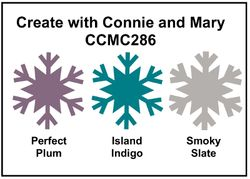
by Joanne James21. January 2014 20:39Good evening blog readers! I had lots of jobs to do today, but after a morning of paperwork I decided the housework could wait and I spent the afternoon cardmaking instead (oops!!) Today I'm sharing another Valentine's card, this time with a more masculine feel. I used the colours from this week's challenge over at Create with Connie and Mary as my starting point:
I decided to use my 'Hearts A Flutter' stamp set, as although this is one of my favourite sets and one I use a lot all year round, I haven't used it on any of my Valentine's cards yet this year. Here is my card:
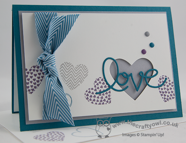
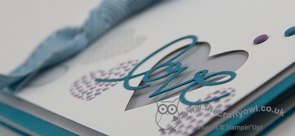
I stamped my hearts somewhat randomly across the lower half of my card, either side of my focal point. I mounted the top layer of cardstock on dimensionals for two reasons: firstly, to make the ribbon easier to attach and secondly so that the heart that I cut out (I used my hearts framelits for this) would have some depth and my die cut 'love' would have more impact. I deliberately chose to use Smoky Slate for my middle layer, as I wanted the heart to have a more masculine appeal, especially as I used ribbon on my card too; Island Indigo Chevron Ribbon isn't too girly, but adds a luxurious feel to the card. A few candy dots to finish just to add balance and done.
Whilst I designed this card with a man in mind, I think it would work equally well for a woman, especially if you're not the kind of person who is into all things pink and red.
Back tomorrow with another Valentine's themed card; until then, happy stampin'!
Stampin' Up! Supplies Used:
3b716918-6b62-4e10-9759-5e7a63b00c72|0|.0|96d5b379-7e1d-4dac-a6ba-1e50db561b04
Tags: Anniversary, Candy Dots, Hearts a Flutter, Hearts Framelits, Expressions Thinlits Dies, Magnetic Platform, masculine cards, Shop online, Stampin' Up, Stampin' Up Card, Stampin' Up Card ideas, Stampin' Up Supplies, Valentine's
Cards | Stamping
by Joanne James7. January 2014 19:49Today I am sticking with the 'love' theme, but no Flowerfull Heart today. I'm taking my colour scheme from the challenge palette over at Create with Connie and Mary this week, which requires a card made with the following colours:
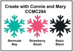
I thought this was a great modern colour combination so decided to create a card with one of my other favourite products, the 'love' from the Expressions Thinlits Dies. Here's my card:
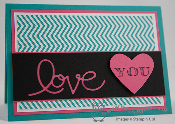
I used the negative space from the thinlit cut out, rather than the word 'love' itself (don't worry, I didn't bin it - if you keep your eye out you'll see it appear on another card someday soon). I've done this before and like this effect almost as mush as the delicate cut out words that you get with these dies. I then contrasted the black top layer with the Strawberry Slush heart which I stamped in black with the word 'you' from the stamp I used on yesterday's card from the 'Follow My Heart' stamp set. Not necessarily the most romantic of colour combinations perhaps, but I think this card would definitely appeal to a trendy teenager. Don't forget, the Expressions Thinlits Dies feature in the Autumn-Winter seasonal catalogue and will only be available to order until the 1st February, so if they're still on your wishlist, don't leave it too late to order them; just click on the product link in the table below and hop on over to my online store.
So, my voice is still absent - the rest of the James household is loving it! It's good preparation for the children's return to school tomorrow, the first few days back always seem really quiet. Don't forget to hop on over to see what the designers at Create With Connie and Mary came up with in response to this week's colour challenge.
Back tomorrow with another card; until then, happy stampin'!
Stampin' Up! Supplies Used: