It's Tuesday and time for a new challenge over at CAS Colours & Sketches. Shannon is hosting this month and this week we have another colour challenge:

For my card today I decided to highlight a stamp set that will soon be leaving us, but you might not have even noticed in the January-June mini catalogue. Do you recognise this flower?
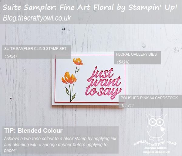
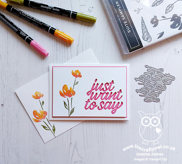
Here's the low-down on today's card:
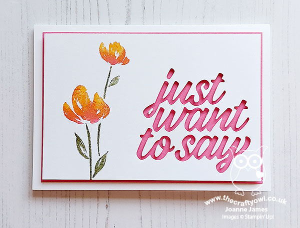
Suite Sampler - The flower stem on today's card looks like the flowers in the Art Gallery stamp set that is part of the Fine Art Florals Suite, and don't worry - those stamps have been carried over to the annual catalogue so they're not leaving anytime soon! - but it actually comes from the exclusive host set, Suite Sampler. This stamp set has a selection of images, each of which co-ordinates with one or other of the suites that feature in the mini catalogue. I really like this double-blossomed stem; not only does it give more mileage to my Art Gallery set, but it is also great for clean and simple cards. This set will retire at the end of the month, so if you like it you still have time to put in a big order or gather some orders between friends and earn the hostess rewards needed to be able to add it to your shopping basket.
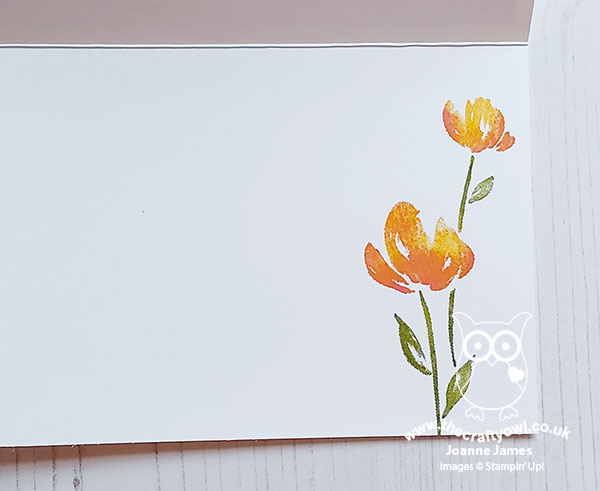
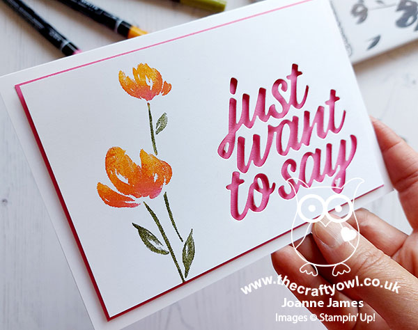
Ink Blending - I loved Shannon's colour choices this week and I thought the Mango Melody and Polished pink would make a lovely two-tone flower, so I used a combination of ink, Stampin' Write markers direct to stamp and a sponge dauber to gently apply the ink and blend the colour. I loved the effect so much, I cleaned my stamp and repeated the stamping, both on my envelope and the inside of my card:
Just To Say - I paired my flower with a negative 'just to say' cut using the large single die in the Floral Gallery Dies set. I will pair it with a stamped sentiment on the inside of my card from the Art Gallery set but for the time being I have left it blank so that I can stamp it to suit when my card is needed. Don't you just love that Polished Pink peeking through?
I really like the simplicity of this card - if I can find the time I'm going to make a few more in alternative colours. It's a great one to have on standby so that the greeting can be adapted as needed.
Here is the visual summary of the key products used on today's project for you to pin for easy reference:
You can see all of my 'How To' summaries on my 'How To - Tips and Techniques' Pinterest board in case you've missed any.
As a reminder, for our colour challenges, you must use all of the stated challenge colours. You may also use neutral colours; however, the challenge colours should be the most noticeable ones featured on your card. We use Stampin' Up! color names for reference, but you are welcome to use any other companies' products as long as you match the challenge colours as closely as possible.
Enjoy your day and I'll be back tomorrow with another project. Until then, happy stampin'!
Stampin' Up! Supplies Used: