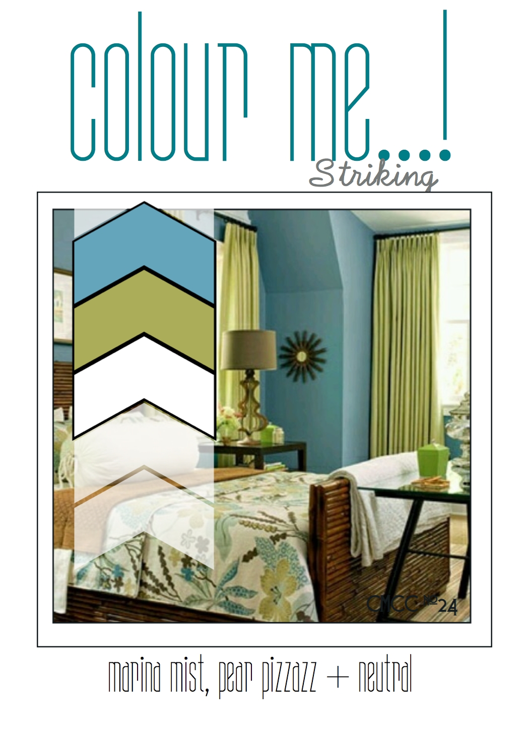
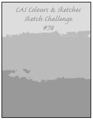
by Joanne James16. June 2014 20:56Today's creative post uses the colours for this week's Colour Me...! Challenge (although I am not linking up this week as the challenge has already closed) and I've used this week's sketch over at CAS Colours & Sketches for my layout:
I decided to get out my 'So Very Grateful' stamp set for this card - I can't quite believe this set will be leaving us at the end of the month, I love it and don't feel I've used it anywhere near enough. This is a good time to point out that whilst there's always lots of focus on those items in the main catalogue that are retiring, we sometimes forget about the lovely stamps that are in the Spring-Summer seasonal catalogue that will also no longer be available after 30th June. If you still have items on your wishlist, you've only got a couple of weeks to find out whether they are being carried over into the new annual catalogue or whether they will be gone for good. So, here is my card:
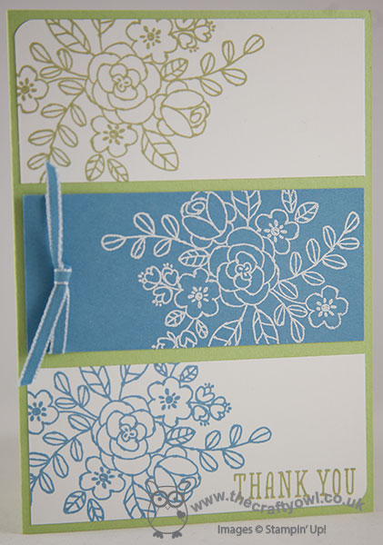
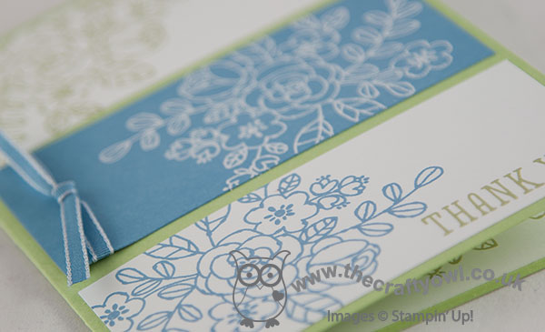
I used a base of Pear Pizzazz then decided to create three clear panels for my card and stamped the main flower image from the set in the challenge colours on white for the outer pieces, then stamped the same image in Versamark on the central panel of Marina Mist and heat embossed in white. I finished the central panel with a piece of 'vintage' Marina Mist taffeta ribbon and lastly added my sentiment to the bottom panel.
This card makes me think of the old saying 'blue and green should never be seen, unless there's a colour in between' - I have to say, I think this card looks really fresh and old saying or not, I'd have to disagree!
Back tomorrow with a sneak peek; until then, happy stampin'!
Stampin' Up! Supplies Used:
by Joanne James14. May 2014 11:00I'm having a love affair with my heat gun this week as this is my second card that features heat embossing and I've another cued up for tomorrow too! Today's card is my entry for this week's challenge over at The Paper Players where Sandy has chosen some lovely subtle spring colours to work with; I've also used this week's layout over at Retrosketches as the basis for my card:
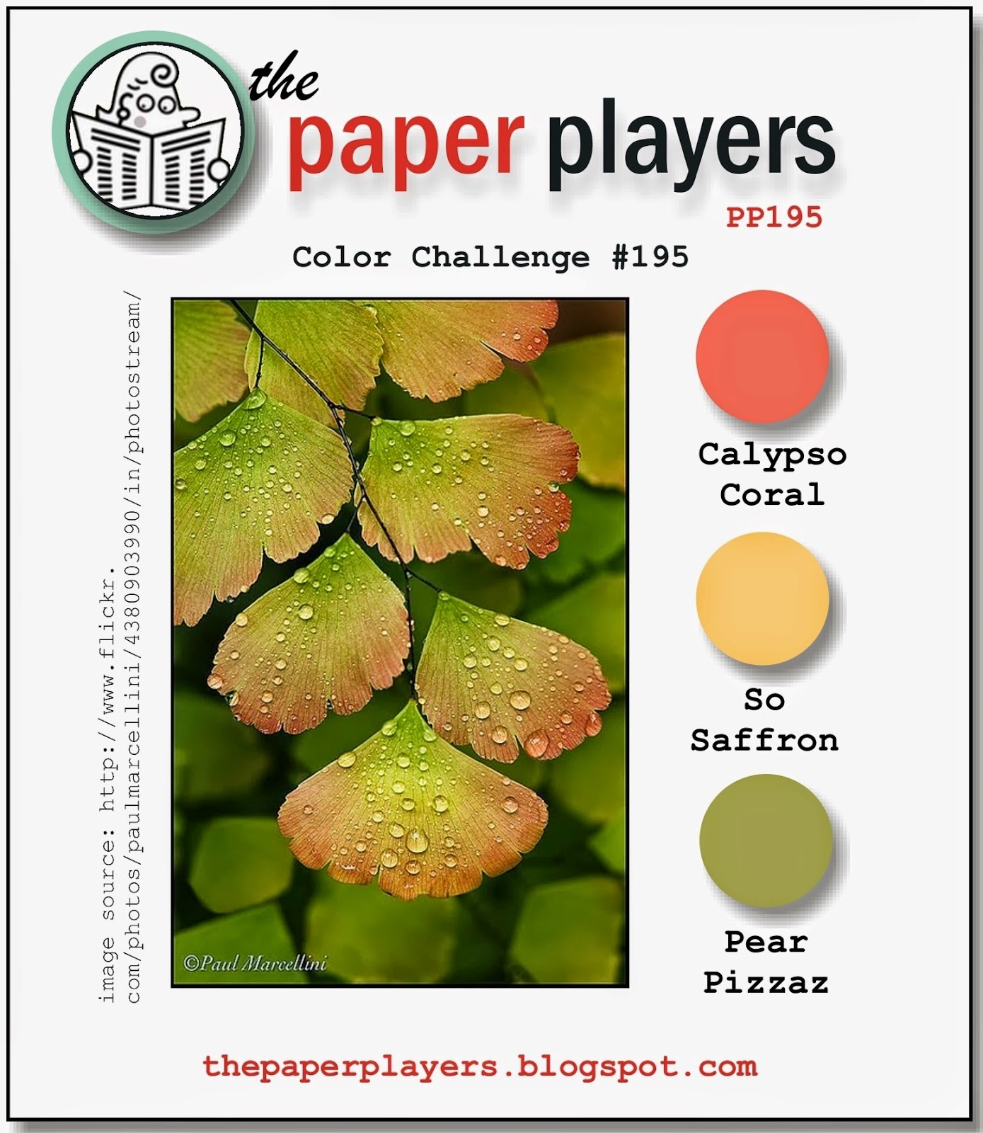
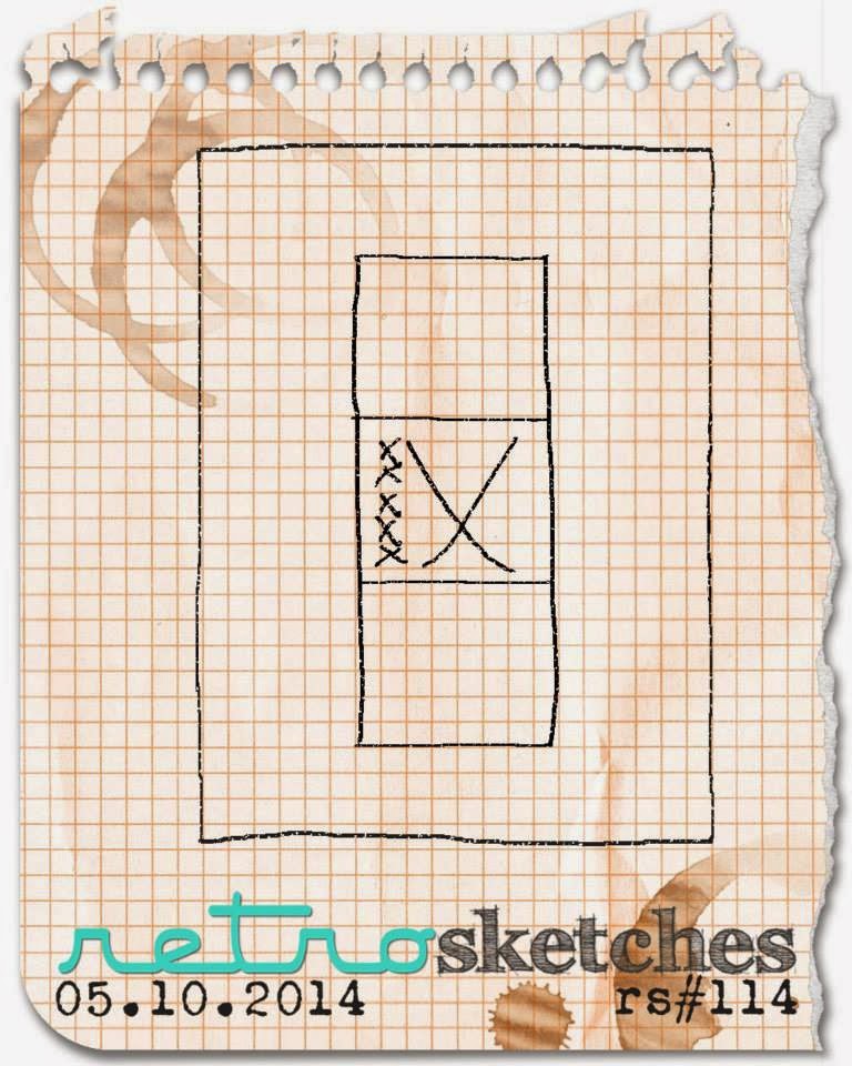
I thought that The Paper Players colours were just asking to be used on a floral card - this is what I came up with:
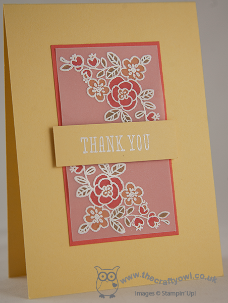
I stamped the corner flower image twice in Versamark onto my vellum panel then heat embossed in white and coloured the reverse of the images with my So Saffron, Calypso Coral and Pear Pizzazz markers. I then adhered this to a panel of Calypso Coral and heat embossed my 'thank you' sentiment in white onto a panel of So Saffron and placed this across the middle on dimensionals.
This card came together quite quickly and I love the subtle effect of the colouring behind the vellum.
That's all from me today - I have to go and get on with my swaps in readiness for Stampin' Up!'s UK regional training event in Telford on Saturday, in order to be finished in time to go and watch Rebecca's first rounders match of the season later on this afternoon!
Back tomorrow with another card; until then, happy stampin'!
Stampin' Up! Supplies Used:
by Joanne James24. February 2014 20:29Good evening blog readers! I managed to grab a few hours this afternoon to catch up on some crafting (a reward to myself for getting some of my admin out of the way this morning!) and I made a card using both this week's 'tall and skinny' Mojo Monday sketch and the colours over at Colour Q:
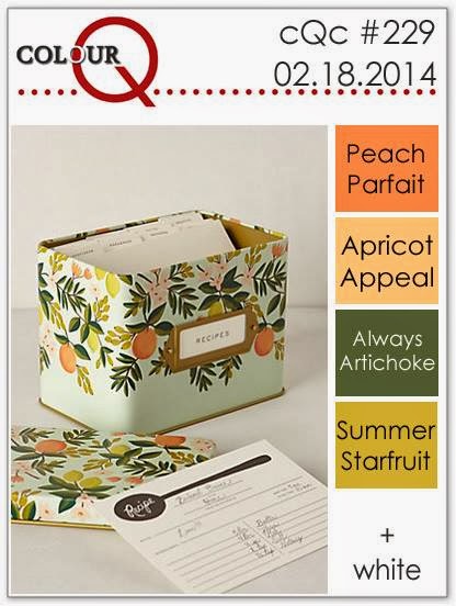
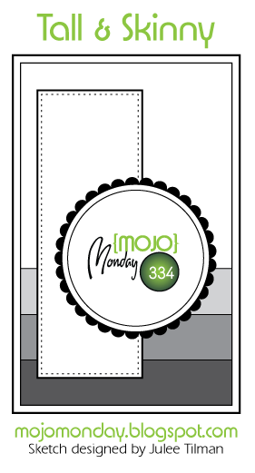
I don't often make 'tall and skinny' cards and historically was always put off by not having the correct sized envelope, but now I have my Envelope Punch Board, irregular envelope sizes don't phase me at all! As for the Colour Q challenge, well you may remember when I made this card a few weeks ago that I confessed I had two ink pads in my stash that I had owned for more than 12 months and never broke the cellophane wrapper on; one of them was Garden Green, that I used on the previous card; the other - Always Artichoke. So when I saw this colour challenge, I just had to have a go! Now Peach Parfait and Apricot Appeal are retired SU colours; I did have an old inkpad and some Peach Parfait cardstock, which I've used, but no Apricot Appeal, so I substituted with Pumpkin Pie instead. Here is my card:
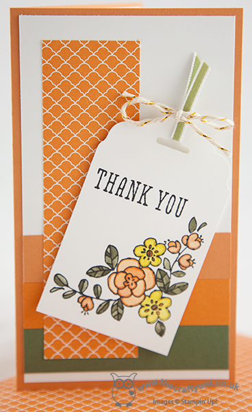
I followed the background layering of the sketch with solid colour cardstock and overlaid with a slim panel of Pumpkin Pie Brights DSP. Instead of a circle as my focal point, I decided to use a tag punched with my Scalloped Tag Topper Punch. I cut my cardstock slightly wider than the 2" groove in order that it could accommodate my corner flower stamp from the 'You're So Grateful' stamp set. I stamped the image in black Stazon and used my Aquapainter to colour in the design. When the image had dried, I went around the inside edge of the image with the co-ordinating colour marker pen to give it added definition. I have one small confession, which is that I used a small piece of Old Olive ribbon to finish off my tag as it was the closest match I had to Always Artichoke. And finally - I made a co-ordinating envelope!
Hope you like today's card; I'll be back tomorrow with a very special punch art creation, so do check back to see what I've made. Until then, happy stampin'!
Stampin' Up! Supplies Used: