by Joanne James31. March 2016 08:05
Today it's time for a new challenge over at Create With Connie and Mary and this week we have a colour combination for you:
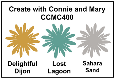
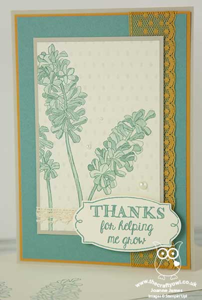
Ok - so I'll be honest upfront: I'm not a fan of Delightful Dijon! Actually, I'm sure I've declared this to my regular readers before and I can honestly say I've only used it once on a card where I really loved the output (funnily enough a previous CCMC colour challenge - you can see that card here). I have therefore mixed feelings about today's card - and it's really the presence of the mustard that's the reason! So, here is today's creation:
The details for today's card are as follows:
Helping Me Grow - This is a stamp set you haven't seen me use before and there is good reason for that - I don't own it! I actually bought it as a Christmas gift for my mother-in-law, borrowed it back for an idea I had that I then didn't get to try out a few weeks ago but knew it would be just perfect for today's card. The large, over-size blooms in this set are perfect for a centre-piece of their very own; I stamped them in Lost Lagoon and used my Aquapainter to colour them in with the same colour for a soft, washed look. So thank you Kathy!
Timeless Elegance - If you look really closely, you will see that there is a subtle pattern to the paper I used for my main stamped image. The Timeless Elegance designer series paper has Sahara Sand as one of its feature colours; it adds interest to my floral panel without overwhelming the stamped image and fits with the challenge colours.
The Perfect Label - The sentiment on my card is also from the 'Helping Me Grow' stamp set. There are some great sentiment combinations that can be made with this set; there are also a number of nice corner or border treatments, including the one I used on this card. What's more, the sentiment border is the perfect fit for the framelit in the Rose Garden Thinlits Dies set - bonus!
So that's my card - not-so-Delightful Dijon and all!
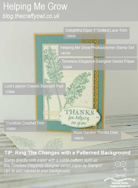
Here is the visual summary of the key products used on today's project for you to pin for easy reference:
You can see all of my 'How To' summaries on my 'How To - Tips and Techniques' Pinterest board in case you've missed any.
Do visit the other Design Team members to see what they did with this week's colours; there's lots of inspiration over on their blogs too!
Enjoy your day and I'll be back tomorrow with another project; until then, happy stampin'!
Stampin' Up! Supplies Used:
- Helping Me Grow Photopolymer Stamp Set
- Rose Garden Thinlits Dies
- Timeless Elegance Designer Series Paper
- Delightful Dijon A4 Cardstock
- Delightful Dijon 1" Dotted Lace Trim
- Lost Lagoon Classic Stampin' Pad
- Lost Lagoon A4 Cardstock
- Very Vanilla A4 Cardstock
- Sahara Sand A4 Cardstock
- Pearl Basic Jewels
- Venetian Crochet Trim