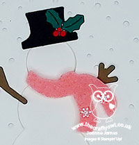
Today I'm sharing a card for the new challenge over at CASology where I have been invited by the lovely Melissa to be the guest designer, following my 'stag' card being chosen as a winner for challenge 378 - if you missed it, you can see that card here.
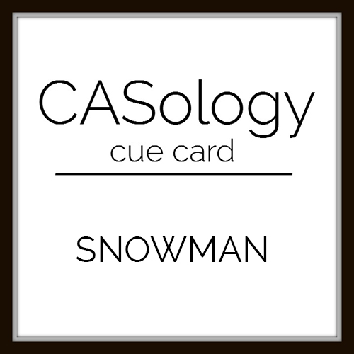
Today's cue card is a festive one and perfect for some last-minute card making for the Christmas season:
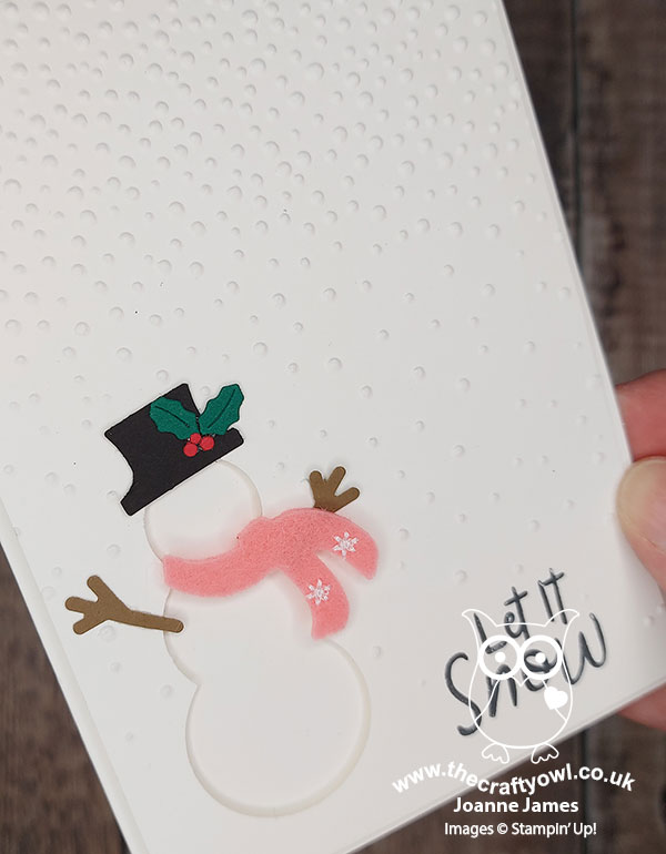
I decided to create a cute snowman using negative space for my card today - take a look:
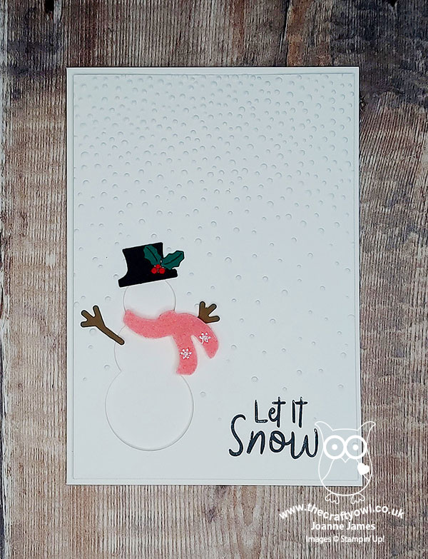
Here's the low-down on today's card:
Do You Wanna Build A Snowman - Apologies if you now have THAT song stuck in your head, but that was exactly what I decided to do today, on my card at least! Whilst I used my Snowman Builder Punch for the hat and arms, it wouldn't work for the body but this was easily remedied by using some (retired) circle punches (3/4", 1" and 1 1/4"). I added a felt scarf left over from one of last year's accessory kits for a little added texture, a simple sentiment from the 'Snowman Season' stamp set and my falling snow was courtesy of my much-loved retired Softly Falling embossing folder - it's still a favourite of mine:
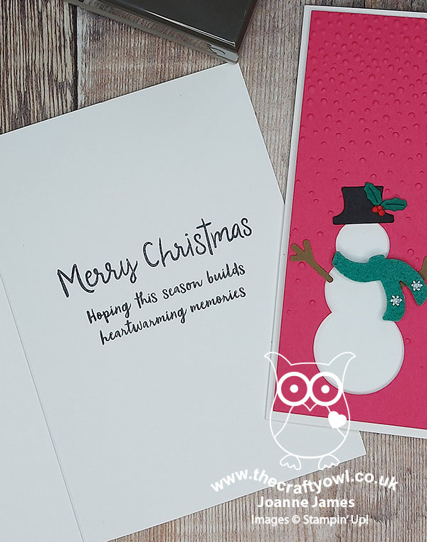
This was the stamping on the inside of my card:
Design Defined - One of the things I love about the CASology challenge is that they encourage us to consider what makes our card 'clean and simple'. In addition to the basic guidelines, the design team offer some great tips in terms of their cards. Often when I play along I do the same, and if you check out my previous CASology-related blog posts, you will see lots of similar tips in relation to the cards that I created. For today's card, I defined my card design as 'Use negative space to create a focal point' which is a great way to add interest to a CAS design.
An Unconventional Take - I actually made a second card using the same design, that was as a result of seeing this week's Inspired By inspiration photo:
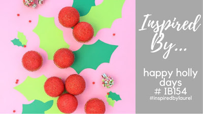
I loved the holly against the bright pink for an unconventional take on Christmas colour, so decided I would use this idea to create a second version of the above card. My holly is small and I swapped out my scarf colour for more green, but this card is very much about the pink:
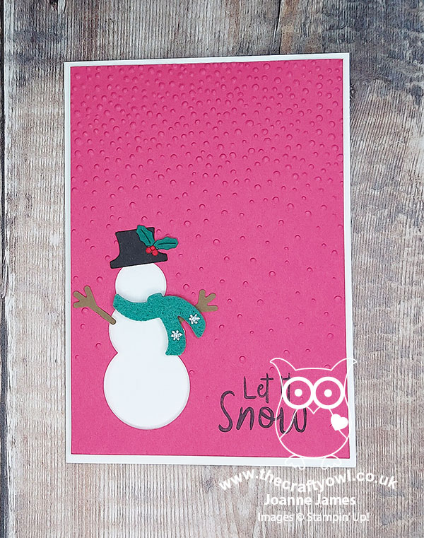
So what do you think? I actually still prefer the original one myself, however it was fun to change out the colour for an alternative effect. Here are both cards together for comparison:
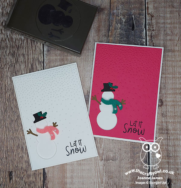
Which one do you prefer? Do leave me a comment below - I would love to hear your thoughts.
Here is the visual summary of the key products used on today's project for you to pin for easy reference:
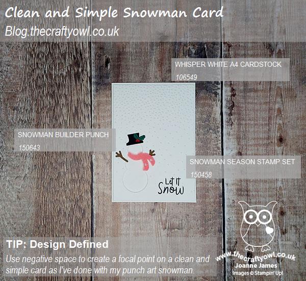
You can see all of my 'How To' summaries on my 'How To - Tips and Techniques' Pinterest board in case you've missed any. Thank you to the team at CASology for having me as their Guest Designer this week - do check out the team designs and I'm sure they would love you to play along with this challenge too.
Enjoy your day and I'll be back tomorrow with another project. Until then, happy stampin'!
Stampin' Up! Supplies Used: