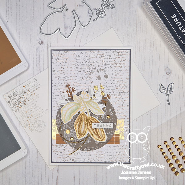
Today I'm sharing my design team card for our new challenge over at As you See It where it's time for my favourite, a sketch challenge designed by the lovely Jan:
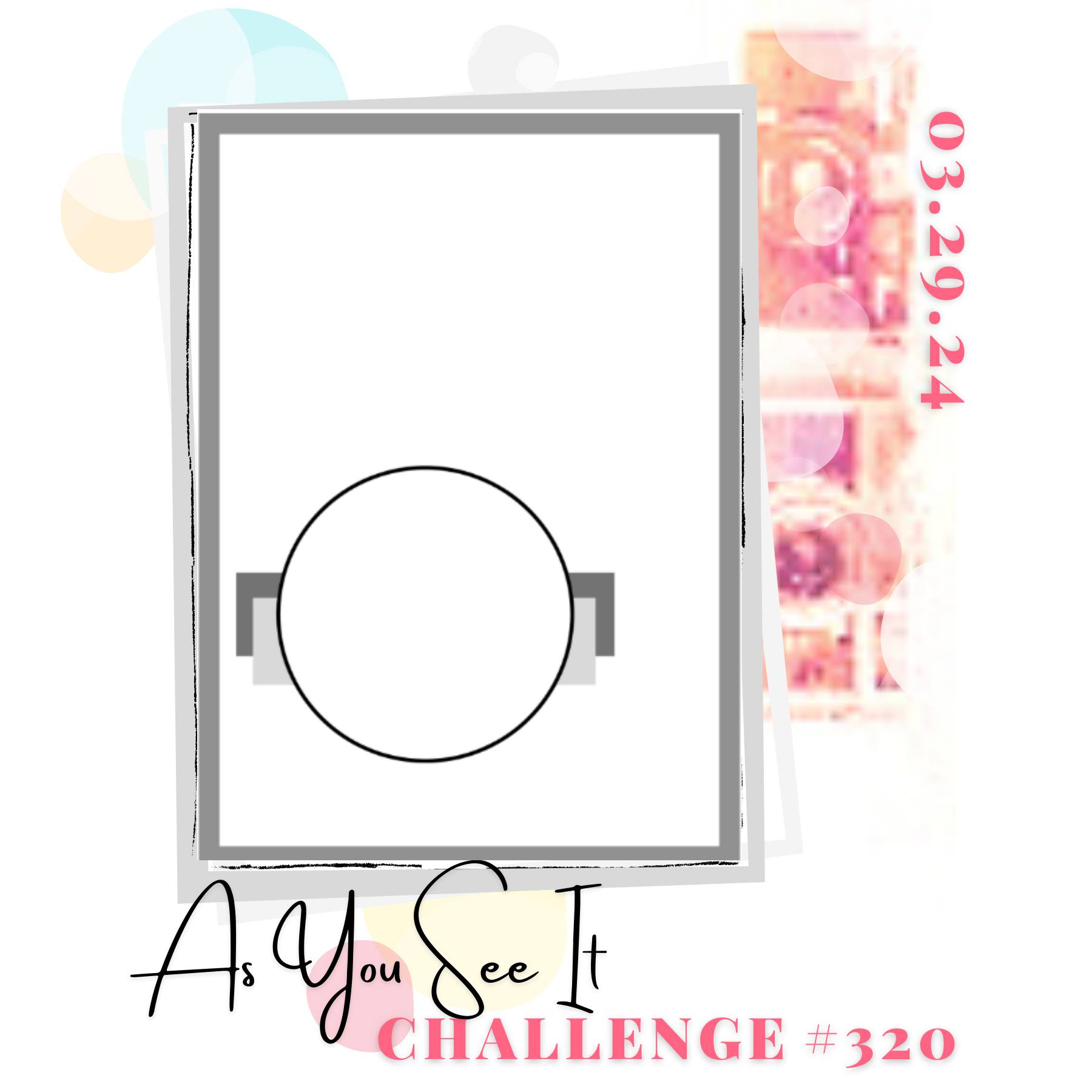

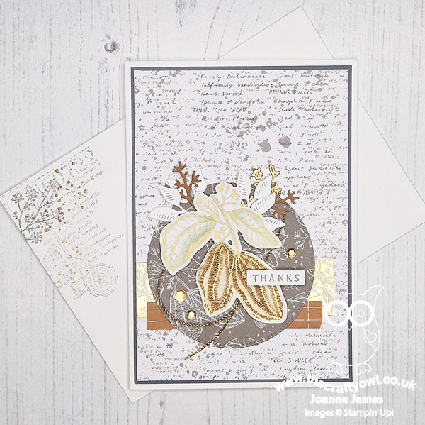
I love our sketch this week; it's the kind of layout that can be dressed up or down, with a clean and simple or much more detailed design - lots of possibilities! I decided to go over-the-top with this one and go big on designer series paper - there are no less than 5 different patterns used on this card! Too much? Here's my card - take a look:
Here's the low-down on today's card:
Nature's Sweetness - It's that time of year when we are getting ready to say goodbye to lots of product from the Stampin' Up! annual and mini catalogues and time to get using up that designer series paper! On today's card I used 5 different patterns from the Nature's Sweetness specialty designer series papers - can you spot them all? One for the background, a couple for the strips behind the circle (another one) and finally the cocoa pods have been diecut from another of the sheets, bringing the total to 5. I wouldn't normally use so many on one card, but I think the colours and patterns work sufficiently well together to not be too overwhelming.
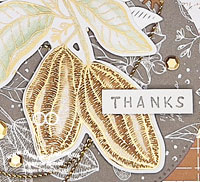
A Touch of Colour - I used a diecut cocoa pod for the focal point on my card - I'm hoping this is ok for the theme of 'Just Add Chocolate' over at Just Add Ink this week - I'm sure they were thinking chocolate eggs and bunnies, but I don't have any of those in my current stash so I'm hoping my cocoa pods as the purest form of the brown stuff still ticks the box. I added a touch of colour to the designer paper with my Soft Sea Foam and Pecan Pie Stampin' Blends to make my pods stand out against the background detail:
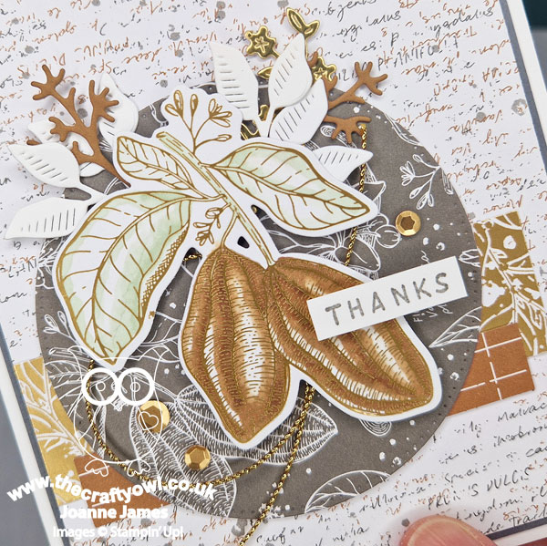
Accessorize, Accessorize - I added a few leafy diecuts, some elegant gold trim and gold sequins as finishing touches to my card. I trimmed down to a simple 'thanks' sentiment and also stamped the inside of my card and the envelope with the 'Notes of Nature' stamp set to complete my card.
I was a 'late bloomer' as far as this suite is concerned (I have Jan to thank for finally convincing me I needed it in my life), so definitely feel as if I'm making up for lost time!
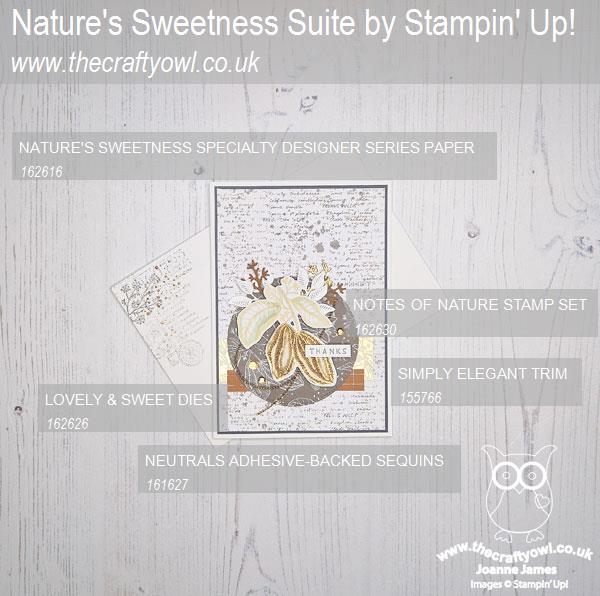
Here is the visual summary of the key products used on today's project for you to pin for easy reference:
You can see all of my 'How To' summaries on my 'How To - Tips and Techniques' Pinterest board in case you've missed any.
Here's a summary of our challenge rules:
- Create any card, scrapbooking page, 3D project or packaging project that fits the challenge.
- Please include the challenge graphic and link back to the challenge in your blog post. Turn off word verification so we can leave you lots of lovely comments. Make sure you link the post not the whole blog to the Linky. Use #AYSIXXX when uploading to a public gallery.
- If you’re unsure about ‘the rules’, check the details under the Challenge Guidelines tab on the As You See It Challenge homepage.
- In a sketch challenge, you are welcome to rotate or flip a sketch. You can replace shapes used such as substituting a circle panel for a square panel. However, we must be able to still see the basis of the original sketch in your finished product.
We look forward to seeing your creations in the AYSI gallery.
Enjoy your Good Friday. Amongst other things, I will be visiting the farm shop today and driving to Birmingham to collect the oldest of the James Juniors who is coming home for the Easter break - we are all excited! I'll be back tomorrow with another project. Until then, happy stampin'!
Stampin' Up! Supplies Used:
