by Joanne James8. March 2022 13:00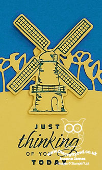
It's Tuesday and time for a new challenge over at CAS Colours & Sketches. This week's challenge is a sketch challenge and Jeanne has asked that we use a curve and non-geometrical shape in our designs.
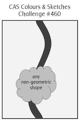
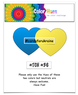
Feel free to flip or rotate the sketch when making your card. i did just that today and rotated the sketch through 90 degrees to create a landscape card. If you are a card maker you will undoubtedly have seen the flood of blue and yellow cards in support of #cardsforukraine. The lovely peeps over at Color Hues are having a double challenge in honour of this and are also featuring the colours of the Ukranian national flag in a bonus colour combo for this challenge, so I decided it was time for me to show my support and play along. The sunflower is the national flower of Ukraine and whilst I have one of those cards in the pipeline to share with you in another post, for today's challenge I decided to use the row of tulips in the Tulips Dies set for that wiggly line - take a look:
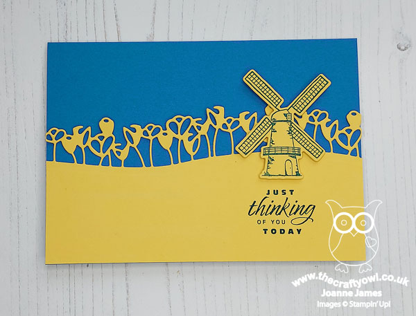
Here's the low-down on today's card:
This card really is super simple to execute - the effort here was in the planning! A Pacific Point card base, then overlaid a panel of Daffodil Delight for the diecut tulips. I chose to feature a stamped windmill as my non-geometrical shape and stamped it in Pacific Point onto Daffodil Delight, stamping the sentiment from the Flowering Tulips set below it - the words seemed appropriate in the circumstances as the people of Ukraine are most definitely in our thoughts.
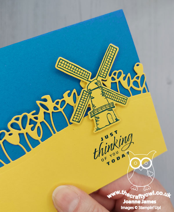
This card is all about the bold blocks of just two colours; it is unusual for there to be no white at all on this card, but having tried a few different things the blue-on-yellow windmill was definitely the way to go - the windmill is much more a part of the landscape and it emulates the horizontal lines of the Ukrainian flag. The only white was for my stamped panel on the inside of my card:
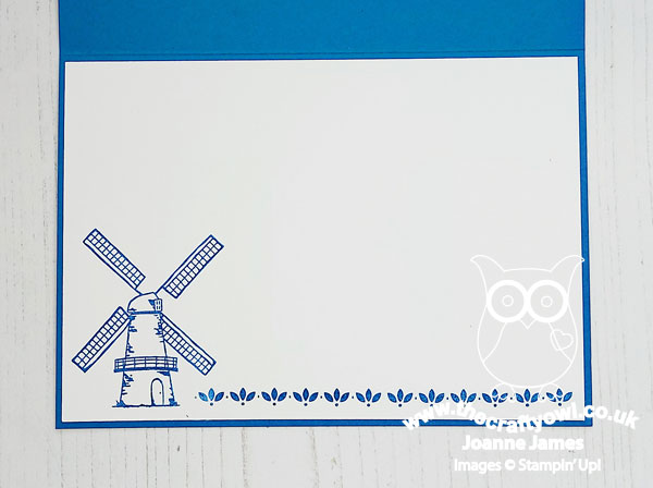
Do you ever use blocks of colour in this way in your crafting? Bold blocks of colour can have a big impact and by avoiding clutter that clean-and-simple feel and 'white space' is preserved.
Here is the visual summary of the key products used on today's project for you to pin for easy reference:
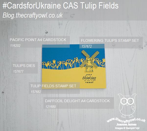
You can see all of my 'How To' summaries on my 'How To - Tips and Techniques' Pinterest board in case you've missed any.
As a reminder, for our colour challenges, you must use all of the stated challenge colours. You may also use neutral colours; however, the challenge colours should be the most noticeable ones featured on your card. We use Stampin' Up! color names for reference, but you are welcome to use any other companies' products as long as you match the challenge colours as closely as possible.
Enjoy your day and I'll be back tomorrow with another project. Until then, happy stampin'!
Stampin' Up! Supplies Used:
e79c0ee5-1345-4f32-8f52-2524ded00f50|0|.0|96d5b379-7e1d-4dac-a6ba-1e50db561b04
Tags: Stampin' Up, Stampin' Up Card, Stampin' Up Card ideas, Stampin' Up Supplies, Shop online, Shop Stampin' Up online, Shop Stampin' Up! Online, CAS Colours and Sketches, Flowering Tulips, Tulip Fields, Tulip Dies, Colour Blocking
Cards | Shop Online | Shop Stampin' Up! Online | Stamping
by Joanne James25. January 2022 13:00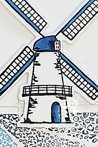
It's Tuesday and time for a new challenge over at CAS Colours & Sketches. Can you believe it's the last Tuesday of the month already and my hosting duties are nearly done? Where did that month go?! I am rounding out the month with a sketch challenge and this week I'd like to see a split panel with a sentiment and clear focal point that bridges the divide:
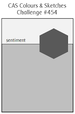

Feel free to flip or rotate the sketch when making your card.
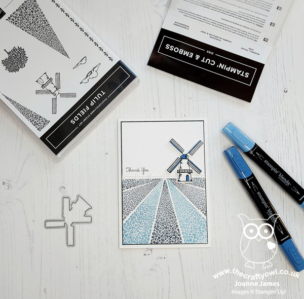
For my card today I decided to go Dutch, with a colour scheme inspired by the famous Delftware pottery and that lovely jug that is bottom left on the Double D Challenge board (no winter though!) - take a look:
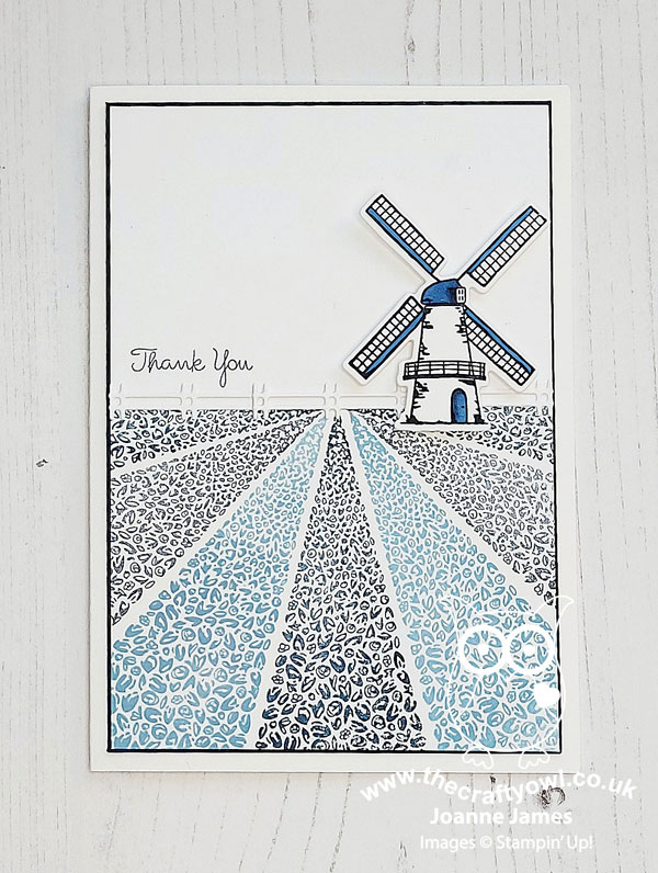
This card is not as tricky as it looks; the Stamparatus makes light work of stamping those rows of tulips (see today's 'Tuesday Tip' in my Crafty Owl Creatives Facebook Group for the best way to get a great result!). I left the sky portion blank to preserve my 'white space', added a simple white diecut fence and a small windmill as my focal point, stamped in Night of Navy and with some added colour using my Blends then cut out using the Windmill Fields Dies - I just love these!
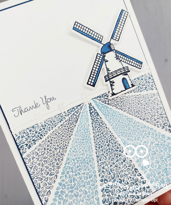
A simple thank you sentiment from the 'Pansy Patch' stamp set completes my card. A palette of blues may seem an unusual choice for the first outing with this stamp set, but I think the monochromatic palette contributes to the clean and simple feel of the card. What do you think? I'm also linking today's card up over at SUO Challenges for a second play, since they are challenging us to create 'Clean and Simple' cards this week too.
Here is the visual summary of the key products used on today's project for you to pin for easy reference:
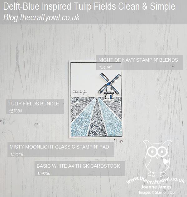
You can see all of my 'How To' summaries on my 'How To - Tips and Techniques' Pinterest board in case you've missed any.
As a reminder, for our colour challenges, you must use all of the stated challenge colours. You may also use neutral colours; however, the challenge colours should be the most noticeable ones featured on your card. We use Stampin' Up! colour names for reference, but you are welcome to use any other companies' products as long as you match the challenge colours as closely as possible.
Enjoy your day and I'll be back soon with another project. Until then, happy stampin'!
Stampin' Up! Supplies Used:
784515d8-e9c7-4201-a2c1-4025384c4798|0|.0|96d5b379-7e1d-4dac-a6ba-1e50db561b04
Tags: Stampin' Up, Stampin' Up Card, Stampin' Up Card ideas, Stampin' Up Supplies, Shop online, Shop Stampin' Up online, Shop Stampin' Up! Online, CAS Colours and Sketches, Pansy Patch, Tulip Fields, Windmill Fields Dies
Cards | Shop Online | Shop Stampin' Up! Online | Stamping