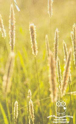
Serene Scenery Just Breathe And A Moment Of Mindfulness

by Joanne James16. May 2017 06:00

Today I'm sharing a card for this week's sketch over at CAS Colours & Sketches:  

Today's card turned out to be one of the easiest ever cards for you to recreate - and is perfect for the sentiment of the day! Check it out:


Here's the low-down on today's card:

Just Breathe - This beautifully scripted oversize sentiment is from a set that will be new in the forthcoming annual catalogue called 'Colorful Seasons': a selection of images and words that co-ordinate with a number of other products that form part of the new Colour Theory Suite. This will be a great set for memory keeping and traditional scrapbooking, as well as card making - it's incredibly versatile and I can't wait to share more of it with you. 

Serene Scenery - The art of mindfulness, that is focusing our attention on the present moment, has become very popular of late. It is a proven stress reliever and can be very effective in helping us to clear our mind, become more objective and therefore more able to move forward in a positive and constructive manner. Using mindfulness techniques for even 10 minutes a day can have beneficial effects; I was recently introduced to the Headspace mobile phone app by a friend of mine and can see why she is so evangelical about it - you can find out more here. When I want to relax my mind and 'just breathe' I am a blue sky thinker - literally. So this photographic image from the retiring Serene Scenery DSP stack made the perfect accompanying image. I wanted my card to deliberately have no other obvious focus other than the sentiment - sometimes when life gets too much we all have times where we need to be reminded to 'just breathe' and this card will be heading to a friend to say just that. 

Neutrals - I went with a largely neutral palette for my card today, using Island Indigo for my sentiment to pick up on the bold blue of the image. If you like this colour combination, feel free to save it for future use:


Here is the visual summary of the key products used on today's project for you to pin for easy reference:


You can see all of my 'How To' summaries on my 'How To - Tips and Techniques' Pinterest board in case you've missed any. 

This has to be one of the quickest cards ever; the funny thing is, I wasn't short on time when I made it. I guess a simple card for a simple sketch - sometimes words are enough. Of course if you disagree feel free to comment below - I'd love to hear your thoughts!

Enjoy your day and I'll be back tomorrow with another project. Until then, happy stampin'!


Stampin' Up! Supplies Used:

Table built using Product Table Builder by The Crafty Owl - Independent Stampin' Up! Demonstrator.

Two Ways With Avant Garden - Yours Free During Sale-A-Bration

by Joanne James2. February 2017 14:00

I've had a couple of blog-free days on account of having to juggle a few things around as I have one of my Juniors at home poorly this week. I think they may have given it to me too, but that's a story for another day! To make it up to you I'm sharing not one but two cards today, both using the most popular of the Sale-A-Bration free stamp sets. Here's the first one, a CASE of the card shown on page 5 of the Sale-A-Bration catalogue:


Here's the low-down on the above card:

Botanical Flower - The Avant Garden stamp set contains two very different flower stamps: the flower stem on the above card is a fine line drawing, almost like the ones you find in botanical plant identification books. Here it is simply coloured with a blender pen and my Daffodil Delight and Old Olive watercolour pencils, then fussy cut using my trusty paper snips. The second flower is a much more fluid, almost watercolour effect bloom - this is the one you can see on the card below, which is a CASE of the card on page 4 of the Sale-A-Bration catalogue, with the layout of the banner horizontal instead of diagonal and an alternative colourway. 

Easy Woodgrain - Do you recognise the background on this card? The ladies in my recent Sale-A-Bration class were keen to understand how I had created this background so full of texture; they were very surprised when I pointed out that it was actually one of the patterns in the Serene Scenery Designer Series Paper stack. This pad is choc-full of great patterns and designs, that make light work out of creating interesting backgrounds. So easy, it almost feels like cheating!

Texture Abounds - Whilst the paper adds texture in the pattern, this card has a lovely collage feel with all the other elements of added texture: a woodgrain embossed circle, a strip of burlap ribbon and piece of lace trim, along with a snippet of doily, some linen thread and a sprinkling of pearls. 

Here is the visual summary of the key products used on today's project for you to pin for easy reference:


You can see all of my 'How To' summaries on my 'How To - Tips and Techniques' Pinterest board in case you've missed any. 

Here's the second card using the same stamp set but with a completely different feel:


Here is the visual summary of the key products used on today's project for you to pin for easy reference:


It's no wonder Avant Garden is so popular: lots of creative ways with florals, not forgetting a useful trio of sentiments that work on lots of different types of card. Lots of my customers have already ordered this set; if you're not one of them but it appeals to you, then all you have to do is place an order for £45 or more and you can receive it for FREE! If you are ordering online, simply add the item code (143272) to your shopping basket once you've added your other items and it will add it free of charge. If you are ordering online (it's easy to do: just click on the shopping basket link in the 'Shop Online' basket on the right of this page, or alternatively click on any of the product links in the supply table below) don't forget to add this month's hostess code 4X3KWTZY in order to receive an extra little thank you in the post separately from me. 

So which one of these cards do you prefer? Do let me know in the comments below - I'd love to hear your thoughts.

Enjoy your day and I'll be back tomorrow with another project. Until then, happy stampin'!


Stampin' Up! Supplies Used:

Table built using Product Table Builder by The Crafty Owl - Independent Stampin' Up! Demonstrator.

Clean and Simple Dragonfly Dreams

by Joanne James30. January 2017 07:00

Today I'm sharing a card that uses the sketch over at CAS(E) This Sketch and the clean and simple challenge over at CASology:


I'm a big fan of the sketches over at CAS(E) This Sketch and had quite a few interpretations on this one and for today chose to combine with the codeword over at CASology: Glisten. I love how a single word can really make you think creatively and sometimes takes your cardmaking into unexpected directions - here's my card:


Here's the low-down on today's card:

All That Glistens - When I consider the word 'glistens', I think of shining light, usually on water or frost, or maybe something transparent or translucent. I decided this sketch would be perfect to showcase a lone dragonfly, with sparkly, translucent wings. I stamped my dragonfly in Versamark onto vellum and heat embossed it in gold, then coated the wings with a liberal dose of clear Wink of Stella. I used Shimmer White cardstock which also has a subtle lustre and added some clear accents to act as raindrops and tie in with the theme. It is so difficult to capture the shimmer in a photograph - here's a close up:


Here's a further close-up of the dragonfly's wings, where you can just about see the sparkle from the clear Wink of Stella - it really looks so beautiful in real life:

A Dragonfly Dream - The single dragonfly is from the Dragonfly Dreams set in the Spring-Summer catalogue and was easily cut out using the co-ordinating Detailed Dragonfly Thinlit Dies. This is one of a number of bundles in the seasonal catalogue - if you buy both items you will save 10%. A great baargain - add a little something to it and you can benefit from a free Sale-A-Bration item too (with an order of £45 or more).

A Trick Of The Light - I added a panel of Serene Scenery designer series paper to the base of my card, to add a little colour and tie in with the theme with this 'bokeh' effect, which is often the resulting effect when light is photographed as it glistens on water or rain. Patterned paper can still feature in a 'clean and simple' design; the trick is to use sparingly; a good rule of thumb is to restrict its use to no more than one third of the overall card design.

Here is the visual summary of the key products used on today's project for you to pin for easy reference:


You can see all of my 'How To' summaries on my 'How To - Tips and Techniques' Pinterest board in case you've missed any. 

Enjoy your day and I'll be back tomorrow with another project. Until then, happy stampin'!


Stampin' Up! Supplies Used:

Table built using Product Table Builder by The Crafty Owl - Independent Stampin' Up! Demonstrator.

Serene Scenery Sunshine

by Joanne James31. July 2016 10:00

It's Sunday and time for a new challenge over at The Paper Players! It's the turn of the lovely Laurie to host this week and she has a fun tic-tac-toe board challenge for us to play along with:


I have been rather time-pressed this week - the joys of school summer holidays! - so although I knew what I wanted to do with today's challenge, it took me some time to find the time to get to my desk to make it! For my card this week I decided to go with the middle column of Laurie's card and create something that was reminiscent of warm, sunny summer days, with the help of this week's sketch over at Global Design Project - take a look:
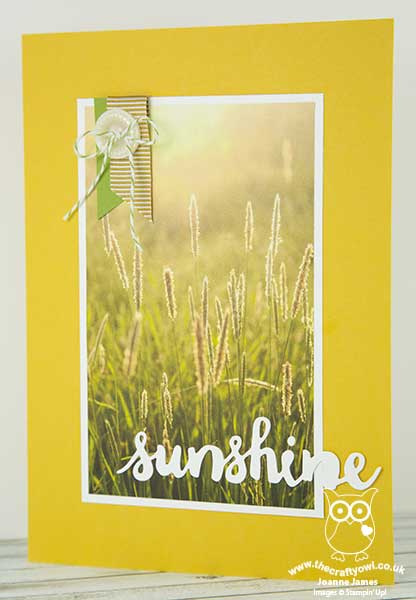
 

Here's the low-down on today's card:

A Serene Scene Indeed - I chose to use a piece of the beautiful Serene Scenery designer series paper for my card today. The photographic images in this paper stack are just so beautiful, they really don't need much other than a sentiment to finish a card. Inspired by nature, there are several images that feature sunshine in this pack and for this card I decided to go with this grassy field, with its warm summer glow. I made my card larger than usual (the finished card measures 14.9cm x 21cm) as I wanted to feature as much of this beautiful paper as possible.

Sunshine Says It All - I used a 'sunshine' diecut sentiment from the Sunshine Wishes die set to finish my card. I toyed with adding the rest of my sentiment using the Sunshine Sayings stamp set to the front of my card, but decided to stamp it inside instead as I really wanted to keep the front as clean as possible. I will let you into a little secret though: in hindsight it should be set a little more to the left, so that it doesn't get as absorbed into my white mat layer, but with no time to go back and start again I'm going to have to live with it! Sshhh - don't tell ;-)

Sunny Honey - The eagle-eyed amongst you will notice that my card base looks a little light for the Delightful Dijon that this paper stack co-ordinates with; the mustard yellow made my card look more autumnal than summery, so I took a piece of my retired in-colour cardstock in Hello Honey to get the colour I was looking for. It always help to stockpile a little retired cardstock for such instances - and I know I'm not the only one! I finished with a sliver of Old Olive cardstock and some Delightful Dijon ribbon for my banners, and a Classy Designer Button threaded with Old Olive baker's twine.

Here is the visual summary of the key products used on today's project for you to pin for easy reference:
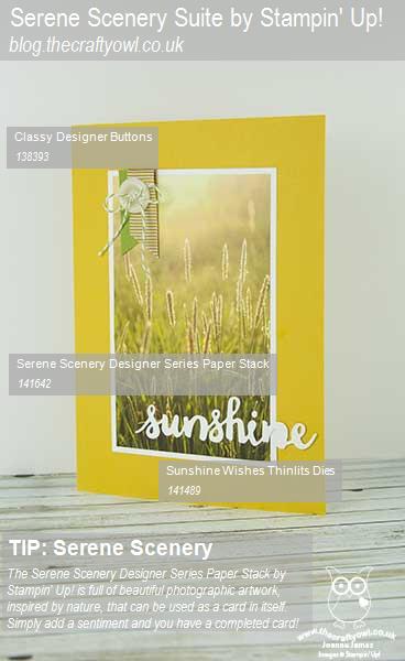
 

You can see all of my 'How To' summaries on my 'How To - Tips and Techniques' Pinterest board in case you've missed any. 

Before you reach for your ink and papers, check out what our amazing team has created to inspire you this week:

The Paper Players Design Team
 
 
Here's a quick recap of our challenge rules:
 
1.  Create a new paper project
2.  Upload your creation to your blog with a link back to us and provide a direct link to the post featuring your challenge submission.
3.  Please link your card to no more than four challenges, TOTAL.
4.  Have FUN! 


Family calls so I'm off to get back to having fun of the non-crafting kind! One last thing: don't forget today is the last day that you can take advantage of the July Bonus days offer; if you are placing an order online, make sure you use this month's hostess code 63RNATE3 when prompted to get a little thank you in the post from me. This hostess code will be closing tonight at 8pm, so be sure to get your orders in before then. I look forward to seeing what you create with Laurie's board this week.

Back tomorrow with another project; until then, happy stampin'!


Stampin' Up! Supplies Used:

Table built using Product Table Builder by The Crafty Owl - Independent Stampin' Up! Demonstrator.

New Online Exclusives

There are new products available exclusively in the online store from 5 November - check them out here.

Latest Kits!

Stampin Cut and Emboss

The Layered Landscapes Kit and Nature's Paintings Kit are the latest kits in the online store - get yours here!

Shop Online

Access my online shop 24 x 7, 365 days of the year:

Current November hostess code:

9NKXDTTR

Shop Online

Mini Catalogue

BROWSE THE CATALOGUE

'Tis The Season - the new Stampin' Up! Mini Catalogue is here! For more details and to download your copy click here

Scrapbooking

Stampin' Up! has introduced a new range of 12x12" scrapbooking product and kit - the full range is now available to purchase online. To download a copy of the new digital Scrapbooking Catalogue click here.

2024-25 Annual Catalogue

BROWSE THE CATALOGUE

Click on the image to download your copy of the 2024-25 annual catalogue. For a full list of current SU! supplies, go to my online store. If you would like any help or advice, please drop me a line at joanne@thecraftyowl.co.uk or give me a call on 07773 421446 - I'd be happy to help.

Join My Team

It's always a great time to join Stampin’ Up! New team members can get £130 worth of products for only £99 + free business supplies + free shipping + all the fun being a part of Stampin’ Up! Stampin' Up! has something for everyone: join my growing team and benefit from my support to enjoy Stampin' Up! however you choose.

If you're interested, call me for a chat to understand how I can help you realise your goals. Alternatively, if you have already decided to sign up and you just can't wait, please click here for the link to the online form where you can sign up and order your starter kit right away! 

About Me

Hi I'm Joanne and live in Northampton and when I'm not looking after my husband and two beautiful children, am an avid crafter with a passion for all things Stampin' Up!

I must confess that I have never been a big rubber stamper - until I discovered Stampin' Up! that is. I love the fact that I can get such great results with co-ordinating stamps, inks, papers and punches - the possibilities are endless! Join me on my stamping journey as I share the things I love and be inspired to create amazing things yourself!

Follow Me

Monthly Newsletter

Box Builder

Click the button above to use Box Buster to create your custom box design using the Envelope Punch Board!

Kits Collection Now Available!

Stampin Cut and Emboss

The new Kits Collection from Stampin' Up! is now available!

Click here to see the current kits available and order yours online today.

I Design For


Stampin' Up Stuff

This is my personal blog and is not endorsed by Stampin’ Up! I hope you find it a plentiful source of ideas and personal inspiration but please don't copy my designs for contest submission or use for classes, publication or sale without express permission.