Another Monday, another week - welcome lovely readers! I enjoyed a lovely day yesterday, with a family lunch, a long cycle ride, more planting of seedlings for the garden and yet more Easter chocolate (we are slowly getting through it!) Today's card is for this week's challenge over at Casology where the cue word is 'washi':

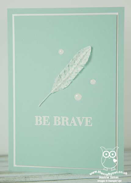
I was thrilled to have my weather cards last week chosen as Honourable Mentions (you can see those cards here and here) and couldn't resist playing along again this week as I try to hone my 'clean and simple' design skills. I'm also entering today's card into this week's challenge over at Simply Less Is More where this week's challenge is to use 'white space that isn't white'. Let me show you my card and then I'll explain a little more what that means:

The key features of today's project are as follows:
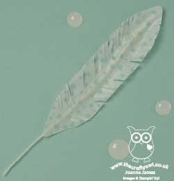
Washi Feather - I have lots of washi tape (I don't hoard it quite as badly as designer series paper, but close!) and rarely use it; I consulted with my 'Things to do with Washi Tape' Pinterest board where I have saved lots of ideas and thought it was about time I tried something a little different, so settled on creating the feather you see on today's card. I used some retired tape as I liked the subtle pattern on this one, but you could use any current tape for a similar effect. It's really easy to do: you just tape both sides of a piece of baker's twine or strand of jute ribbon as I did here, then use your paper snips to shape your feather.
White Space That Isn't White - The creation of 'white space', that is an area of your card with no image, layer, pattern or embellishment, is one of the things that designers often find tricky with this kind of card. 'White space' doesn't refer to the colour of the base layer, although often a white base is used - rather it refers to leaving an large proportion of the card blank. I chose to use Pool Party as my colour of choice today and with the exception of my feather, trio of white Perfect Accents, sentiment and thin border frame, there is nothing else on my card front, meeting the 'white space' clean and simple brief.
Make A Statement - My clean and simple card needed a clean yet bold sentiment. My feather started me thinking about Red Indians (don't ask!) and Indian braves. I remembered this sentiment in the 'Enjoy The Little Things' stamp set; whilst designed to go with the kit of the same name, it stands alone and works well with my lone feather. I stamped it in Versamark and heat embossed in white I think this would be a great card to send to someone battling an illness or difficult circumstance, where a little encouragement is needed.
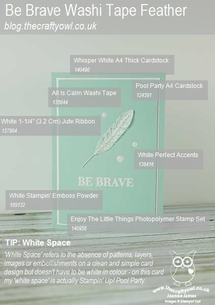
Here's the visual summary of the key supplies used to make this card for you to save for future reference:

You can see all of my 'How To' summaries on my 'How To - Tips and Techniques' Pinterest board in case you've missed any.
This is the second full week of the Easter holidays for the James juniors. I'm not sure what our week will have in store, but you can be sure it will include more fun activities that don't include school work!
Enjoy your day and I'll be back tomorrow with another project; until then, happy stampin'!
Stampin' Up! Supplies Used: