
Today I'm sharing my design team card for our new challenge over at As you See It where it's time for an interesting 'fill in the blank' challenge:
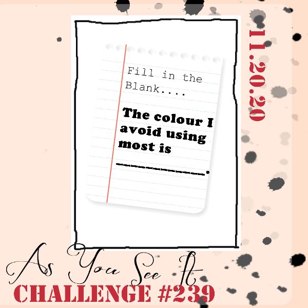
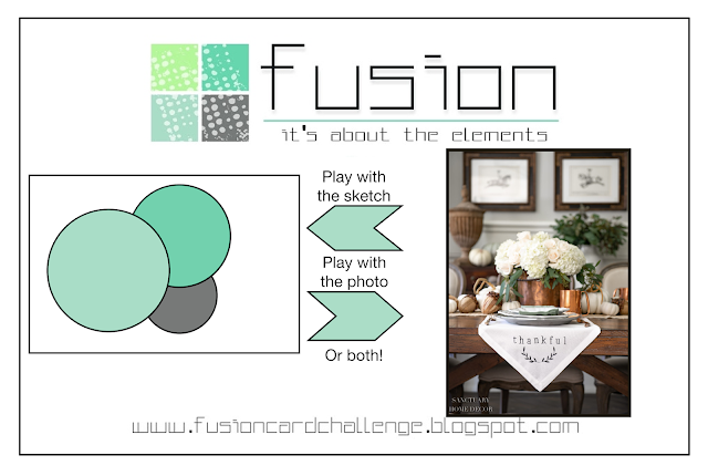

I'll confess I found this a big challenge! There aren't many colours I actively avoid using, although there are definitely some I use far less than others! Orange only features during pumpkin season (or for snowman carrot noses!) but a review of my back catalogue showed me there was another colour that I rarely use - and it might surprise you! I don't often use colour as a starting point on a project either - so making one languishing at the bottom of the pile and making it the focus of my card was a real challenge! I still had a helping hand, in the form of the current Fusion sketch and this week's hot drink theme over at Global Design Project to create my card - take a look:
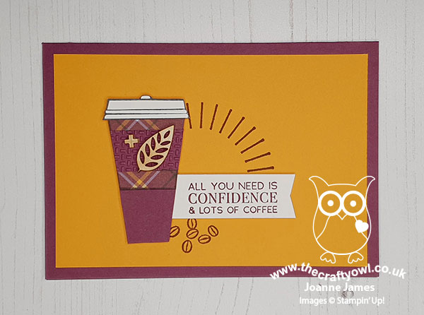
So did you spot it? Yes, it's Rich Razzleberry! I love purple and often feature it in my creations, however this particular purple is not a favourite for me. But I went for it! Here's the low-down on today's card:
Plaid Tidings - I knew that Rich Razzleberry was one of the colours that featured in the Plaid Tidings designer paper (and that I had all of this particular pattern left!), so I decided I would do something that featured this paper as a starting point. I decided to wrap a purple coffee cup and pair the card base with a mat layer in Mango Melody, one of the other colours that feature in the plaid pattern and do all my stamping in Rich Razzleberry too.
Go Large - In order to fit the proportions of the sketch, I needed to 'go large' with my takeaway coffee. With the coffee cup in the 'Press on' stamp set, this is actually really easy to do: take your black Stampin' Write marker and extend the sides and add another horizontal line for the base. Simple!
Added Texture - I added a little extra texture to my cup by adding a textured coffee collar and a couple of wooden elements, for some added detail since the whole thing has a kind-of autumn feel I think:
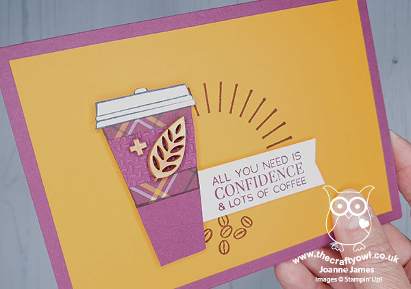
So what do you think? I like the end result, but I don't love it. When my discerning teenager saw the finished result, she declared that whilst she loved both colours separately, she did not care to see them used together! Perhaps I should have gone monochrome ...
Here is the visual summary of the key products used on today's project for you to pin for easy reference:
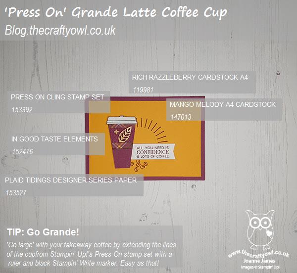
You can see all of my 'How To' summaries on my 'How To - Tips and Techniques' Pinterest board in case you've missed any.
Here's a summary of our challenge rules:
- Create any card, scrapbooking page, 3D project or packaging project that fits the challenge.
- Please include the challenge graphic and link back to the challenge in your blog post. Turn off word verification so we can leave you lots of lovely comments. Make sure you link the post not the whole blog to the Linky. Use #AYSIXXX when uploading to a public gallery.
- If you’re unsure about ‘the rules’, check the details under the Challenge Guidelines tab on the As You See It Challenge homepage.
- In a Fill in the Blank challenge, complete the sentence in the Challenge Banner with the phrase that is true for you and create your project using the words you used. Tell us what you said in your blog or on your site.
We look forward to seeing your creations in the AYSI gallery.
Enjoy your day. I for one is glad it's Friday and I'm looking forward to a slightly quieter evening than I've had for the rest of this week. I'll be back tomorrow with another project. Until then, happy stampin'!
Stampin' Up! Supplies Used: