by Joanne James24. May 2014 15:26I seem to be using a lot of my favourite brights this week and today I wanted to share a card that I made using the Colour Q challenge colours this week, one of my favourite colour palettes:
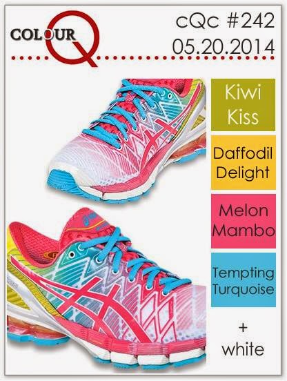
Aren't those trainers so cool?! You wouldn't get lost in the crowd wearing those, for sure! I took the inspiration for my card from their bold, vibrant pattern and this is what I came up with:
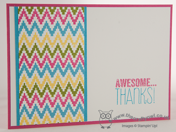
I decided to use one of the wave patterns from the Eye Catching Ikat photopolymer set to create a repeat pattern in the challenge colours (I subsitituted Kiwi Kiss with Old Olive as I don't have the former colour in my collection). I went with quite a simple layered layout, because I wanted the stamped pattern to be the focal point. I still can't quite believe just how easy the photopolymer stamps are to align without the need for a stamp-a-ma-jig - this pattern really didn't take long at all to create, so much so that I made two cards in record time, I just couldn't stop stamping! I mounted my patterned layer onto a strip of Tempting Turquoise. I inked my sentiment using my Brights Stampin' Write Markers, picking up the blue and the Melon Mambo of my card base to tie in with the overall design.
Don't forget, if you would like to own the Eye Catching Ikat stamp set, it is available free with a £60 order until the end of May, so you still have a week to get your order placed. Today is a busy day for me - trampolining parties to attend (Rebecca, not me!!) and a swimming gala this evening. Hope you are all enjoying your weekends. I'll be back tomorrow with another card; until then, happy stampin'!
Stampin' Up! Supplies Used:
by Joanne James12. May 2014 21:29Good evening everyone! Firstly, can I say a big than you to Helen, Dotty and Granny for your lovely comments on Rebecca's blog post yesterday - it's always nice to get comments and she was very touched by your kind words and asked me to say thank you to you all today.
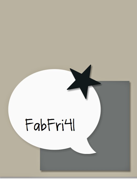
On to today's post! I wanted to play with my new photopolymer stamps that arrived last week (free with each order of £60 or more - read all about the May offer here) and am just managing to squeeze in my entry to this week's Pals Paper Arts challenge, where this week there is a colour challenge. I also loosely based my card on the sketch over at Fab Friday:
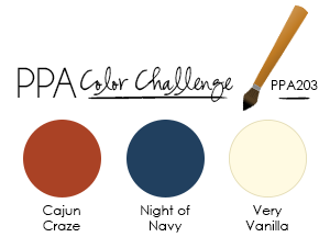
Whilst the PPA design team came up with a great variety of cards suitable for both men and women this week, this colour scheme led me to make a masculine card. As I mentioned, I wanted to use my photopolymer stamps to try out an idea inspired by a printed card I saw recently on Pinterest (you can see that card here) - here is my card:
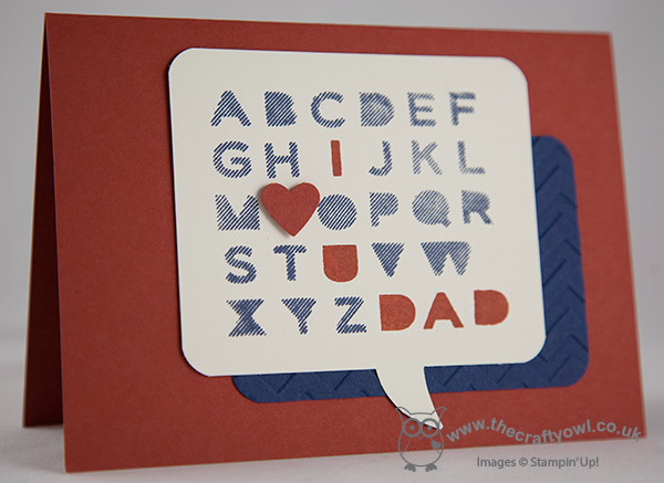
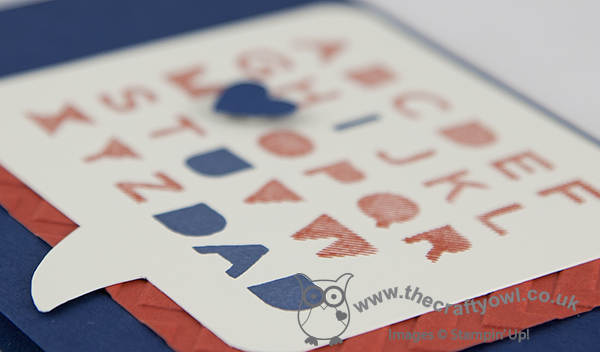
Clearly without the absolute pinpoint accuracy of the printed medium, yet this alphabet was relatively easy to stamp and align using the Sans and Stripes photopolymer stamps without the need for a stamp-a-ma-jig. I cut the word bubble by hand (another reason to add to my list of 'Why I need an e-cutter'!) and backed this with a contrasting coloured panel that I embossed with the Chevron embossing folder, rounding the corners to echo the shape of the word bubble. Lastly, I punched a contrasting heart and popped it on a dimensional. I liked this card so much, I also made one in the reverse colourway:
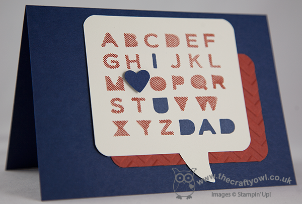
I think I like my Cajun Craze base the most, but this alternative version comes a close second. What about you - which one appeals to you most? I made this card with Father's Day in mind - still a good month away, but it pays to be organised! It would equally make a good birthday card for a special Dad.
That's all from me today; back tomorrow with another project. until then, happy stampin'!
Stampin' Up! Supplies Used:
by Joanne James1. May 2014 11:06Good morning everyone! I've bumped today's creative post as I have more exciting Stampin' Up! news to share with you: following on from successful trials in the USA, Stampin' Up! is introducing photopolymer stamps in Europe too!
Stampin' Up! have spent a long time trying to find the right material to introduce clear stamping to the Stampin' Up! range that gives the high standards of stamp and finish that you would expect of the Stampin' Up! brand and this is it! The forthcoming annual catalogue will now contain wood mount, clear mount and photopolymer stamp sets. There are lots of benefits to photopolymer stamps: they are great value (they are cheaper to produce so you get more stamps per set) and above all their transparency means that they make it so easy to line up your images, without the need for a guide or a stamp-a-ma-jig. Here's a short video showing you how they work:
Now for the best bit - FREE STAMPS!! To celebrate the introduction of the photopolymer range, Stampin' Up! are offering a limited offer on Stampin' Up! photopolymer sets. For every order of £60 or more between 1-31 May, you can choose one of a selection of photopolymer stampsets FREE! This offer is only available whilst stocks last though, so if you'd like one, you need to get your Stampin' Up! order placed as soon as possible! if you're ordering online, don't forget to use the online hostess code to be in with a chance of earning additional benefits. The icons below show the stamp sets on offer (these are not clickable through to my online store - you will be presented with the option to add them to your basket when you have an order with a qualifying spend). To order, simply follow the shop online link on the right of this page.
Back shortly with today's creative post; until then, happy stampin'!