by Joanne James8. July 2015 21:53This is my second post of the day - you can find my earlier post detailing this week's weekly deals here. This is a quick creative post from me today with a card I made this morning for a couple of challenges: another one for Less Is More's red, white and blue challenge and also for Addicted to CAS where the theme is 'patriotic:

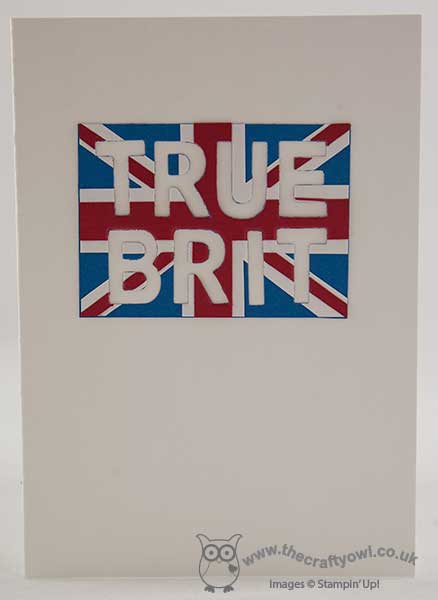
My talented colleague over at The Paper Players, the lovely Jaydee, also designs for ATCAS and she chose the codeword for the current challenge. Whilst Jaydee lives in the USA, she is actually British so I thought that I would make a card with her in mind (oh, and the other current Brit of the moment, Andy Murray, who today got through to the Wimbledon semi-finals - woohoo!):

I used the extra thick Whisper White cardstock as my base and then paper-pieced a union jack flag in Real Red, Whisper White and Pacific Point. My intention originally was to use the letters that I cut using my Bigshot and the Little Letters thinlits, but when I lined up the letters the flag wasn't as obvious as I'd hoped and the negative space worked much better, so I used this instead. Fortunately I managed to do a reasonable job of aligning the letters, although it was quite tricky as the magnets in the magnetic platform have a tendency to make the letters jump about! A no stamp card too!
I hope you like my take on patriotism for today's card; I did contemplate making something more in keeping with my own heritage (I'm Welsh!) although my stamp collection has a complete absence of dragon stamps and punch art would definitely not have fitted with the 'clean and simple' approach!
I'll be back tomorrow with our new challenge over at Create With Connie and Mary; until then, happy stampin'!
Stampin' Up! Supplies Used:
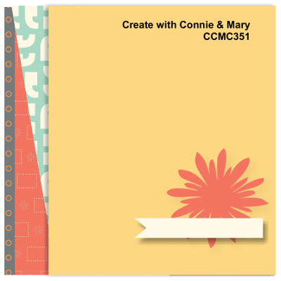
by Joanne James16. April 2015 08:05It's Thursday and time for another challenge over at Create With Connie and Mary, where this week we have a new sketch challenge for you:

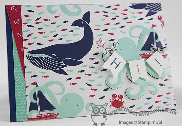
I took quite an unusual approach with this card and decided to try out a new technique that was highlighted on a recent Splitcoast Stampers newsletter - paper tole, where you cut elements of your one layer card using a craft knife to create a raised almost 3D effect. Take a look at my card and then I'll share with you some tips:

I decided to use a sheet of highly patterned Maritime Designer Series Paper for my card front; I haven't used this paper in a while and it is one of my favourites, so thought it opportune to give it some love again for a change! It also has lots of great co-ordinating patterns that made it easy to add my angled layers on the left hand side.
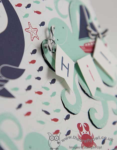
I decided to use the octopus as the focal point for my card, and based my cutting line around that. To create the paper tole effect, I cut some of the upper 'layers' of his legs and rubbed the reverse side with the rounded end of my pokey tool to create a raised cardfront, that is accentuated by placing dimensional behind the cut pieces. You can see that better in the photo below:

I wasn't sure this would work with DSP as the technique suits a thicker cardstock or watercolour paper, but it actually worked quite well and I'm pleased with the overall result. I included some minimal stamping, in the little banner that the octopus is holding, but otherwise, this card is all about the paper!
I was having an interesting discussion with one of my customers yesterday about sketch challenges and I thought I would just take the opportunity in my post to just mention a few of the things that we were talking about - if you've ever considered having a go at one, but were holding back because you weren't sure, you may find the following useful:
- The sketch is for inspiration - it should be used as a guide.
- You don't have to interpret the sketch literally, but your challenge card should bear a resemblance to it and share key elements. So for example, with the sketch above, I would expect to see a focal image, but it can usually be any shape and doesn't have to be exactly the same as the one in the sketch (I used the octopus) some form of flag/embellisment/sentiment banner (I used my Hi! banner garland) and some form of treatment on the left (I layered my DSP).
- The number of mats and layers isn't prescriptive; I did choose to go edge-to-edge with my DSP for this card, largely to fit everything in and because I didn't want a border to distract, however had I been using a punched image for my focal point, I might have created a bordered mat - that would have been ok too.
- You should take note of the challenge rules; all challenges are different, e.g. the Create With Connie and Mary Challenge requires you to use Stampin' Up! products only, others may restrict the number of challenge entries you can combine or have other guidelines to be adhered to.
You will notice that all of the design team have interpreted this week's sketch challenge differently, yet all of them bear a resemblance to the sketch - hence you get lots of additional creative inspiration on how to interpret the sketch and use your SU! products. So enough from me - go get your inks, stamps and paper and see what you can make of this week's sketch - we look forward to seeing your creations in the gallery.
That's all from me - back tomorrow with another project. Until then, happy stampin'!
Stampin' Up! Supplies Used:
- Maritime Designer Series Paper
- Back To Basics Alphabet Photopolymer Stamp Set
- Banner Punch
- Paper-Piercing Tool
- Stampin' Pierce Mat
- Basic Black Baker's Twine
- Night Of Navy Classic Stampin' Pad
- Night Of Navy A4 Card Stock
- Real Red Classic Stampin' Pad
- Whisper White A4 Card Stock