Today is the last day for lots of things - you can read all about those in my earlier post here - but for today's creative post I'm sharing a piece of framed home decor that I made recently for a recent event and my upcoming new catalogue launch to illustrate to my customers the new Stampin' Up! colour collections following the colour revamp, whilst also highlighting both current sets of in-colours.
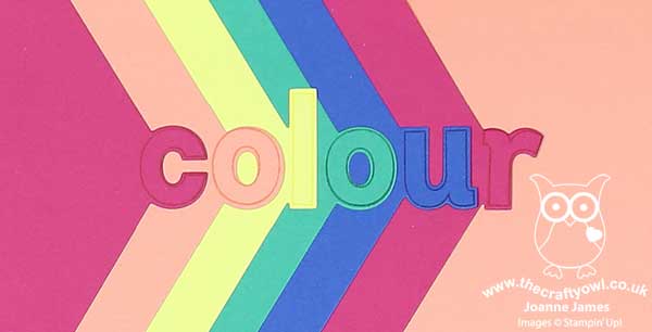
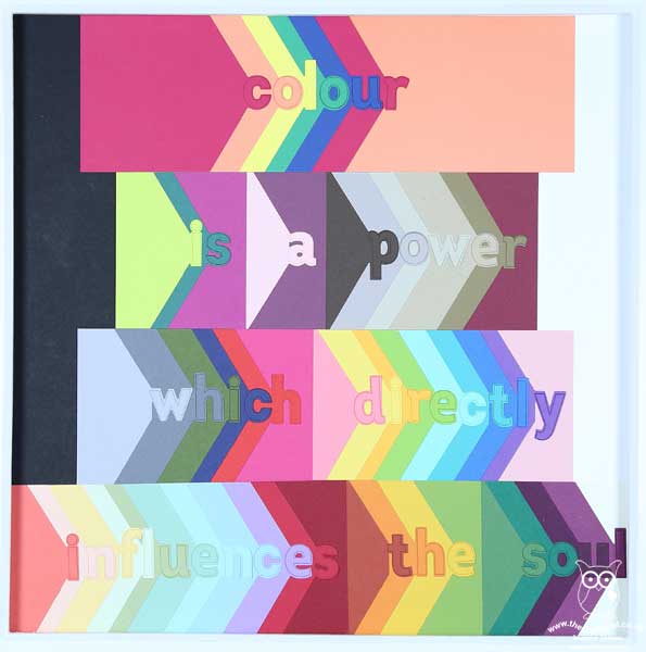
I wanted something that would serve as a conversation-starter for questions and enable comparison of the new colour families so decided to take the opportunity to highlight one of my favourite bundles from the new catalogue, the Lined Alphabet bundle, to create a colour-themed piece of home decor - take a look:

This is a rather large framed piece, measuring a whopping 17 1/2" x 17 1/2" square (or 45cm x 45cm), so I've photographed it quite tightly so that you can see the detail. You might recognise the quotation - it is attributed to the Russian artist Wassily Kandinsky, famed for painting the first works of modern abstract art in the 20th century. In defining life, painting and the psychological impact of colour, he is quoted as saying:
"Colour is a power which directly influences the soul. Colour is the keyboard, the eyes are the hammer, the soul is the strings. The artist is the hand that plays, touching one key or another, to cause vibrations in the soul" (V. The psychological working of Colour: Quoted in: Hajo Düchting (2000) Wassily Kandinsky, 1866-1944: A Revolution in Painting. p. 17).
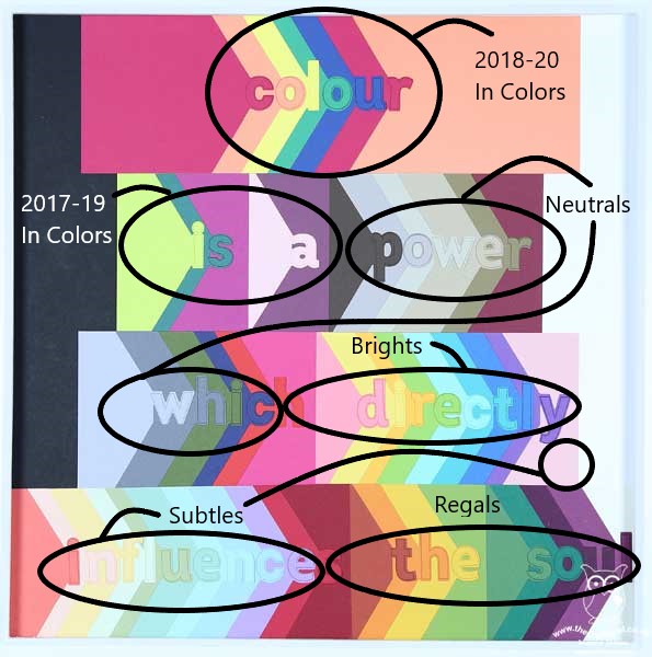
This seemed perfectly suitable for my interpretation of the Stampin' Up! colours. All 53 colours feature: the new 2018-20 In-colours feature first (I repeated the Lovely Lipstick and Grapefruit Grove colours as I needed 6 colours for this word and a seventh panel to give me the symmetry for my overall design, but otherwise all colours feature just once). You can see each of the families in sequence, highlighted below - a little messy to label to be fair, as two of the colour families span more than one horizontal line, but hopefully you can make them all out:

This is then complimented by the three basics of Whisper White, Very Vanilla and Basic Black to make up the background.
What do you think of the new Lined Alphabet and the co-ordinating Layering Alphabet Edgelit Dies? I love them! Rest assured, these are an investment item and I will be getting my money's worth out of them so you will see lots more projects using them in the coming months for sure. They are really easy to use - I actually cut the letters first then stamped afterwards, but you could do the other way around which is the more conventional approach I guess. I like the subtle line detail that stamping the diecut letter adds for just that little bit of extra definition and the marker lines on the dies make it easy to get the words lined up. This is just one of the ways that I will be sharing the new colours with my customers - along with colour swatches, guides and the new in-color bookmarks that I sent out with my catalogues too.
I will be having a couple of new catalogue drop-in sessions next week for anyone who is local to me and would like to have a look at my new product displays including this frame in more detail, pick up their new catalogue, shop my 'buy one, get one free' stash of retired stock and more. These drop-ins will be on Wednesday 6th June 10am-12 noon and then again on Thursday evening 7th June from 6-8pm - please get in touch and let me know if you would like to attend either via email or my Facebook page.
Enjoy your day and I'll be back tomorrow with news of the new catalogue. Until then, happy stampin'!
Stampin' Up! Supplies Used: